Unbleached Materials
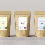
Tea & Glory by Socio Design
Tea & Glory are loose-leaf tea experts and are described as the antithesis of fast-paced coffee culture. In the same spirit of ancient tea drinking rituals, the brand is interested in the continued promotion of slow-living, a lifestyle that seeks to place more focus on the small details and experiences of everyday life. With a desire to better express this position Tea &...
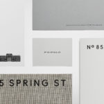
85 Spring Street by Studio Ongarato
85 Spring St is a residential property development of 132 apartments by Golden Age Group, designed by Bates Smart and located in the Australian city of Melbourne. It will be marked by its total work of art philosophy, or Gesamtkunstwerk, which embraces a multitude of artworks to compose one singular piece, but also its distinctive, sculptural and high-rise modernity within an area of...

Repair by Studio Round
Under the title Freespace the 16th International Architecture Exhibition, Biennale Architettura 2018 in Venice, asked international participants to “encourage reviewing ways of thinking, new ways of seeing the world, of inventing solutions where architecture provides for the well being and dignity of each citizen on this fragile planet”. The response from Australia; a pavilion titled Repair and a collaboration between...

Loyal Coffee by Mast
Loyal Coffee is a barista-owned and operated specialty coffee shop located in Colorado Springs. It features a high ceiling, exposed beams and concrete surfaces, natural material detail such as tree trunk stools, and crafted finishes that include a mosaic floor, carved wood panel and what looks like a ghost sign. Drawing on this, the surrounding landscape, and the loyal bond that...
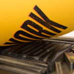
Raw Wine by The Counter Press
Raw Wine is an international two-day wine fair that takes place in the cities of LA, London, Berlin and New York. It was founded by Deborah Lambert and Isabelle Legeron MW, France’s only female master of wine, and provides an opportunity for growers, makers and buyers to get together. Raw Wine is also a celebration of the best organic, biodynamic and...
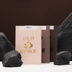
Old Spike Coffee by Commission Studio
Old Spike is a coffee roastery, subscription service and wholesaler, cafe and social enterprise working with the homeless, located in South East London. It is situated on the site of a former workhouse, a place where the poor would break rocks over metal spikes for food and lodgings, and where the roaster gets its name. With a desire to separate the roastery’s commercial...

Paulig Kulma by Bond
Paulig Kulma is distinctive space, located in the heart of Helsinki, developed by Paulig, the leading coffee brand in the Nordics. It combines a coffee shop, roastery and barista institute, and intends to appeal to a broad customer group, and accommodate a variety use cases throughout the day. Paulig Kulma serves multiple functions. From the inviting and flexible space of the coffee shop, to...

The Dayrooms by Two Times Elliott
The Dayrooms is a multi-label womenswear store, located in the London district of Notting Hill, created by Aytan Mehdiyeva and Zumrud Mammadova. The store gives a UK platform to emerging Australian designers and is an expression of Aytan and Zumrud’s shared passion for fashion and travel, and Aytan’s love of photography, textiles and Australian craftsmanship. This is reflected throughout The Dayroom’s graphic identity, developed by Two Times...
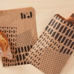
H+J by Spy
H+J is a UK independent catering business, established in 2004, that has provided food and catering solutions to venues such as The Cutty Sark, Moët & Chandon, Abbey Road, RIBA and Selfridges. Their services include working lunches and private dining rooms, large scale food courts, cafes and deli bars. London-based graphic design studio Spy worked with H+J to develop a new brand identity that would...

Well Coffee by Bond
Well Coffee is a new vegetarian café in the centre of the Finnish capital of Helsinki. It has a distinctive interior of steel frames and wood surfaces, exposed concrete walls, drilled and CNC cut panels of circles, large menu board, marine lamps and potted plants. These blend the current and utilitarian with the more welcoming. Scandinavian graphic design studio Bond worked with the...

Blackhorse Lane Ateliers by StudioSmall
Blackhorse Lane Ateliers is a UK-based premium selvedge and organic raw denim jeans brand. It was founded in 2016 by Han Ates, who has over 25 years experience in the textiles industry, and is located in a renovated 1920s factory building with a distinctive profile in Walthamstow, North London. Blackhorse Lane Ateliers is committed to implementing a sustainable and ethical production model....

Qoñi by Leo Burnett
Qoñi is a small artisan community in the Peruvian city of Puno creating hand knitted socks, scarves, gloves and shawls from alpaca fleece. With a desire to present itself as a modern fashion brand and with the intention of entering the international market, Qoñi worked with Toronto-based graphic design studio Leo Burnett to develop a new visual identity; from naming to wordmark, brand story to lookbook, and...