Junction Moama by Seesaw
Opinion by Richard Baird Posted 4 February 2015

Junction is a bar and restaurant situated within the tourist district of the Australian twin-towns of Moama and Echuca, both of which have histories that began in the middle of the 19th century and grew to share a border along the Murray River. Originally a wooden tavern built by James Maiden in 1840, and named the Junction Inn – a reflection of its location at the confluence of the rivers Campaspe and Murray – it was place were travellers and settlers would converge. Its humble beginnings are now honoured with a new permanent structure, a seasonal menu made from local produce, a variety of craft beers, wines and cocktails, and by continuing to serve as a meeting point.
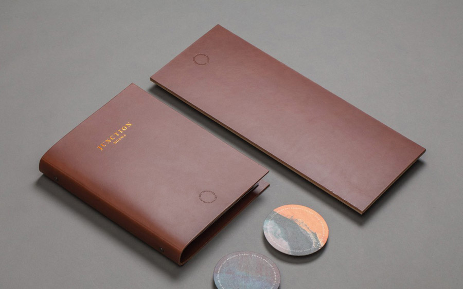
As part of a new brand strategy, developed and then visualised as a brand identity system by Melbourne-based graphic design studio Seesaw, the Junction Inn has been shortened to Junction, and expands on the concept of meeting points, not just of people or rivers, but of past and present, the town and the outback, regional taste and craft brews. This manifests itself across a rich interior design and visual identity treatment which included menus, stationery, signage and business cards, bound by a variety of material textures, high-quality handcrafted finishes and a subtle urban quality.


Interior environment and visual identity are seamlessly woven together, each leveraging traditional material detail, craft process and print finish. This includes stained wood panels and menu boards, copper signage, copper foiled and blind embossed leather menu covers, brass screws, exposed brick and cast beams, wood pens, utilitarian low hanging lights, the hardwearing aesthetic of leather strapped aprons, cast logotype detail and the denim of the staff uniforms. These are traditional, inviting, warm and familiar components put together in a way that is current yet also references the historic nature of the location as a hub for trade along the river.


The cast, polished and coloured concrete of the vases, and the way that these have been photographed and utilised as images across the website and stationery, introduce a distinctive, bright, urban layer and a subtle modern craft sensibility to the more traditional warmth of wood, copper and red brick. It is a smart contrast of both form, colour and texture that draws in urban expansion and utilitarian trends from the gestro-pub and coffee shop space and sets it alongside heritage cues. The disparate nature of these two aesthetics serves to emphasises their detail, communicative value and the tone that each sets, and at times directly interact to great effect, the copper foil over the images of concrete across the business cards is particularly neat.

The images and vases capture the modernistic, consistent and replicable intentions of concrete but also its unique and organic imperfections created by pockets of gas, some of which look like ariel photographs of river deltas, or cross sections of sediment, which feels rather appropriate for a restaurant set at the heart of a river based community. These are enhanced through colour and effectively used as bright edge to edge panels across the stationery, and have informed the dieline of a small folder, a particular highlight.
These are reminiscent of the decay of large city landscapes, making for an acute and unusual contrast against the romanticised and reproduced interpretation of the past, without looking scruffy or contrived, uniting both three-dimensional space, flat artwork and online experience and adding depth to the overall concept. Junction describes itself as a place where the rustic charm of colonial days and the comfort of contemporary culture meet, and it is this that Seesaw have captured and effectively resolved within their brand identity treatment.
Design: Seesaw. Product Design: Studio Twocan. Photography: Andrew Johnson. Opinion: Richard Baird