BP&O Collections — Best Awards Finalists 2015
Opinion by Richard Baird Posted 11 August 2015
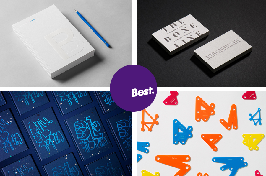
The Best Awards is an annual celebration of interactive, graphic, product and spacial design work from New Zealand and Australia, run by The Designer’s Institute. This year’s event will take place on Friday 9th October at Auckland’s Viaduct Events Centre where winning studios will be awarded a Gold Pin for best in category, a Supreme Pin for best in discipline or a Purple Pin for those considered to have lifted the bar of New Zealand design.
Other awards include The John Britten Black Pin, which will be given to an individual for their leadership, vision and achievements nationally and internationally, and The Designer’s Institute of New Zealand Black Pin for Outstanding Achievement. This will be awarded to a member who has made a lasting and valuable contribution to the design profession and design culture in New Zealand. The judging process and criteria can be seen here.
To coincide with the publication of these finalists BP&O looks back at those projects up for awards in October which have been reviewed on the site. Finalists include Inhouse, Strategy, Garbett and Richards Partners.
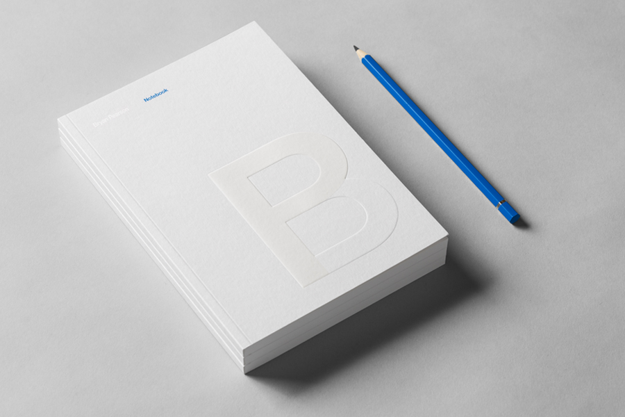
Bryan Pearson by Strategy
Drawing on his extensive experience as a successful CEO, one that spans 20 years in the corporate, private and public sectors of New Zealand and Australia, Bryan Pearson has developed a niche business that provides strategic leadership and support to CEOs. His brand identity, created by design and advertising studio Strategy, is informed by the personal skills and experience that defines his business, and reflects professionalism and integrity, through a typographical and material restraint and the tactical flourish and contrast of matt surfaces and a glossy print finish.
See more of this project here
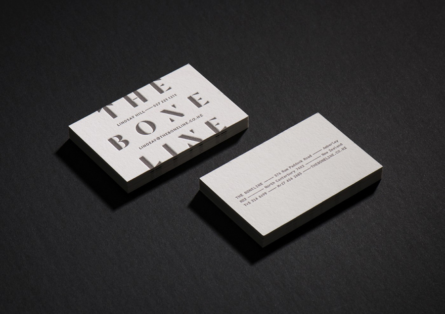
The Bone Line by Inhouse
The Bone Line is a New Zealand winery with a name that references the K—T Boundary, a thin band that runs close to The Bone Line’s location in the Waipara Valley, and that marks the end of the Mesozoic Era and the extinction of the dinosaurs. Auckland based graphic design studio Inhouse worked with the winery to establish a distinctive packaging and identity treatment. Like many good wine label solutions, Inhouse have taken its cues from the provenance of the wine. While conventional, this approach benefits from a significant regional prehistory that ties in well with the themes of age and vintage, and is effectively visualised through a contrast of type reduction, the detailed texture of fossil photography and a black, white and copper colour palette.
See more of this project here
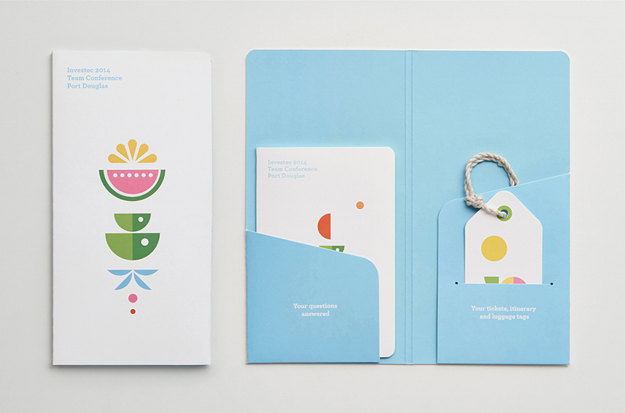
Investec Port Douglas Conference by Garbett
International banking specialist and asset management group Investec’s 2014 annual team conference took place in Port Douglas, a coastal town located in the tropical north of Queensland, home to the Great Barrier Reef and the rainforest of Daintree and Cape Tribulation.
The conference’s identity, designed by Sydney-based Garbett, draws on themes of travel, tropical destination and for the most part avoids any hint of corporate convention. This is achieved through simple geometric illustrations across beach towels and tote bags, a bright colour palette, the generosity of dyed papers, die cut detail to create luggage tags and a passport-like notebook and the dual nature of the language choice. The result is a playful summer holiday aesthetic with a practical edge.
See more of this project here
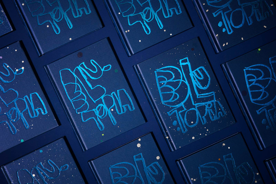
Blutopia by Inhouse
John Reynolds is a New Zealand based contemporary artist, Arts Foundation Laureate, Sydney Biennale headliner and Walters Prize nominee. John began painting large abstract panels, however, has moved towards creating work with a typographic and structural foundation and has embraced smaller formats which has, amongst others, included postcards and stamps.
Blutopia is a full colour reproduction of John Reynolds’ Bluetopia series from 2014 which uses form, image, type and composition, bound by the theme of blue, to draw on association and make connections that are both visceral and intellectual. These connections are explored by Laurence Simmons as complimentary essays.
Blutopia is published by Six Point Press, is a collaboration with creative director Arch MacDonnell, and features cover and layouts by Aukland based graphic design studio Inhouse.
See more of this project here
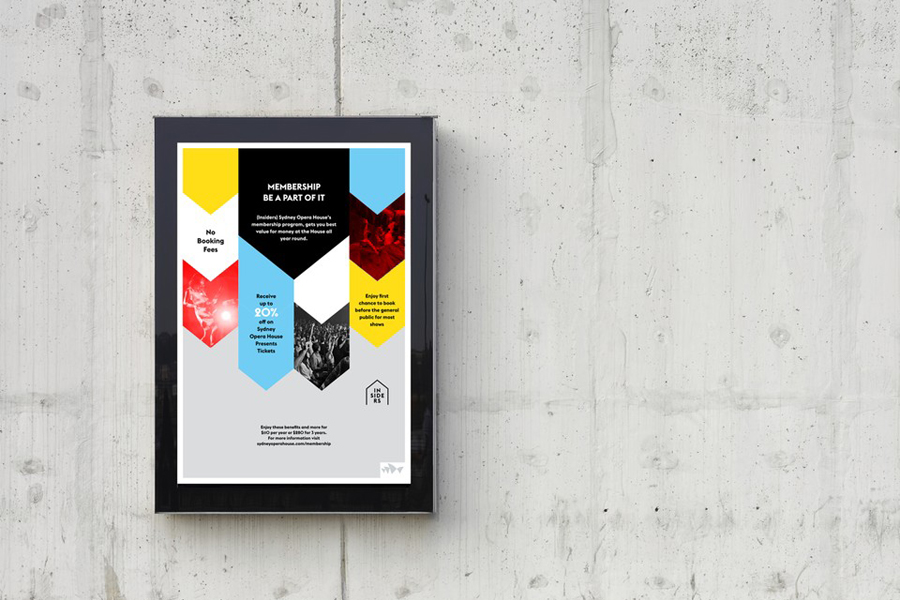
Insiders by Garbett
Insiders is the membership program of Sydney Opera House launched to nurture customer loyalty, increase market share and raise the frequency of attendance through priority booking, discounts, dress rehearsal ‘sneak peeks’ and invitations to meet staff and artists.
Multidisciplinary design agency Garbett, formerly Naughtyfish, were recently commissioned to ‘evolve’ the Insiders visual identity, positioning it as a retail product with greater focus on communicating the value proposition for members, to meet the changing focus of the Sydney Opera House program and represent the shifting perceptions around the brand. The project involved trademark design, posters, welcome pack, brochures, membership card, digital advertising and brand guidelines.
See more of this project here
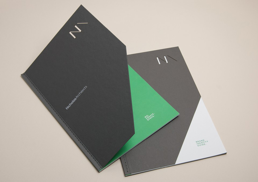
Nicholas Architects by Strategy
Nicholas Architects is an Australian architecture studio working within both the private and public sectors from its offices in the city of Sydney. The studio has a portfolio of community centres, golf clubs, ambulance stations, sports terraces and university campuses, amongst a variety of other structures and spaces. Nicholas Architects commissioned Strategy to develop a new visual identity treatment—which was recently announced as a finalist in this year’s Best Awards—that included monogram and logotype design, business cards, brand guidelines, brochure and website.
See more of this project here
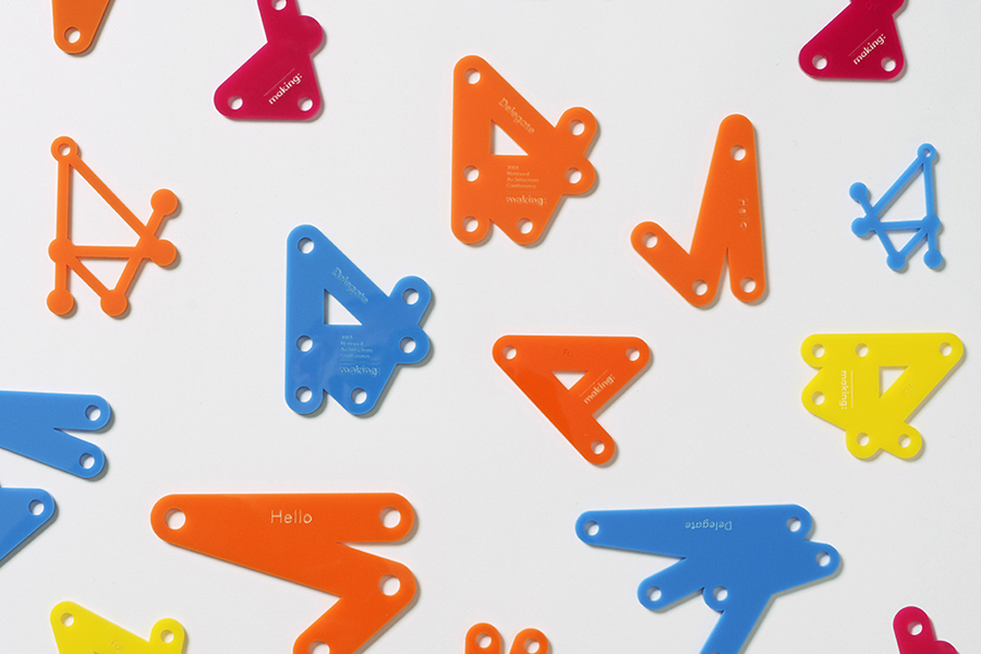
Making by Garbett
Making: is the Australian Institute of Architects’ 2014 conference. Working in collaboration with creative directors Sam Crawford, Adam Haddow and Helen Norrie, Sydney based design studio Garbett developed a brand identity for the conference, which included logo, lanyard, merchandise and print design, that explores the role of the architect as maker of environments and connections that extend beyond the bounds of traditional practise. This was expressed visually and dynamically in print and online using handmade detail, an alphabetic ‘matrix’ that creates imagery when words are input, dot-to-dot portraits of the speakers, animations and a stop motion video.
See more of this project here
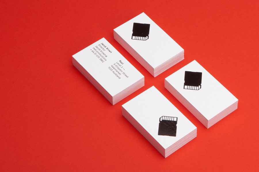
Reel by Richards Partners
Reel, formerly Reel Good, is a digital production company telling memorable stories and crafting digital experiences from its offices in Auckland, New Zealand. It has positioned itself at the intersection between new technologies and established filming techniques, and delivers both creative and distribution services. These include providing direction, production, post-production, animation and music to clients such as New Zealand Air, Casio, Warner Music and Vodafone, amongst others. To coincide with the name change graphic design studio Richards Partners were commissioned by Reel to create a new brand identity treatment, which extended across business cards, brochure, posters and responsive website, that would help move it from start-up to respected production house.
See more of this project here
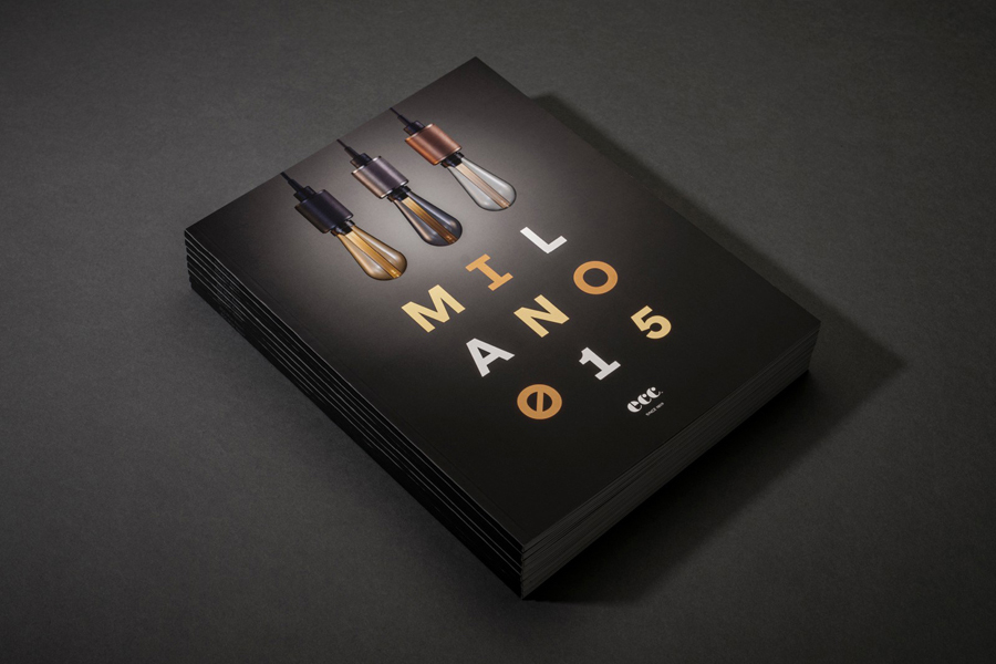
ECC Milano 2015 by Inhouse
ECC is a high quality lighting, furniture and product supplier for both the home and commercial markets. It represents a variety of brands, some of which include Jeremy Coal, Parri and Lumina, and has showrooms throughout Australia and New Zealand.
As part of its continued commitment to these brands, ECC attends Salone Internazionale del Mobile di Milano, an annual event that showcases the latest products and technologies from the industry. The ECC Milan Report is a distillation of this event and features the latest releases from design leaders such as Flos, Moooi, Minotti and Tom Dixon, alongside editorials and interviews. Graphic design studio Inhouse, who won Bronze at New Zealand’s Best Awards for their ECC 2014 Milan Report, worked with ECC again to create cover, spreads and layouts for their 2015 edition.
See more of this project here

