Hurly Burly by Midday
Opinion by Richard Baird Posted 19 April 2017

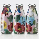
Hurly Burly brings the bold flavour and natural health benefits of naturally fermented foods to the United Kingdom. Its first range of products will be a variety of raw organic coleslaws. Flavours include Jalapeño & Oregano, Lemon & Ginger and Turmeric & Cumin. Name, brand identity and packaging design, developed by London-based design studio Midday, intends to bring to the forefront the turbulent and continual process of fermentation, emphasis the strong flavour profile of fermented foods and secure shelf impact through a combination of bold typographical play and colour.

Midday takes the microscopic process of fermentation and gives it an exaggerated visual character through naming, bold sans-serif characters, layout and a bright colour palette. These choices feel in line with strong flavour, have a compositional simplicity and weight that is well-suited to the wholesome and sits well within the context of a low structural choice.
Logotype, which plays with direction and continuation in the arrangement of letters and words, and in the use of colour to link top and bottom lines, is intended to reference the never-ending process of fermentation. This runs throughout all communications, in a static form across packaging and print materials, and in motion online.
The theme of ongoing fermentation is not explicit but does lend a simple type-centric approach a memorable and quirky expression, and works well around the circumference of jar, running off the edges of print communication, and is neatly retained within a simple HB monogram.


Colour is bright and cheerful. Where the weight of type offers contrast to the finely shredded qualities of product, ink compliments their natural tones but punches it up a touch for more impact. White backgrounds enhance, and two colours work well to give an almost looping around quality to logotype.
Conceptually the work, although simple, is thoughtful and unusual in its interpretation of fermentation, and stylistically, has plenty of distinctive and convivial character. This is complimented by copywriting but falls a little short in its implementation online. More work by Midday on BP&O.
Design: Midday. Opinion: Richard Baird. Fonts Used: GT Wlasheim.