Cafes, Bars and Restaurants

Knahia by Requena Office
Estepona is a Spanish resort town on the Costa del Sol. It surveys the azure waves of the Mediterranean from the apex of a bight that traces a gentle South-Westerly arc from Marbella to Gibraltar. Strewn as it is on this notoriously idyllic coastline, Estepona largely conforms to the stereotypically cheerful charm of the Spanish resort town, pandering to the...
Frydate by Skinn
Beyond its eye-wateringly strong beers, decadent chocolates, and waffles; Belgium is famous for serving up one beloved belt-buster that’s easy to eat, and deceptively hard to get right: chips. A new Belgian homemade burger and snacks offer, Frydate, positions itself far beyond a humble chippie and into the realm of ‘Belgian frymanship’-led ‘friterie concept’. To help it achieve its ‘insatiable...
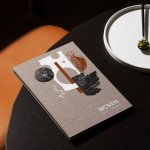
Woven by Adam Smith by Magpie
Coworth Park is a grand 18th-century manor-house-turned-luxury-spa-hotel, set among a profusion of wildflowers in a sumptuous patch of Berkshire countryside. It’s part of the Dorchester Collection: ten prestigious hotels scattered across the world, all owned (through the Brunei Investment Agency) by Hassanal Bolkiah ibni Omar Ali Saifuddien III, the Sultan of Brunei. Bolkiah rules as an absolute monarch, and personally...
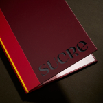
Sucre by DutchScot
It’s always satisfying to see smart, bold new identity designs for a household name brand, often by one of the big name studios: things like the still-hyped 2021 JKR Burger King rebrand; Collins’ Girl Scouts revamp in 2022; Springetts’ fresh look for Ryvita that same year, which makes the much-maligned crispbread seem a lot more palatable. And while such projects...
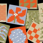
La Oficina del Parque by Studio Ingrid Picanyol
Last month @designershumour shared a meme titled, ‘When I ask my client to send their logo in vector format’. The god-tier client supplies logo.ai, from which point there’s a sliding scale of disgust and incredulity from logo.psd to logo.jpg and logo.doc. The punchline is logo.xls. The joke resonated, attracting over 30k knowing likes (or eyerolls). At one point or another,...
Tugg by Kurppa Hosk
The hamburger is an American icon. It conjures associations with all-American diners and drive-thrus, backyard cookouts and family gatherings; American values, such as entrepreneurship, as well as less positive attributes of Western countries, like obesity. The burger’s visual identity is inseparable from its history and has been solidified time and time again as the big fast food franchises conquered the...
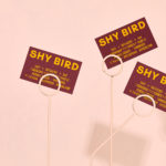
Shy Bird by Perky Bros
Shy Bird is a all-day café, rotisserie and bar in Cambridge, Massachusetts. Its core mission is to elevate chicken, and the experience of eating chicken into the realms of the exceptional through gastronomic know-how, a beautiful interior and a visual identity designed by American studio Perky Bros. Drawing their inspiration from the red junglefowl, the “original chicken” and descendant of the domestic chicken, and...
Oji by Seachange
Oji is a sushi brand of firsts. It is the first in New Zealand to use fully recyclable and biodegradable packaging and the first to use all free-range products. This is a significant move forward and marks the brand out from well-established competitors. Oji opened in New Zealand with two locations in Auckland’s Commercial Bay, a place where they source...
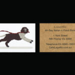
Lagotto by Studio Hi Ho
Lagotto is a new all-day café, wine bar and food store situated inside Nth Fitzroy, a residential property development project from Milieu located at the heart of Melbourne’s, inner north. Named after the truffle-hunting Italian dog breed, the café offers a relaxed European surrounding in which to enjoy an Italian menu with a “joyful vibrancy that avoids kitschiness or pastiche”. Studio Hi Ho,...
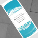
Ascari by Blok Design
Ascari is an Italian restaurant which two locations, one on Queens Street East and another newly opened establishment on King St West. Toronto, Canada. It is named after the proprietor’s hero, Formula 1 legend, Alberto Ascari, (who was also known for his love of food). To reflect both the passion for good simple food and racing, design studio Blok developed an identity that brings together...
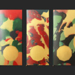
The Golden Hour by Triboro
The Golden Hour is an outdoor seasonal restaurant located in New York’s The High Line Hotel. It is a place to experience the softening of sunlight with unobstructed views of the Chelsea skyline. The restaurant intends to draw to mind the casual elegance of a coastal soirée rather than the rushing of pre-dinner drinks. The restaurant space is described as being...
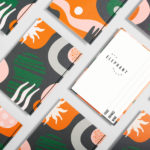
Old Elephant House by Studio South
Old Elephant House is a new brasserie and courtyard bar in the former elephant enclosure at Auckland Zoo. It offers an à la carte menu and set three-course meals made up of light and elegant dishes. It is a building that is distinct in its proportions and location, with tall doors and windows from which to hear the distant calling siamang...