Panini Internazionale by Stockholm Design Lab
Panini Internazionale began life as a small delicatessen in 1990 and since then has grown to become a chain of fast food stores with 19 locations in and around the city of Stockholm, Sweden. Panini Internazionale delivers good quality healthy food quickly and conveniently, is a family run business, and features a name and brand identity treatment developed by Stockholm Design Lab. This included logo,...
Sushi & Co. by Bond
Sushi & Co. is a restaurant and cafe on-board a cruise ship taking guests to destinations along the Baltic Sea. It has a modern interior design that mixes dark and light wood furniture, features warm low hanging lights, organic patterned upholstery, cool grey walls, exposed brick panels, slate floors and a visual identity developed by Helsinki based graphic design studio Bond. Extending...
Marco Marco by Acre
Marco Marco is an Italian restaurant business with five locations across the city-state of Singapore and an affordable menu made up of international interpretations of classic dishes. These are created from simple recipes inspired by modern food culture using fresh locally sourced ingredients. The name, a reference to the adventures of merchant traveller Marco Polo, was chosen to reflect the international meeting...
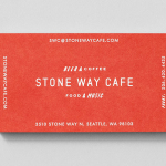
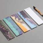
Stone Way Cafe by Shore
Stone Way Cafe, formerly the Tiny Ninja Cafe, is a Seattle based neighbourhood meeting point, music venue and internet cafe, in the area of Fremont, with a formidable, geometric, concrete exterior structure and a warmer interior of wood surfaces created by goCstudio. Design studio Shore, working closely with signwriters and fabricators, created a brand identity treatment for the cafe, which included...
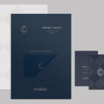
CC Bar by Freytag Anderson
Glasgow based design studio Freytag Anderson recently worked with Fraher Architects to develop the brand identity and collateral for Champagne & Cocktails at the Hilton Hotel, 22 Park Lane, London. Based around a monogram, midnight blue colour palette, hand crafted finishes of wood cut and etched glass detail, and both visual and material texture, Freytag Anderson delivered what they describe as a luxurious and old-world aesthetic that is...
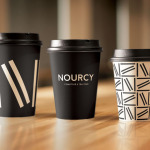
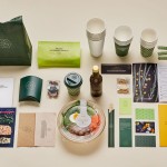
Nourcy by lg2boutique
Nourcy is a delicatessen that has been creating fresh, home-made and original products for thirty years from its location in Quebec City. While providing a contemporary dining environment Nourcy also offers catering services and lunch boxes to customers who have come to expect restaurant-quality at work and at home. In conjunction with a new menu of pastries, an expanded chocolate selection, exclusive gourmet delicacies and the development of a...
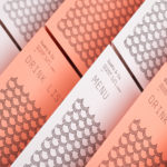
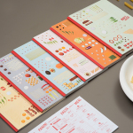
Tanoshii Ramen Bar by Mast
Ramen is a Japanese meat broth and wheat-noodle soup that originated in China and is now embraced internationally. While many enjoy instant versions, the best is said to be prepared over days and is the product, and some would say the art form, of a creative and experienced chef. These are the values of Tanoshii. As the first dedicated ramen bar...
Chavez by Föda
Chavez is a contemporary Mexican restaurant located within the Radisson hotel, Austin, Texas. The restaurant has a Southwestern menu created by chef Shawn Cirkiel and inspired by his memories of family road trips taken to the Mexican coast and the cuisine he experienced there. These memories also informed the development of a warmly lit, wood and fabric furnished interior design by Michael Hsu Office...
Junction Moama by Seesaw
Junction is a bar and restaurant situated within the tourist district of the Australian twin-towns of Moama and Echuca, both of which have histories that began in the middle of the 19th century and grew to share a border along the Murray River. Originally a wooden tavern built by James Maiden in 1840, and named the Junction Inn – a reflection of...
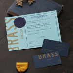
Brass Union by Oat
Located in the Union Square neighbourhood of Somerville, Massachusetts, Brass Union is a pub and cocktail bar with a small plate dinner menu. It takes over the space formerly occupied by the restaurant and music venue Precinct, both of which incorporated the historic nature of the building as a former police station into their names. To British readers, Brass Union would comfortably...
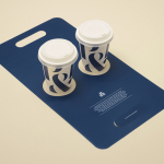
Pablo & Rusty’s by Manual
Pablo & Rusty’s is a small-batch coffee roaster, wholesaler, retailer and cafe with four locations in and around Sydney, and a company culture passionate about sustainability and the pursuit of perfection. San Francisco based studio Manual created a visual identity for Pablo & Rusty’s that would better reflect their values, was sensitive to local coffee culture and is described as having a level...
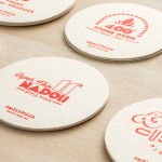
Melt by Can I Play
Melt is a Australian takeaway and restaurant franchise with a philosophy that looks to honour the 200 year old Napoli history of pizza making and its origins as a fast and nutritious meal by mixing high quality ingredients and recipe authenticity with the speed, price-point and openness that today’s consumers have come to expect. These values are also reflected through an absence of oil, fat or sugar...