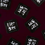
Bier Bier by Tsto
Bier Bier is located on the ground floor of a striking Art Nouveau building in the centre of Helsinki, and part of The We Are Group, alongside wine bar Vin Vin, restaurant Story and wine importer and wholesaler Viinitie. It has over 100 different types of beer and an interior of dark wood panels and carved frames, ocean green walls, light wood...
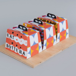
Bottura by Foreign Policy
Bottura is an Italian restaurant and food store with space in Singapore’s Suntec City Mall. It has a contemporary interior of exposed utilities painted black, white suspended ceiling and surfaces, dark wood and steel furniture, glass, concrete and steel counters, warm spot and low-hanging lights and an open kitchen working from authentic family recipes rooted in the owner’s hometown of Bologna. This interior is punctuated...
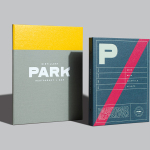
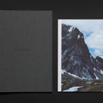
Park Restaurant & Distillery by Glasfurd & Walker
Park is a bar, restaurant and distillery located in the Canadian resort town of Banff, within the Banff National Park, and the province of Alberta. It is a region of diverse natural beauty which includes mountains, prairies, forests and desert badlands, and that attracts walkers, campers and skiers locally and internationally. The restaurant is a celebration of Banff’s alpine history and lifestyle. This runs...
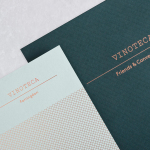
Vinoteca by dn&co
Vinoteca is a group of London based restaurants, founded by business partners and friends Brett Woonton and Charlie Young, that were inspired by the wine bars of Spain and Italy. Aside from the restaurant experience, and as a testament to the quality of their wine list, these restaurants also operate as local wine retailers. dn&co. were commissioned to refresh and formalise Vinoteca’s brand identity. With...
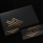
Maaemo by Bielke&Yang
Design studio Bielke&Yang have worked with Norwegian two Michelin starred restaurant Maaemo to develop a holistic brand identity solution informed by the philosophies and creative practices of its unique dining experience and culinary expertise. The studio’s brand identity design, which encompassed website, custom typography, colour, the tone and content of images, and the tactile finishes of welcome notes, magazines, business cards, folders...

Torafuku by Brief
Torafuku has a simple yet adventurous menu that reinterprets pan asian flavours as modern shared dishes. These are made from good quality and locally sourced ingredients, which are complimented by a variety of contemporary cocktails, a carefully curated wine list and local craft beers. Torafuku is located on the border of Vancouver‘s historic Chinatown and features an open and reductive urban interior space of leather upholstered benches, light...
Iron Grill by End Of Work
Iron Grill is fast food outlet preparing healthy, flame grilled wraps and burgers, to order, from its kitchen and counter at the Optus headquarters at Macquarie Park, Australia. The food court at Optus is a competitive environment with a large captive audience of over 6,500 people and a number of other food outlets competing for business but serving familiar, unhealthy favourites. To help define and convey...
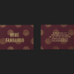
Wine Fandango by Moruba
Drawing inspiration from New York neon, and its show business associations, graphic design studio Moruba have developed a new brand identity treatment for Wine Fandango, a restaurant and wine bar, located in the Spanish city of Logroño, that features a rich interior design of textured glass, wood floors and furniture, ceramic tiles, exposed brick and gold fixtures. Wine Fandango’s identity is made up of custom typography and logotype, patterns,...
Bibelot by A Friend Of Mine
Bibelot is a luxury European-inspired dessert boutique in Melbourne with a coffee bar, chocolate shop, high tea salon, gelaterie and artisinal patisserie. It features an interior of long marble counters, a light spotted stone floor, spot lighting, cornicing, black and white walls, as well as bronze and tiled detailing. Informed by the sense of place and the permanence that underpins Bibelot’s...
Melba at The Savoy by Pentagram
Melba is a pâtisserie and cafe, located on the corner of The Strand and Savoy Place in London’s North Bank, and is one of nine places to eat and drink at The Savoy hotel. The patisserie is described as offering a glimpse into the exclusive and luxury world of The Savoy, and is the first time that the hotel, accessed via private...
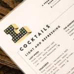
Libertine Liquor Bar by CODO
Libertine is a bar and restaurant, located on Indianapolis’ Mass Avenue, that celebrates the pioneering American spirit with an emphasis on classic cocktails, craft distillers, boutique wines and an evolving menu. It is recognised as one of the best restaurants and bars in the country, and as being instrumental in the city’s growing and continued support of local food and independent...
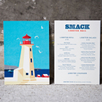
Smack Lobster Roll by & Smith
Smack Lobster Roll is a takeaway business, located on Mayfair’s 26 Binney Street, serving freshly cooked lobster in brioche rolls, as well as a variety of other fillings. In conjunction with a name change, formerly Smack Deli, and to coincide with the opening of a second site on Dean Street in Soho, British graphic design studio & Smith worked with Smack to...