Peter Bailey Company by Bunch
Opinion by Richard Baird Posted 16 June 2011
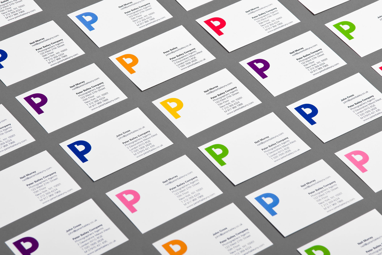
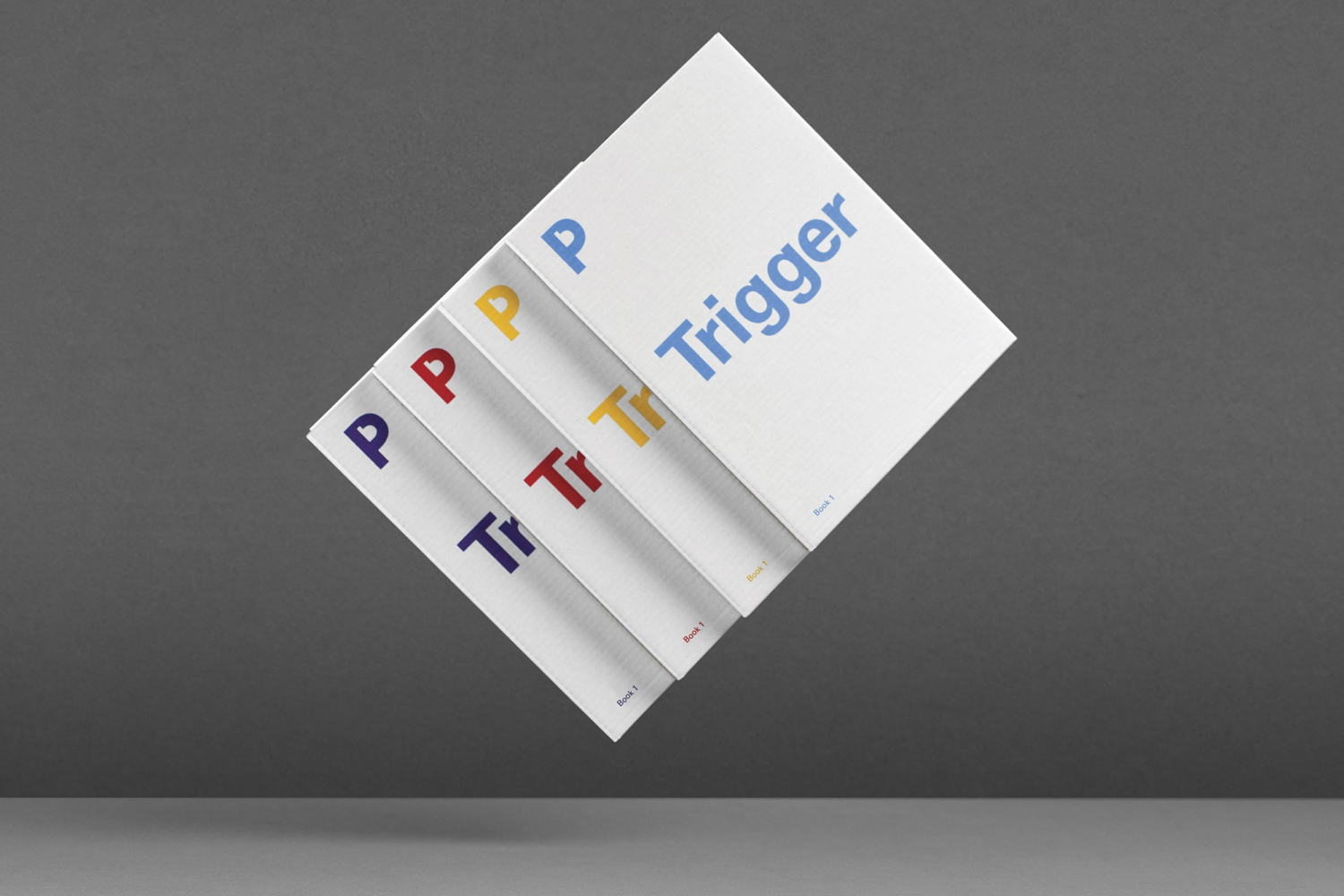
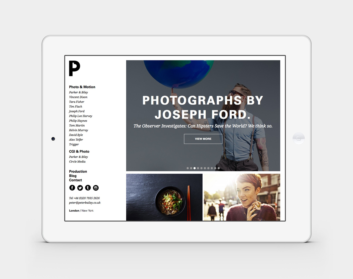
Peter Bailey Company is an international representative of unique and talented photographers and digital artists. Since its founding in 1982 it has grown internationally, and now has offices in both London and New York and commissions photo, motion and CGI work for a global client base. Their new visual identity, designed by creative agency Bunch, utilises negative space in the creation of a colourful PB monogram and is bold and confident in its consistent application and relationship with photography. This post was originally published June 2011, and was update October 2017 with more images.

Bunch delivers a modern take on the historical arts and crafts origins of the monogram, effectively drawing a letter b in the counter space of the p. What is particularly neat is the mirrored nature of the two letter-forms, capturing both sides of the lens, the photographer and the subject, and touches upon the fundamental part of DSLR camera workings, a mirror. It establishes a neat contrast, in form and colour, between image and identity, yet allows image to be an integral part, adding colour to the negative space b.
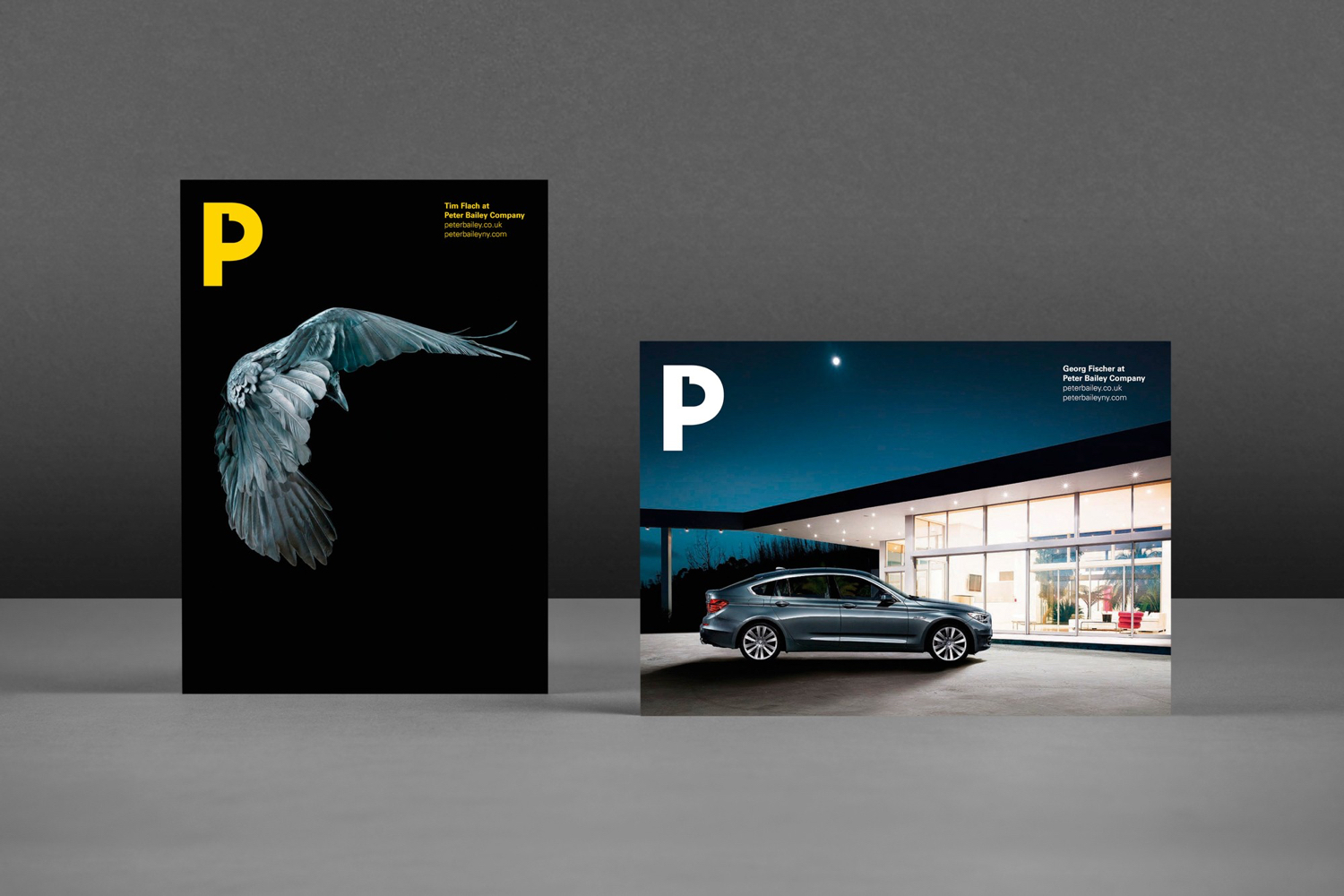
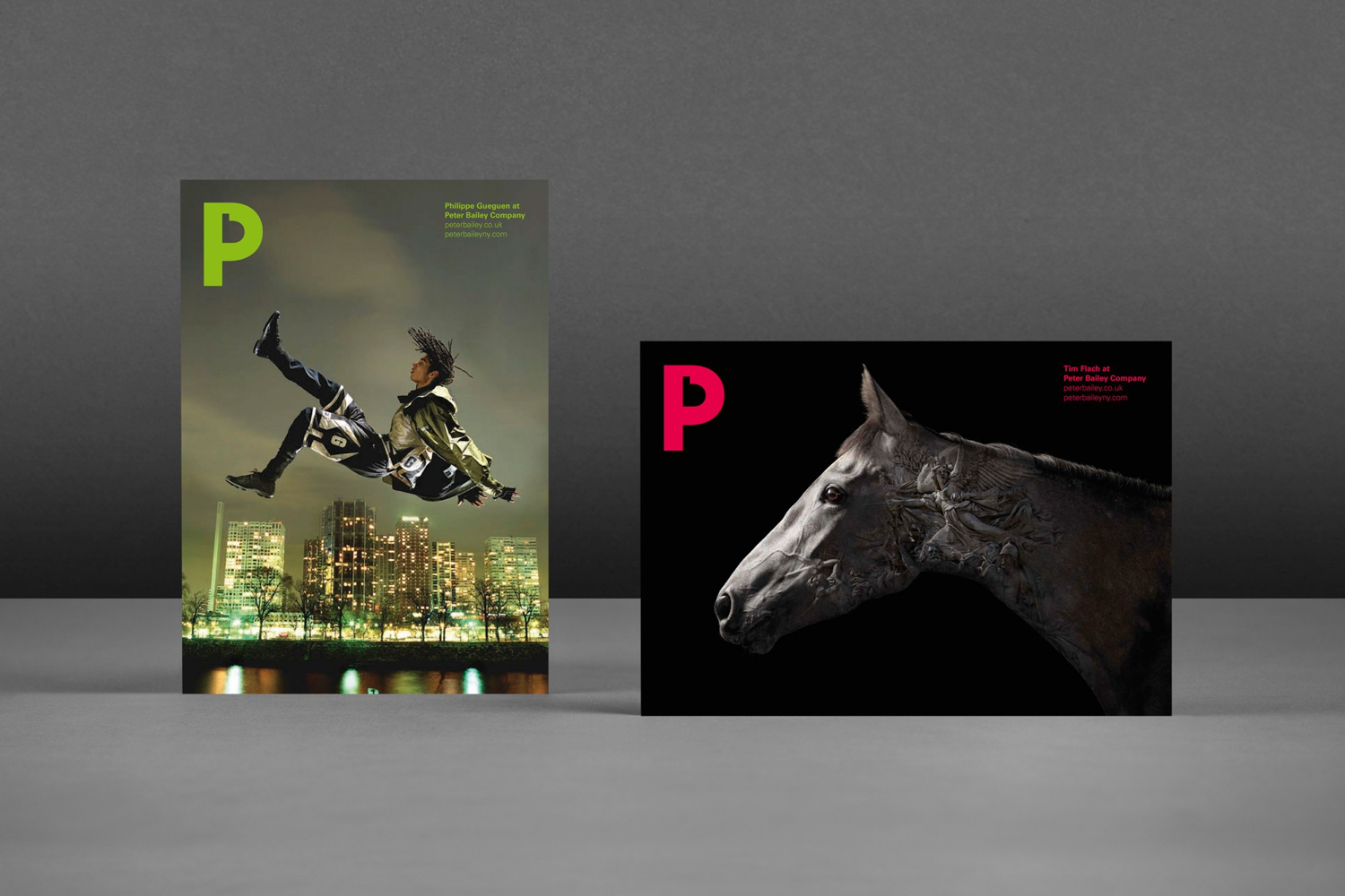
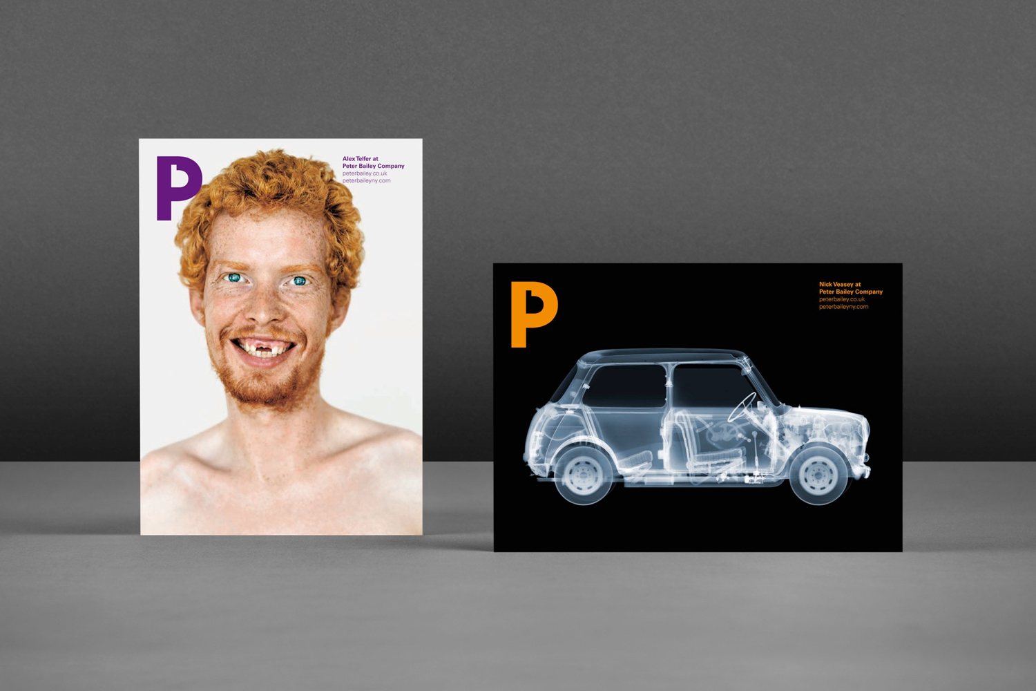
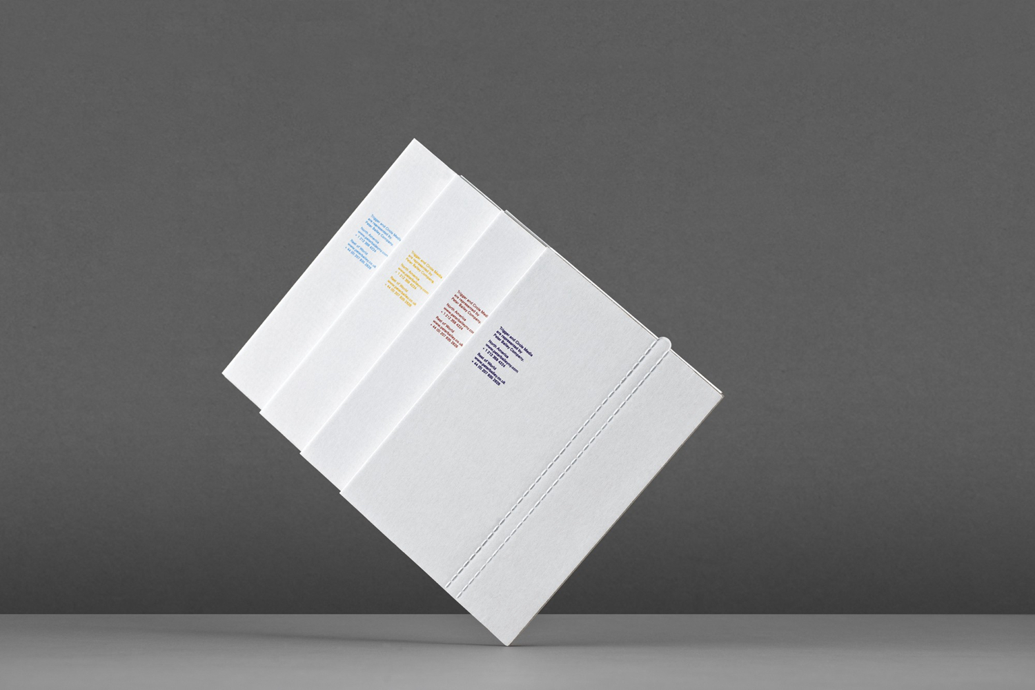
The accompanying type choice of Univers secures continuity with monogram and forms a corporate consistency while a bright colour palette introduces a playful spirit that speaks of creativity and diversity. The black and white version, and the use of a clear UV varnish in conjunction with image, sets a more serious tone, and highlights the flexibility of this logo-centric approach. More work by Bunch on BP&O.
Design: Bunch. Opinion: Richard Baird. Fonts: Univers.
