The Best of BP&O — Packaging of 2014
Opinion by Richard Baird Posted 6 January 2015
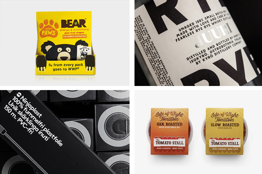
2014 was another great year for new packaging projects. Highlights included Designers Anonymous’ piece for Carpe Nux, Hype Type’s work for uBear, Mucho’s design solution for Mother, and Robot Food’s work for Under Your Skin. However, there were five that have made it into BP&O’s best of 2014, a feature that brings together what I believe to be the most interesting projects for another opportunity to be seen and shared. Between them these mix graphic design, material and structural choices, custom type, brand storytelling and effectively leverage, yet avoid relying completely upon, category conventions. Each is visually distinctive and clear in their communicative intentions.
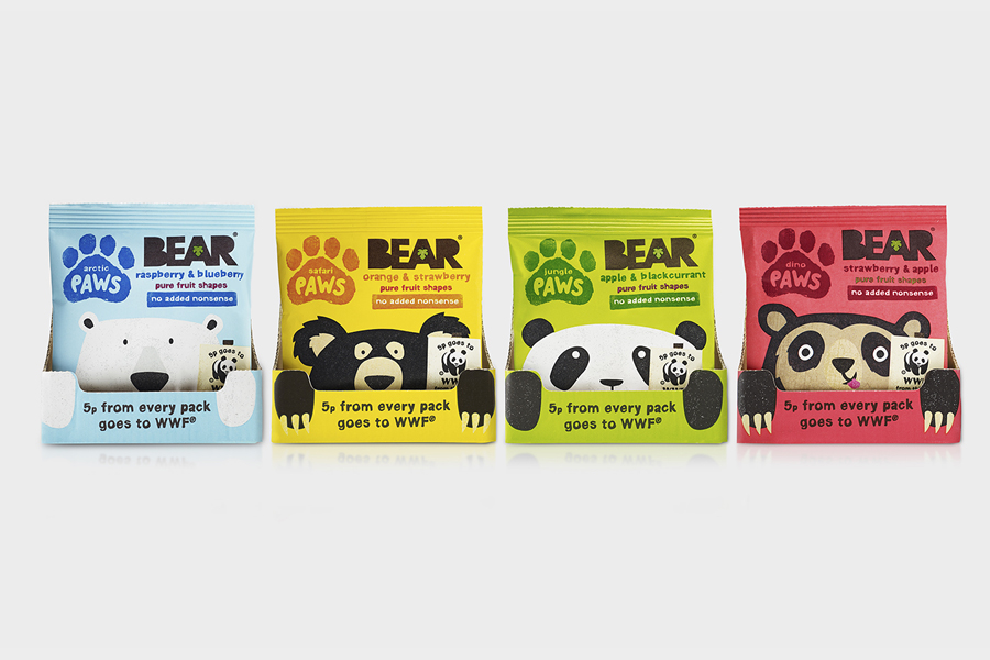
Bear Paws designed by B&B Studio
Bear Paws is a baked and shaped pure fruit snack range available in four distinct flavour combinations and produced by the British health food brand Bear Nibbles. To draw attention to endangered species such as pandas, polar and sun bears, the brand recently launched a limited edition pack design alongside a pledge to donate 5p per sale to the WWF. This limited edition packaging, which features illustrated character detail and Bear’s distinctive colour palette, was developed by B&B, a London-based design studio who have worked with Bear Nibble since its inception, establishing names, developing identity and creating packaging treatments for its cereals and baked fruit products.
Read more about this project here
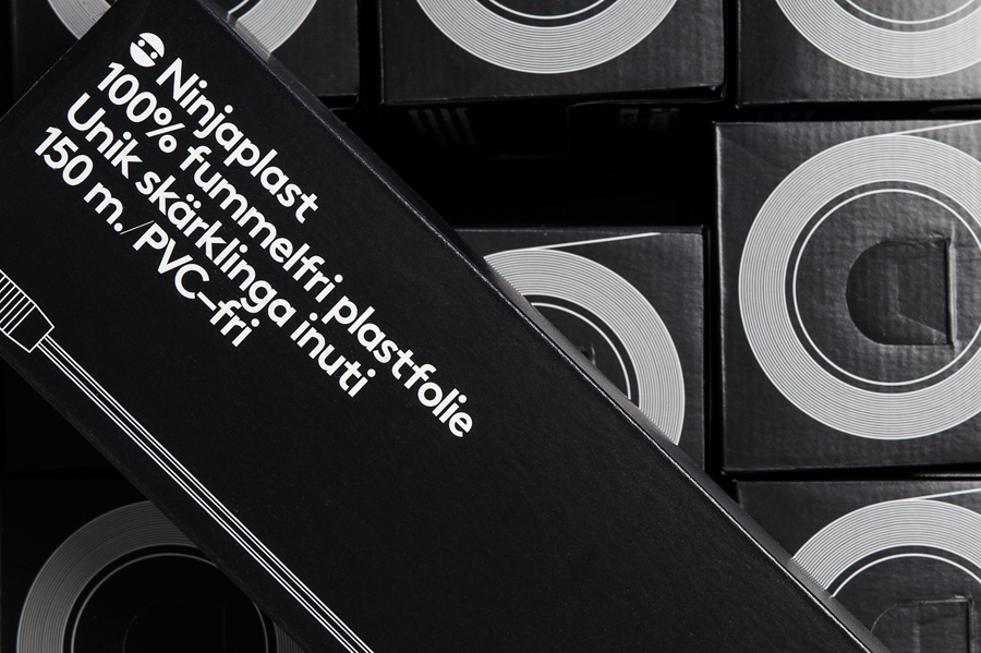
Ninjaplast designed by Kurppa Hosk
Ninjaplast is a Swedish plastic food wrap product with a unique packaging solution that addresses the difficulties often associated with cutting similar products effectively from a roll. Rather than a serrated card bar, Ninjaplast comes with a built-in and safe to use cutting blade that makes wrapping food a “fumble free” experience. Packaging becomes the defining characteristic of product and this functionality is enhanced by, and communicated through, a distinctive visual identity treatment developed by Stockholm-based Kurppa Hosk that mixes character with precision and functionality.
Read more about this project here
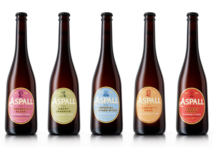
Aspall designed by NB Studio
Aspall is a British family run cyder maker with a significant history, now into its eight generation and third century. In response to increased competition from both the Cyder and Vinegar categories, Aspall recently worked with NB Studio to help reinvigorate and re-craft its brand identity. This included new logo and packaging treatments for retail and trade as well as website, point of sale and livery design. Drawing on Aspall’s rich history and archive of documents, records, old marks, motifs and photographs, NB Studio looked to connect the new design to the past and capture the unique quirks and eccentricities of the business, and the family members that have had a hand in running it.
Read more about this project here
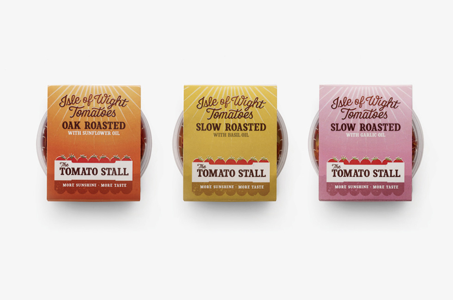
The Tomato Stall designed by Designers Anonymous
The Tomato Stall is a grower of speciality tomatoes whose distinct flavour is attributed to the increased sunshine they receive from being farmed on the southern English island of the Isle of Wight. From these, The Tomato Stall produces a range of ‘tomato inspired’ artisanal products that are stocked by farm shops and delis throughout the UK and sold from their own market stalls across London and the south. With a desire to appeal to ‘sophisticated foodies’ and achieve a more established market position capable of meeting the needs of big supermarkets, Designers Anonymous developed a new brand identity and packaging treatment that delivers a clearer brand story, has a strong sense of provenance and a contemporary crafted sensibility.
Read more about this project here
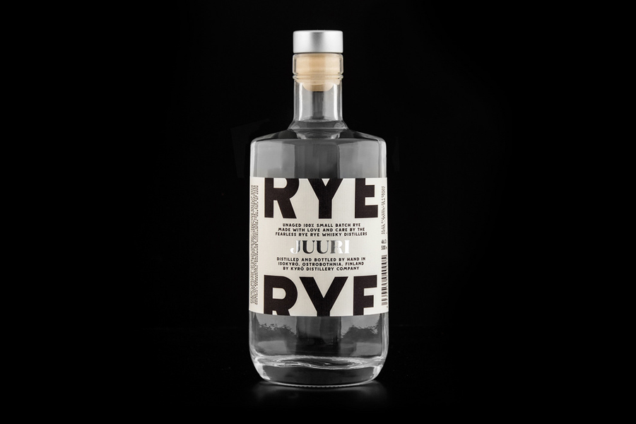
Kyrö Distillery Company designed by Werklig
Kyrö is a Finnish distillery, located in a former dairy in the region of Isokyrö, that will yield a high quality 100% rye whisky in 2017 for national and international markets and currently batch produces a root variety for cocktails. At the beginning of 2014 design studio Werklig were commissioned by the distillery to create a brand identity and packaging design treatment that would reflect whisky culture and the distillery’s local roots and heritage.
Read more about this project here

