Vocation Brewery by Robot Food
Opinion by Richard Baird Posted 1 May 2015
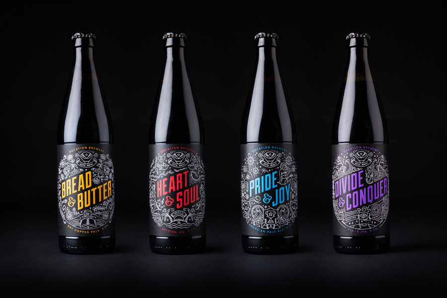
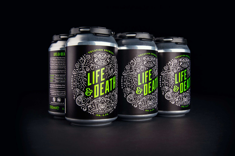
Vocation is a UK microbrewery, established and run by John Hickling, with a range of craft beers that have distinctive and punchy flavour profiles, and a visual identity, packaging design and naming convention created by Leeds-based studio Robot Food. This draws on the tropical, fruity, floral and hoppy characteristic of the range, and the brewery’s fearless, daring and renegade attitude.
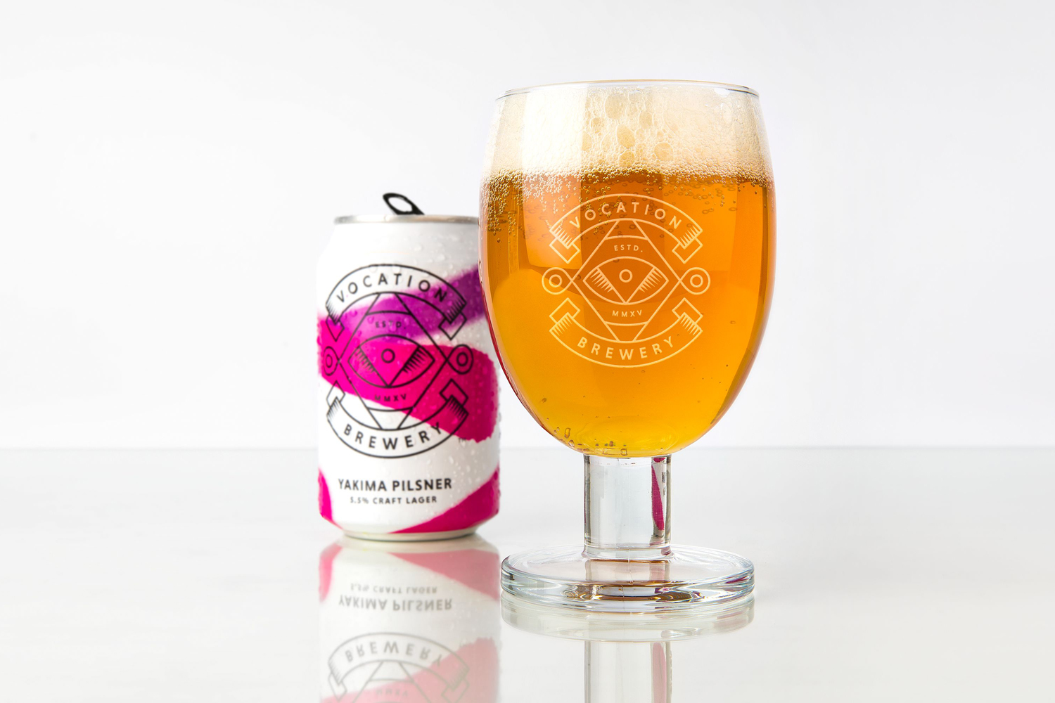
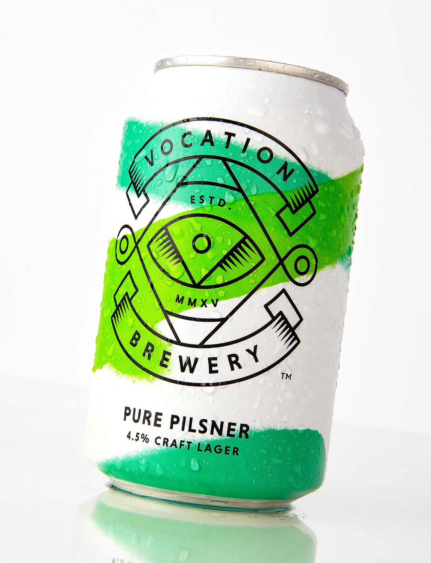
This post was updated March 2017 to include Vocation’s latest release, a range of craft lagers that acknowledge the increasing interest in the subtle complexities of pilsner. Robot Food drop the detailed illustration and dark backgrounds in favour of a lighter and brighter approach with the intention of expressing the crisp and fresh qualities of these new varieties whilst working in an alternative take on the brewery’s renegade attitude.
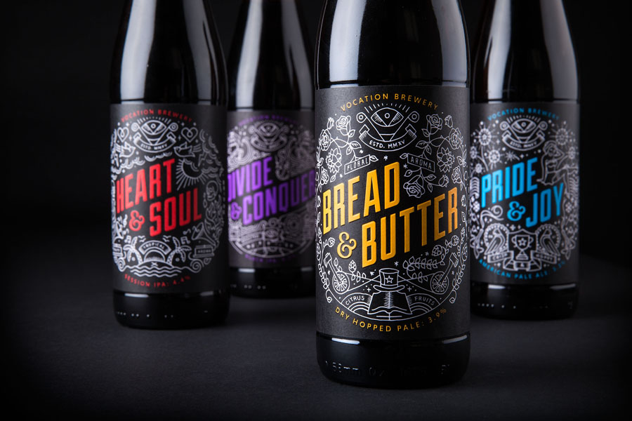
With the continued growth of the craft beer market and the rise of the microbrewery, packaging has become increasingly more expressive, individual and divergent. Some continue to favour the conveyance of tradition, traditional crafts, local industry, heritage and provenance, while others embrace the quirky, left-field and intentional/unintentional homespun qualities. Here, Robot Food run with a current and polished monolinear illustrative aesthetic, bold typography, and a solid grasp of contrast, close up detail and impact from a distance.
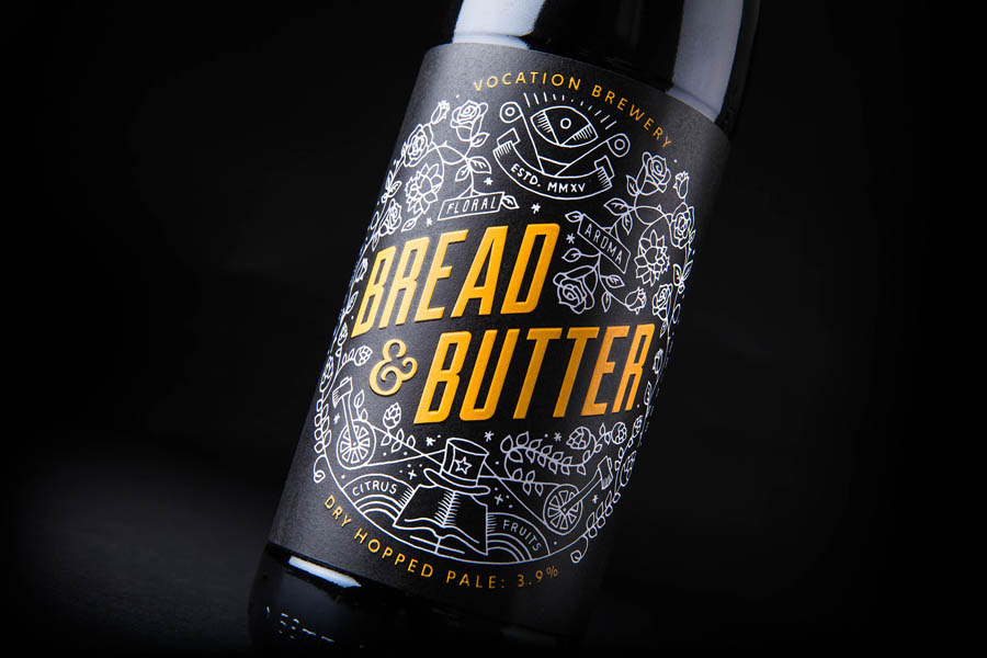
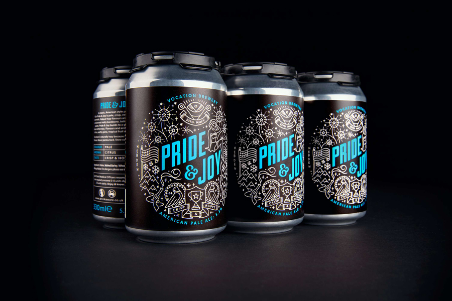
The illustrations are busy but far from cluttered, youthful but not childish, well-balanced and composed with a good eye for positive and negative space. Loose organic lines gives these a fine hand drawn quality that neatly move between prison tattoos and a current favour for the monolinear.
Waves, islands, tall ships, bluebirds, an American patriotism, waves and globe appear to be bound by the theme of journeys, perhaps a metaphor for John Hickling’s own adventures, while canons, skulls and the prison tattoo style have a touch of the renegade nature in them. These emphasise individual flavour qualities in an engaging and distinctive way, are individually distinctive but collectively cohesive, have a subtle subtext and a circular composition draws a little on tap heads and traditional beer identity lock-ups. These look particularly good across beer mats.
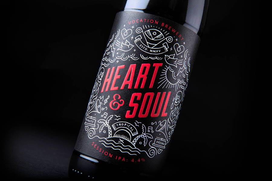
The detail of the illustrations are juxtaposed alongside a vivid contemporary spot colour and impact of condensed sans-serif typography, and together effectively leverage contrast. An ascending baseline, two-line typesetting and the condensed letterforms of Duke Fill make the most of the bottle’s width, is sensitive to legibility from a distance, and infuse the names with a little of the dynamic and enthusiastic nature of comic books, or perhaps the rousing slogans of wartime propaganda.
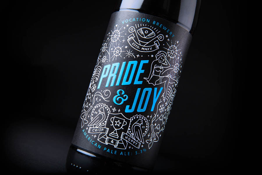
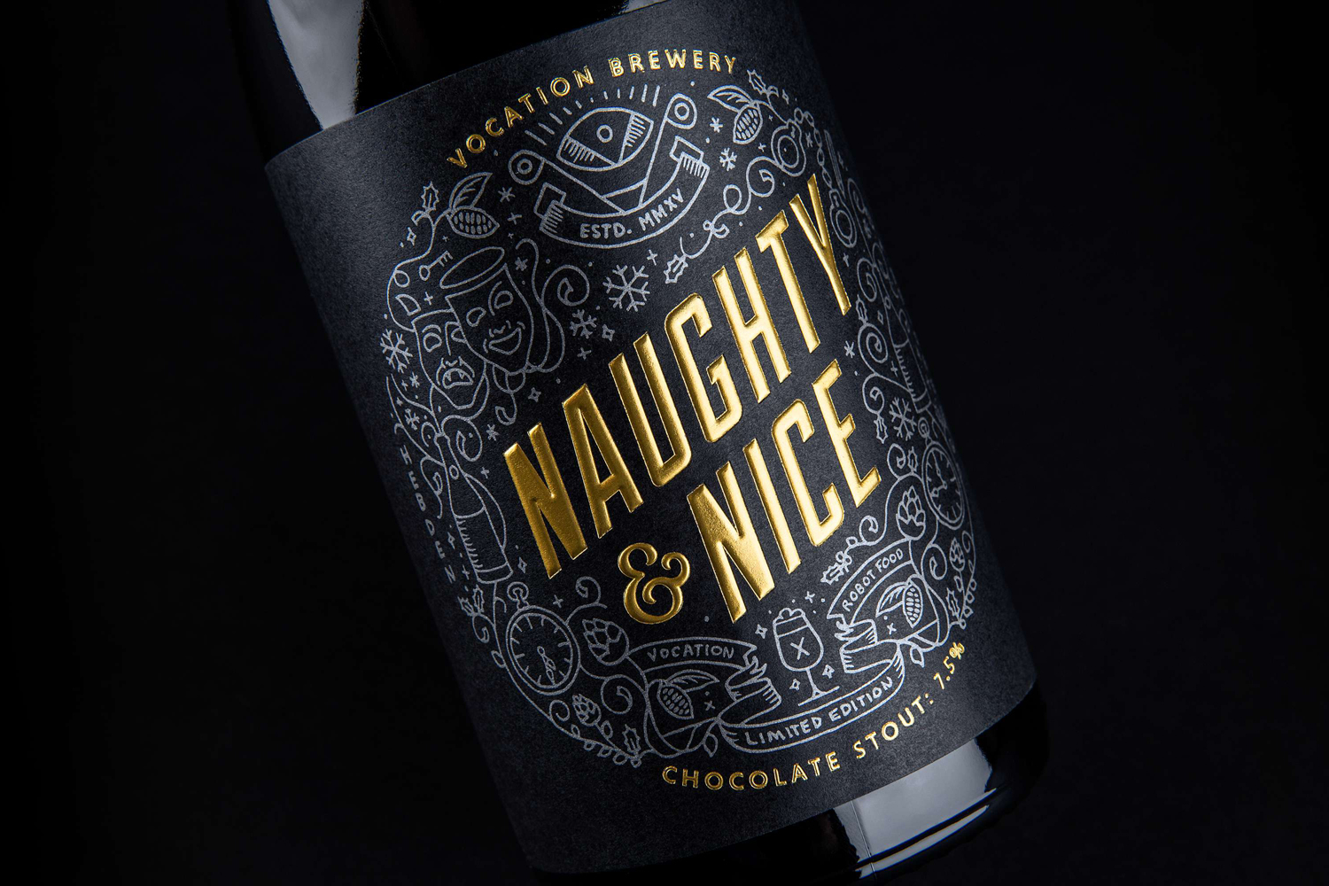
Contrast continues through to the gloss of the bottle and the uncoated matt surface textures of the label. An embossed print finish adds an unexpected tactile layer that leverages perceptions of high quality and an attention to detail, while a amber glass and slender structural choice is firmly rooted in the traditions of ale drinking.
The black of the bottles here work a little better than the amber seen on Vocation website. The borderless transition from structure to graphic design appears as a neater and less abrupt resolution of past and present.
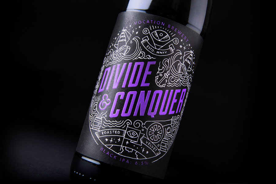
Robot Food’s treatment captures the adventurous and creative qualities of Vocation, the quirks of its range, and the passion of brewer John Hickling in a contemporary, distinctive and youthful way, and delivers enough impact at a distance and compelling detail up close. Like many craft beer brands absent heritage or wanting to avoid convention, it is very much about character rather than storytelling. Vocation’s beer is said to be not for everyone, and the packaging, in its specificity, is very much the same, yet is clear in its target market.
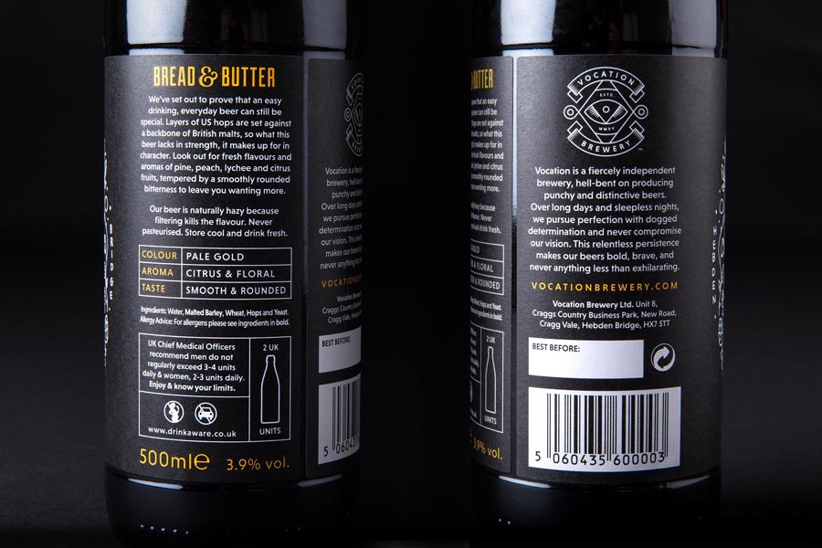

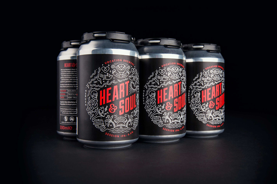
Robot Food continue to work with Vocation Brewery, expanding on their work with a range short cans and a limited edition Chocolate Stout, Naughty & Nice, created for the 2015 festive season.
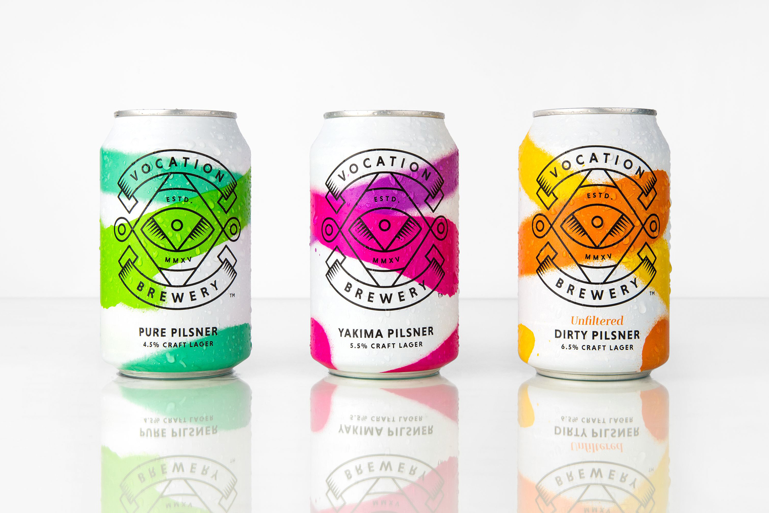
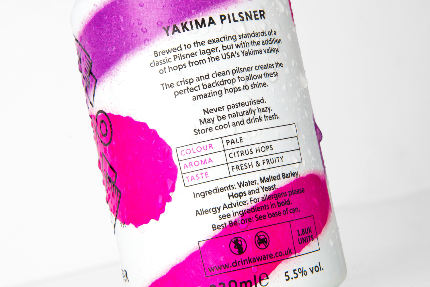
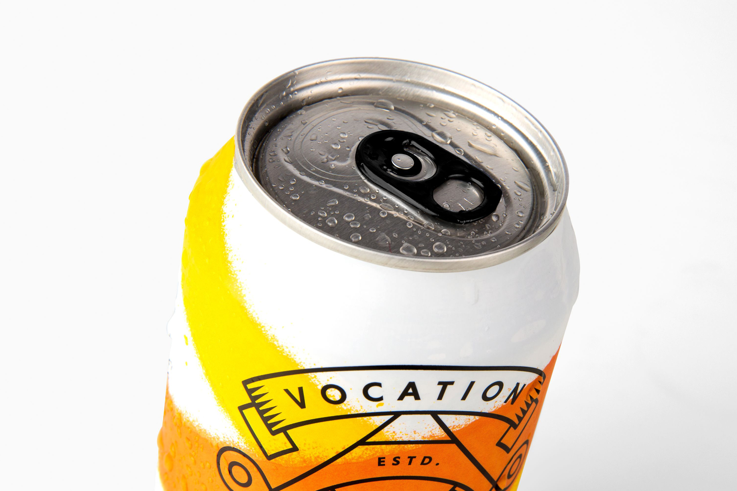
The packaging for Vocation Brewery’s March 2017 release, a range of craft lagers, drops the detailed illustration and black labels in favour of a lighter and brighter approach designed to express the crisp and fresh qualities of these three new varieties. It successfully retains something of the renegade attitude of the brewery through spray paint, with colour used to differentiate varieties, and white cans clearly differentiating the lager from beers. Logo works particularly well, as simple line art, over the organic lines of spray paint and striking colour. More from Robot Food on BP&O.
Design: Robot Food. Opinion: Richard Baird. Fonts Used: Niveau Grotesk & Duke
