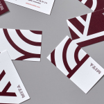
Tenderloin Museum by Mucho
Opinion by Richard Baird Posted 17 November 2015

The Tenderloin Museum tells the story of, and celebrates, the people and rich history of the Tenderloin district, a 31 block region of San Francisco. The museum’s permanent exhibition covers the area’s rebuilding, from 1906, following the great earthquake, until the present, and captures its diversity. It is a neighbourhood that has been filled with, what Mucho, the graphic design studio behind the museum’s visual identity describe rather romantically as, immigrants and iconoclasts, artists and activists, sinners and saints. It is a place known for “girls, gambling and graft” but equally for its cultural icons, these have included the Grateful Dead, Miles Davis and Dashiell Hammett.
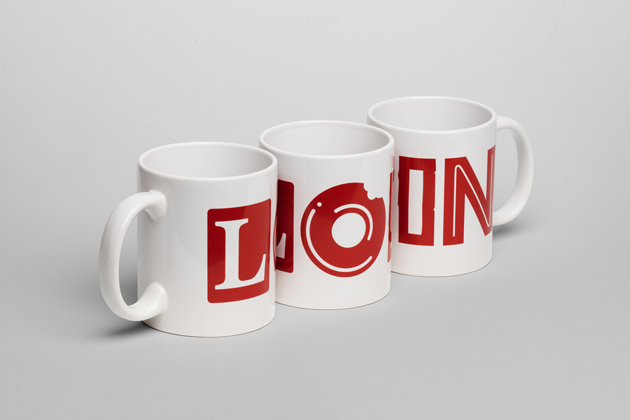
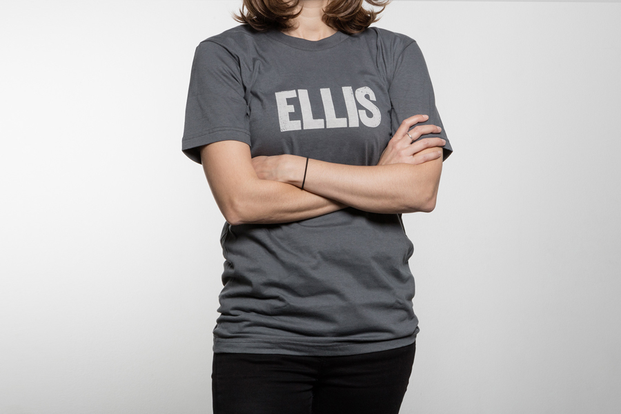
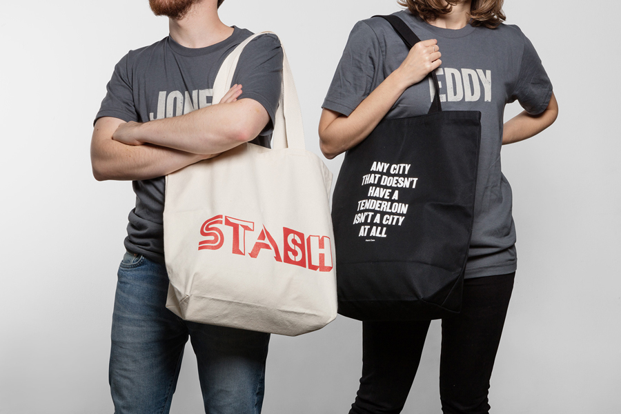
Mucho were responsible for creating the museum’s brand identity, signage and merchandise, which extended to t-shirts, coasters, cups, mugs, maps, tote bags and posters.
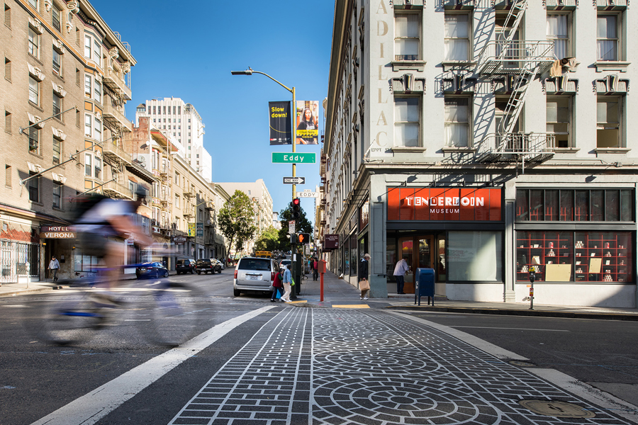
Built from letterforms drawn from the signage of the neighbourhood, the typographical treatment of the museum’s logotype, and broader custom type, effectively captures the diversity of the area, and becomes the foundation of museum’s merchandise strategy. The mixing of those appropriated from porn establishments and drug rehabilitation centres, alongside coffee shops and single room occupancy hotels, is fitting for a museum and honest about the area.
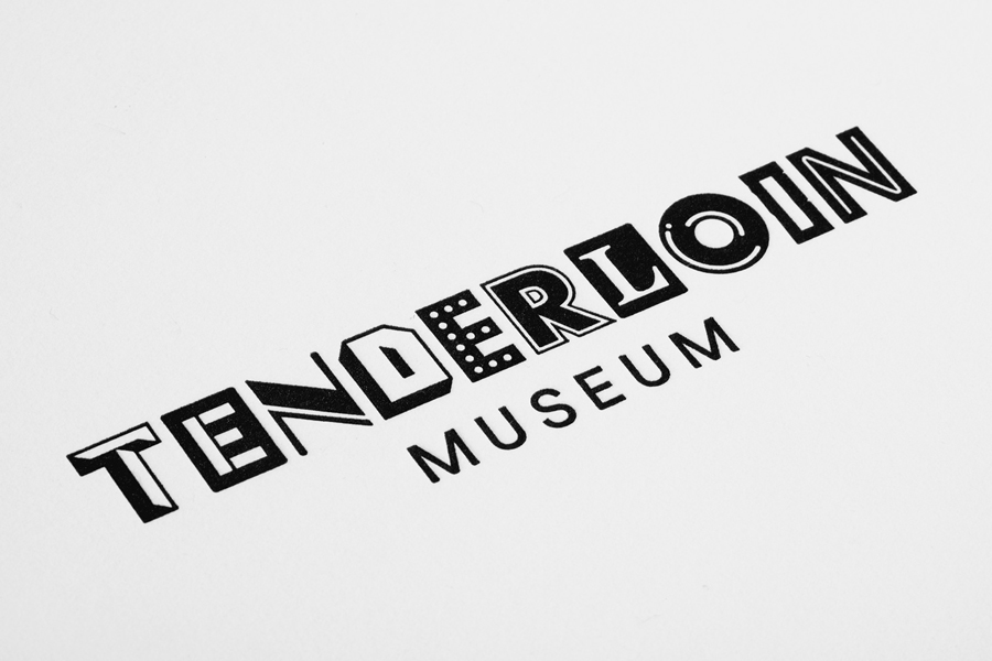
The logotype’s distinction, impact and communicative value clearly comes from its eclectic nature, typographical contrast, elements of familiarity and its reference to the surrounding area. The letters hold-up well individually, with a nice mix of serif detail and reduction, depth and flatness, fills and negative space, the monolinear and the stencil cut, and the use of highlight and shadow.
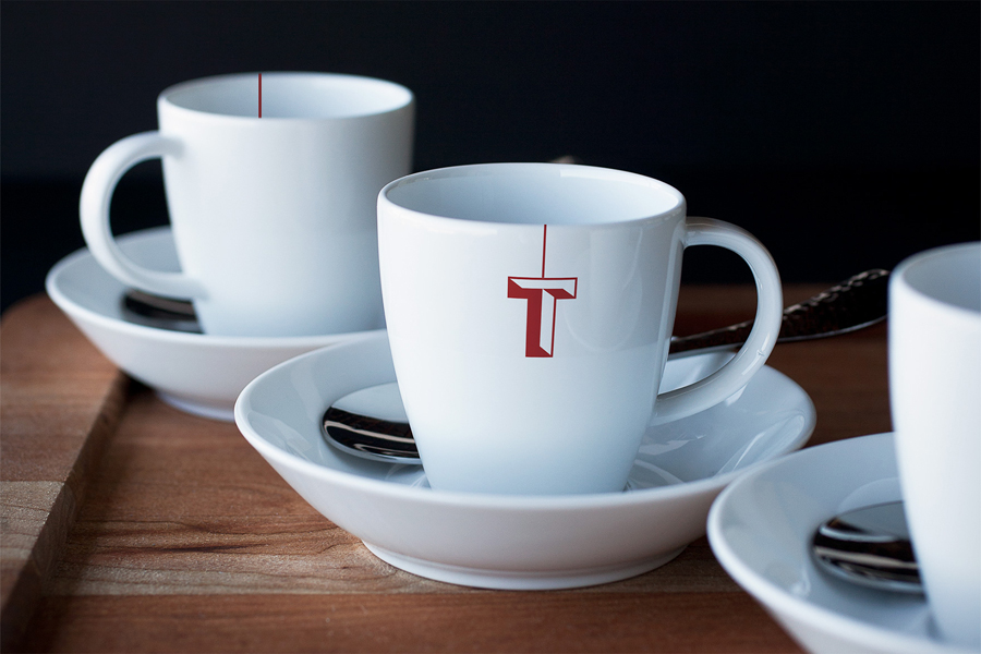
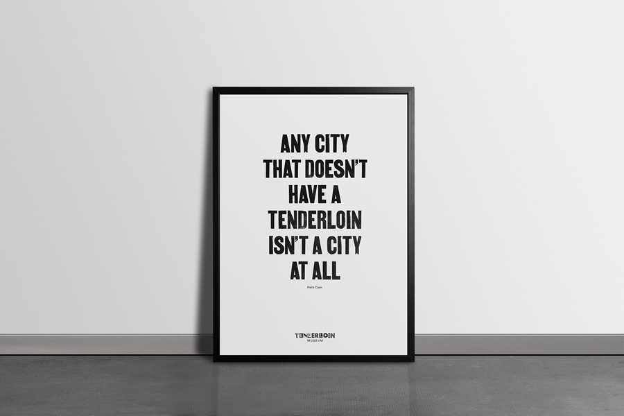
These work well as simple imagery across mugs, as cropped type in print, and as the basis for some play with language and tone of voice across t-shirts, bags and posters. The “Stash” tote bag is a particularly nice use of type, language and historical reference to the corrupt nature of the neighbourhood and its place as the criminal underbelly of the city. The T of the tea cups is also a neat little flourish.
These individual letters have also been successfully united within the context of a logotype using red ink—thankfully the only link to meat outside of the website—a favour for capitals, some solid spacing and a tight adherence to baseline and cap height.
Check out Bedow’s work for Second Hand Orchestra of Foreign Policy’s work for Bottura to see similar type treatments.
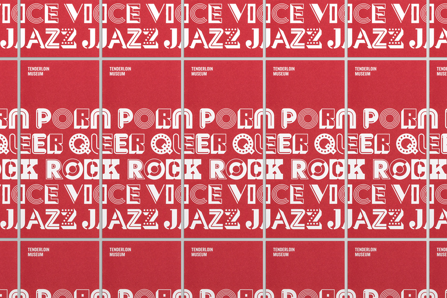
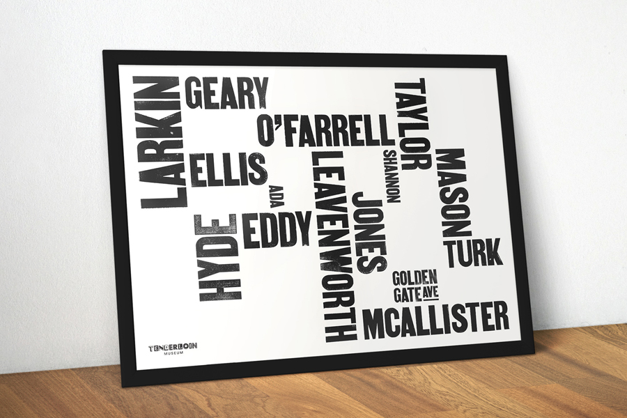
A woodblock font, described by Mucho as imparting some of the grittiness of the area into the identity, adds an irregular texture and finer detail to what are largely geometric letterforms, and has also been used to create a map of the area.
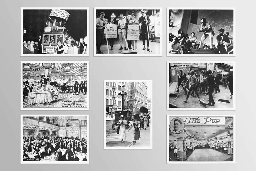
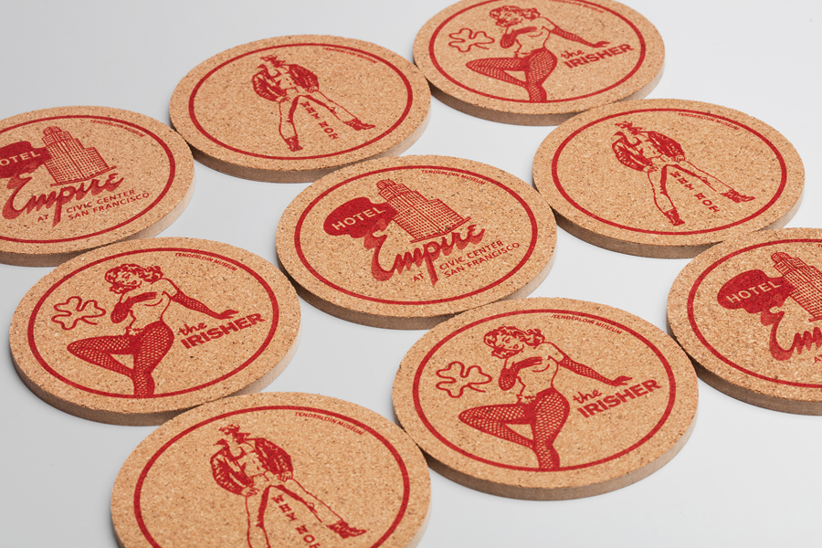
The choice of illustration across coasters, builds on the period nature of the logotype and shares the same colour palette, however, deviates slightly from an identity that, for the most part, goes all in for typography. This is perhaps an acknowledgment of tourist’s preference for souvenirs with familiar American imagery and iconography,
Mucho’s approach is a visually striking yet straightforward concept, one rooted in, and drawing its character from, a uniquely diverse community, and touches on the theme of connections, the linking of both past and present, as a museum should do, the points that mark the Tenderloin’s boundaries, and the people and businesses that live and have thrived within these. More from Mucho on BP&O.
Design: Mucho. Opinion: Richard Baird
