Talawa by Spy
Opinion by Richard Baird Posted 2 December 2015
Talawa, Jamaican patois for “small but feisty”, is an all black theatre company that looked to address the lack of opportunities for minorities and their marginalisation at the time of its founding in 1986. Since then it has established itself as one of the most successful theatres of its type in the United Kingdom.
“Our work is informed by the wealth and diversity of the Black British experience, and through that we create outstanding work by cultivating the best in emerging and established Black artists. We invest in talent, develop audiences and inspire dialogue with and within communities across the UK and internationally. By doing so we enrich the cultural life of all.” – Talawa
Talawa has a diverse portfolio of productions, from Shakespeare to African classics, Oscar Wilde to new Black British, and from Nobel-prize winning playwrights to musicals. Some of these have gone on to win awards, tour internationally, and have provided many of its staff and performers with the skills necessary to go on to develop successful careers in radio, film and television.
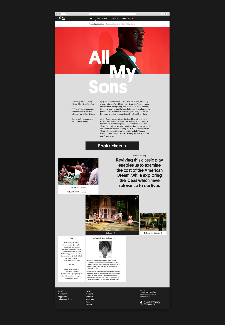
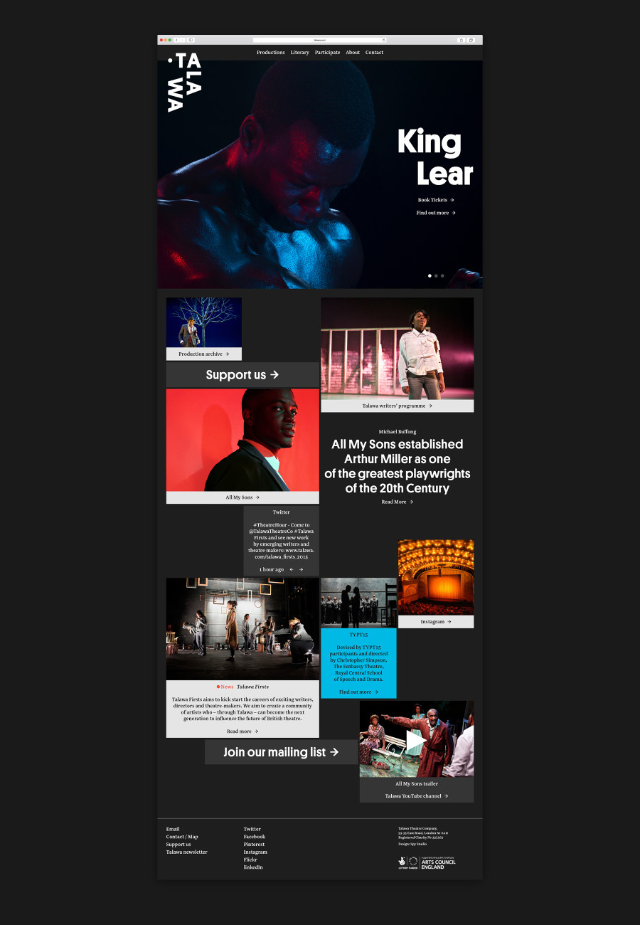
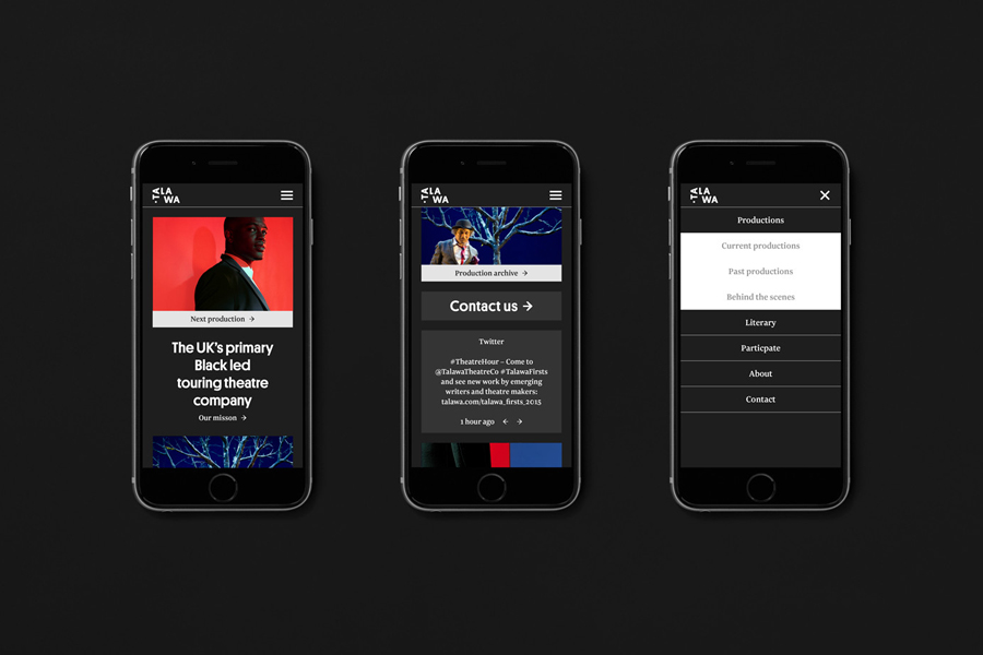
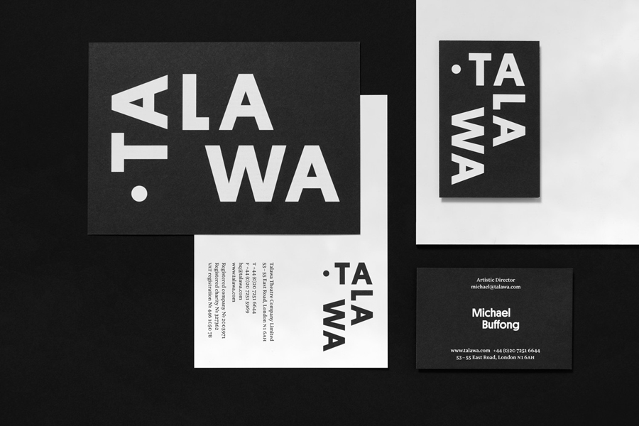
London based Graphic design studio Spy worked with the theatre to develop a new brand identity and visual language that would help convey the theatre’s powerful spirit. This went on to include an animated logo, stationery, business cards, posters and website.

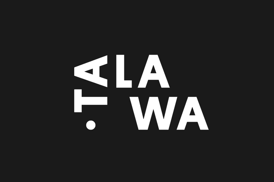
Spy’s bespoke logotype treatment works two-fold; to capture the energy and rhythm of performance but also to emphasise the phonetics of the Patois name. The animation is well done, and functions to draw movement from bold, robust characters, while the logotype’s structure, when static, secures memorability from fairly neutral letterforms.
Logotype animation plays out well but subtly online, and is expanded upon using a number of other motion effects. These include zooms and sliding type. Although often a stylistic and superfluous flourish, here, these are grounded by concept, and tempered by a overall sense of simplicity.
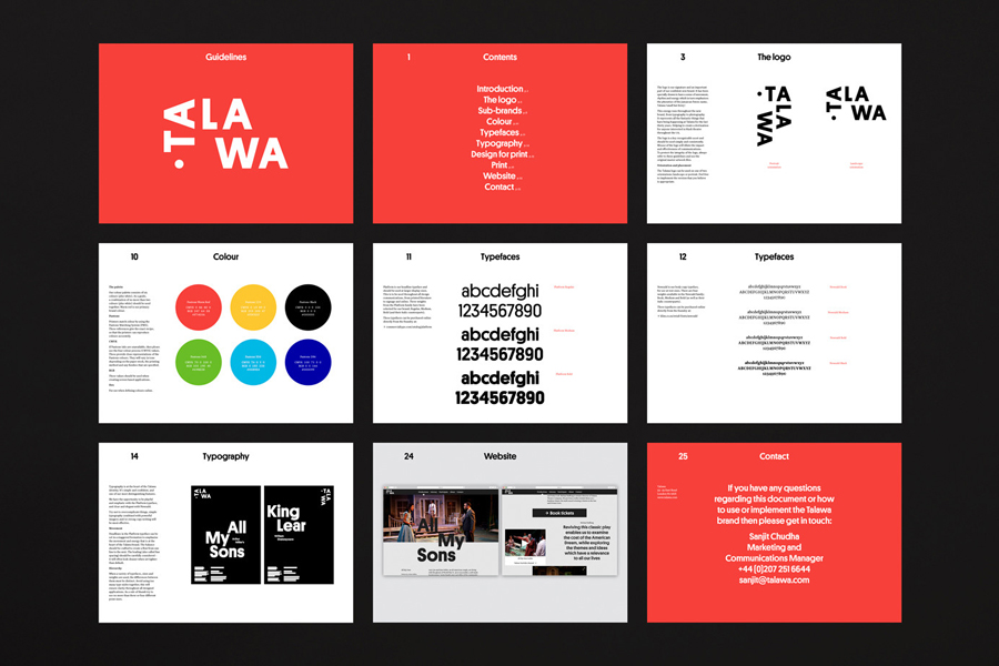
A broad portfolio of both modern and classic productions is effectively distilled down to, and communicated through, typographical juxtaposition. The heavy lines and small counters of Commercial Type’s Platform sit alongside the fine detail of Klim’s Newzald. These are used to great effect, alongside layout and proportion in print, to deliver visual impact from a distance and communicative detail up close.
A limited but striking colour palette secures a bold and confident position, and provides continuity to photography through backdrops. Check out Bond’s work for Helsinki Philharmonic Orchestra to see something similar.
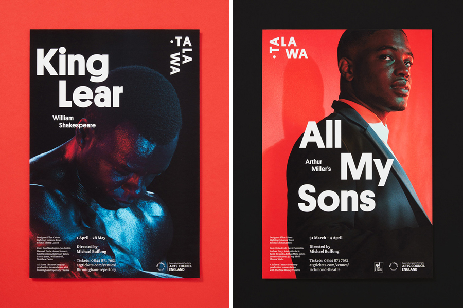
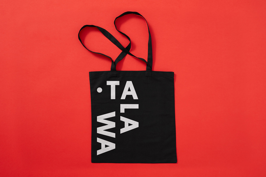
Black on white, white on black, and a mix of typographical orientation, rooted in the structure of logotype, adds variety to a strong sense of consistency across printed assets such as stationery and tote bags.
“The immersive and cinematic website now gives Talawa the chance to really tell people about all they do. From building on their community work and showcasing new talent, to promoting engagement and teaching work, to castings, jobs and the chance for people to donate. The website is now a destination for those interested in black theatre throughout the UK. Without a venue, it’s their shop window.” More work by Spy on BP&O.
Design: Spy. Opinion: Richard Baird. Fonts Used: Platform & Newzald.
