Farah by Post
Opinion by Richard Baird Posted 25 April 2016
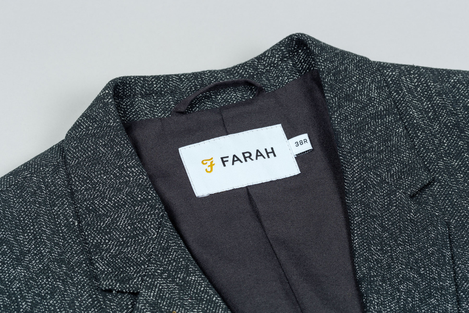
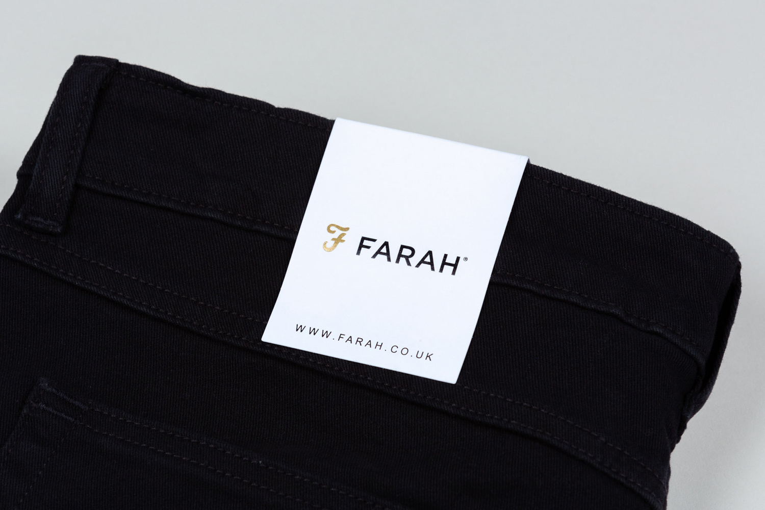
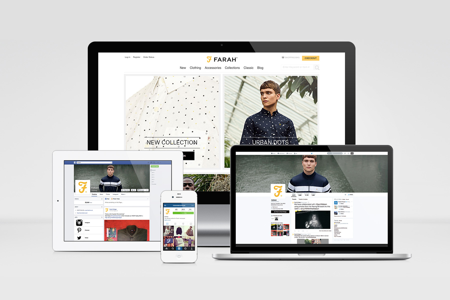
Farah is a men’s fashion brand with a seasonal catalogue of shirts, polo shirts, knitwear, jackets, footwear, bags and accessories available online and from high street and department store premises in the United Kingdom. Following two years of collaboration, London based graphic design studio Post were commissioned by Farah to refresh its visual identity, from tags, retail concept, internal communications and art direction, to stationery, business cards, brand book and signage.
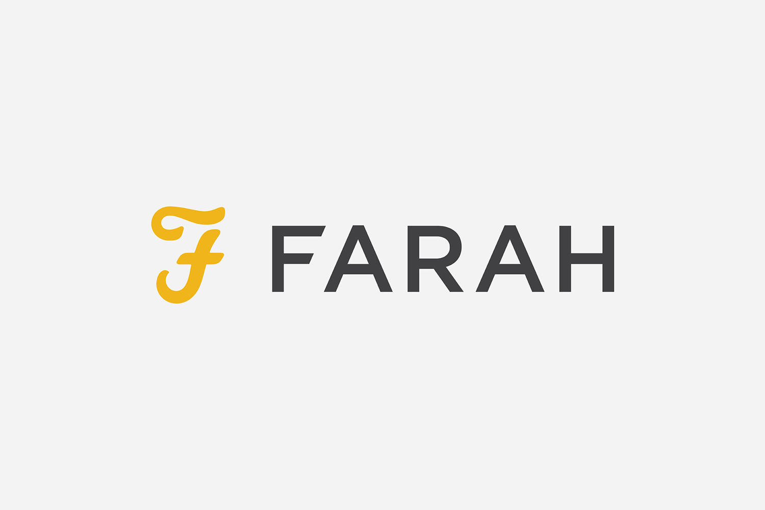
Farah’s new visual identity communicates its move away from its original retro-inspiration towards one of modernity through a distinctly reductionist expression, founded on thorough analysis, and its consistent and unwavering implementation.
The brand’s iconic F, compromised by many years of poor reproduction, leading to a loss of definition and the accumulation of imperfection, was redrawn with a contemporary vector precision, more defined lines and terminals, and an eye for the natural contours and flow of a signature.
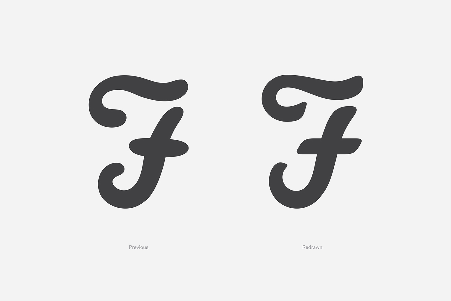
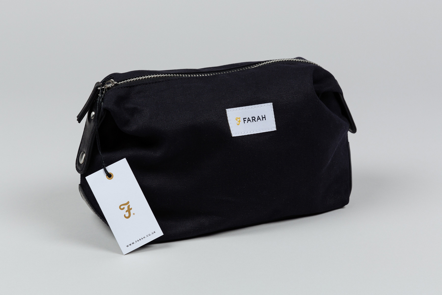
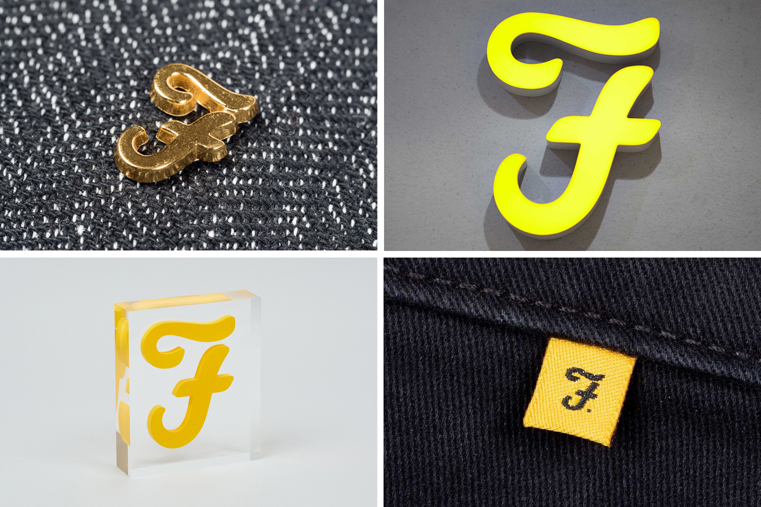
Post acknowledge the visual and communicative equity of the logo, retaining much of its original shape (what looks like an upside down £), with improvements that are subtle and appropriate for the variety of its uses. It takes finishes such as inks, foils and stitching well but also holds up three-dimensionally as mounted and standalone signage and cast as pins. This diversity in application works to add a bit of crafted detail, aesthetic variation and perceived value without undermining the reductionist intentions of the wider concept.
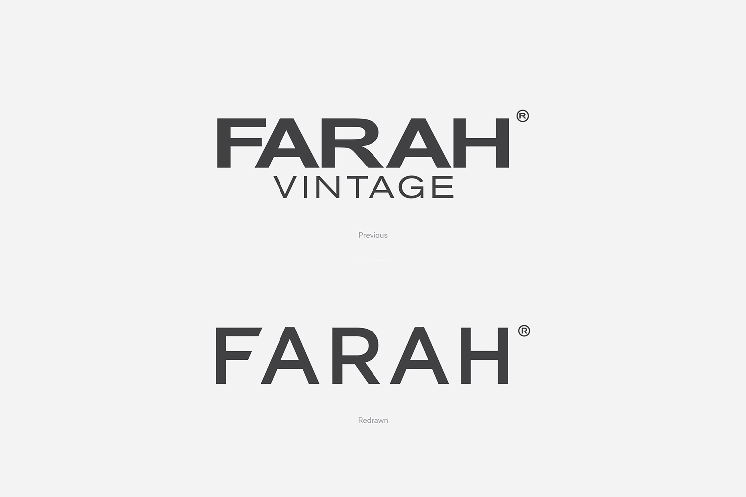
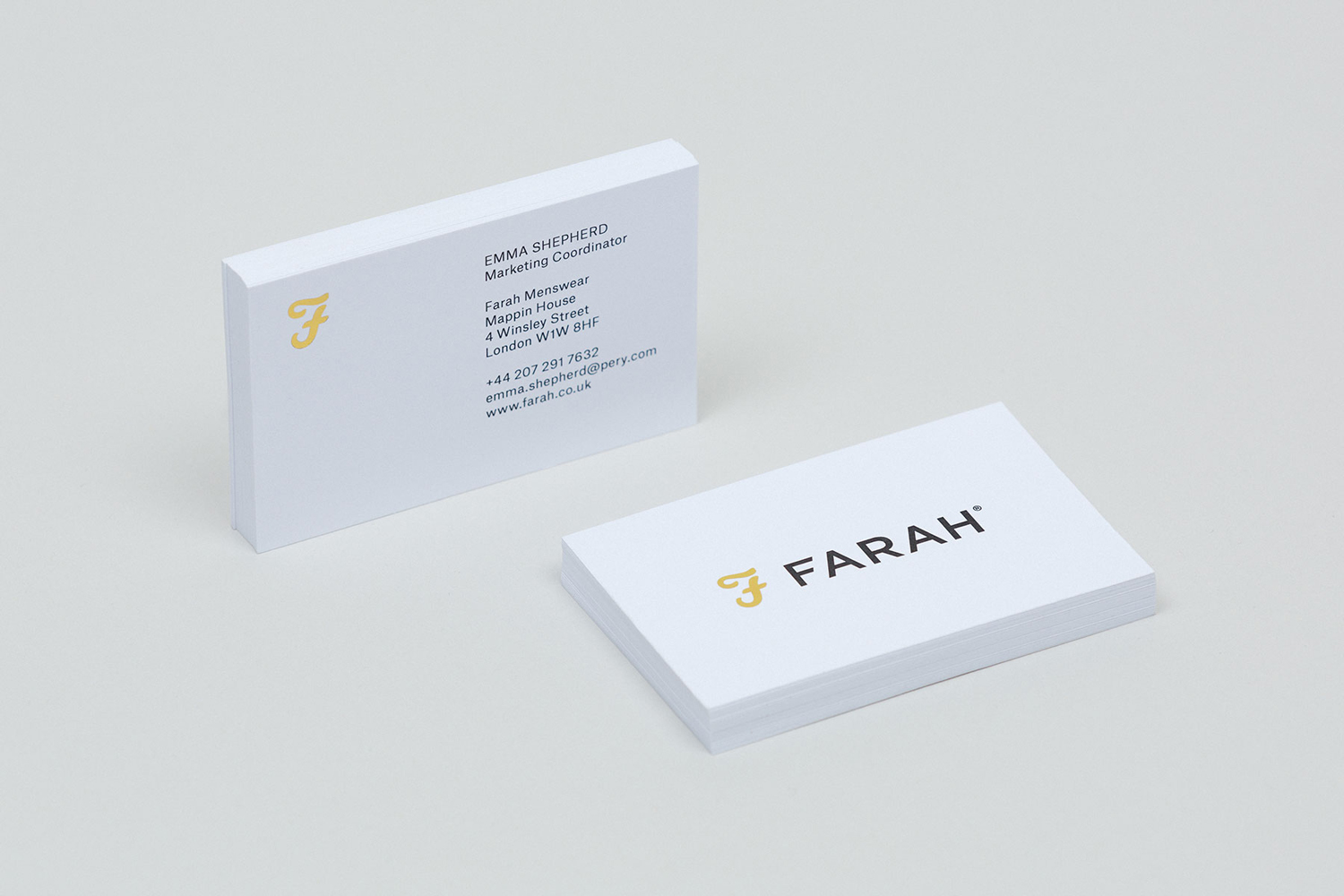
Where the logo is personable and full of character, logotype plays with a current and familiar sans-serif modernity, and introduces contrast. It is largely neutral, with a functional and practical clarity in its letter shapes. Nothing gets in the way of legibility, and it is understandable in its minimalist and on-trend fashion brand expression. This is only slightly undermined by the rather unnecessary extended bars and diagonal cuts of the F, which are neither in the spirit of reduction or really in service of memorability or distinction. For all the small changes, it is a vast improvement.
The logotype works because it functions as a counterpoint to the crafted and memorable qualities of the logo, its colour and implementation. Set together, although proportion feels a little off, these two assets give Farah a precise duality, one of craft, personality and individuality, but also utility and fashion convention, which plays out in print.
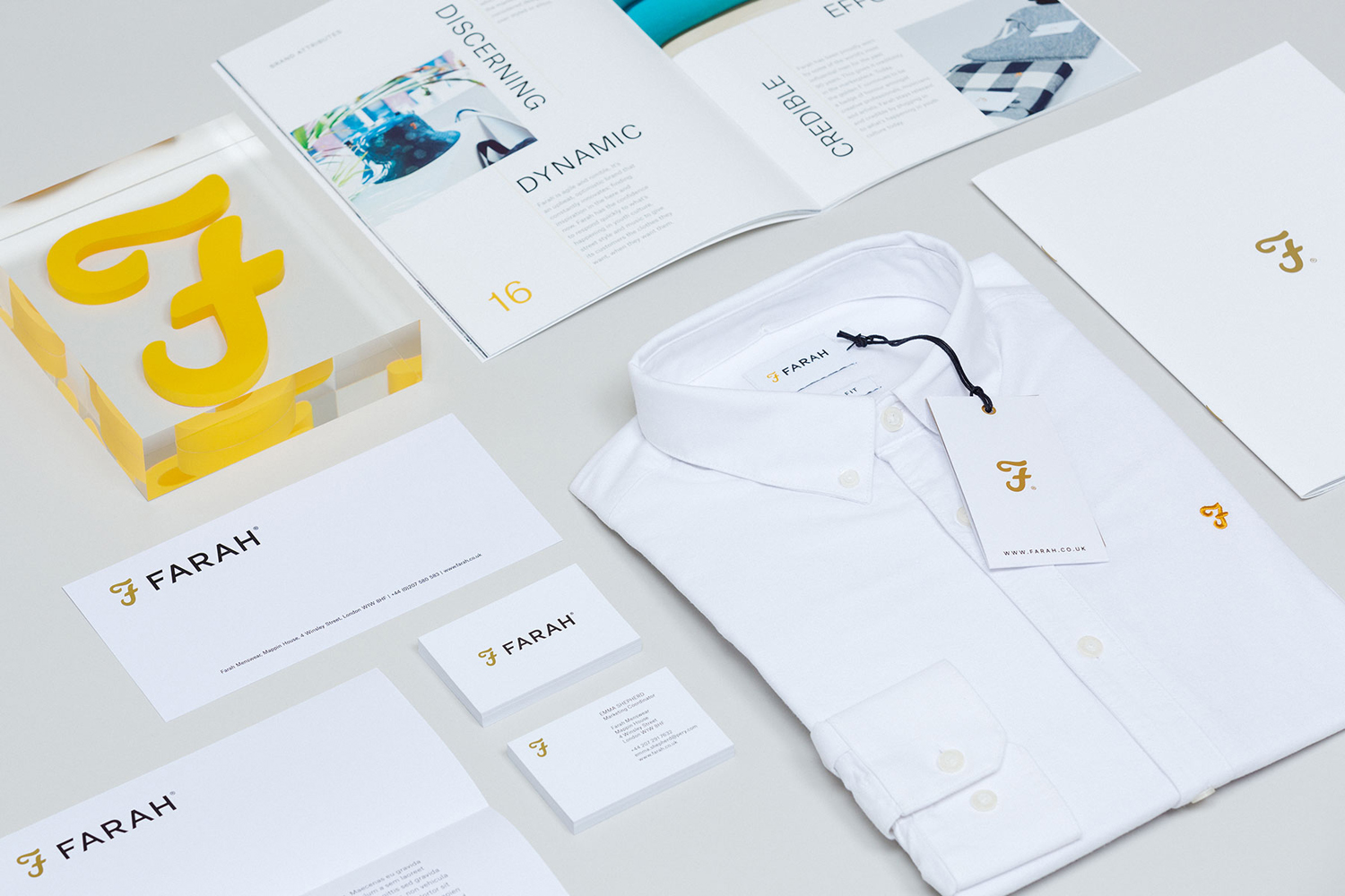
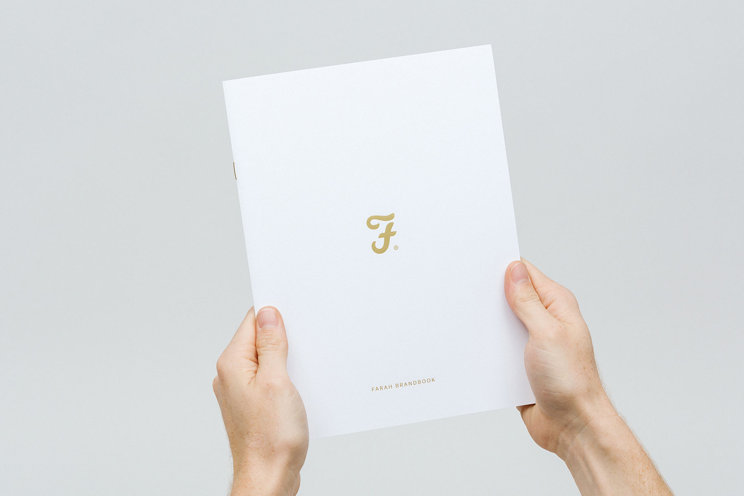
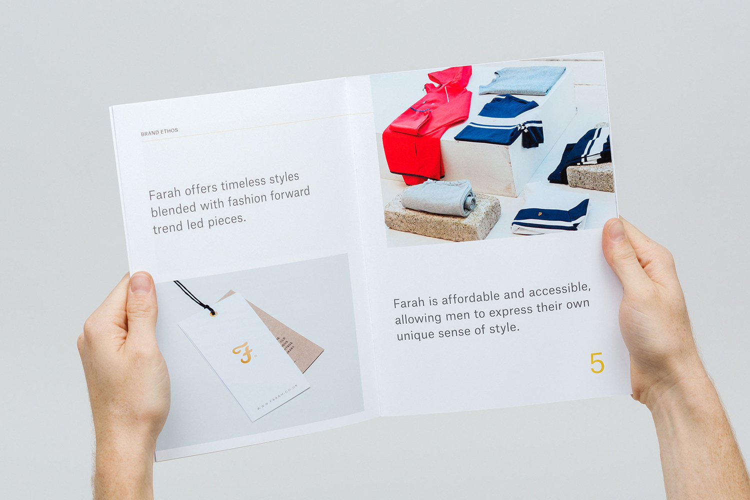
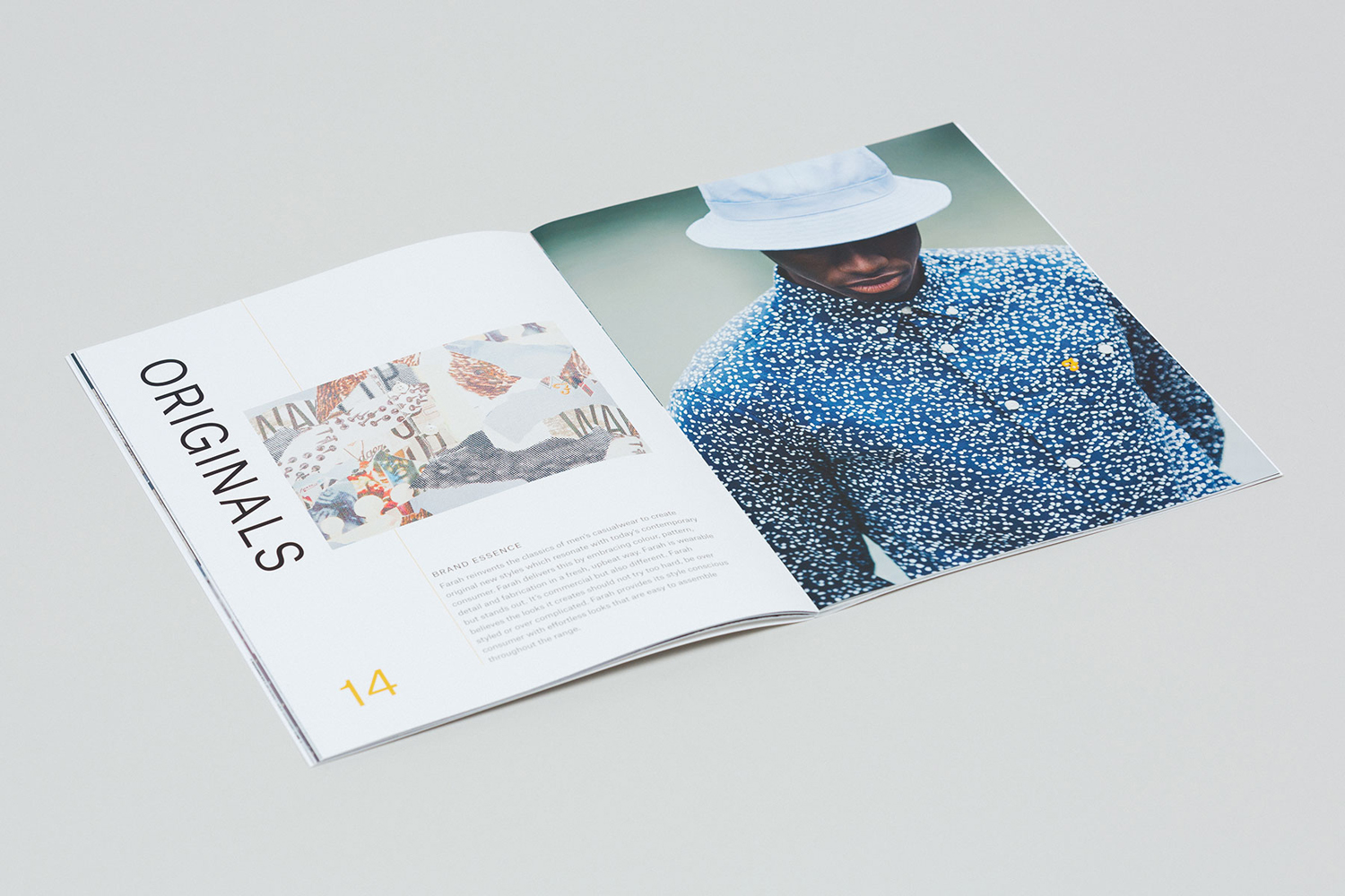
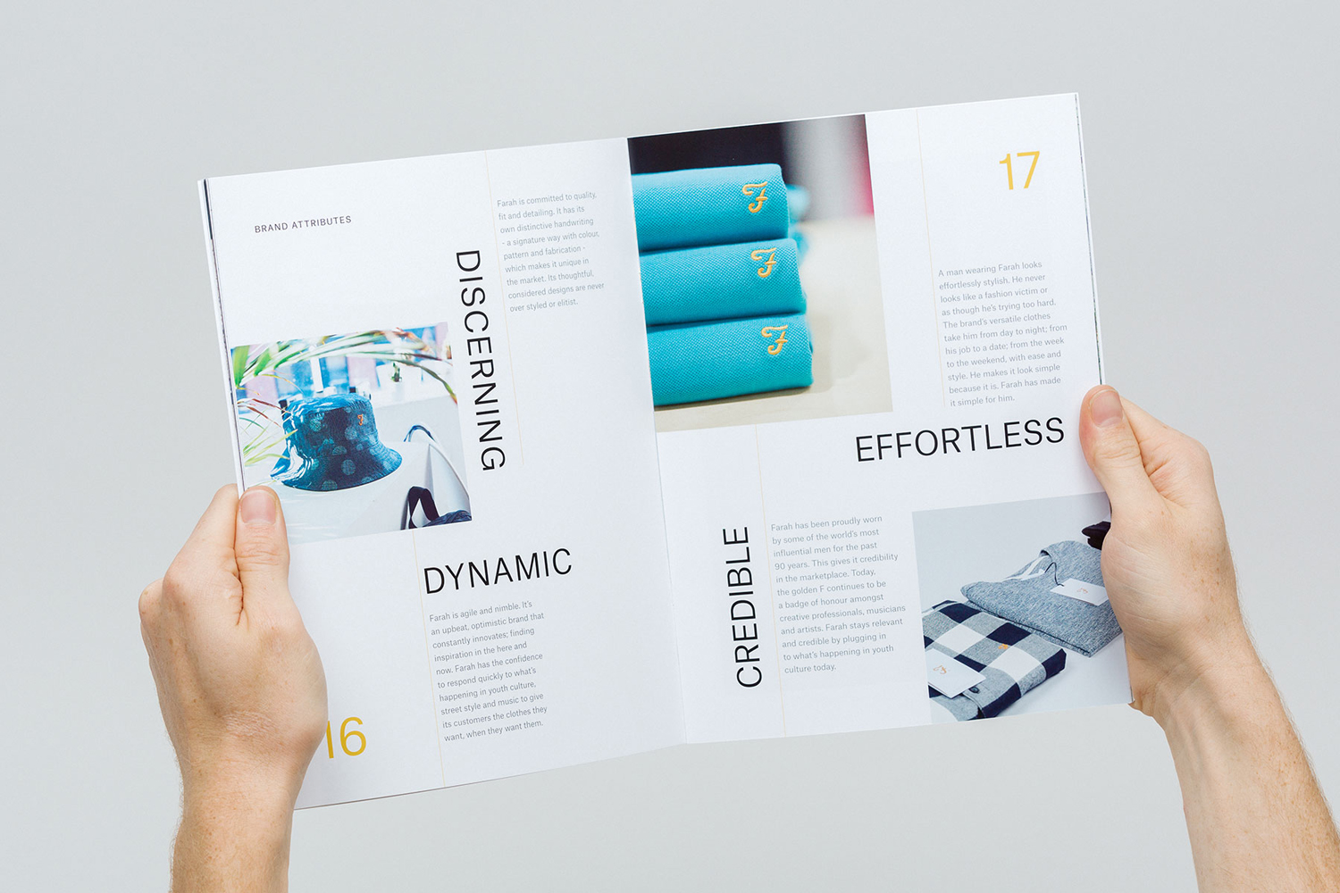
The layouts of the brand book are generous with space, both around paragraphs, lines and letters. There is an element of play in the formatting of headlines and page numbers, drawn from the practicality and economy of a single type choice. These introduce a bold, youthful and dynamic quality, and function to break up content. Although these choices do have their roots in a reductive and straightforward communicative intention, in conjunction with copywriting, occasionally slip into the slightly unsophisticated, but do avoid the overtly corporate.
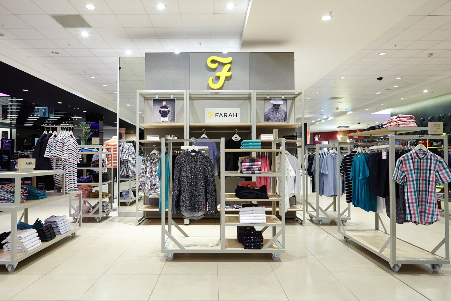
Farah’s retail environment plays with utility, in the build of the rails and concrete-like surfaces, and with contrast, punctuating these with a bright yellow logo. Within a visually busy and competitive department store setting the logo, its colour and background, convey brand positioning and is clearly identifiable from a distance. Unfortunately, the abundance of white that characterises brand identity, alongside mark and type, seems to have been lost on retail space.
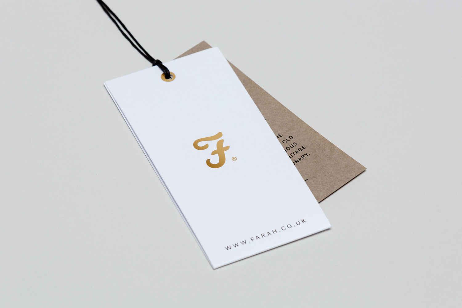
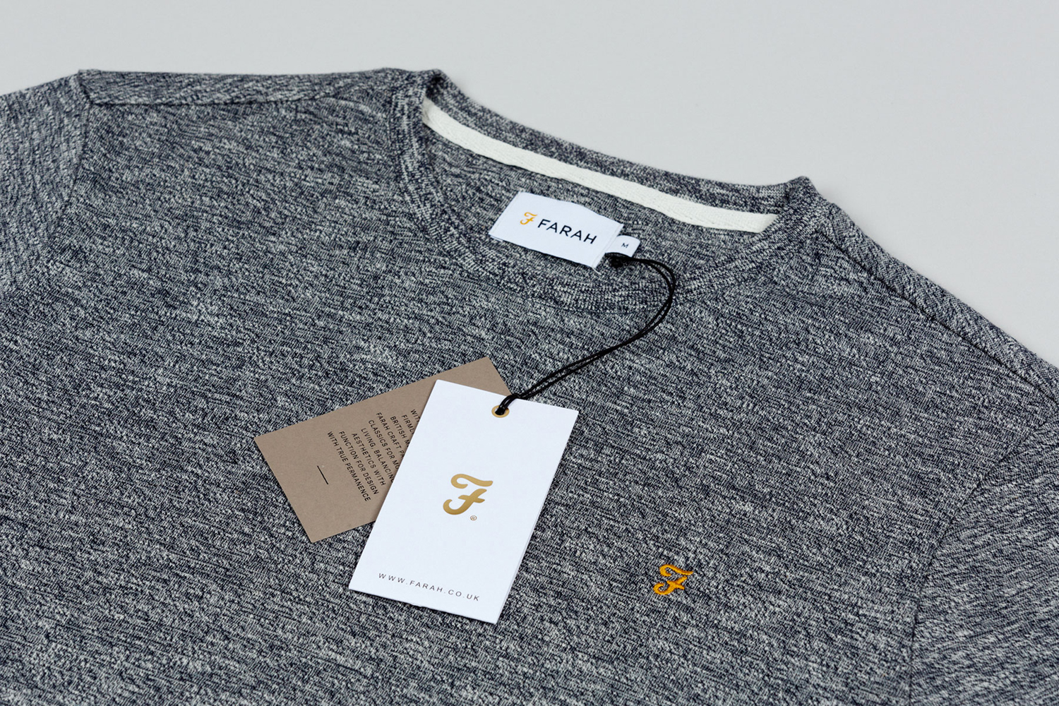
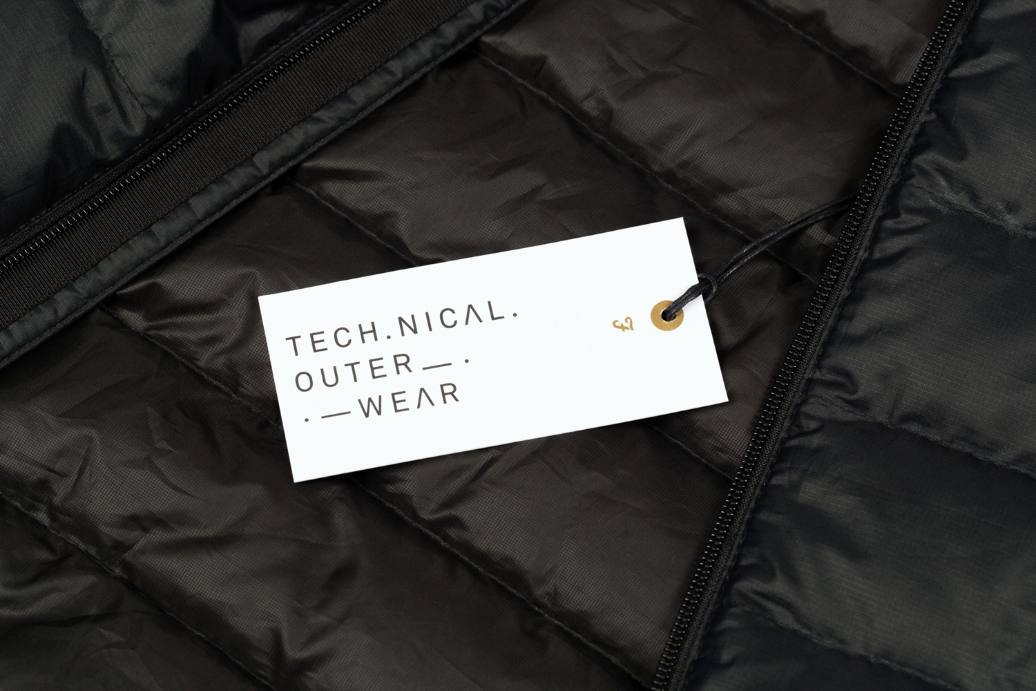
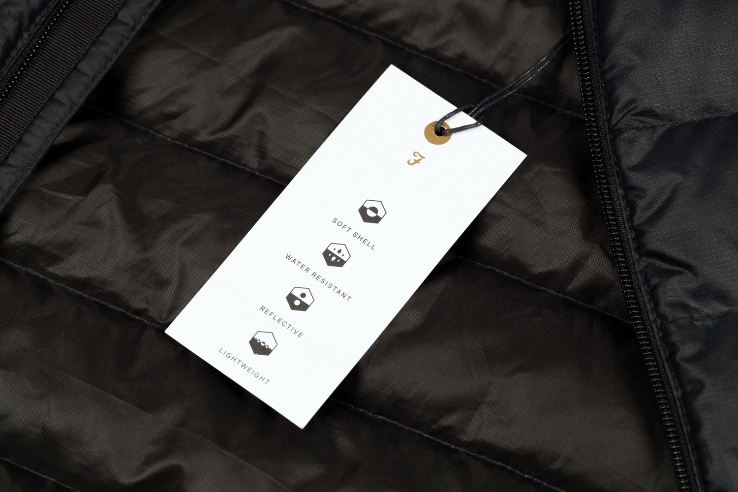
In the same way reductive logotype draws its value from crafted mark, the simplicity and abundance of white space of the tags, is given visual impact and communicative value within the context of garments of texture and fine detail, favouring significant contrast over the complimentary. Craft and reduction are similarly, and successfully weaved together with a preference for and unwavering use of white board and the perceived value of gold and black block foil print finishes. More from Post on BP&O.
Design: Post. Retail Design: Yum Design. Interior Photography: Kristy Noble. Opinion: Richard Baird. Fonts Used: Atlas Grotesk.
