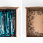
Ragnar Hartvig by Commando Group
Opinion by Richard Baird Posted 23 May 2016
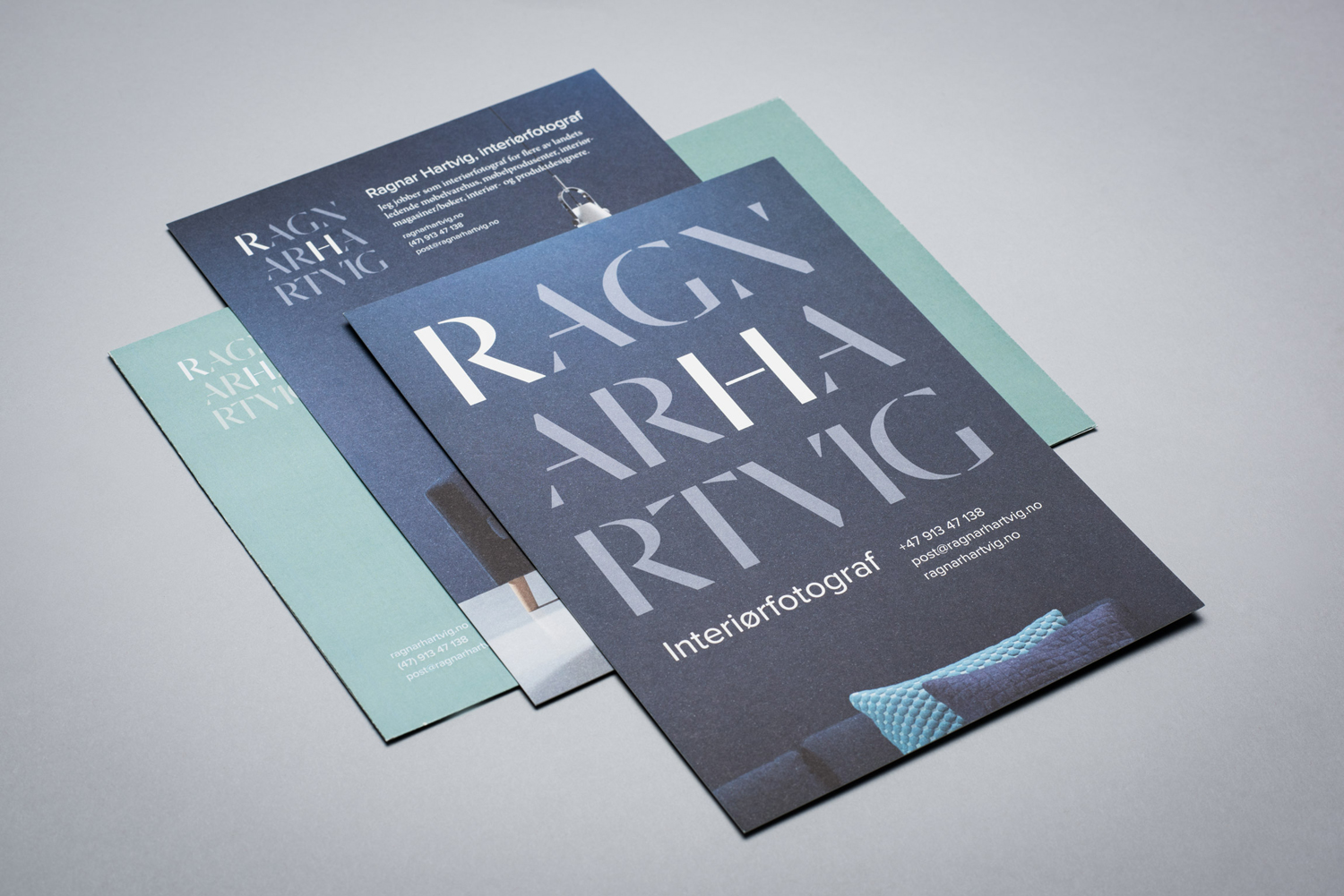
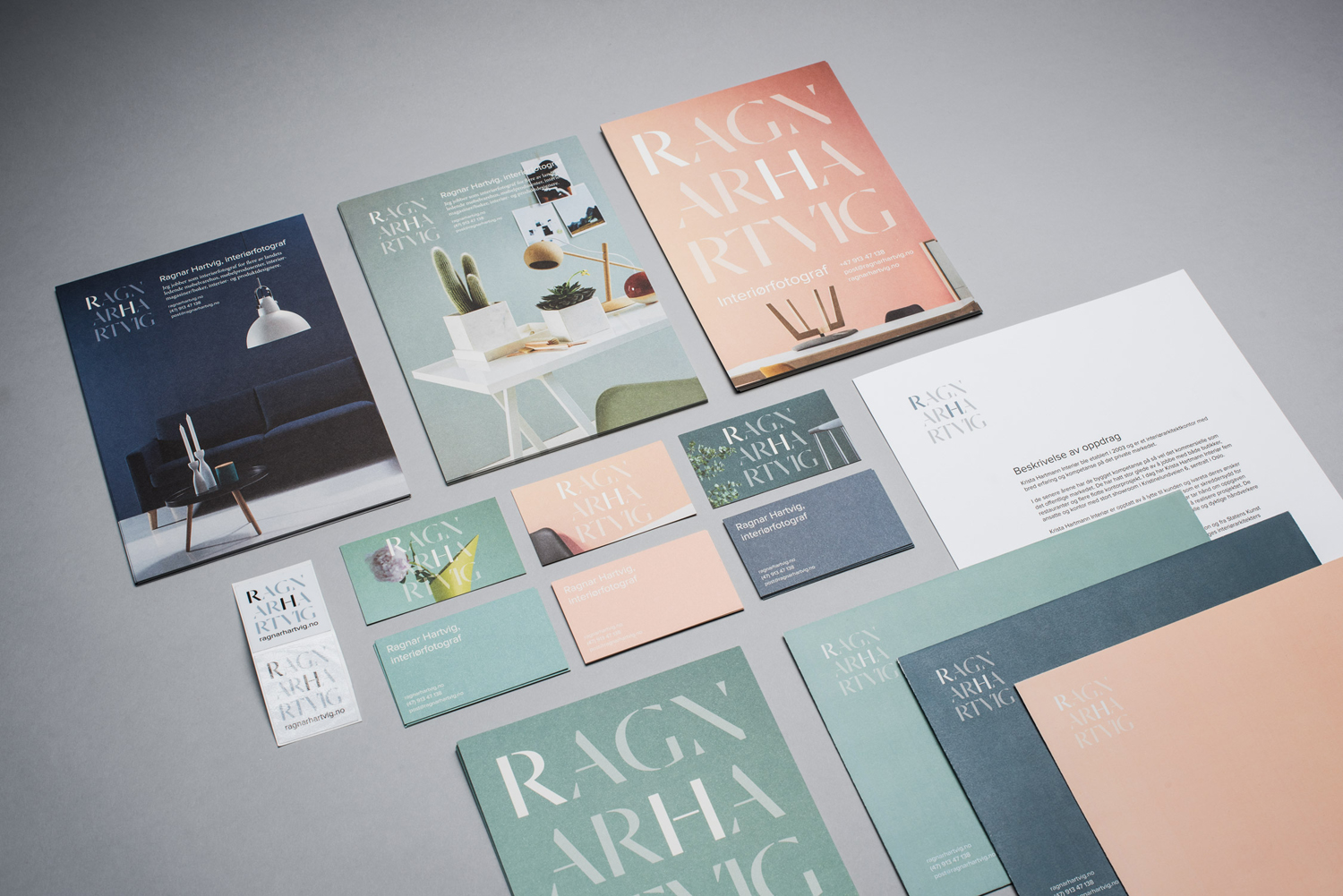
Ragnar Hartvig is a renowned Norwegian photographer with over 20 years experience and a strong network of collaborators. Clients have included leading furniture manufacturers, magazines and books, as well as interior and product designers. Ragnar Hartvig worked with Oslo based graphic design studio Commando Group to develop a new brand identity that would convey some of his personality, skillset and experience and link a variety of assets. These included flyers, business cards, stationery and website.
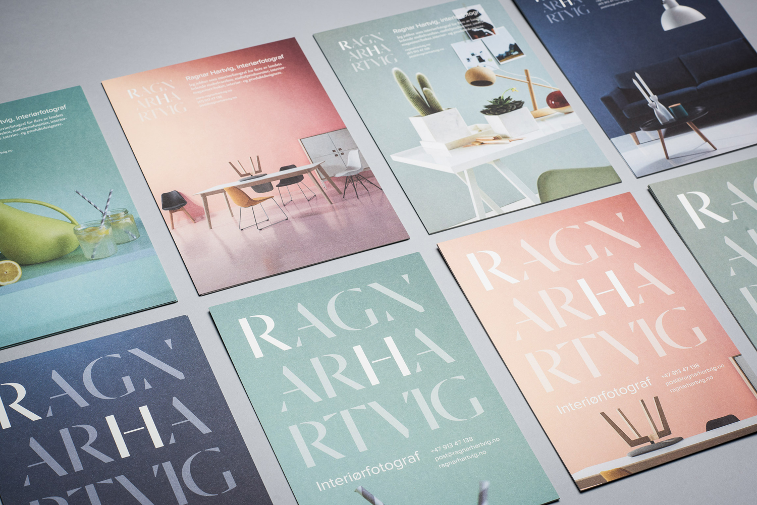
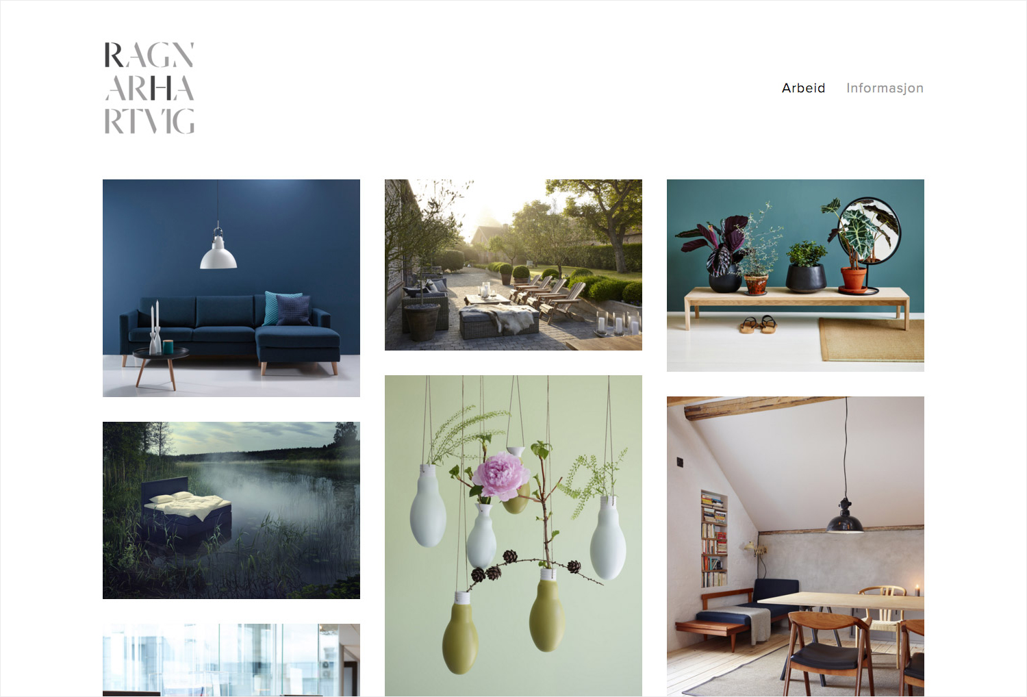
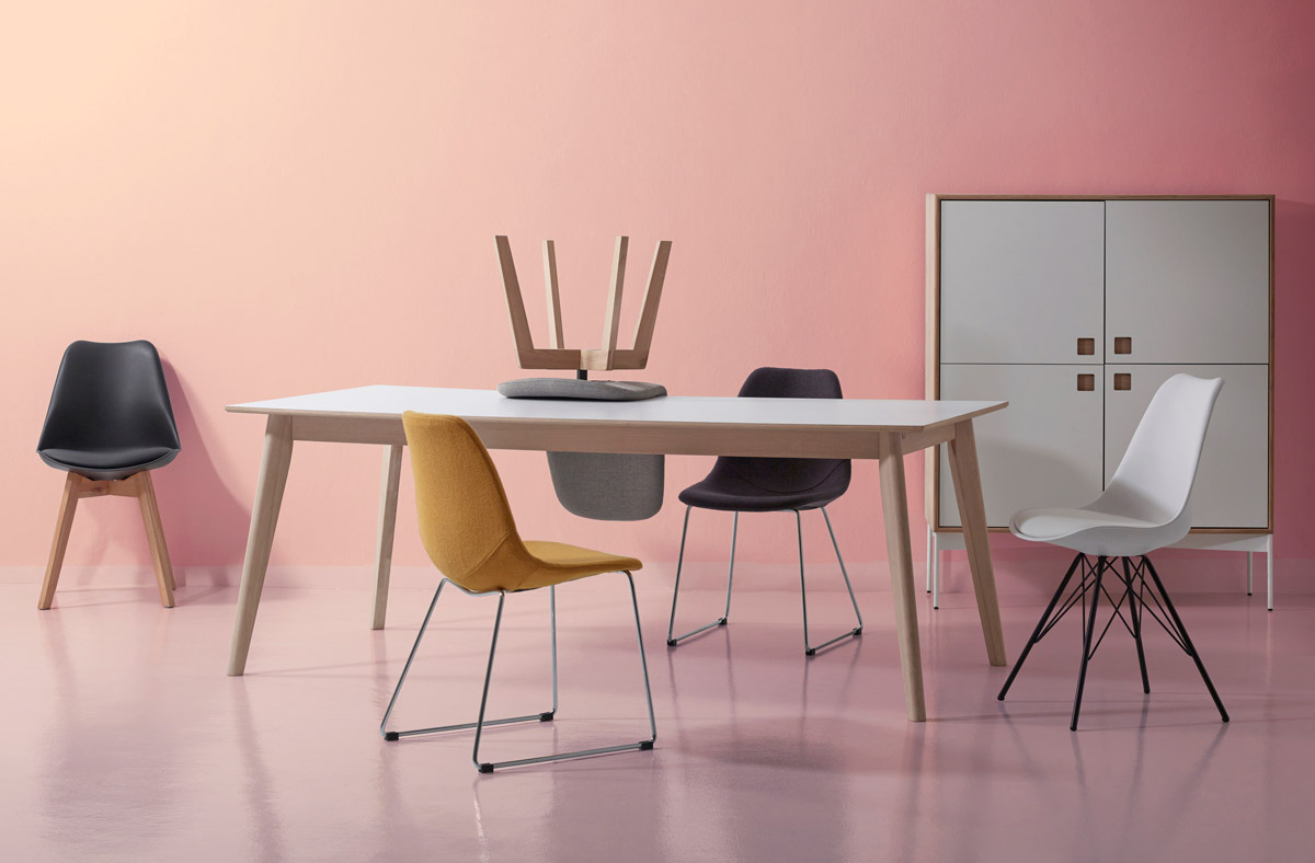
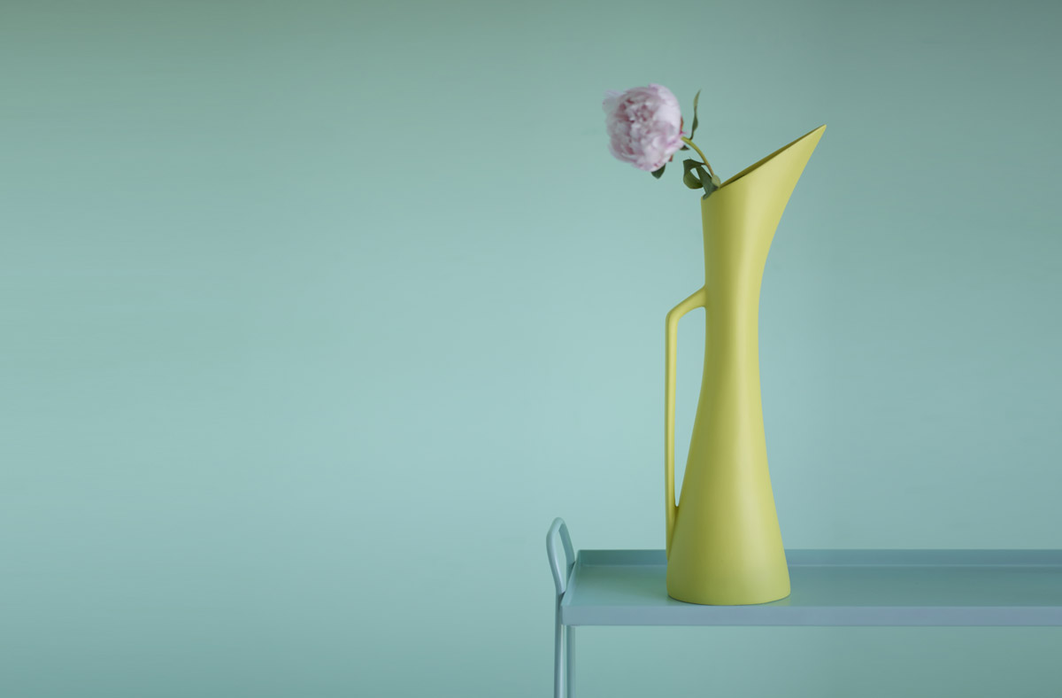
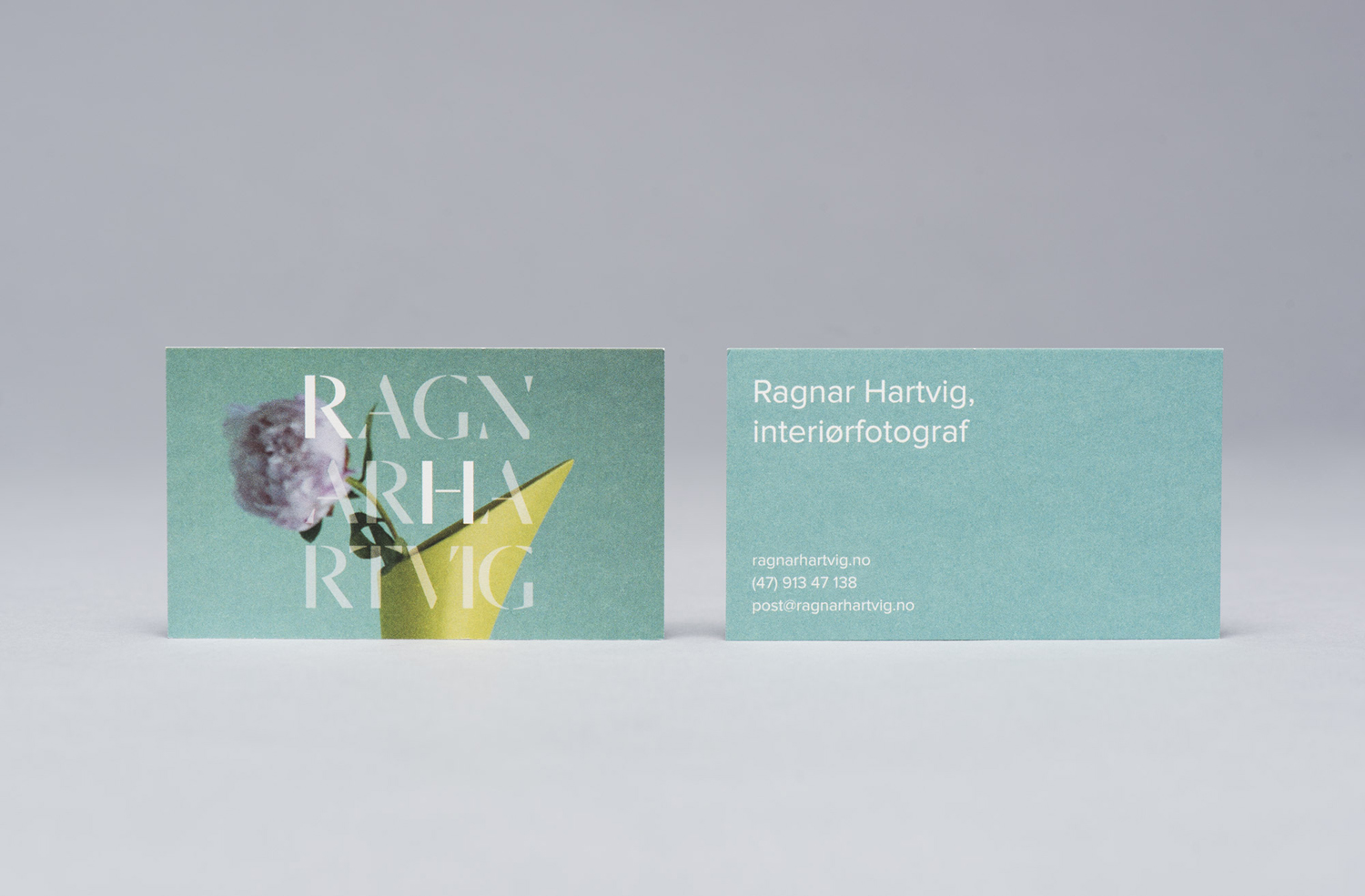
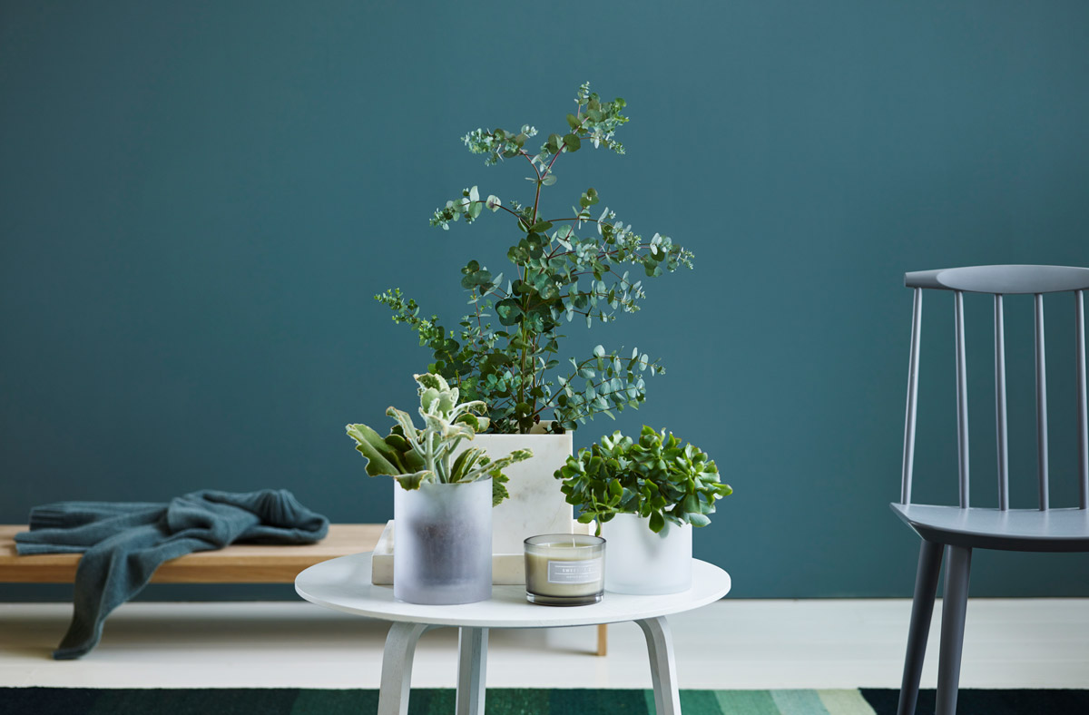
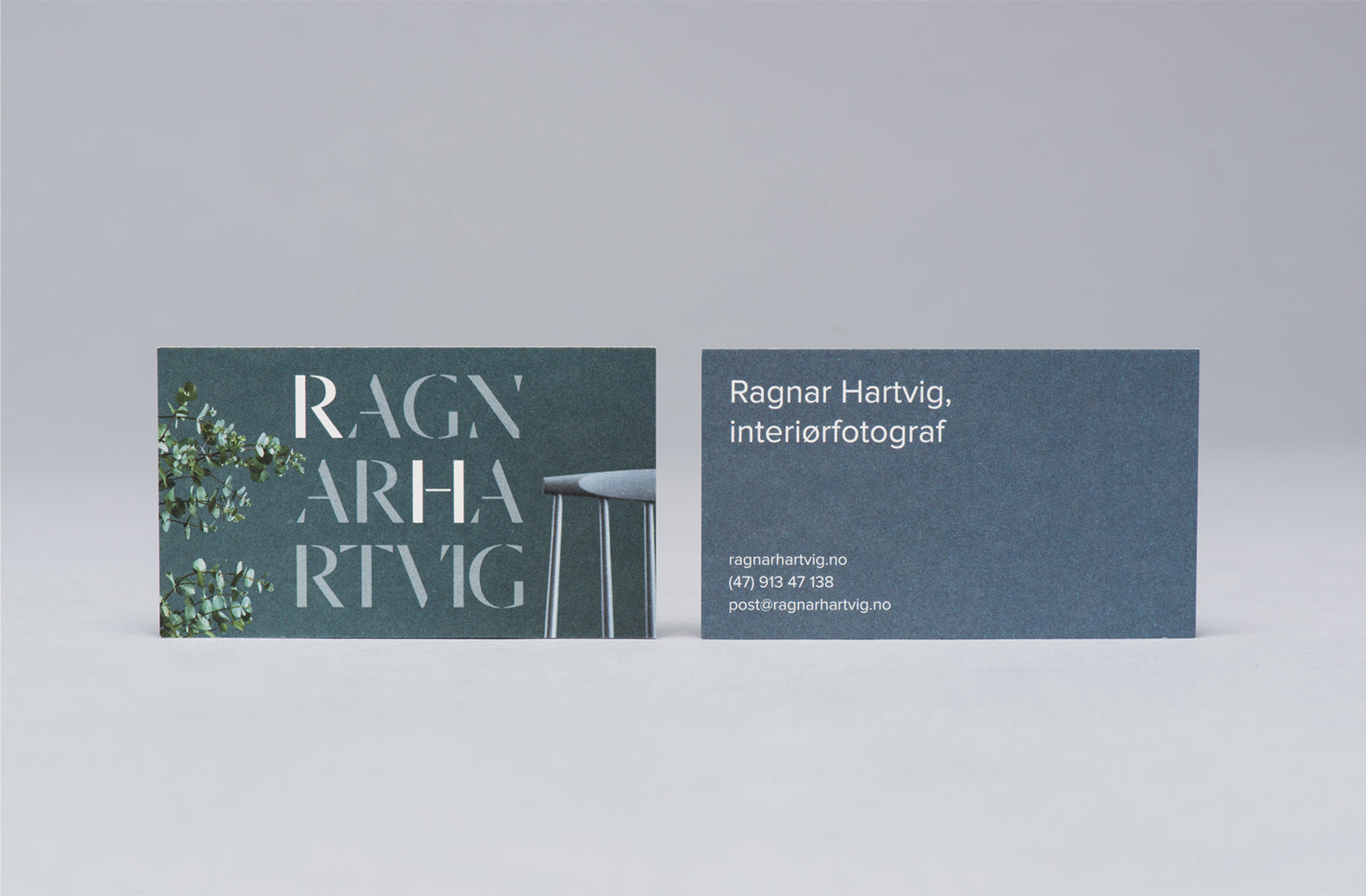
Commando Group’s identity work for Ragnar Hartvig takes its cues from his flexibility, experience and love of colour. This is clearly expressed through a distinctive and rather lovely colour palette, which marks him out from his competitors, and a typographical contrast that moves between sans-serif modernity and a sense of longevity in the erosion of lines. Print makes the most of Ragnar Hartvig’s distinctive images, particular the gradation of backdrops, through full bleeds and tight crops.
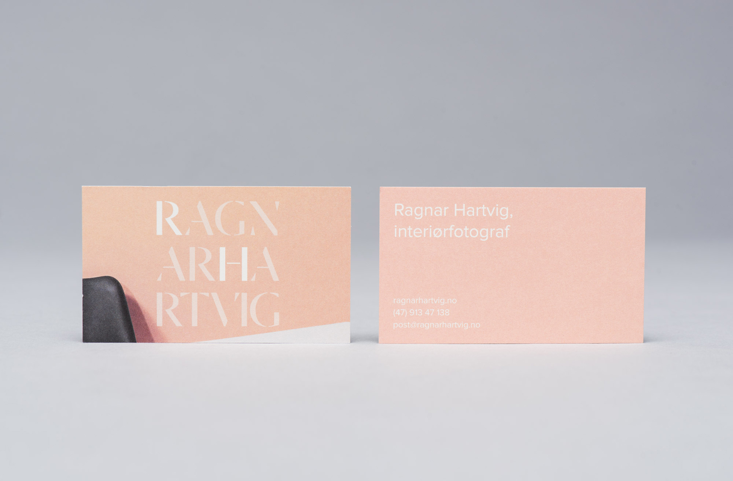
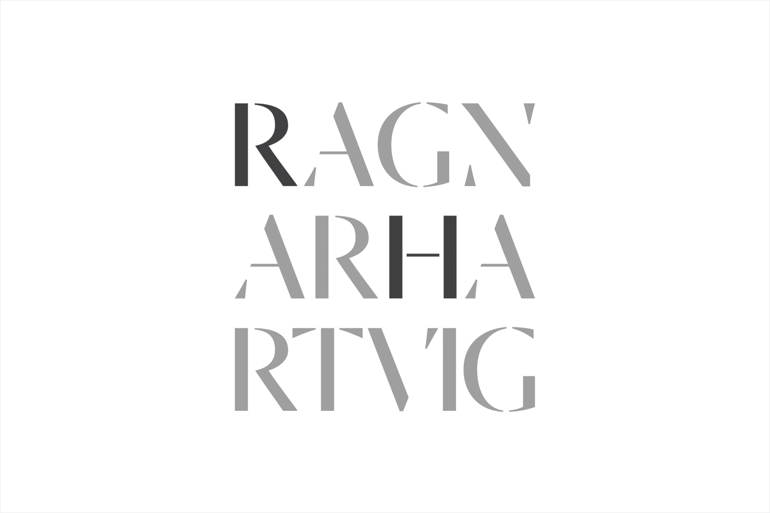
Dala Moa, a stencil typeface for display that takes its inspirations from the erosion of stone carved letters, appears current in its simple forms and cuts, yet with a sense of legacy in its origins and experience in its associations. Broken into three lines, readability is tested, with tint rather than space or form struggling to separate first and last name. Its structure, set within a square, works well in conjunction with images, with proportion providing impact, and the repetition of letterforms creating a pleasant diagonal, linking and moving through the three lines.
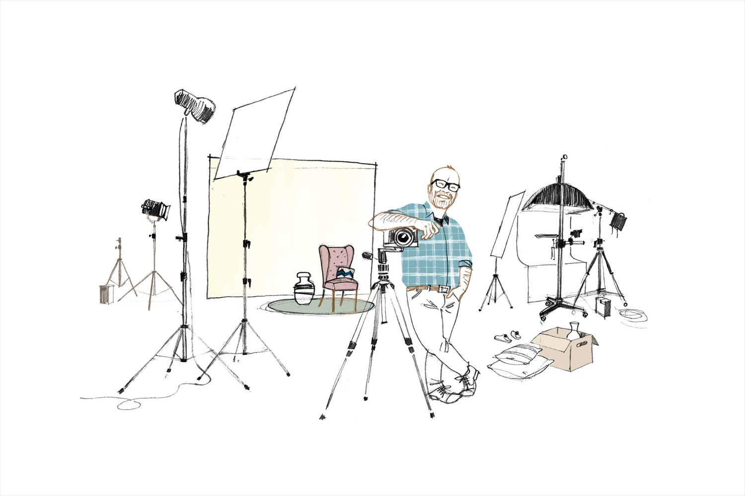
Online, a playful hand drawn profile and studio illustration works well to convey a personable and charming character, and brings balance and breadth to the more formal aspects of logotype and print work, and the structured and functional quality of the website. More from Commando Group on BP&O.
Design: Commando Group. Opinion: Richard Baird. Fonts Used: Dala Moa.
