Designers’ Friend by Paul Belford Ltd
Opinion by Richard Baird Posted 27 May 2016

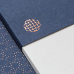
Designers’ Friend is a UK web development company working with designers and design studios to deliver fast sites that look exactly as they were designed. The company commissioned London-based graphic design studio, past client and collaborator Paul Belford Ltd., to deliver a brand identity concept that would work in print and online.
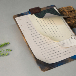
The studio’s concept is described as a dramatisation of the line ‘we write code’ and visualised, rather literally, by a keyboard. This then forms the basis of a minimal graphic expression in print across business cards and headed paper, and as part of a search rather than menu-based functionality online.

Although Paul Belford’s work for Designers’ Friend is economical in its visual character, the highlight really comes in the continuity it forms between graphic expression in print and the connection to functionality online.
Where others often try to draw personality from what is a utilitarian tool and its associated glyphs, the studio embraces this utility with very little in the way of individual flourish, yet is clearly designed. The keyboard makes for an interesting device, particularly across letterhead and business cards, that with all of its familiarity and ubiquity in our daily lives, still appears unique in the entirety and simplicity of its implementation.


OCR, a monospaced font from the early days of computing, is a pleasant and nuanced nod to the history of computer coding, and well-suited to a company exclusively dedicated to development and not design. There is a communicative clarity in its aesthetic, both as a tool to express service and convey information, and is typeset with an unwavering consistency in its spacing and size, which stays true to its origins.
The serendipity of the Designers’ Friend initials being set next to each other on a standard keyboard, and the way this is drawn out by retaining the spacing is neat, and again, avoids expressing a designed quality, whilst being one part of a functional system of assets. The DFT of the t-shirt shows potential for play within the limits of the keyboard, and without undermining the basic developer not designer intention.

Although the keyboard is a familiar interface, its use, as part of a navigation element online, although demanding a moment of adjustment and discovery, and its direct relationship with brand identity, is a rather surprising and original detail, used with a restraint that still links assets and is clear in its communicative intentions. More from Paul Belford Ltd. on BP&O.
Design: Paul Belford Ltd. Opinion: Richard Baird. Fonts Used: OCR.