BP&O
BP&O Plus

Learig by The District

Opinion by Richard Baird Posted 3 June 2016
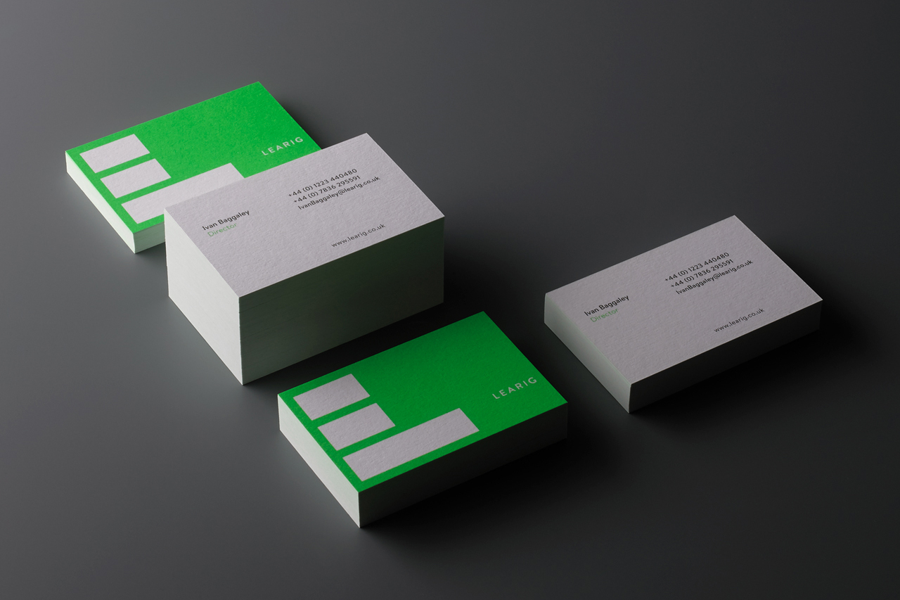
Brand identity and business cards for commercial and residential property developer Learig designed by The District, United Kingdom

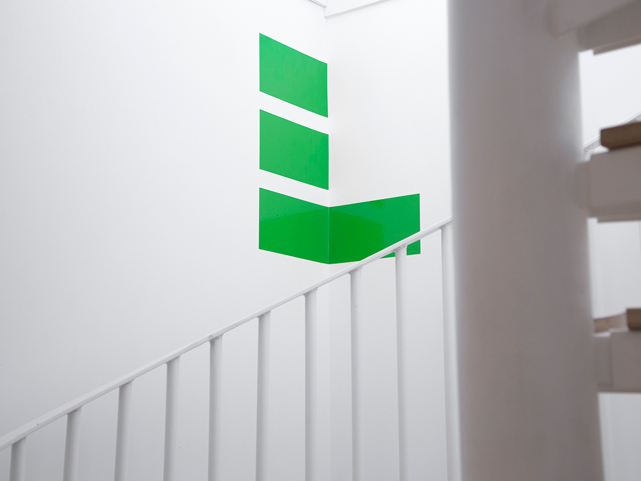
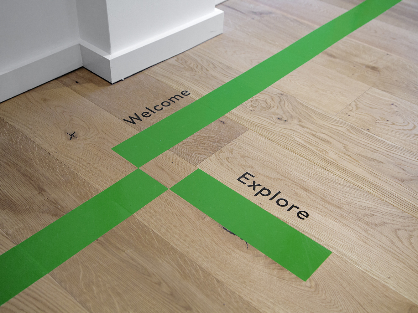
Learig is a UK-based commercial and residential property developer managing projects end to end, from planning to design to build, and the financial considerations that link each of these stages. This end to end management, and Learig’s three tiers of expertise, is visually articulated by its new brand identity, designed by The District, through a logo of three stacked blogs which extend out to guide people through property, linking information and punctuating neutral white walls with a distinctive neon green. The project also included stationery, business cards, brand guidelines, interior signage and brochure design linked by bold colour and consistent type.

Logo for commercial and residential property developer Learig designed by The District, United Kingdom

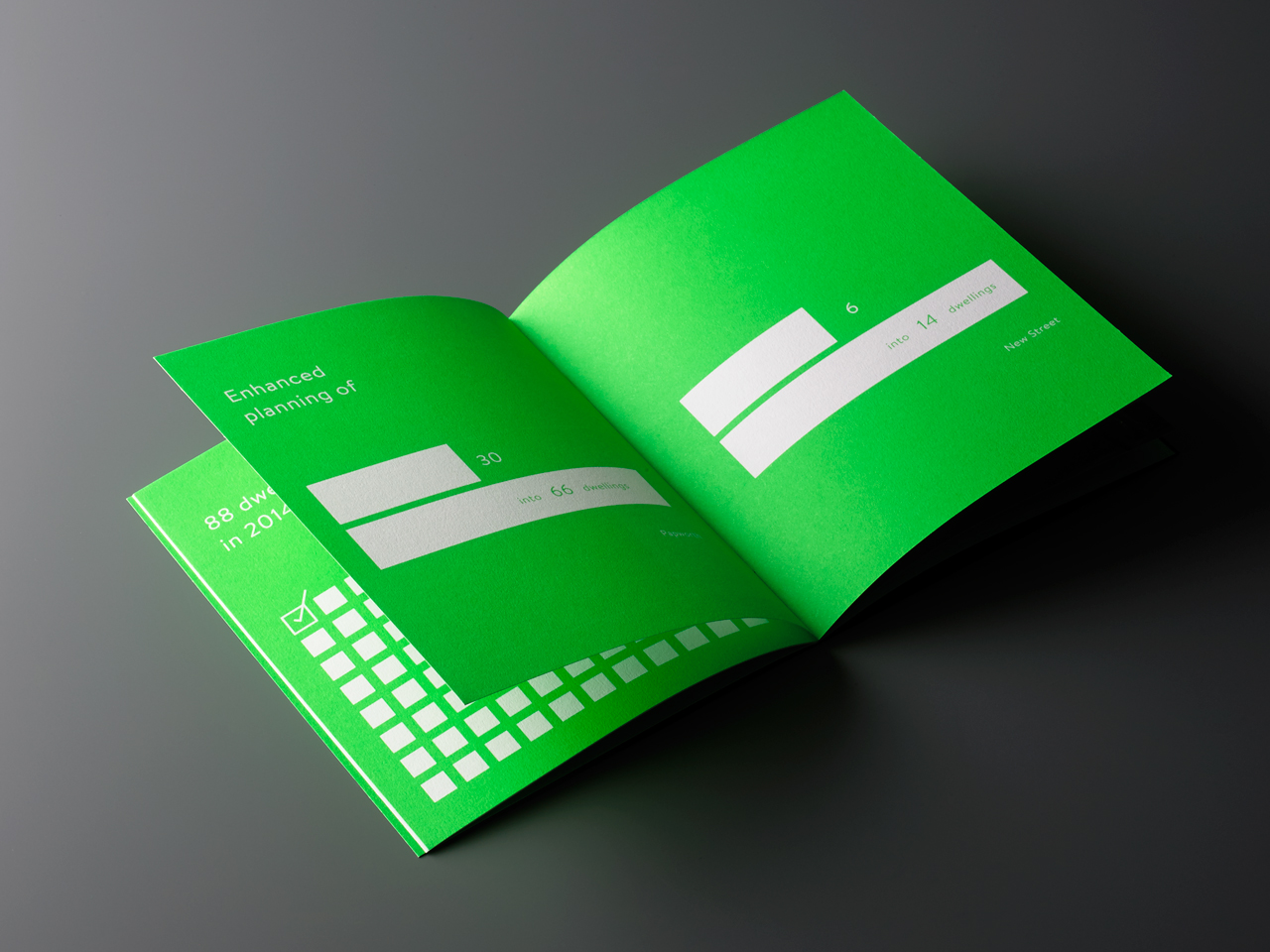
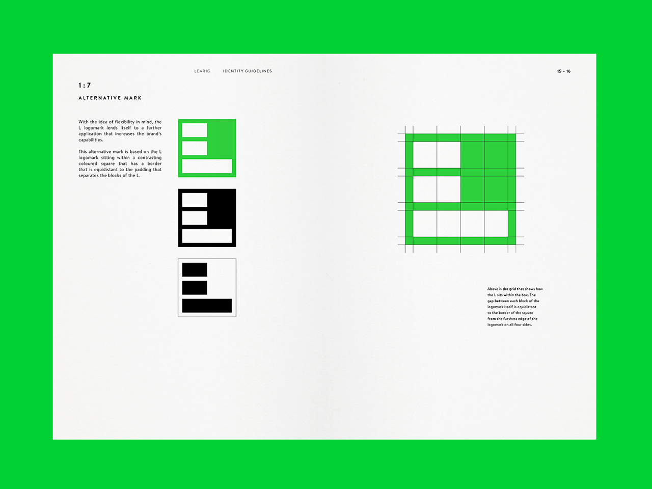
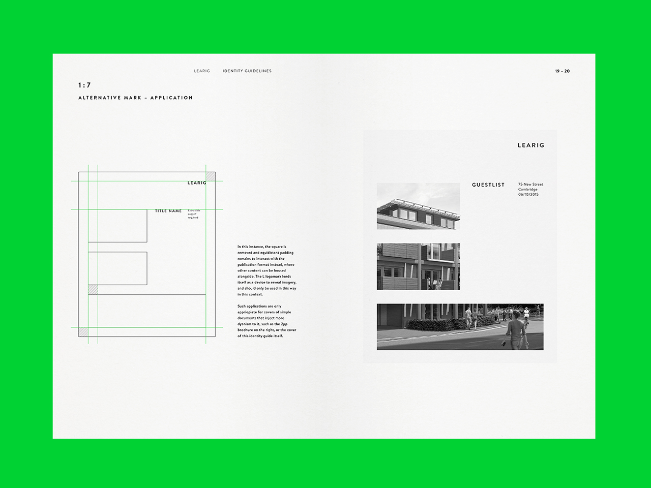
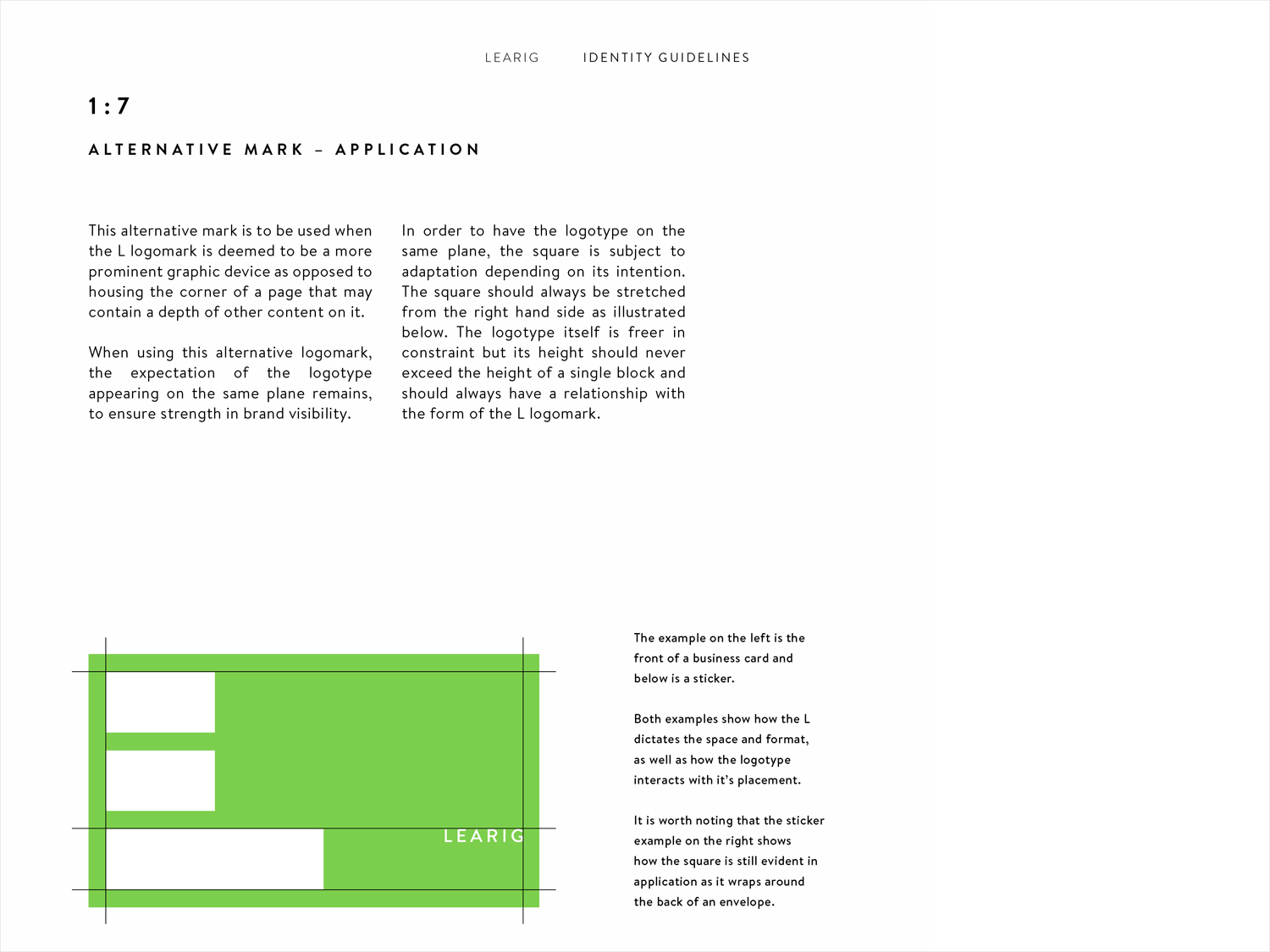
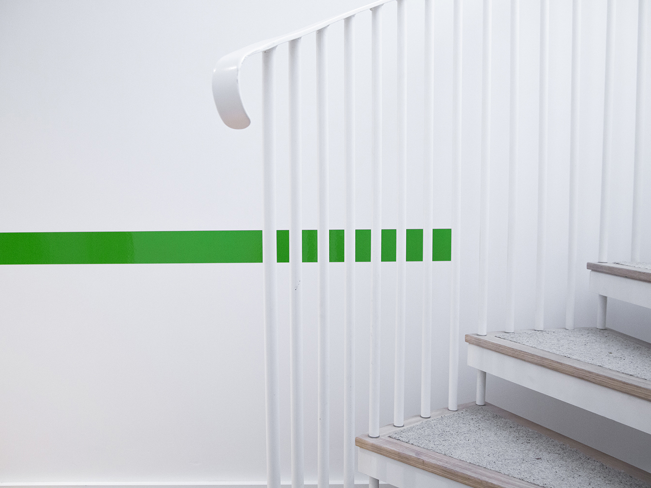
The District’s brand identity builds outwards from logo which becomes a flexible system of extending lines that move through properties, guiding and highlighting information, as the basis of infographics across the brochure, as an animated loading image online (a highlight), and as a die cut window in print.

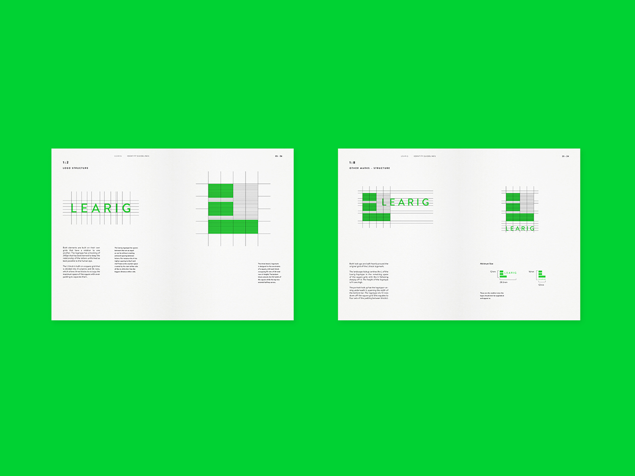
Logo and logo grid for commercial and residential property developer Learig designed by The District, United Kingdom

Although initially dismissive of the logo, particularly when reading the three tiers of expertise (knowledge, expertise and vision), the creativity and diversity of its implementation marks it out as something quite interesting.

In form, it is incredibly simple with a clear structural quality that works well within the context of property development, however, and more importantly, it is used in both a visually interesting and useful way with plenty of room for expansion. This balance between bold visual expression, usefulness and play, feels well-pitched for a company working within the commercial and residential sectors.

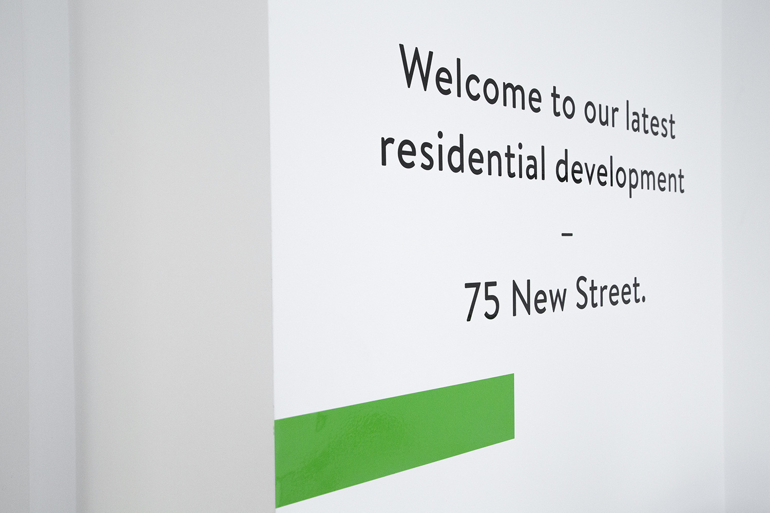
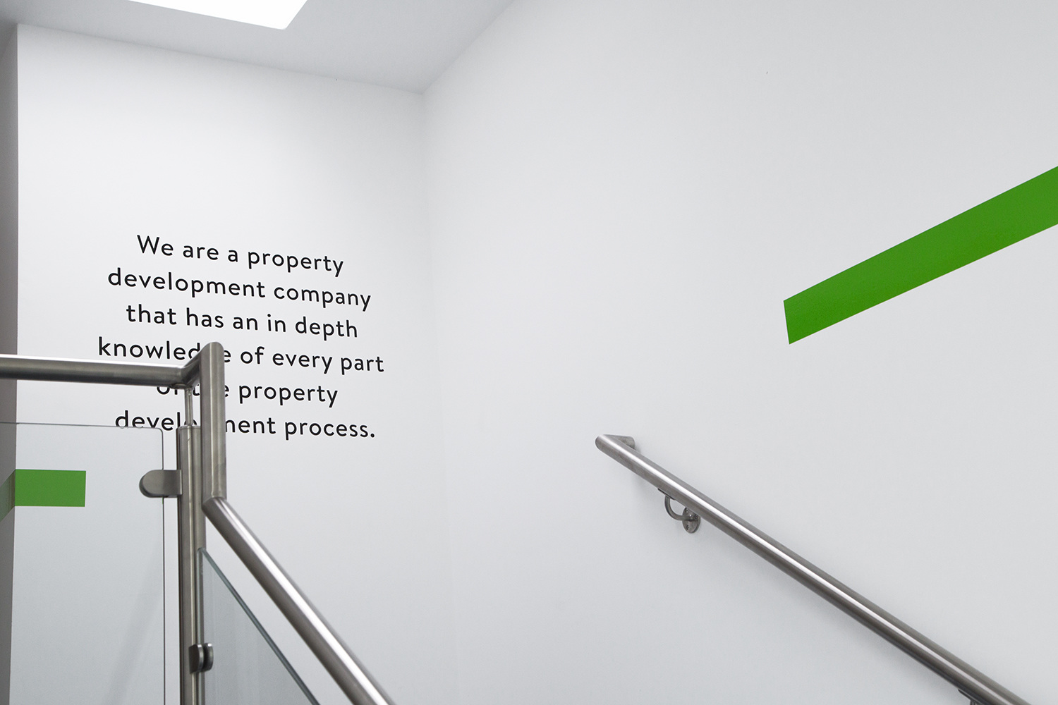
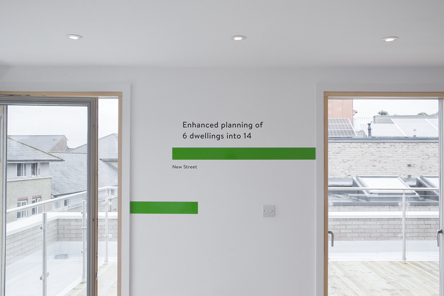
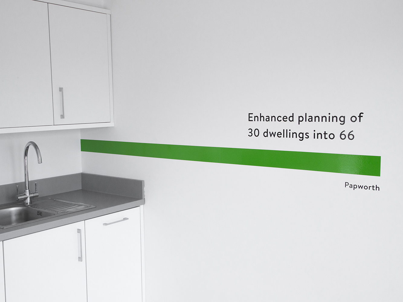
Branding and wayfinding for commercial and residential property developer Learig designed by The District, United Kingdom Branding and wayfinding for commercial and residential property developer Learig designed by The District, United Kingdom Branding and signage for commercial and residential property developer Learig designed by The District, United Kingdom Branding and wayfinding for commercial and residential property developer Learig designed by The District, United Kingdom Brand identity and brochure for commercial and residential property developer Learig designed by The District, United Kingdom

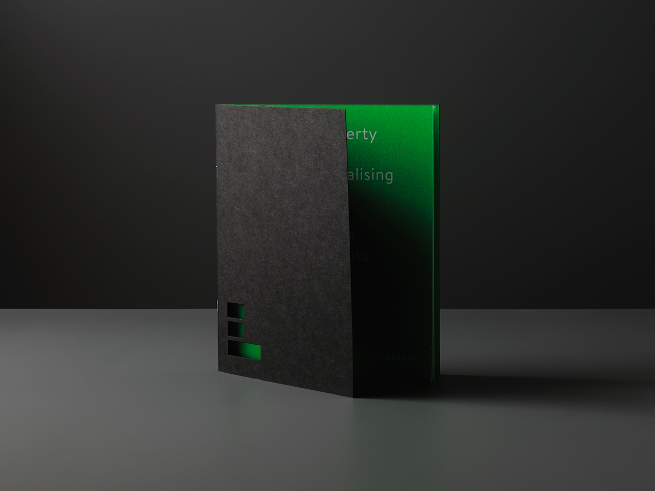
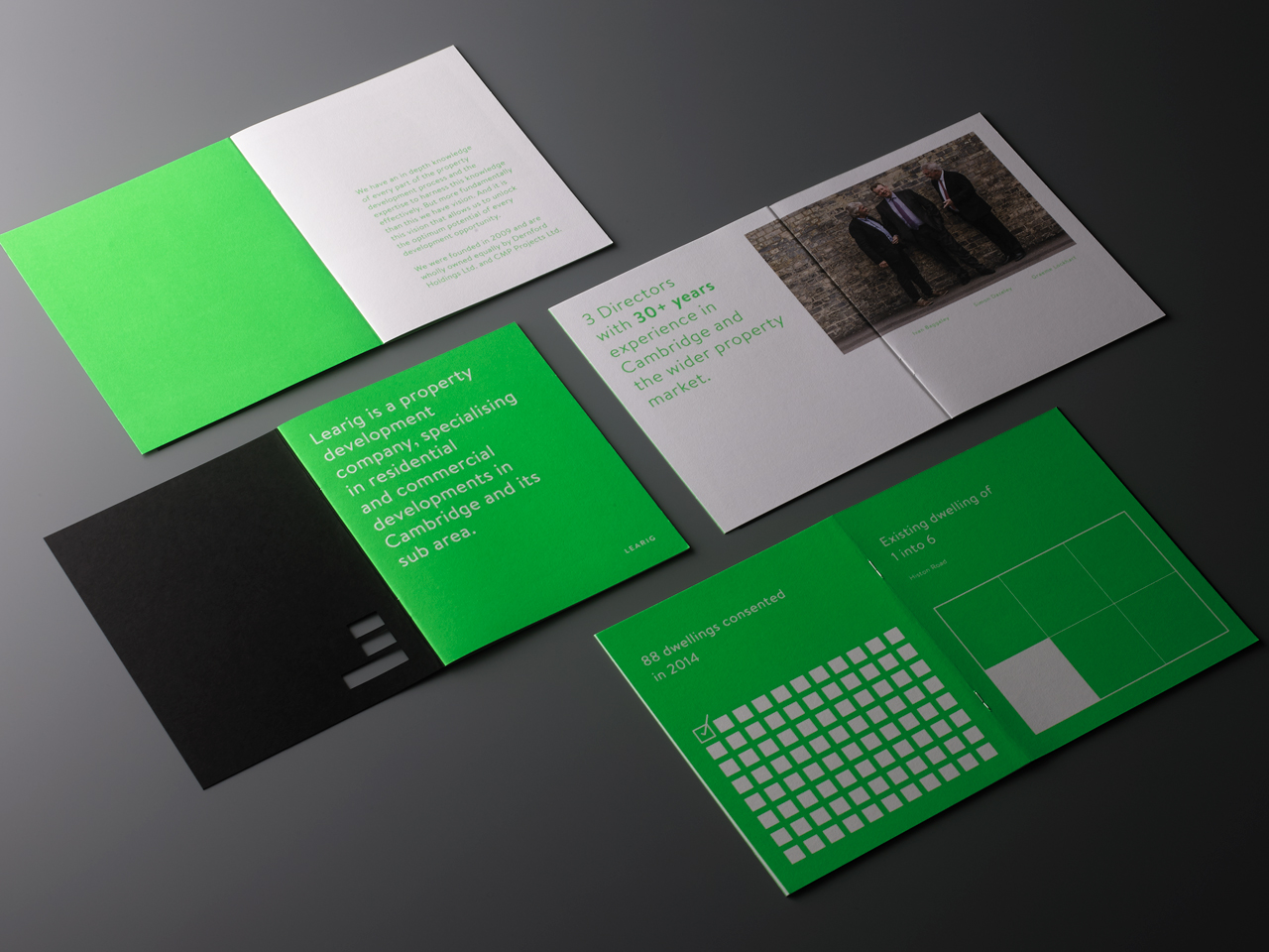
A bright green effectively punctuates and brands clinical and neutral white walls of property and office space, and clearly links brochures and stationery. Its use in print is impactful and for the most part does not undermine content, and tempered by dyed black boards and white paper.
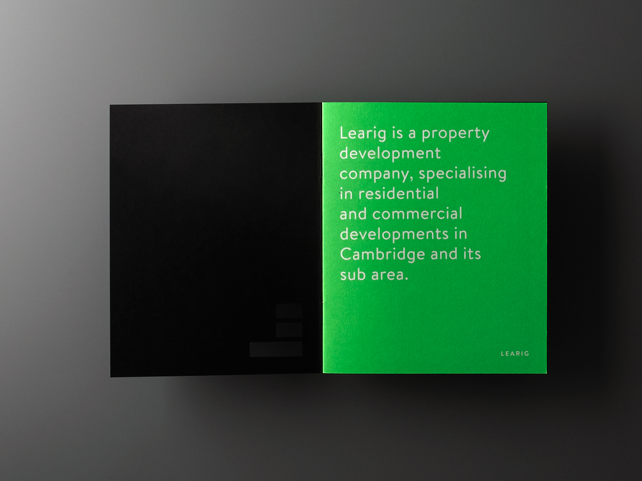
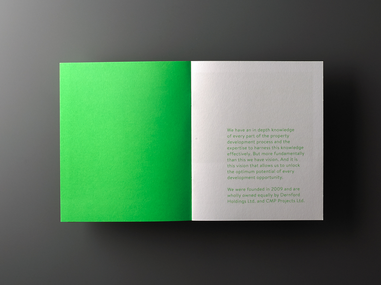
Brand identity and brochure for commercial and residential property developer Learig designed by The District, United Kingdom Brand identity and brochure for commercial and residential property developer Learig designed by The District, United Kingdom

The unwavering consistency of colour also continues in the use of Brandon and its typesetting, the straightforward layout of the brochure and simple geometric imagery. This repetition of colour, type and form, while it does have a strong sense of brand, is a touch repetitive. Different sheet sizes, in the absence of available images and/or copy, might have helped to break up the brochure a bit more.
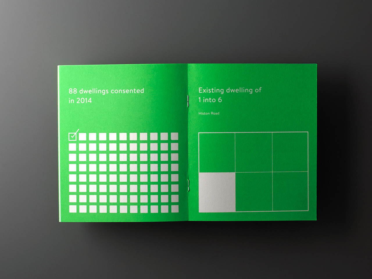
Brand identity and brochure for commercial and residential property developer Learig designed by The District, United Kingdom Brand identity and brochure for commercial and residential property developer Learig designed by The District, United Kingdom

The continuity between print and digital experience is clear and to be commended. The website does a good job of balancing type, white space and project imagery, where the brochure feels a little too sparse. However, looking over the property photography used online, it is perhaps a little clearer as to why these were not used in print. More from The District on BP&O.

Design: The District.
Interior Photography: Charlie Bryan & Redwan El-Harrak.
Opinion: Richard Baird.
Fonts Used: Brandon.
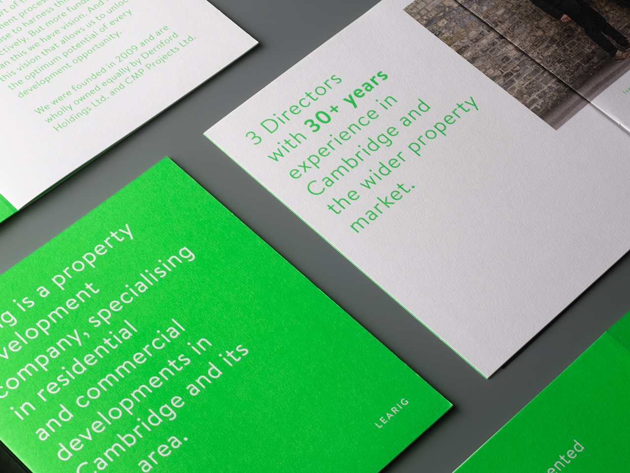
Brand identity and brochure for commercial and residential property developer Learig designed by The District, United Kingdom Brand identity and brochure for commercial and residential property developer Learig designed by The District, United Kingdom Brand guidelines for commercial and residential property developer Learig designed by The District, United Kingdom Brand guidelines for commercial and residential property developer Learig designed by The District, United Kingdom Brand guidelines for commercial and residential property developer Learig designed by The District, United Kingdom Brand guidelines for commercial and residential property developer Learig designed by The District, United Kingdom Branding and signage for commercial and residential property developer Learig designed by The District, United Kingdom Branding and signage for commercial and residential property developer Learig designed by The District, United Kingdom Branding and signage for commercial and residential property developer Learig designed by The District, United Kingdom Branding and wayfinding for commercial and residential property developer Learig designed by The District, United Kingdom Branding and signage for commercial and residential property developer Learig designed by The District, United Kingdom Branding and signage for commercial and residential property developer Learig designed by The District, United Kingdom