Paul’s at Haymarket by 25AH
Opinion by Richard Baird Posted 23 June 2016
Paul’s is a restaurant located in the Haymarket hotel which is situated at the heart of the Swedish capital of Stockholm. The restaurant is named after Paul U. Bergström, founder of a well-known department store that previously occupied the building, and features a distinctive period interior of bent wood chairs, white tiles, leather banquette seating, marble surfaces and art deco-inspired flourishes. This is a reflection of Paul’s menu which is inspired by classical European cuisine and the American grill from the turn of the century.
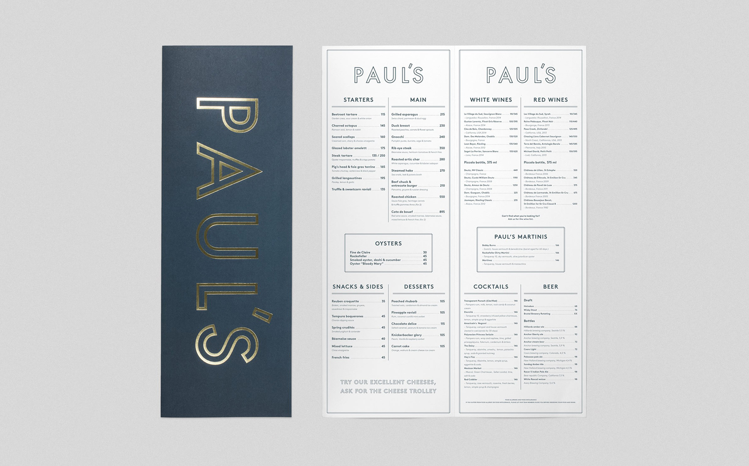
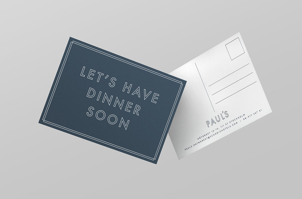
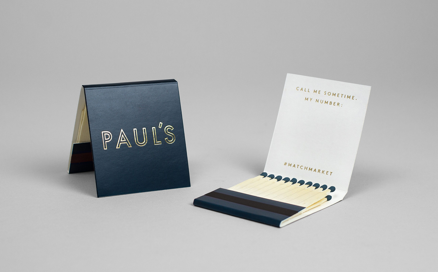
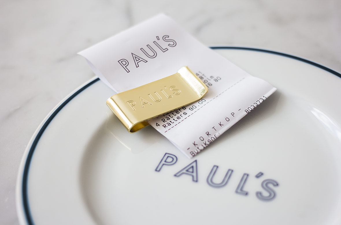
Scandinavian graphic design studio 25AH created a visual identity for Paul’s that although simple in its graphic expression, draws on Haymarket’s signage, unchanged since the 1920s, the history of the building, the restaurant’s period interior and its European and American menu. This is expressed through type, neon signage and materiality which links rich interior design with a more restrained set of printed materials that included matchbooks, menus, postcards, tableware and bill clips.
Where interior is rich in material detail and texture, form and colour, Paul’s graphic language and the way this manifests itself in print is far more restrained, appearing as a neat distillation of the restaurant’s complex but well-resolved aesthetic, the duality of the menu that informed it and the historical nature of the venue.
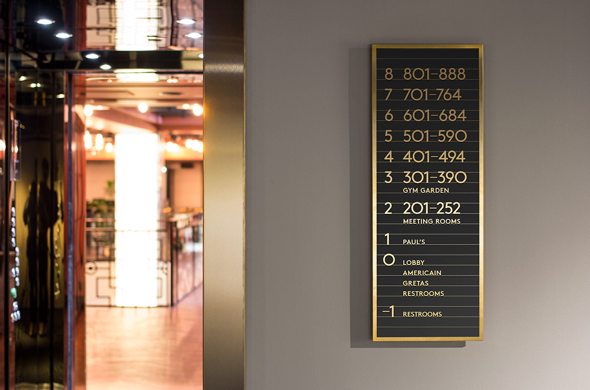
The logotype’s uppercase, geometric and inline characters are commonplace but well-set, comfortably playing with distinction and continuity within the context of Haymarket. It shares something in common with interior wayfinding and the original 1920s exterior signage of the hotel in lettershape, and secures differentiation in the use of an inline.

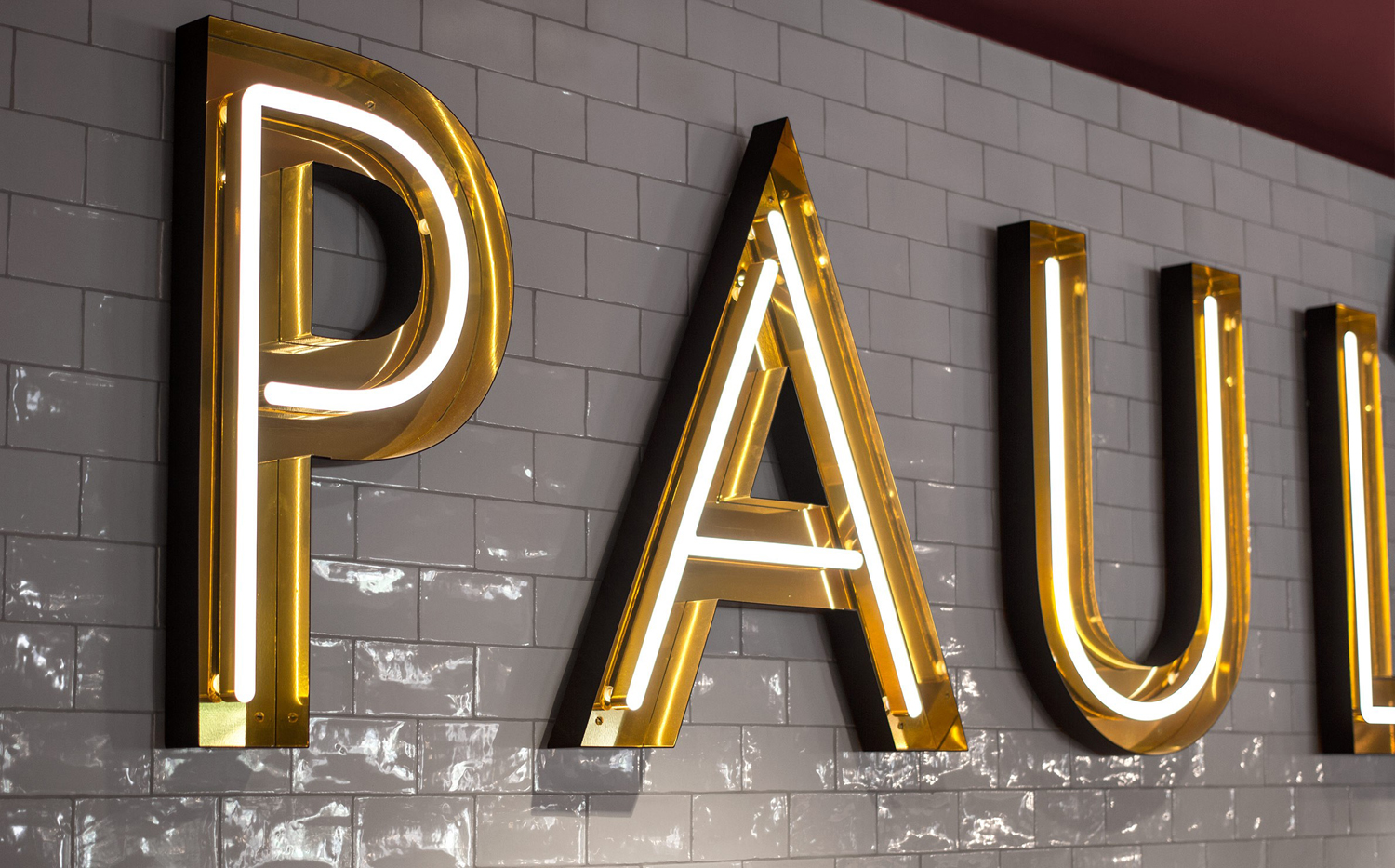
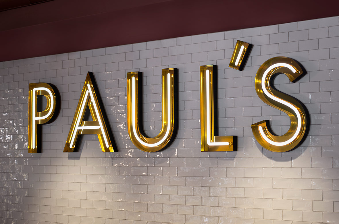
Printed materials and environment are linked effectively and explicitly through some well-built signage, not only in lettershape but also in a bold use of proportion, which makes it appear oversized and dramatic both across walls and menus, in the use of gold, which runs throughout the restaurant in the form of fixtures and fittings, and in print as a gold block foil.
The inline turned fluorescent tubes is particularly neat. So, although the logotype remains simple, it gains a lot from its association with the more compelling qualities of dining at paul’s, and balances the American grill/diner aesthetic with those that are associated with early 20th century Europe.
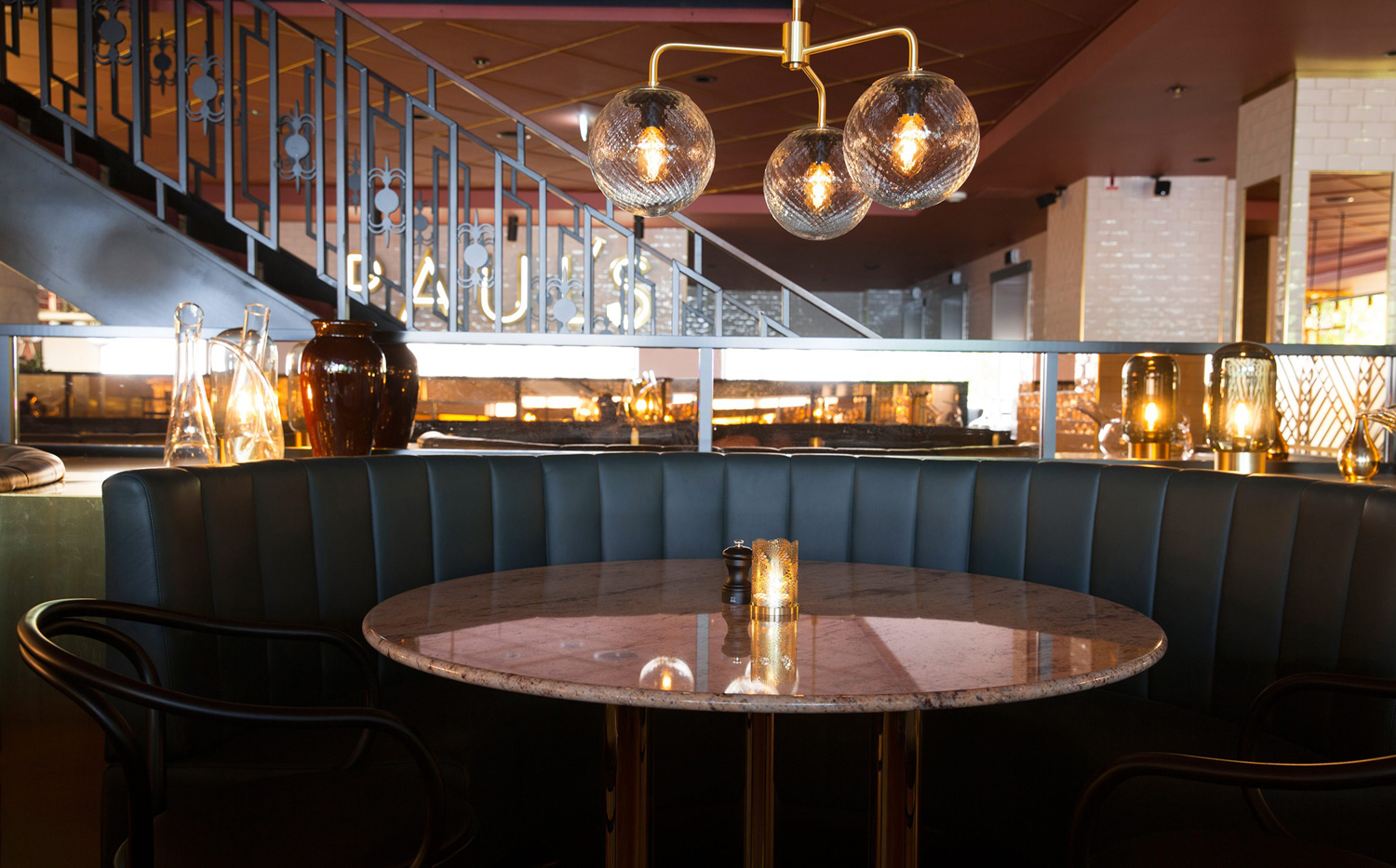
The materiality of identity, again while restrained, appears as a fair reflection and simplification of interior. It makes a connection with and draws value from the more compelling interior experience. Uncoated textures, dyed papers and boards, the fine gold foiled lines of tiled patterns and the heavier lines of the logotype can be seen in interior.
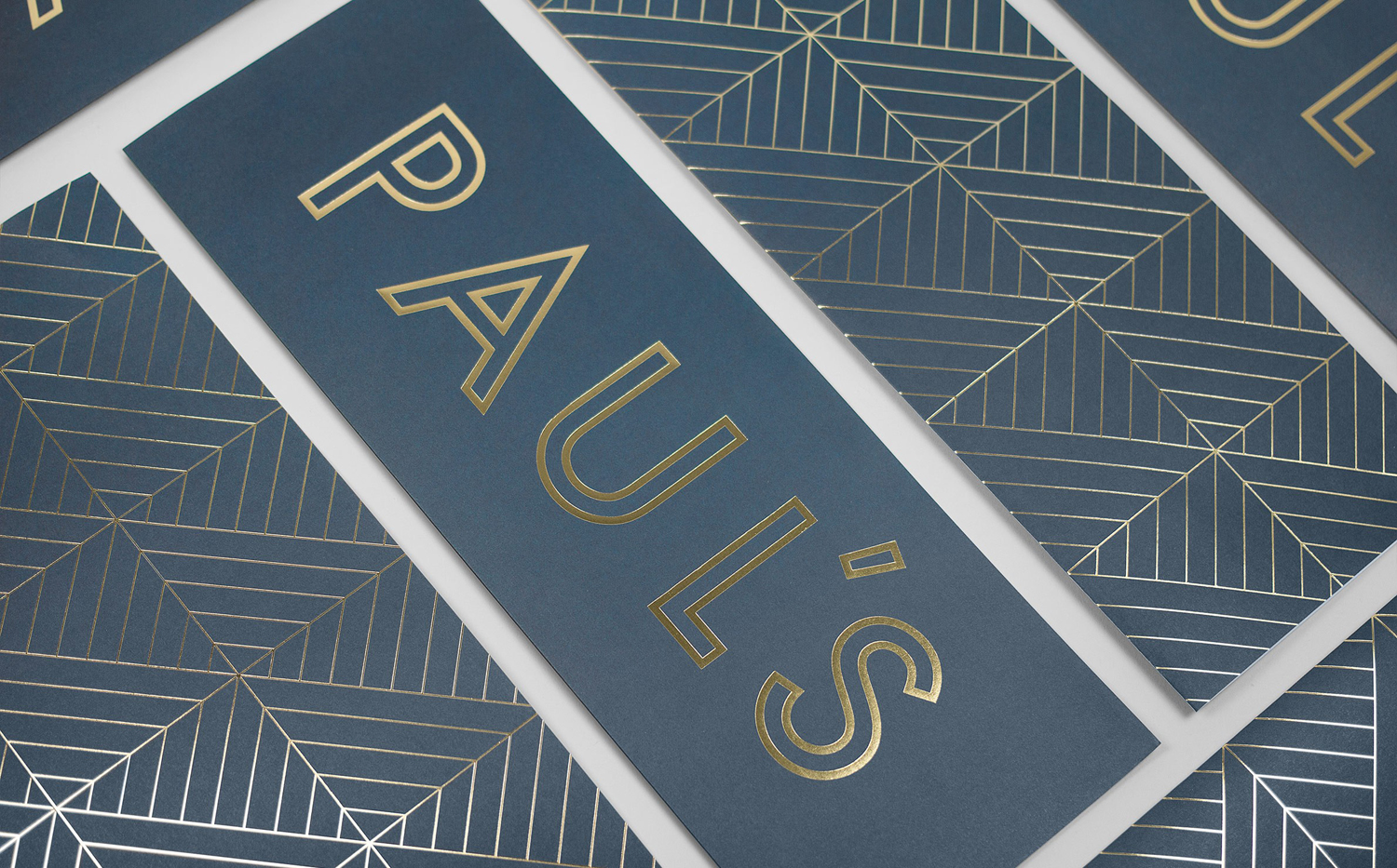
Conceptually the approach is not unusual, and leans quite heavily on period signage that does not have as much individual character as something like Fazer Cafe, which takes a similar approach but explores this to a greater extent. 25AH’s work for Paul’s does, however, feel well-balanced within the context of the restaurant, offering a momentary break amongst a lot detail, and gains value from an association with environment and experience through recurring but simplified visual cues. More from 25AH on BP&O.
Design: 25AH. Opinion: Richard Baird. Fonts Used: Brown.
