John Lewis Childrenswear by Charlie Smith Design
Opinion by Richard Baird Posted 3 October 2016
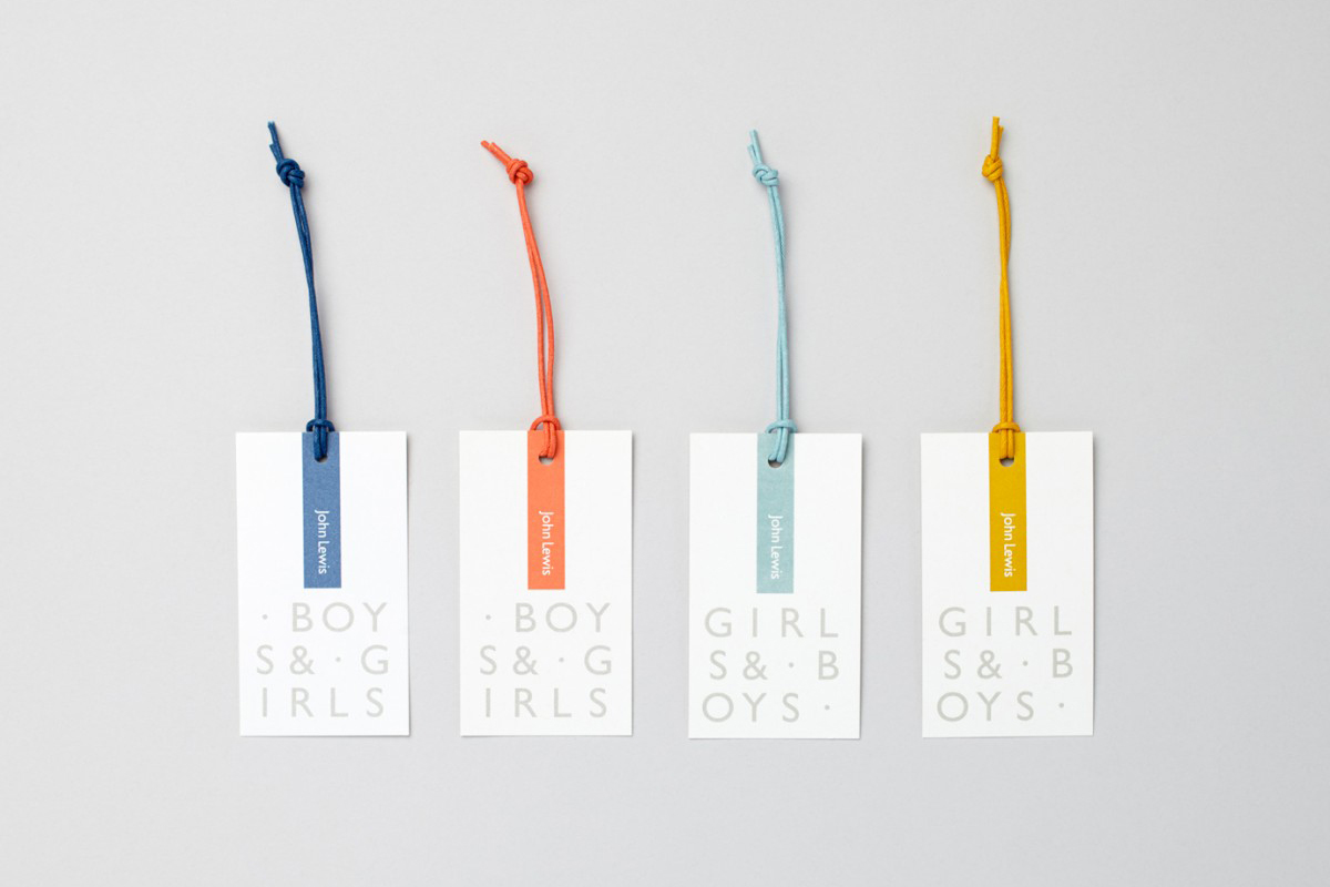
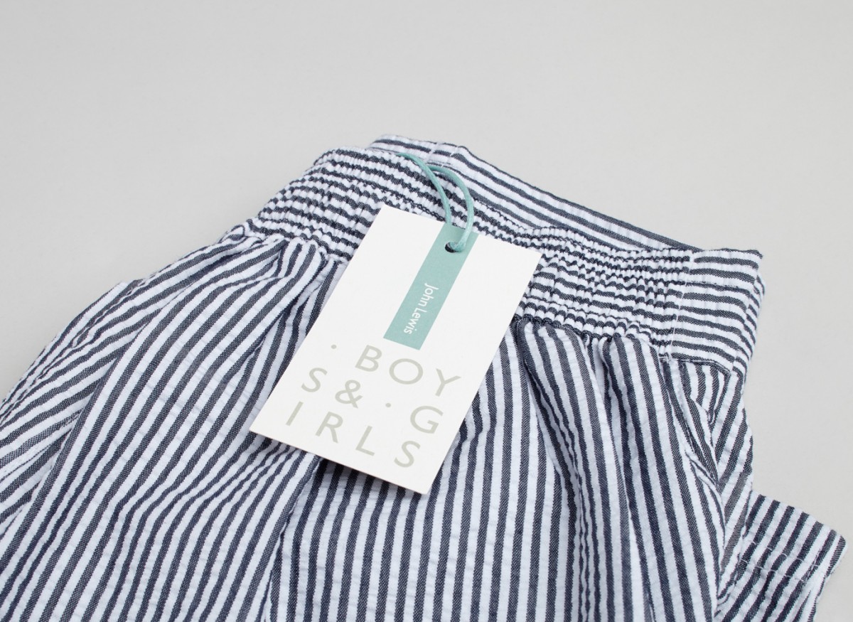
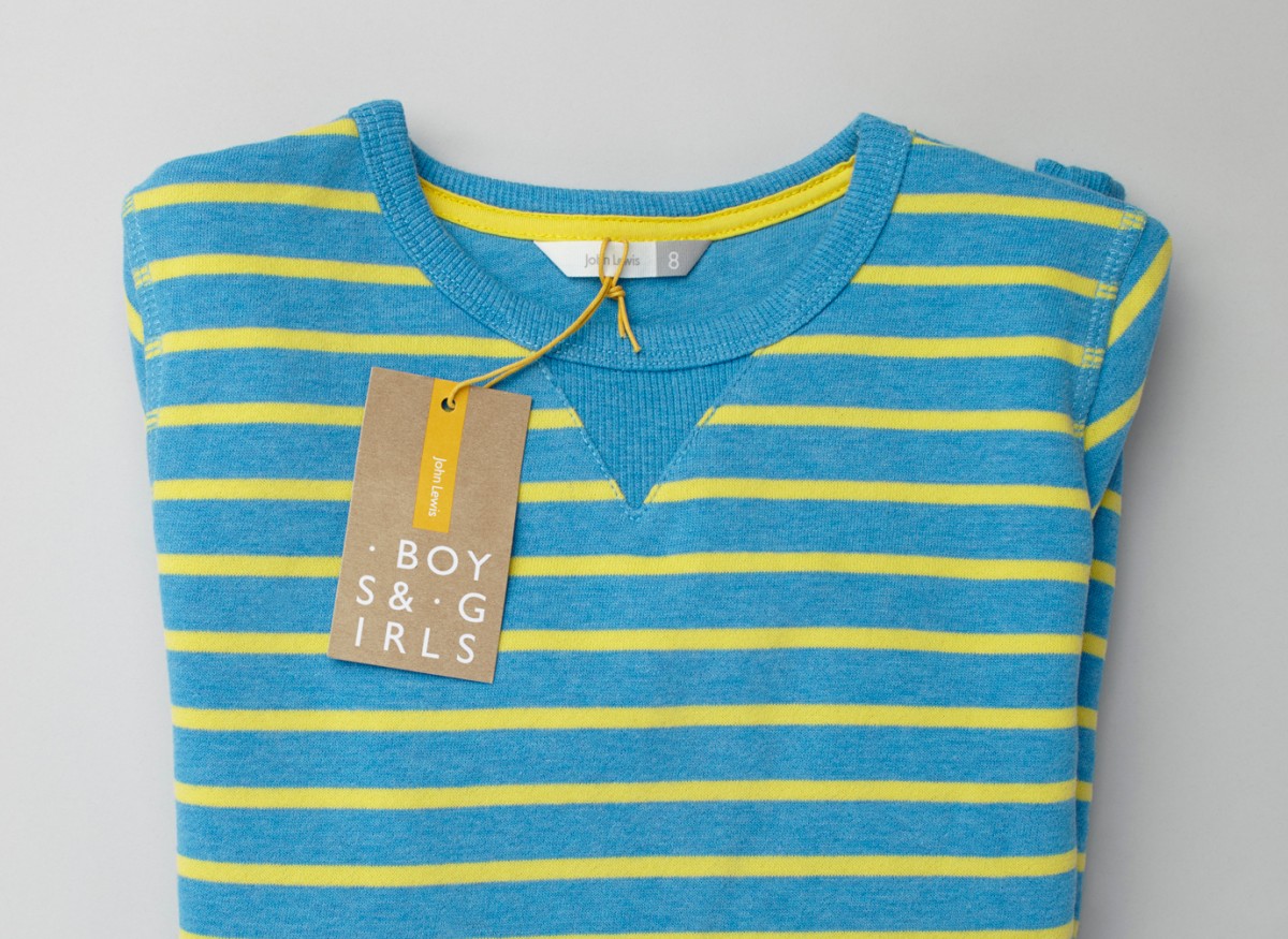
London-based studio Charlie Smith Design worked with British department store John Lewis to develop the visual identity system and packaging for their childrenswear department. The system needed to appeal to girls and boys aged from 2 to 14 (and presumably their parents), and connect a broad range of accessories and garments that included denim, swimwear, shoes and underwear.
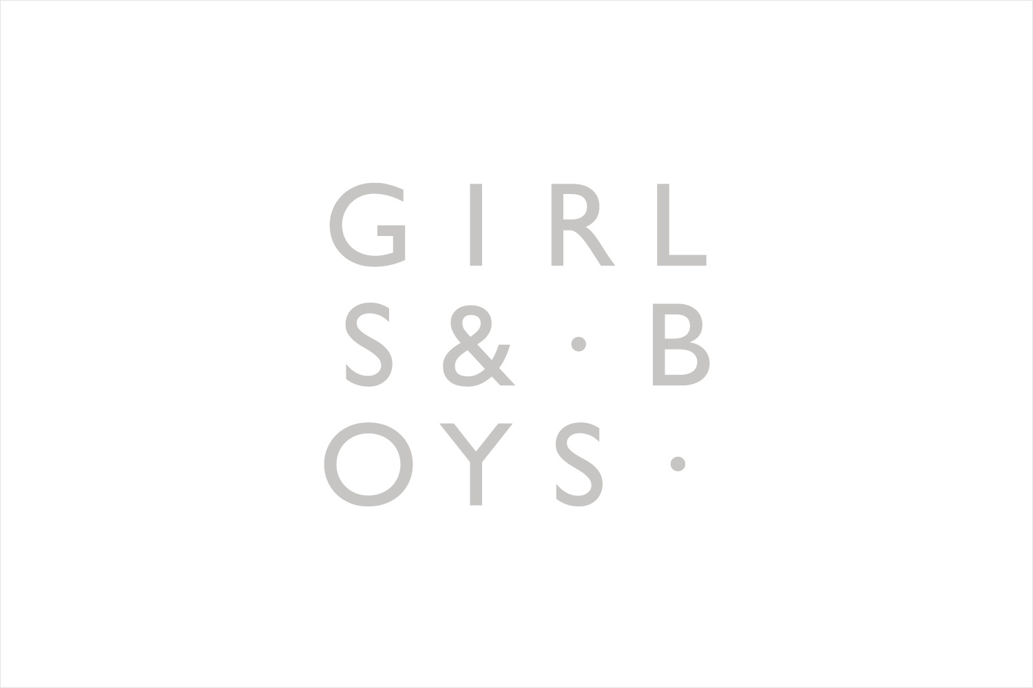
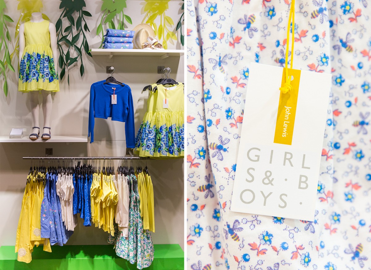
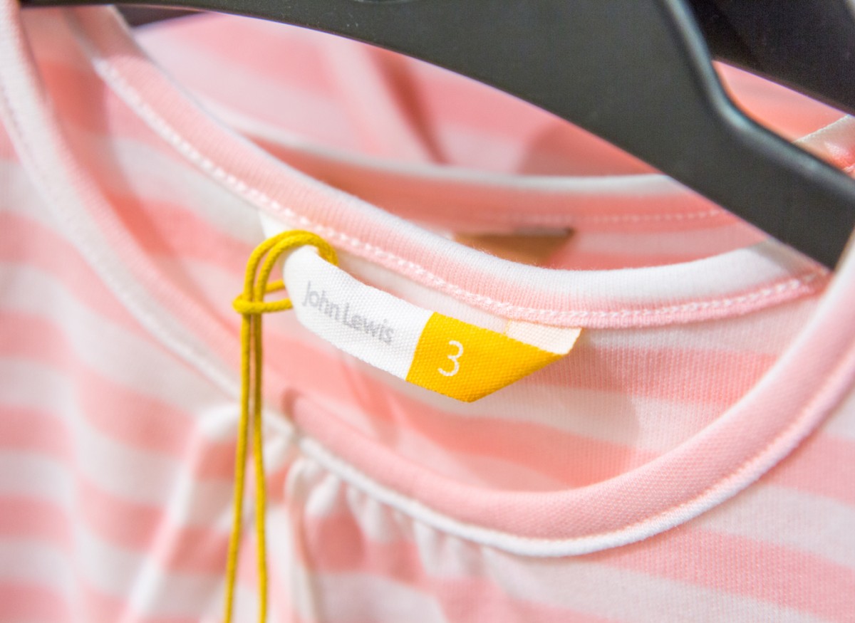
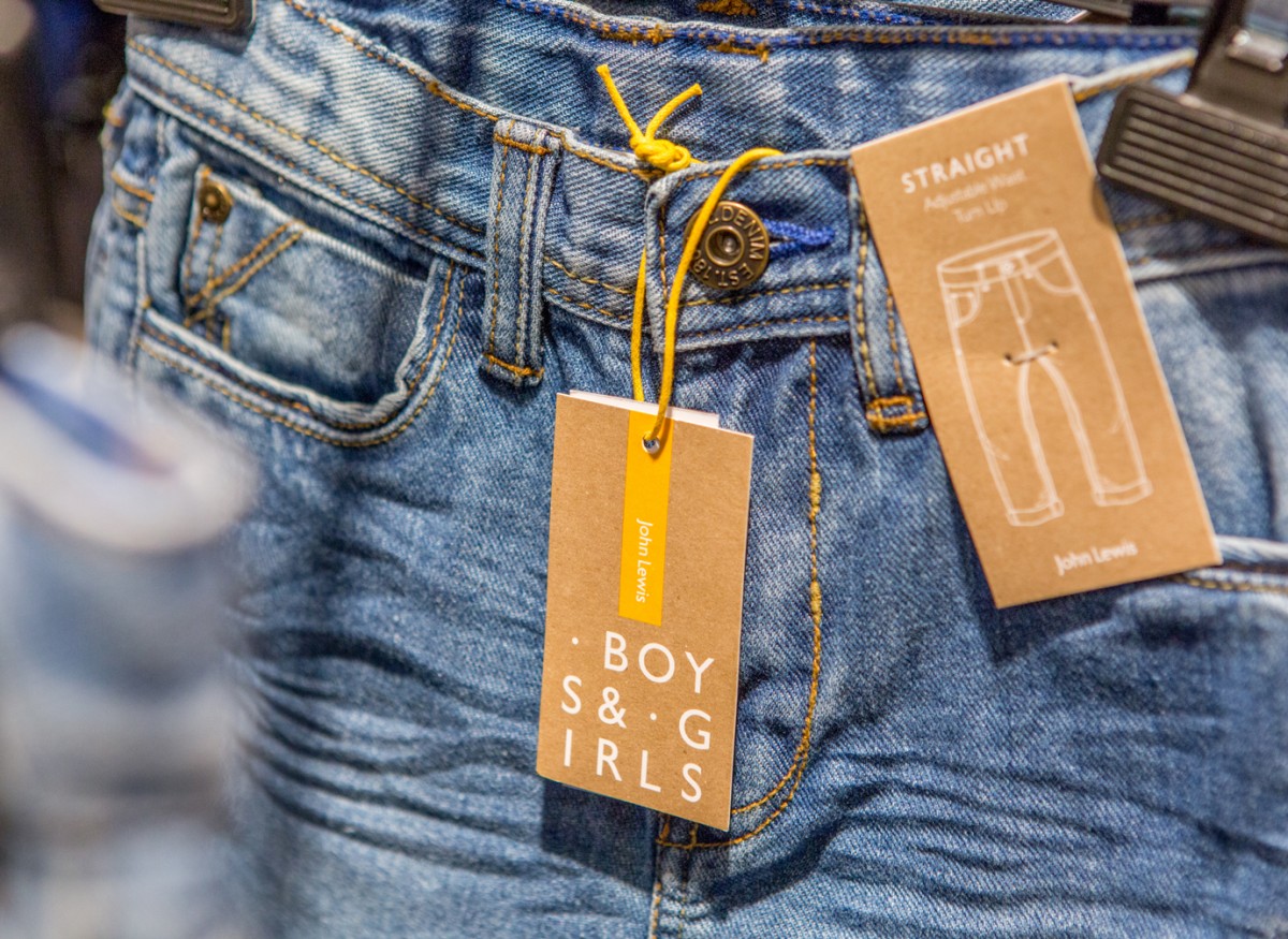
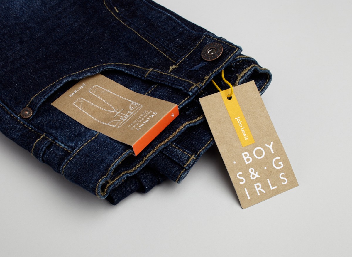
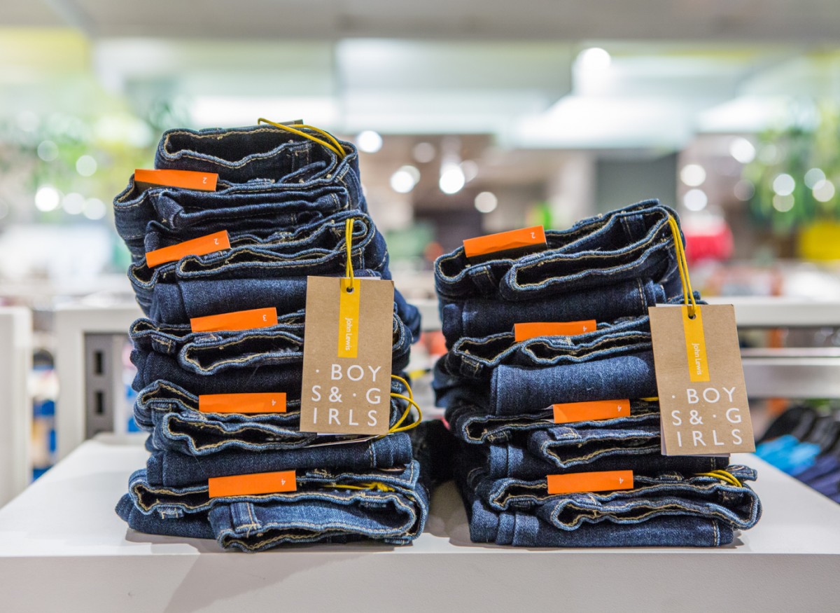
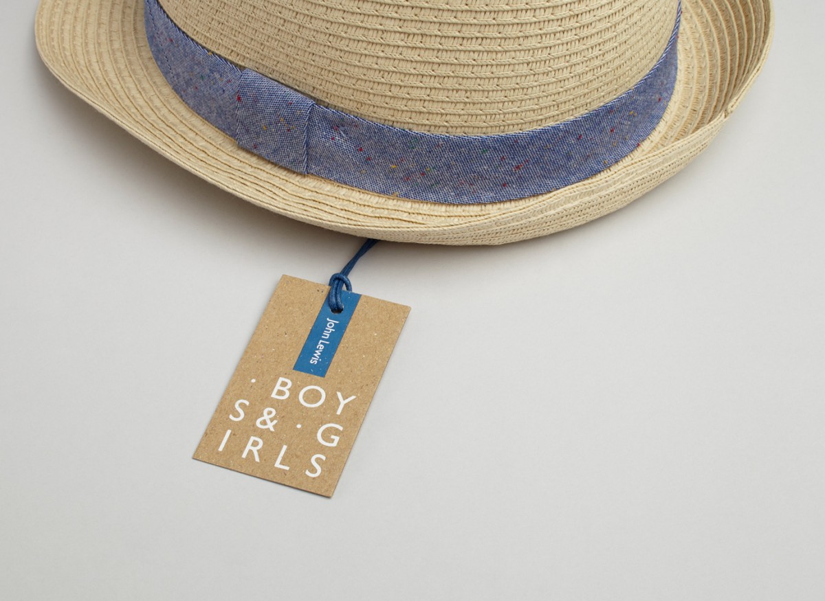
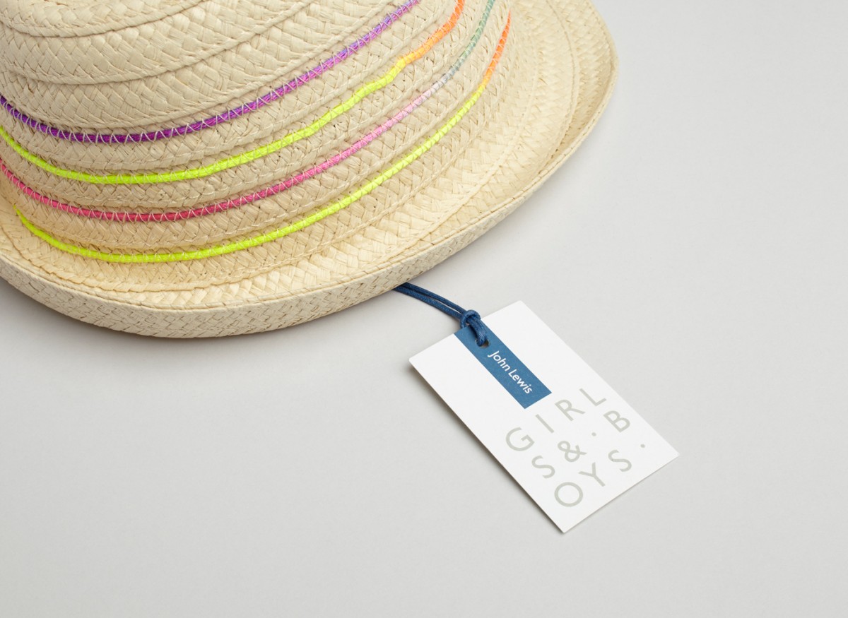
The result is as a contemporary and playful typographic treatment across tags that use arrangement to call out gender, colour to identify different sizes, and materiality to establish a useful communicative contrast yet visual continuity throughout.
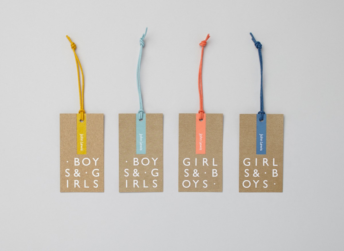
Charlie Smith Design’s direction is interesting in the way that it feels distinctly unisex; in the forms and changing structure of type, and in the use of colour and material.
It feels sophisticated in the absence of blunt gender stereotyping, whilst still retaining character, and although there is a simplicity to system, there are some really lovely aesthetic and functional details to this that make it stand out. In particular, colour palette tied to sizing, the colour matching of ink and string, and how well and consistently ink is implemented across both bleached and unbleached boards.
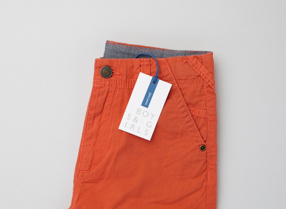
There is a good use of both contrast and continuity. A bright white, in conjunction with some lovely spot colours, introduce contrast to textiles and finer detailing, while the unbleached board offers something of the more robust and harder wearing alongside jeans.
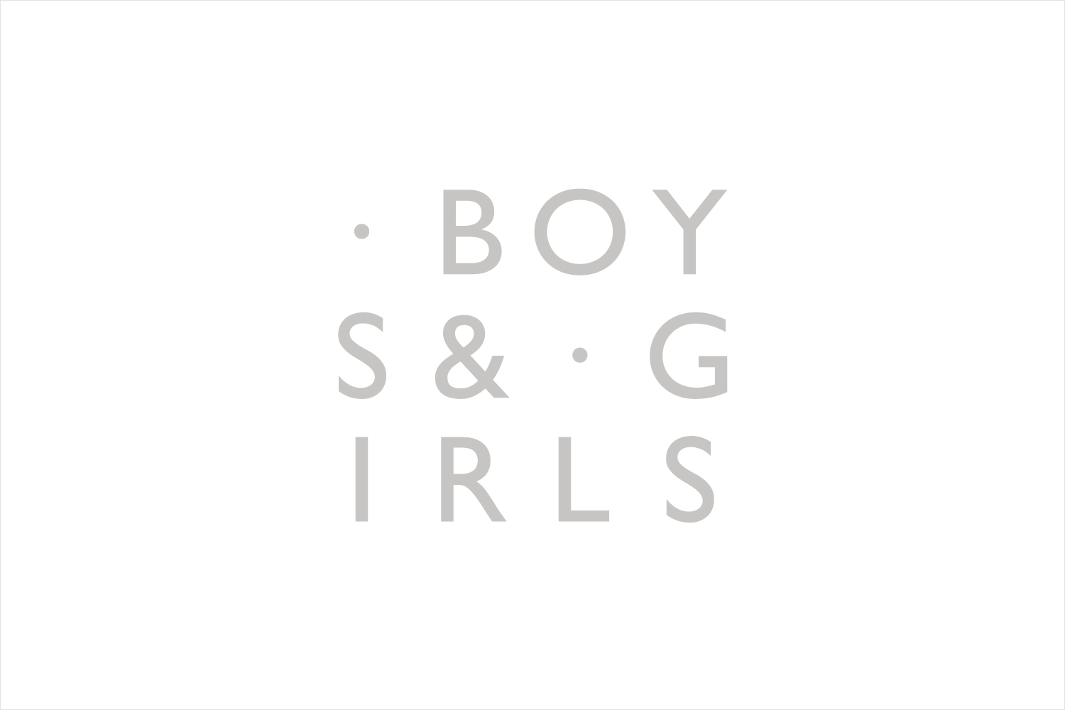
The monolinear line weight, stacking and spacing of Gill Sans, and the equality of wordmark, finds a comfortable space between modernity and legacy, a fair reflection of today’s John Lewis, while orientation, and the boxing of John Lewis wordmark, functions to divide the store and its childrenswear department. More from Charlie Smith Design on BP&O.
Design: Charlie Smith Design. Opinion: Richard Baird. Fonts Used: Gill Sans.
