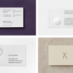
Gallery & Co. by Foreign Policy
Opinion by Richard Baird Posted 8 November 2016

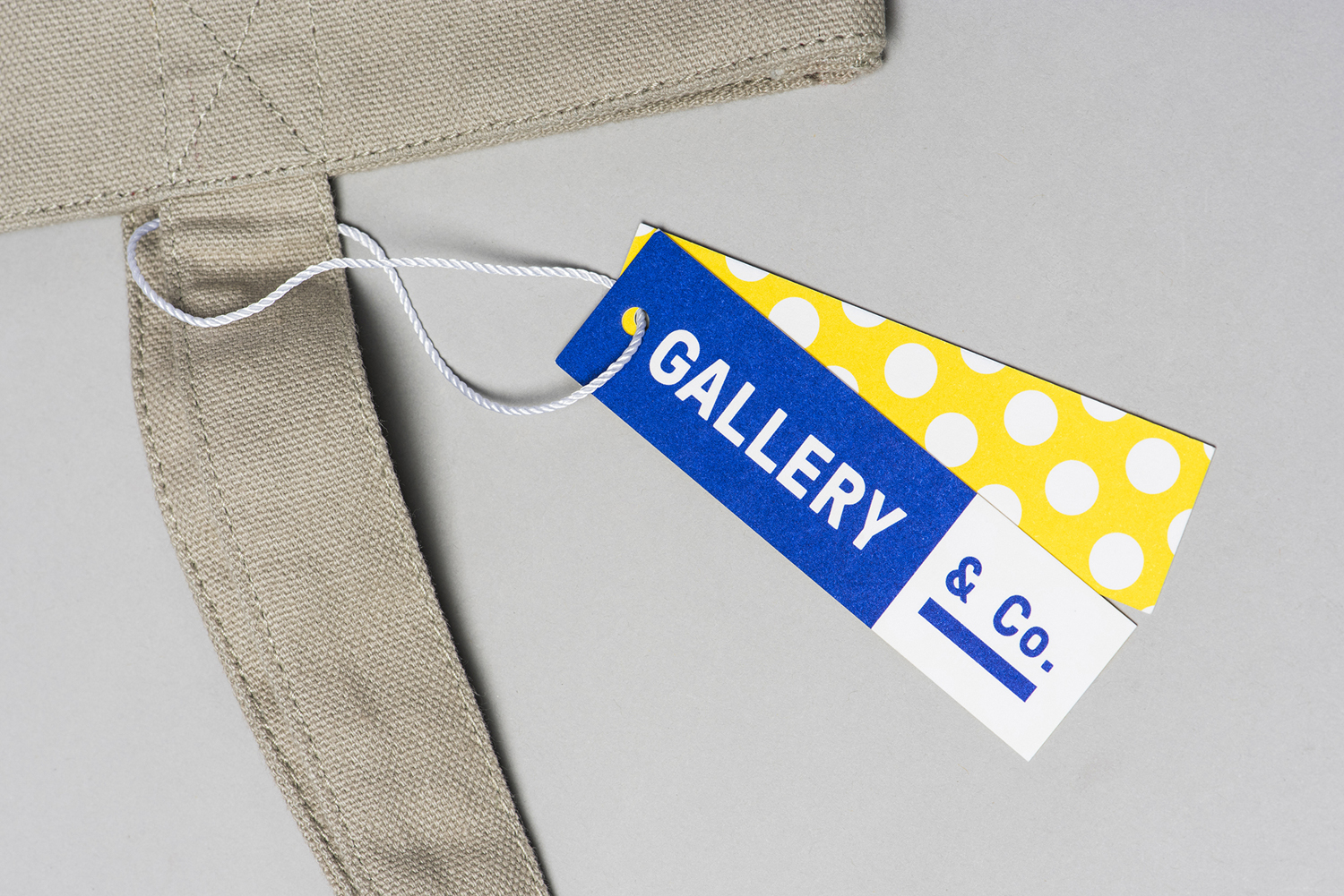
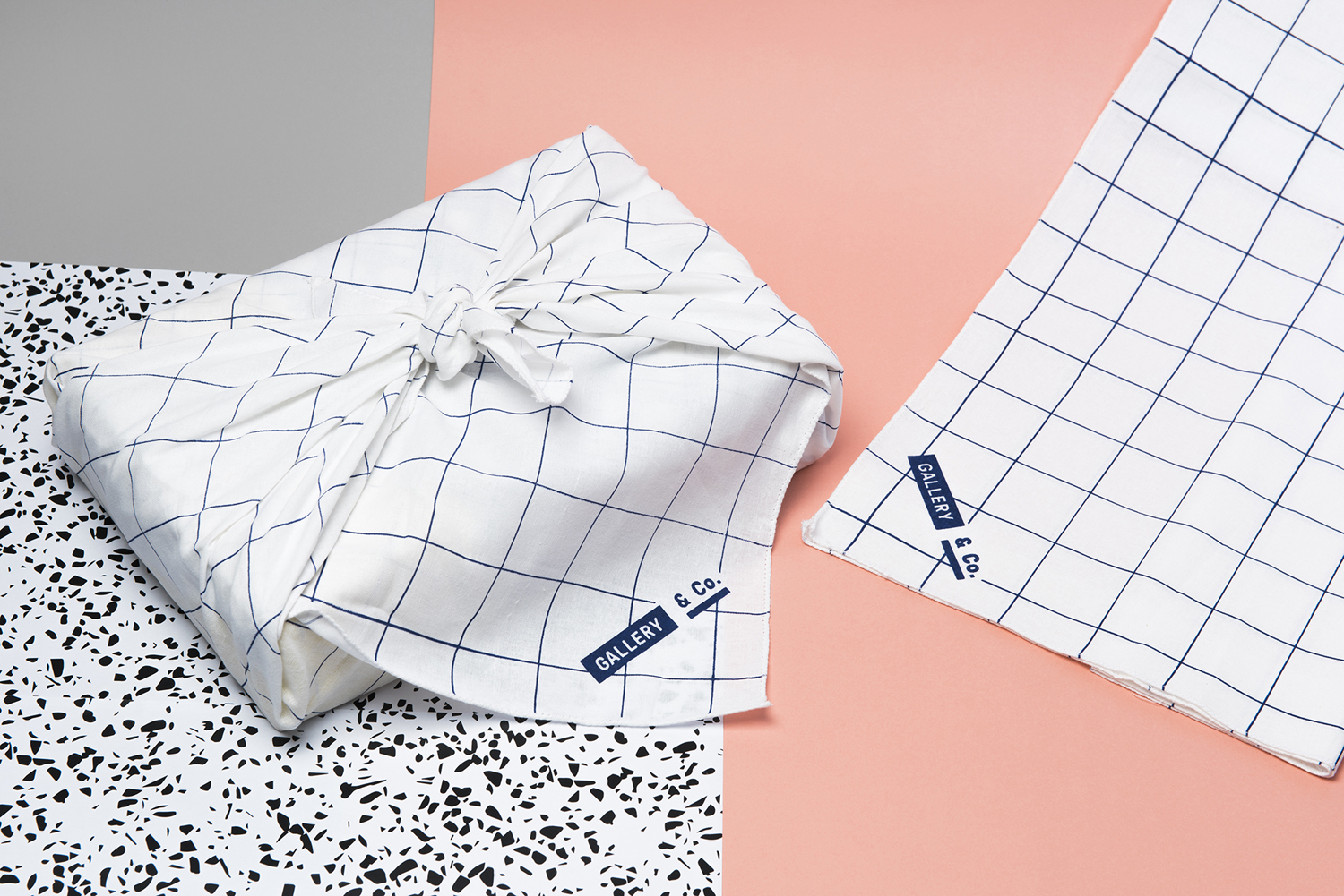
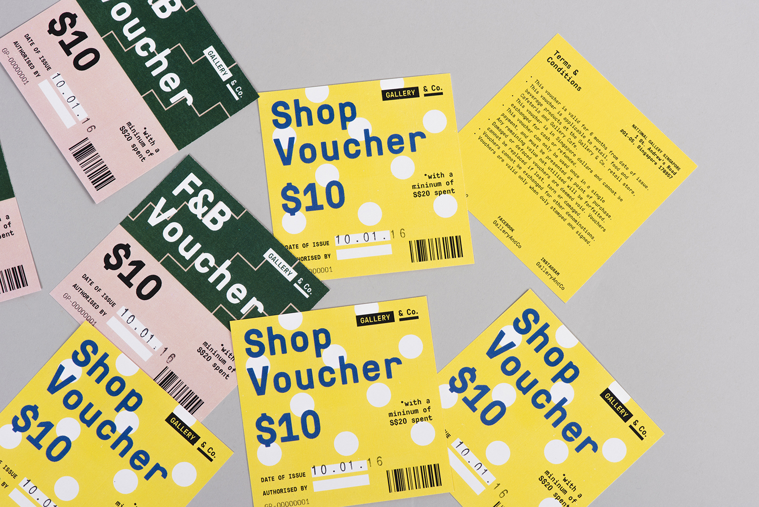
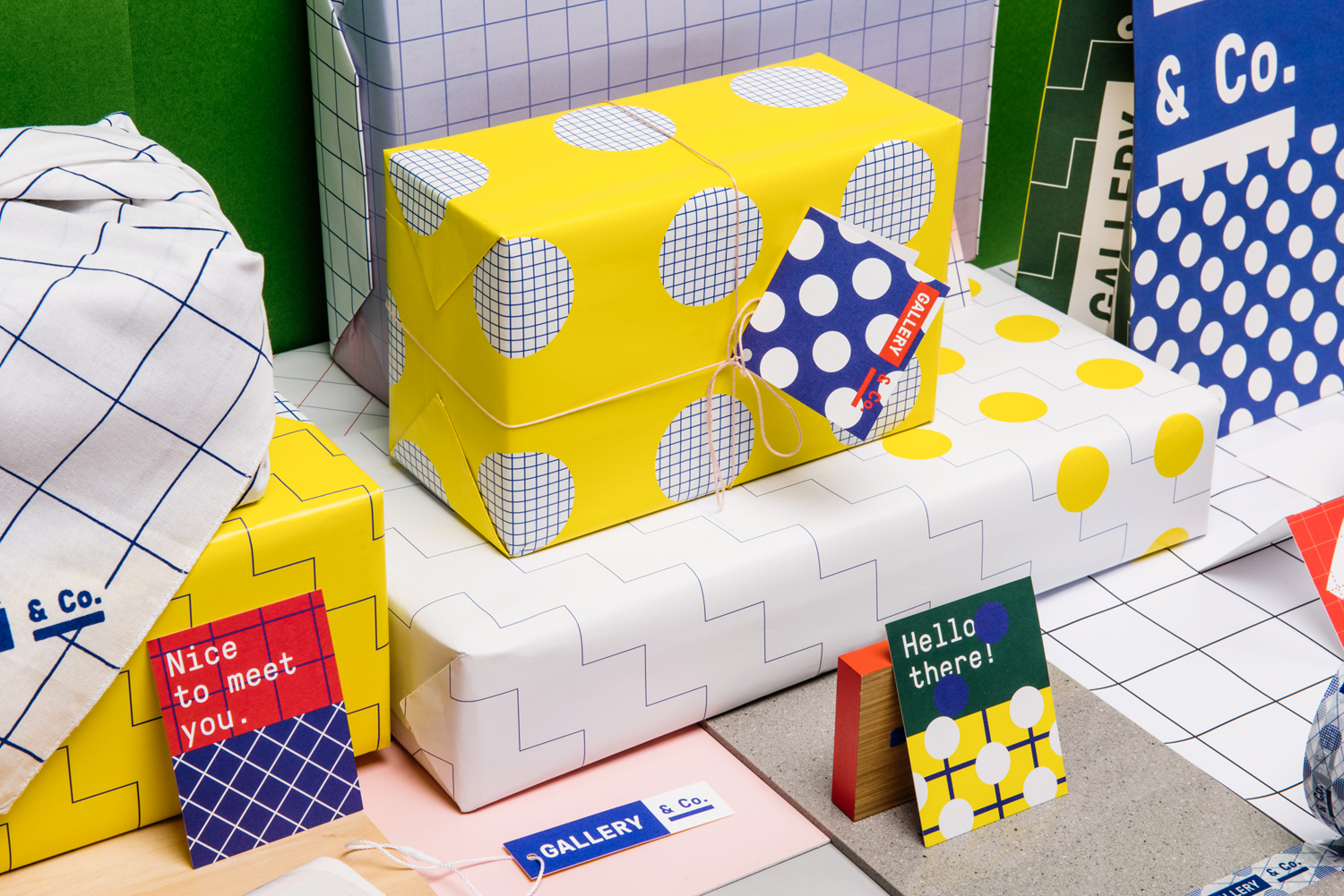
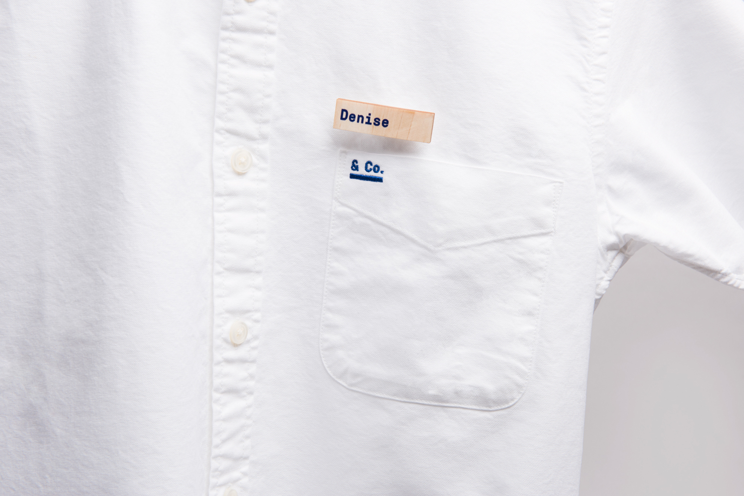
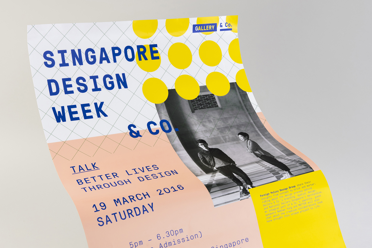
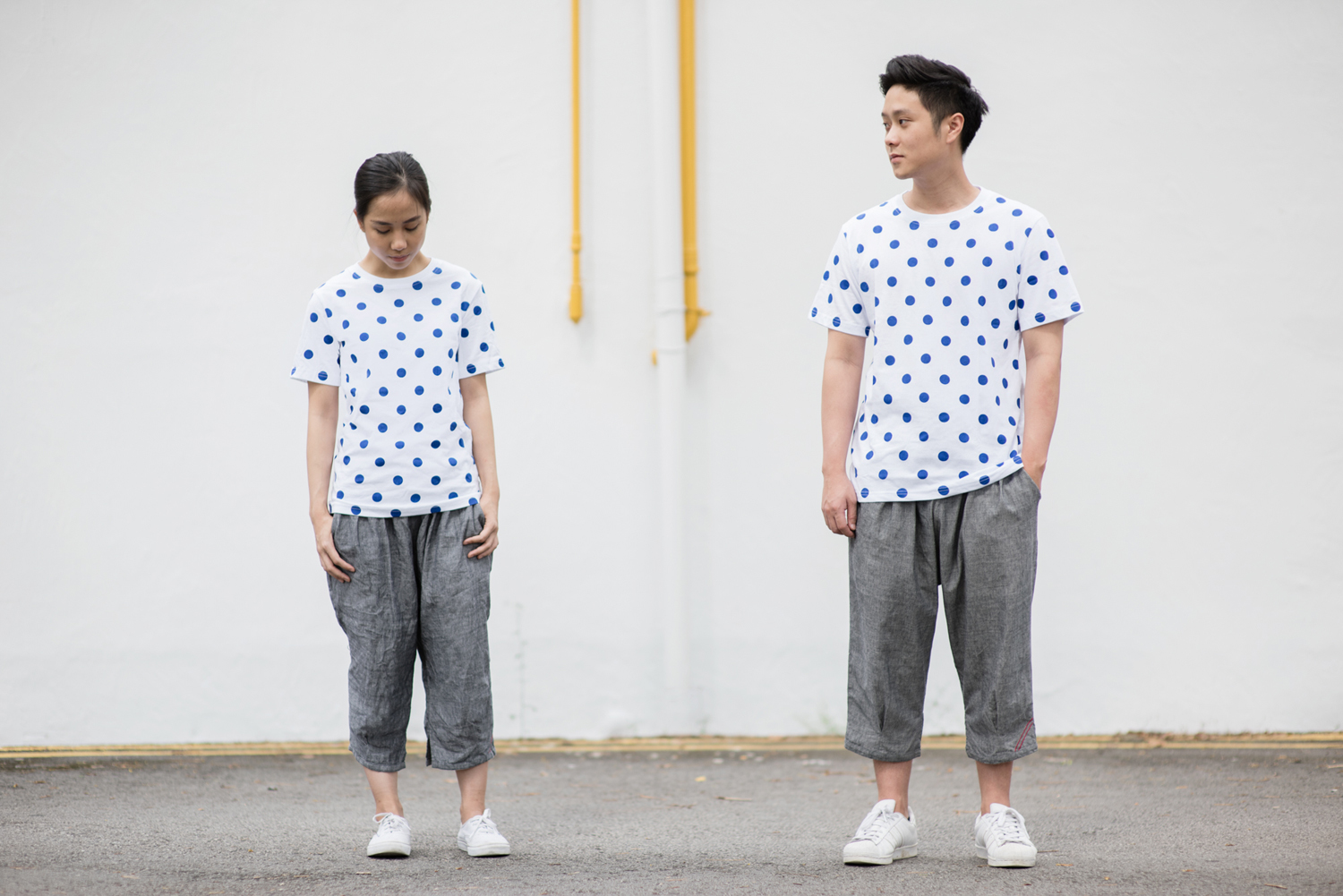
& Co. links museum shop, a food and drink retailer and cafe housed within the National Gallery Singapore. These share a brand identity designed by Singapore-based graphic design studio Foreign Policy, built around the basic foundations of modern art and design; primary colour, geometric form and repetition, and Grilli Type’s GT Pressura. This runs across and unites a variety of printed materials that includes, but is not limited to, vouchers, packaging, swing tags, uniforms and posters. Although launched in 2015, Foreign Policy recently documented and published the work, which coincided with the launch of their new website.
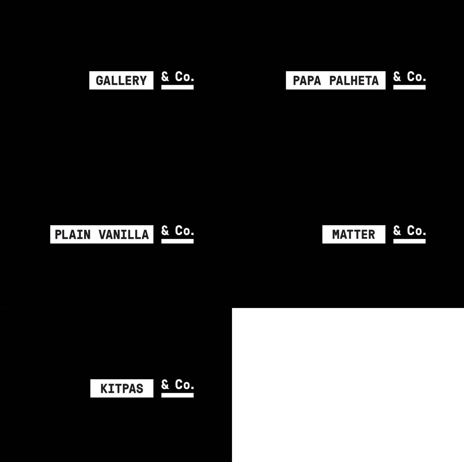
& Co. is a creative business partnership with collaboration at its core. This is expressed by the two part nature of the logo that unifies, in a simple manner, a variety of partners that cover fo0d, drink and products. Diversity of partnerships is managed through the neutrality of Grilli Type’s GT Pressura, utilitarian in its inspirations, letter shapes and monolinear build. It also has a technicality in form and spacing that resonates with, but also sits well over, some very busy pattern work.
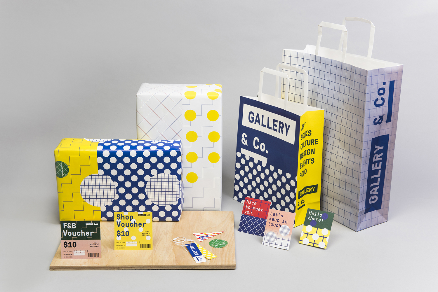
It is worth having a look at the Gallery & Co. shop and cafe here and getting a better sense of the architectural and space of National Gallery Singapore here to better contextualise the work, as isolated it appears busy and not the best measure of its appropriateness.
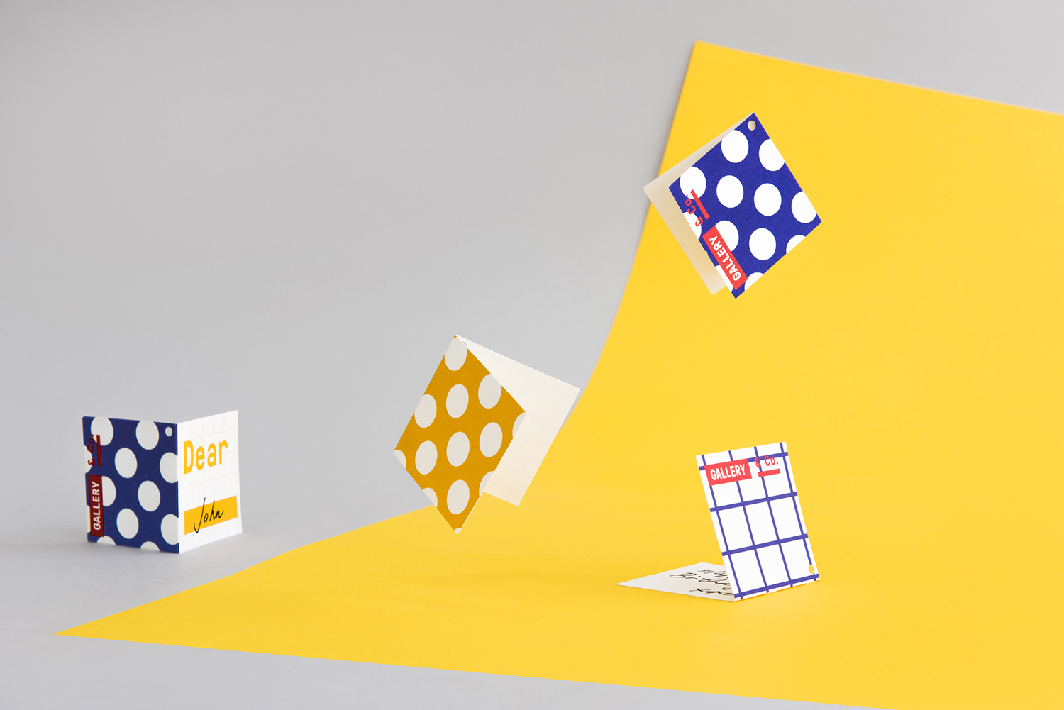
The design language references primary elements used in art and design. Lines and dots, circles, squares and triangles, and a palette of primary colours are mixed and matched to create a multitude of vibrant, bold and contrasting patterns. Although these secure an unmistakable visual impact, they are also grounded in a concept that looks to articulate the collaborative spirit of & Co. and draws a line between the retailers and the more expected and conservative brand identity of gallery.
National Gallery Singapore is an interesting space where robust and imposing historical structure meets lighter and more modern architectural additions. Gallery & Co.’s visually identity is in stark contrast to the historical but shares something in common with the more recent.
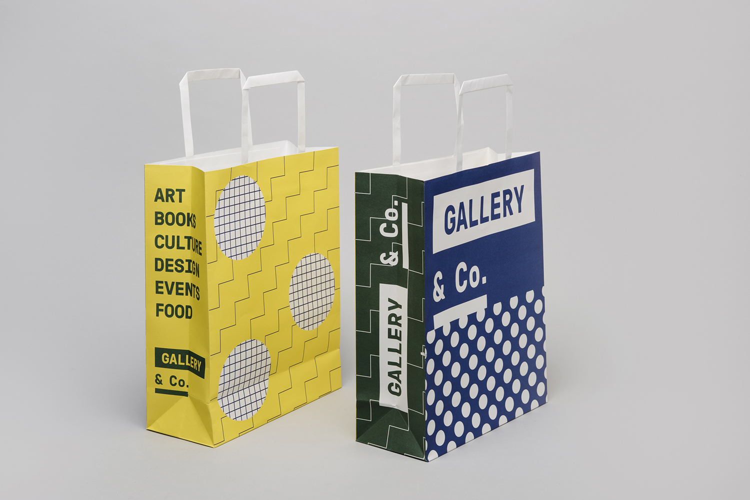
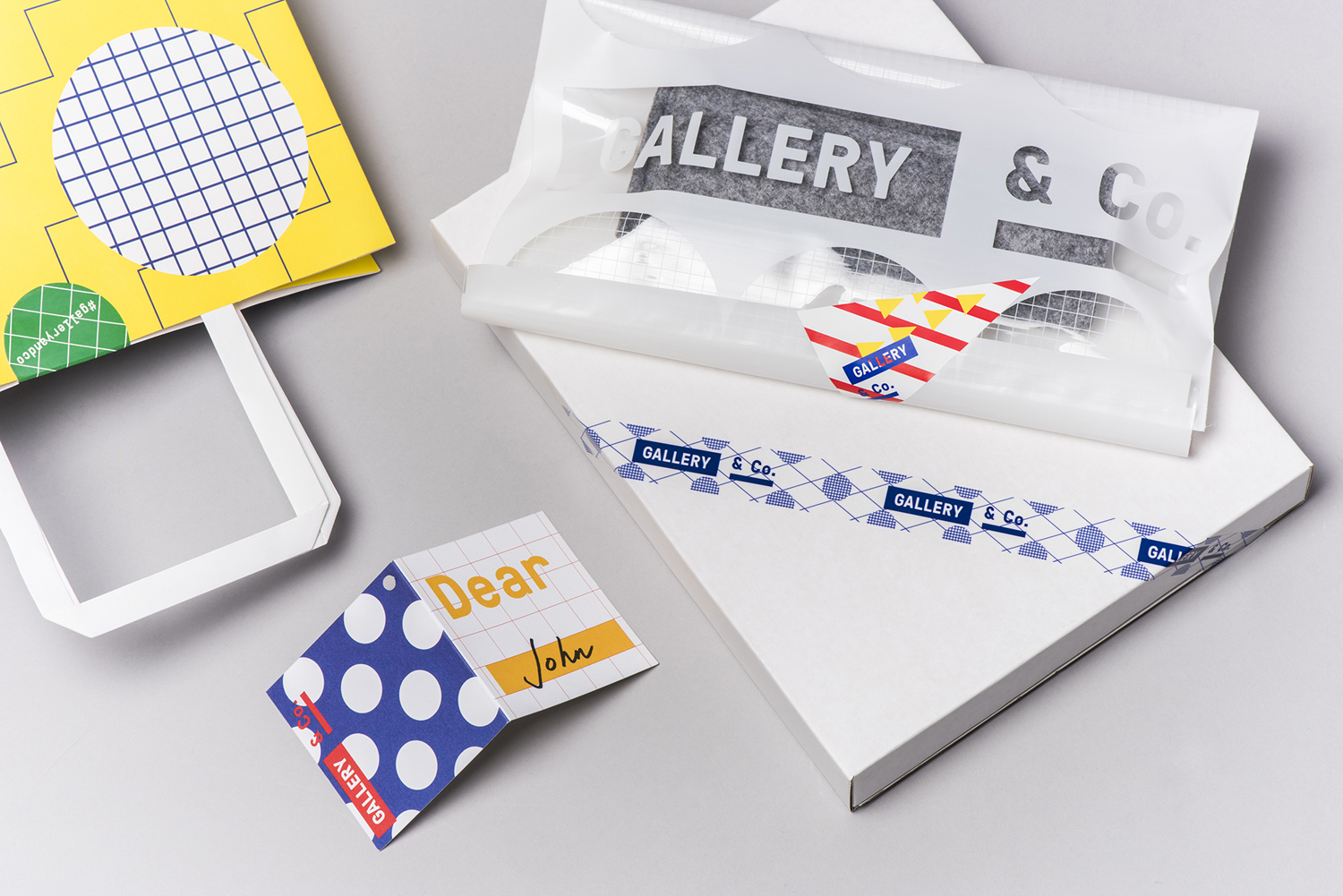
Foreign Policy’s work for Gallery & Co. subverts expectations. Where there can often be a preference for restraint and nuance in the world of contemporary art, here there is a favour for the loud and the noticeable. It is worth reiterating, this is for the shops and cafe of the gallery and not the brand identity of the gallery itself. It is a large space, and the unifying of retailers within gallery is an interesting approach.
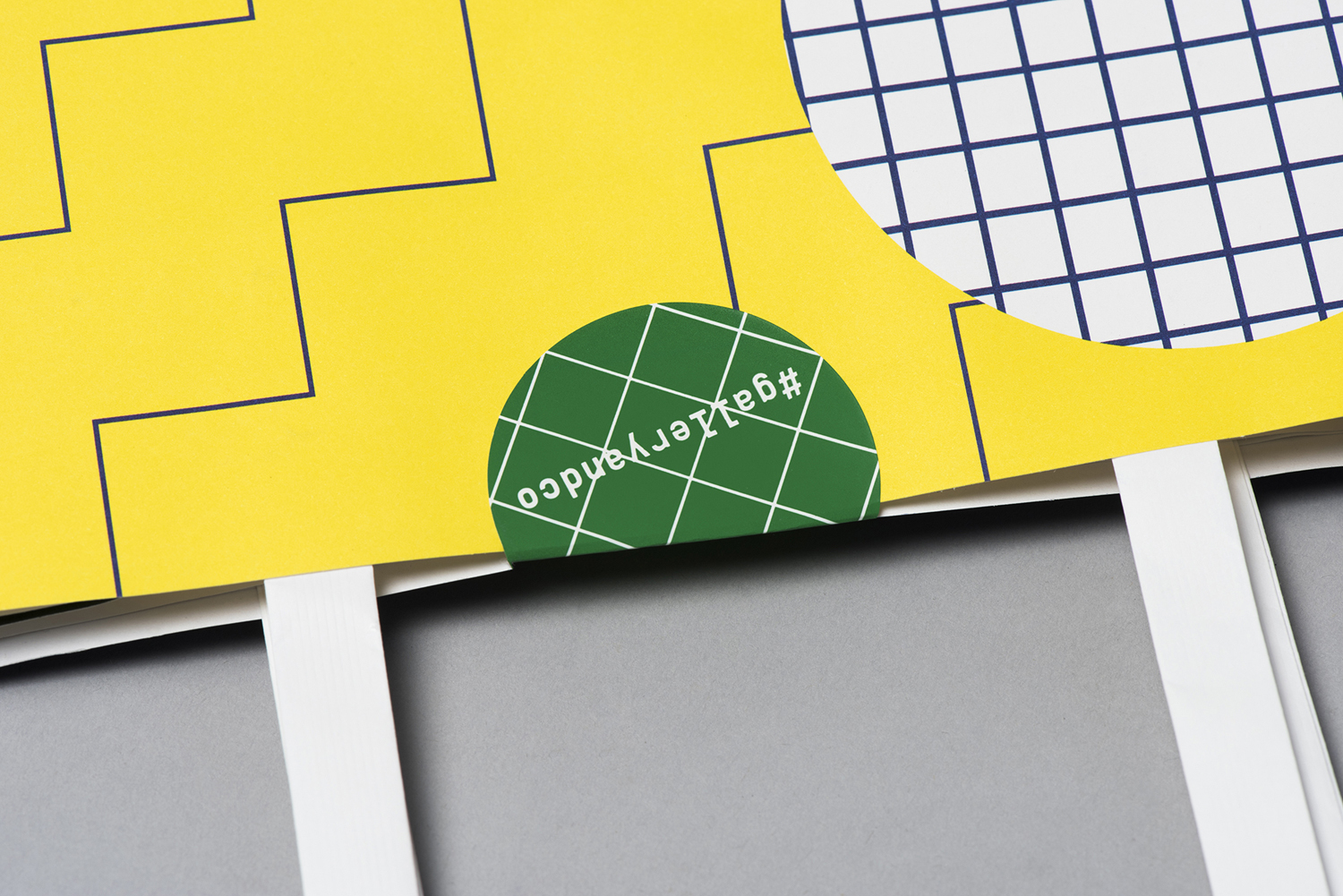
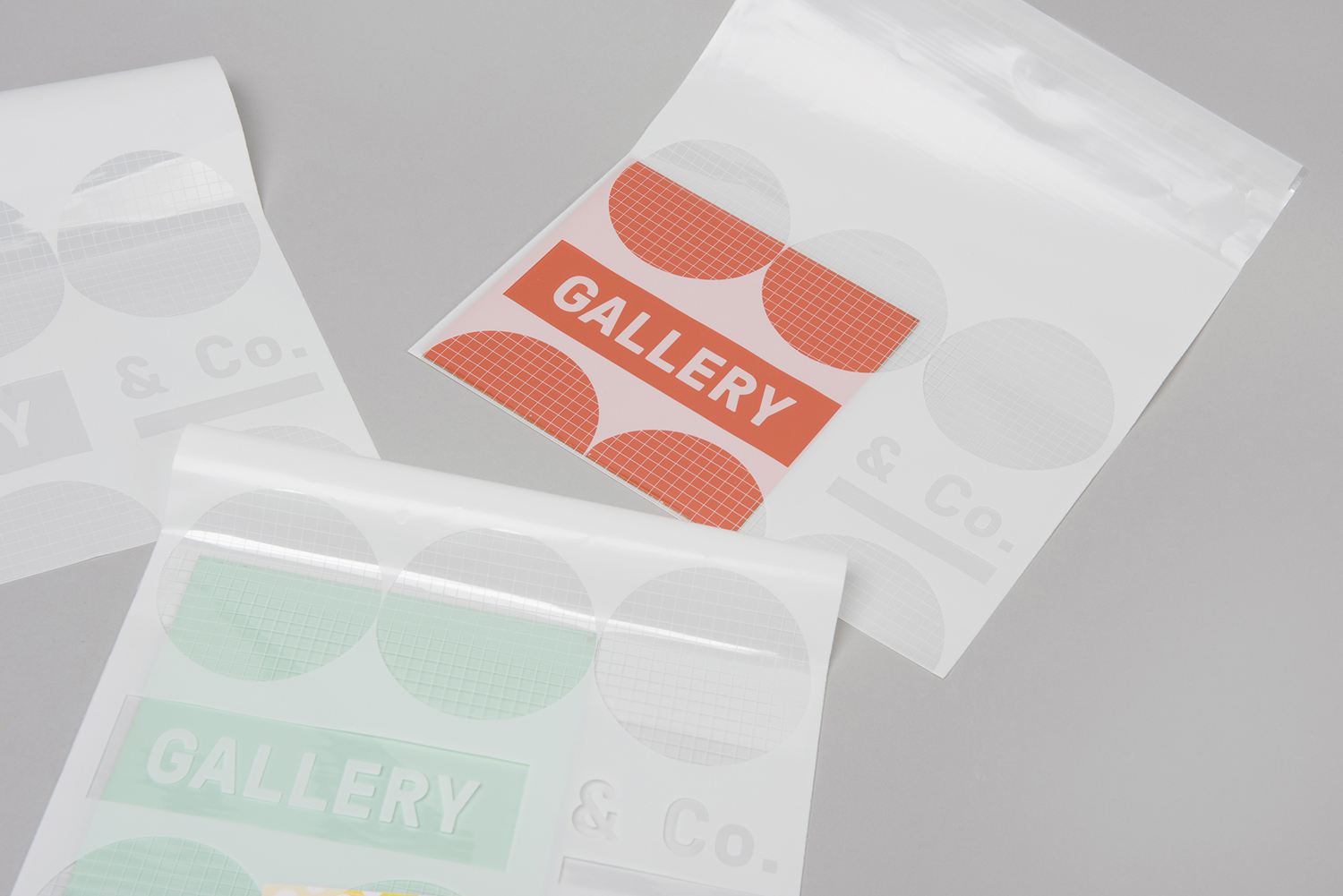
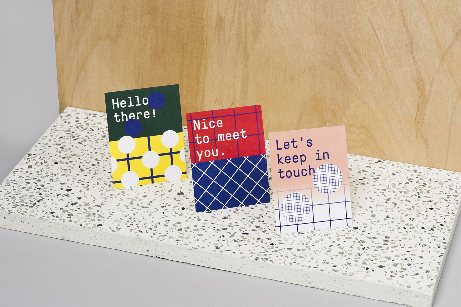
The work is impactful and memorable, and has a clearly discernible concept that looks at some fundamental principles that are the foundation to many of the more interesting and complex works held within the gallery and the idea of shared identity and collaboration. It is not particularly sophisticated but it is cheerful. Although it appears busy here, environment provides a counter point and some space between many of the assets, and offers an unexpected moment to a more natural colours and materials of cafe experience and plays out in the shapes and prints of the displays of the store. More from Foreign Policy on BP&O.
Design: Foreign Policy. Opinion: Richard Baird. Fonts Used: GT Pressura.
