ShopAround by Design by Toko
Opinion by Richard Baird Posted 27 January 2017
ShopAround is described as a creative supermarket, however, in more conventional terms, began as an artist representation agency in 1998. It has grown, since then, to become a creative production agency specialising in contemporary illustration, graphic design, animation, motion graphics and interactive design. ShopAround co-ordinates a network of over 80 international freelance designers, and fosters new creative talent from its offices in New York, Amsterdam and Rotterdam.
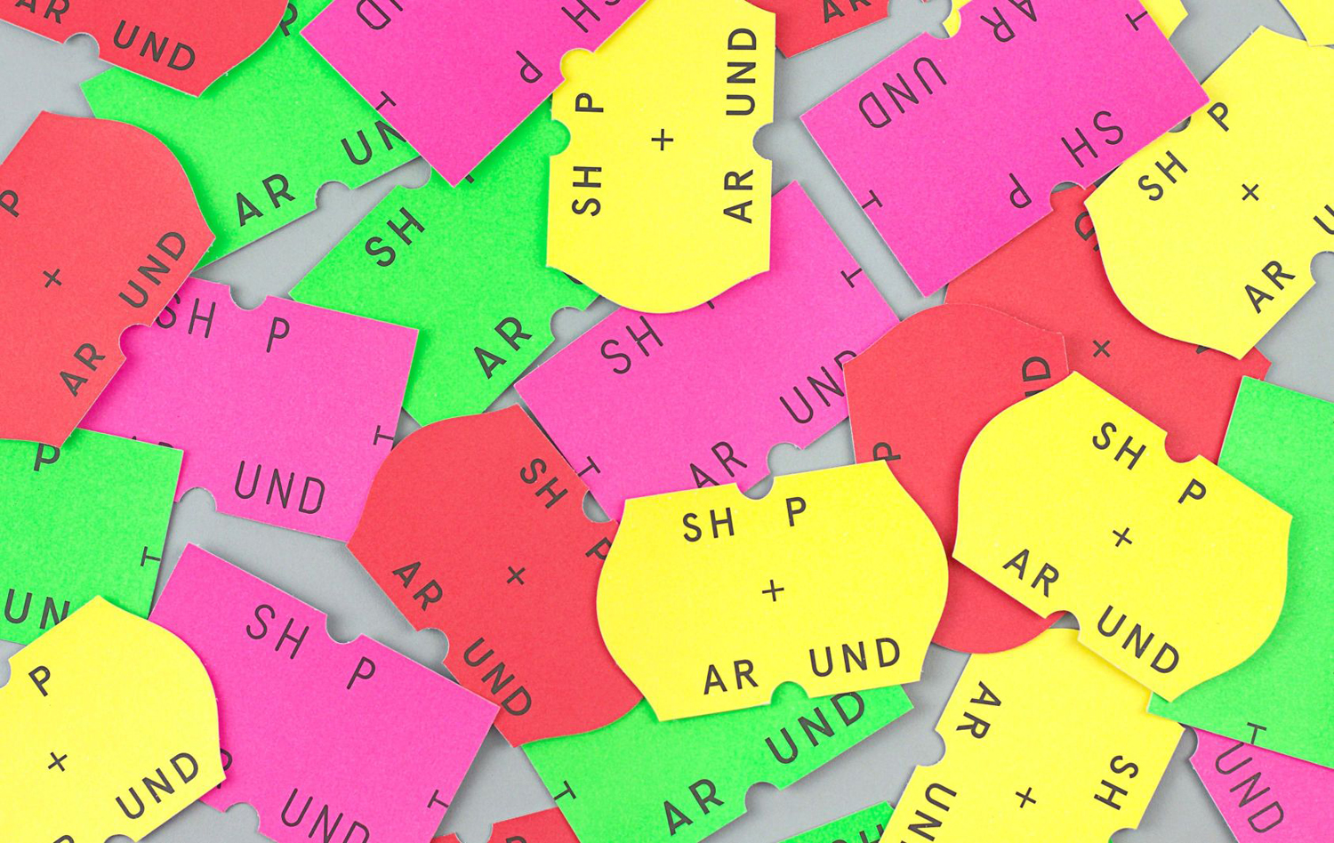
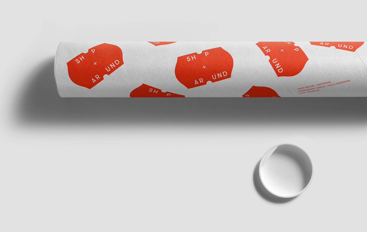
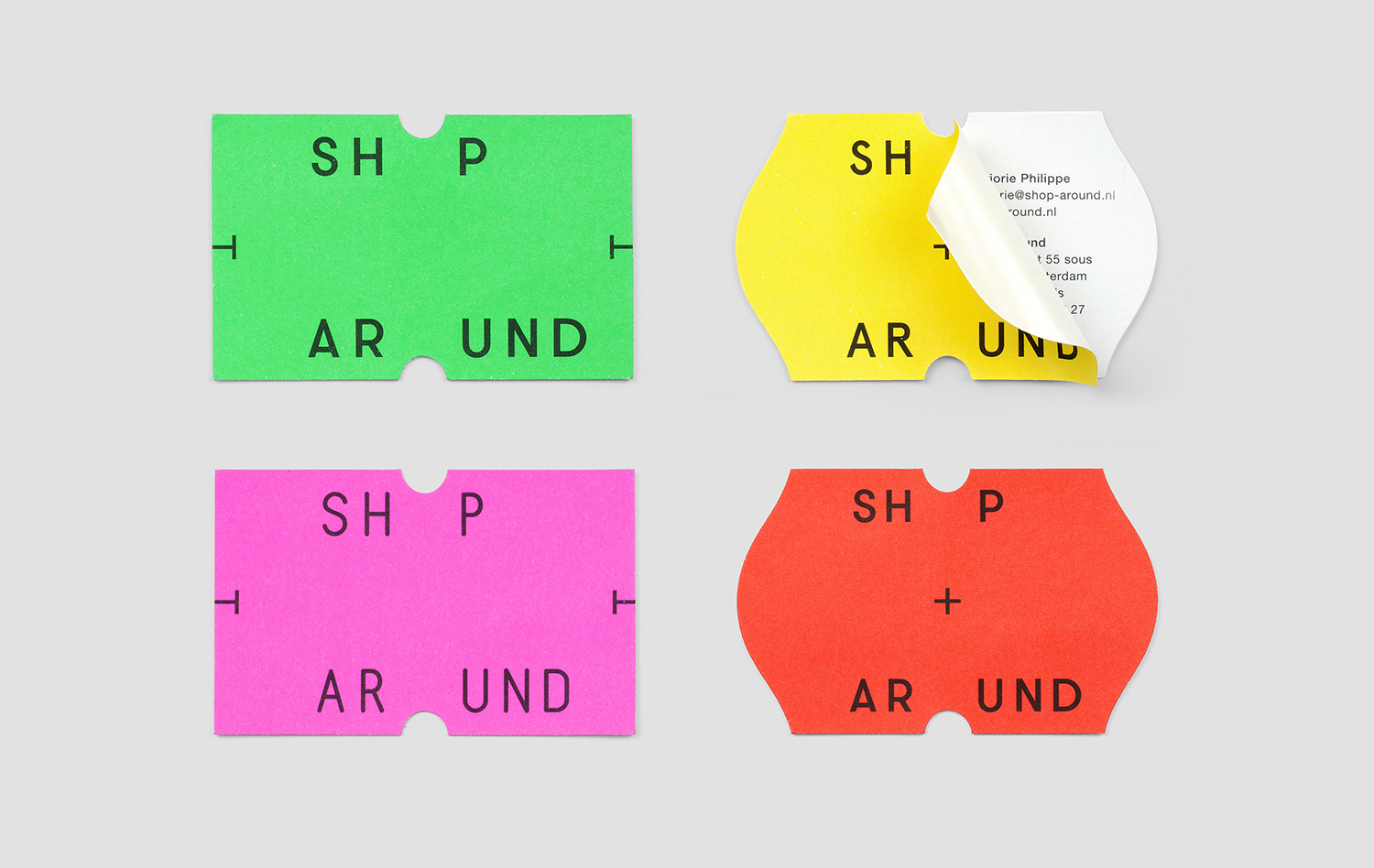
ShopAround worked with Sydney-based Design by Toko on a new visual identity. This appropriates the visual vernacular associated with independent supermarkets and small gift shops. Multi-colour and shape are the basis of identity, with a referential quality that is playful and distinctive in its new context and proportionality. This links business cards, stickers and tote bags, with an updated website soon to follow.
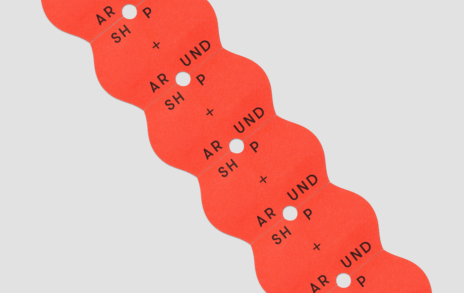
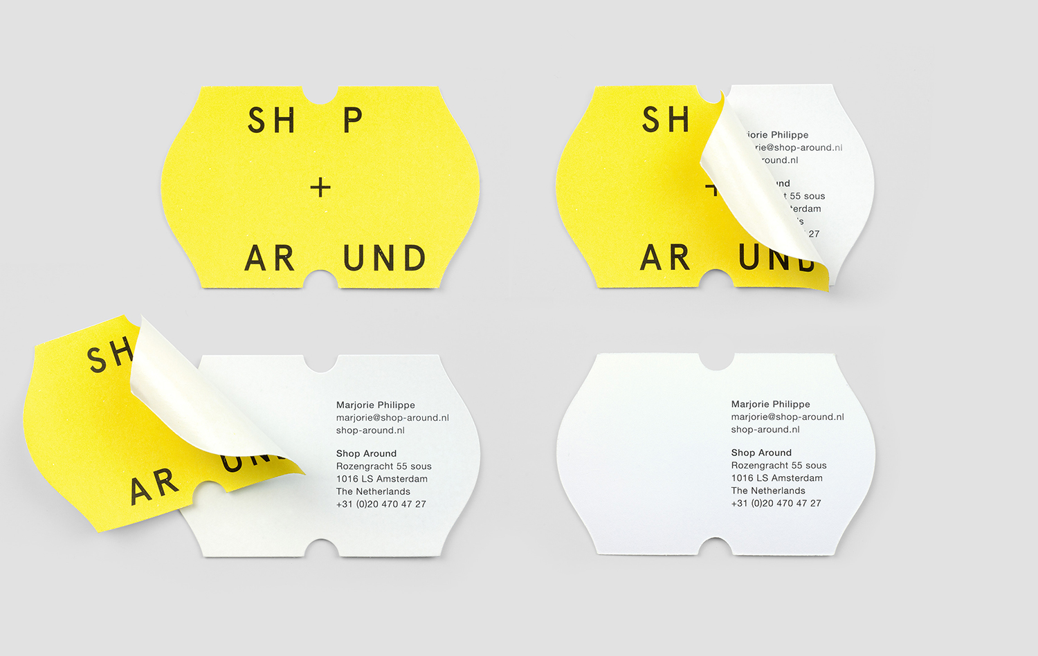
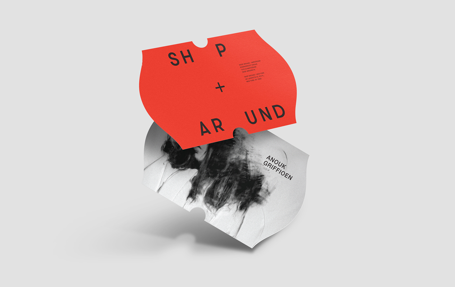
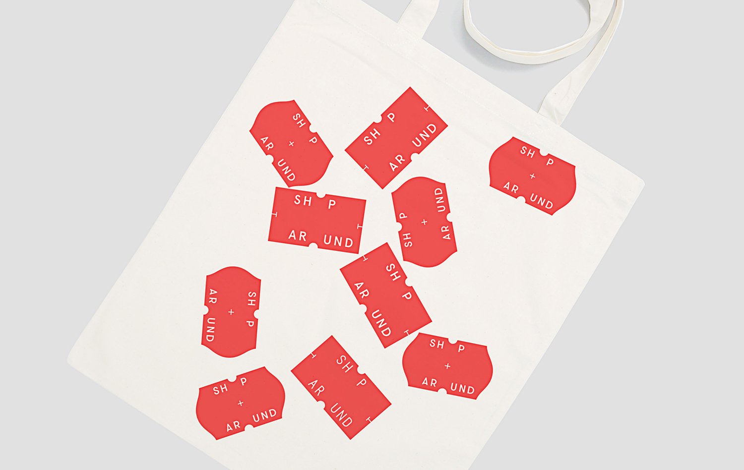
Design by Toko takes the shapes defined by a mechanical labelling process, an intentionally garish (but functional) high contrast fluorescent colour palette, and the utility of a monospaced typeface and place these within a new context in which to represent a creative service, a process far from the mechanical, where shape, colour and type is more that just a product of practicality, contrast and legibility. In this appropriation, contextual subversion and scaling up, the ubiquitous becomes the distinctive and unique. Other details include the use of stickers, and how the die cut forms the Os of Shop Around. More work by Toko on BP&O.
