Trika by Bunch
Opinion by Richard Baird Posted 14 February 2017
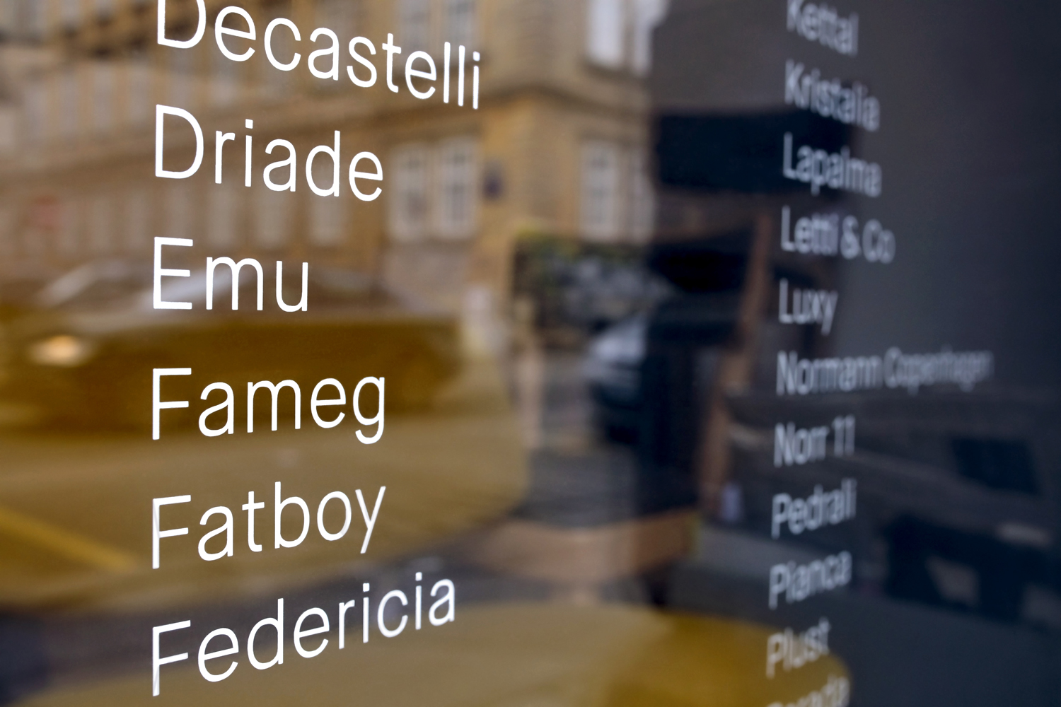
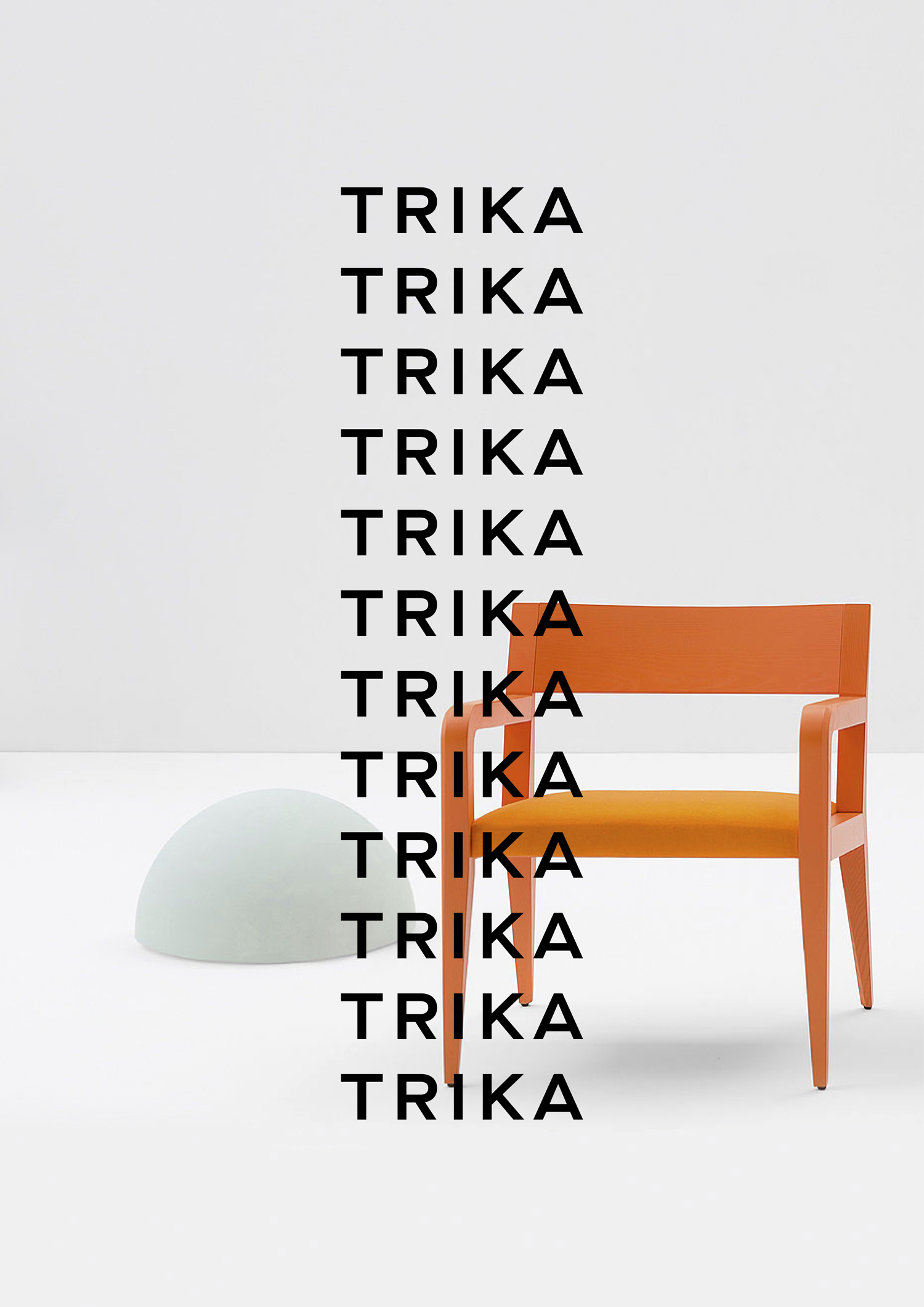
Trika is an interior design company, working on both public and private spaces, with a showroom and studio in the Croatian capital of Zagreb. They represent furniture and equipment manufacturers such as Billiani, Enea and Federicia, amongst many others, whose brand names are described as being synonyms for quality, comfort and design.
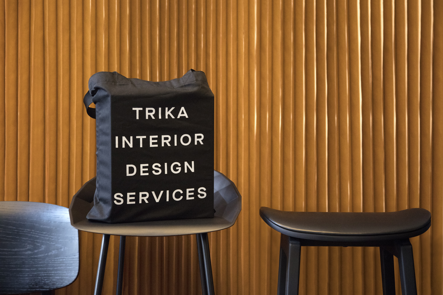
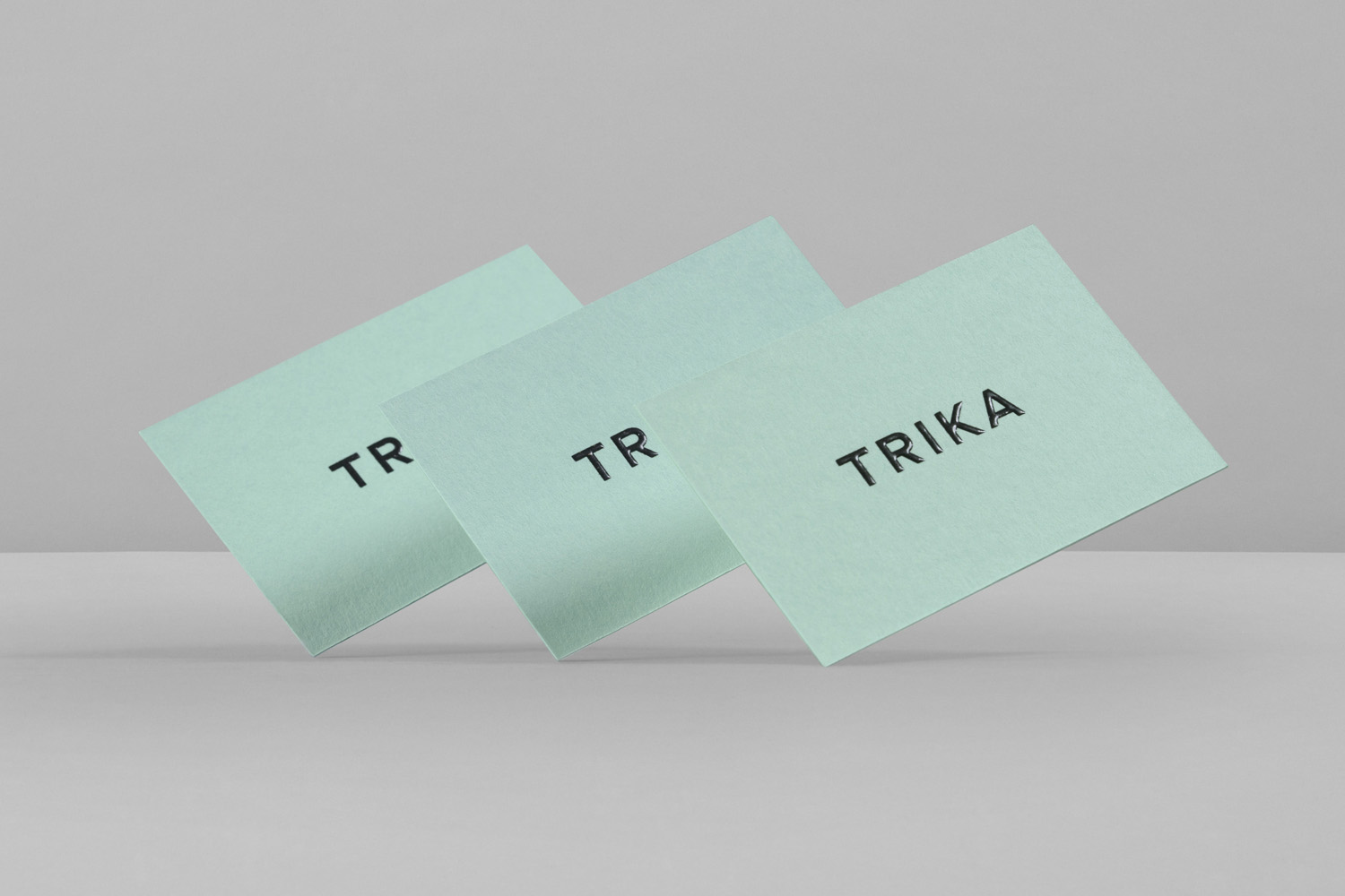
Graphic design studio Bunch worked with Trika to develop a new brand identity. This included logotype, business cards, notebooks, tote bag and website. Bunch’s work frames some lovely project photography and distils down modern contemporary interior and furniture design into a simple and functional graphic expression, elevated by material detail.
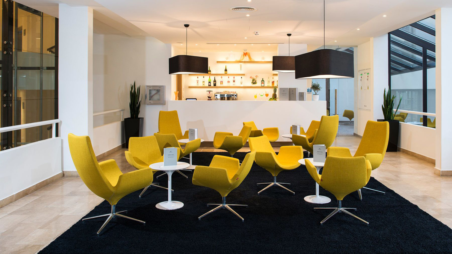
Drawing on a wide palette of furniture, Trika has outfitted a number of hotel’s, inside and poolside, as well as bars and restaurants in and around Zagreb. Each project is characterised by a strong sense of modernity in its mix of functionality, spacial awareness, colour and materiality. Although built from few assets, you can see this reflected within Trika’s brand identity.
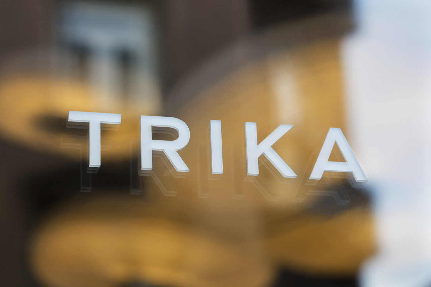
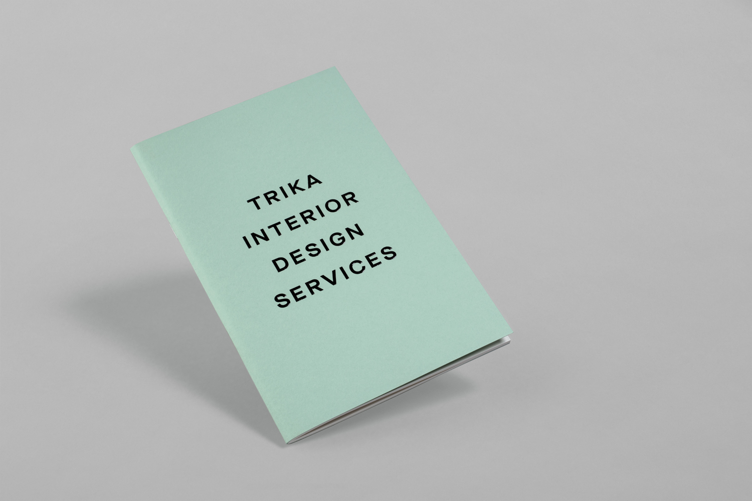
Type is modern, reductive and functional in its monolinear characters and geometric forms. While name is compact, the breadth of Milieu Grotesque’s soon to be released Maison Neue Wide and Bunch’s generous letterspacing gives logotype a weight and presence. This continues in its implementation; centre-aligned and afforded plenty of surrounding space. This, alongside colour and finish, links business cards, notebooks and tote bags, and anchors a website of image. Although not hugely distinctive, presumably naming delivers on this, lettershape and line, space and structure, feel rooted in the basic principles of interior design.
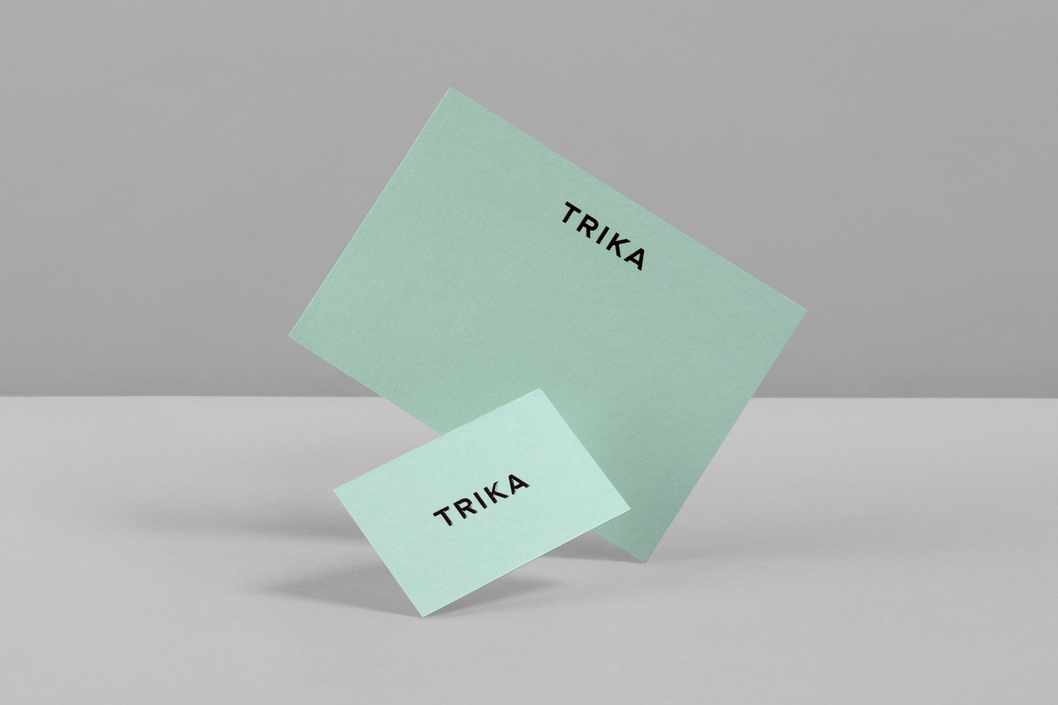
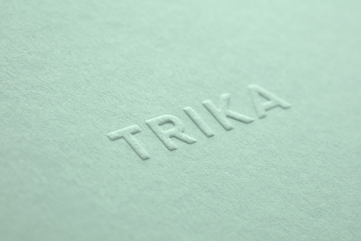
A good quality, uncoated and dyed board, and the raised finish of thermographic ink and blind embossing bring an unexpected material quality to something that is otherwise graphically economical, while a consistent use of G.F Smith’s Colorplan Park Green calls to mind the focal point contemporary feature furniture often provides.
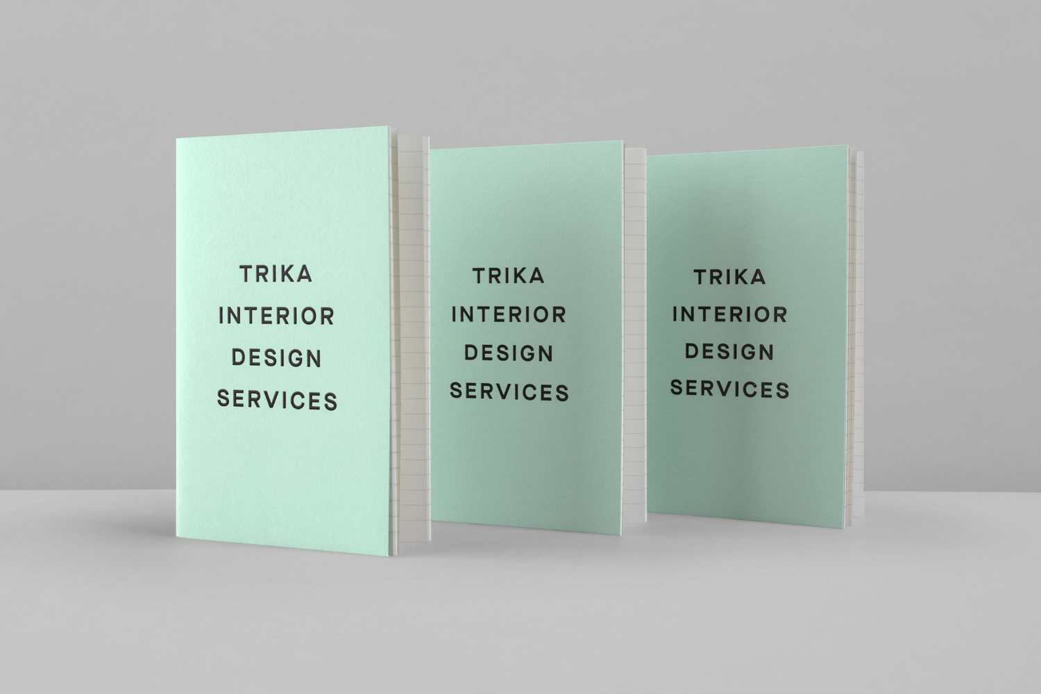
Bunch’s work, in its simplicity of type and finish, finds a balance between practicality, materiality and modernity, and much like a gallery, works well to frame and not detract from Trika’s portfolio online, and deliver impact in print. More work by Bunch on BP&O.
Design: Bunch. Opinion: Richard Baird. Fonts Used: Maison Neue Wide.
Material & Print Specifications:
G.F. Smith Colorplan Park Green 350gsm
Thermographic Ink
Blind Embossing
Screen Printing
