The Best of BP&O — April 2017
Opinion by Richard Baird Posted 1 May 2017

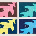
April’s highlights included Midday’s packaging for fermented raw food company Hurly Burly and Here Design’s brand identity work for London-based for catering company Rocket. However, there were five projects that stood out, and have made it into BP&O’s Best Of Series.
This feature brings together some of the most thoughtful and distinctive projects published on BP&O each month for another opportunity to be seen and shared. These typically balance a strong concept with a compelling aesthetic and clear communicative intention that appropriately plays with form, colour, type and layout, as well as material, texture, image and print finish.

Superfly by B&B Studio, United Kingdom
Superfly is a new limited edition non-alcoholic cocktail, and collaboration between celebrated mixologist Ryan Chetiyawardana, aka Mr Lyan, and naturally revitalising UK juice drink brand Firefly. The cocktail blends redcurrents, aronia berries and grapefruit with botanicals that include green coffee, angelica, wormwood, kola nut and cascara. It features a unique packaging design by London-based B&B Studio that wraps Firefly’s distinctive structural design with bespoke botanical illustration. Superfly will be rolled out in April, initially as a Selfridges exclusive and through Mr Lyan cocktail bars, followed by a wider UK release in May.
See more of this project here

Somm by Frost, Australia
Somm is a limited edition Australian Shiraz from Niche Wine Co., a winery that embraces an innovative dry farming process that yields fewer yet higher quality grapes with an intensity of flavour and colour. With a desire to convey an established, old vineyard feel, and a sense of heritage and sophistication, Niche Wine Co. worked with Sydney-based design studio Frost to develop name and packaging.
Inspired by the sommelier, a trusted and knowledgeable figure in the world of wine, Frost developed an idea based around the sommelier’s notebook, literally translating the spontaneity, insight and personable qualities of this directly onto label and tissue paper, then packaging bottle into bespoke wooden box.
See more of this project here

Finland 100 by Kokoro & Moi, Finland
This year Finland celebrates its centenary and will mark the occasion with a broad programme of events created and supported by a wide range of stakeholders. Based around the theme of “Together”, and with the intention of creating a cohesive and useful system to unite events and initiatives from local councils and independent organisations and businesses, Scandinavian design studio Kokoro & Moi created “Finland’s Faces”, a brand identity made up of an extensive and diverse library of faces, drawn in a variety of styles.
With a desire to be inclusive Kokomo & Moi also developed an online platform and complimentary app with developer Great Apes as a strategic part of brand identity. This invites Finns and friends of Finland to participate and edit selfies into unique cartoons, to share these via the social media or submit these to be part of the ‘Finland’s Faces’ collection. These will be used as part of event communications throughout the year.
Alongside print communications and packaging, Kokoro & Moi also developed advertising and several other projects that make up Finland 100. These included product, spatial and interactive design, working in collaboration with Miltton Creative.
See more of this project here

Disrepute by Two Times Elliott, United Kingdom
Disrepute is a members-only bar, located in London’s Soho, described by Two Times Elliott, the design studio behind its brand identity, as having a heritage of “establishment and scandal”. The bar features a rich interior design of high quality material detail that elegantly plays with shape, pattern and symmetry, solid colour and texture, the geometric and the organic. There is an element of period theatricality, yet a contemporary eye for unique character, comfort and continuity throughout.
Two Times Elliott’s brand identity takes these qualities and focuses them into a quieter but distinct brand identity expression that favours commonality and, taking inspiration from Soho’s “most notorious eras of concealed communications and discrete symbols”, layers this with a narrative component that calls to light the loves, intimacy and people of the venue’s past, alongside a historical notoriety, one of secrecy, seduction and the clandestine.
See more of this project here

Summerhill Market by Blok, Canada
Summerhill Market is a family-run business, managed by the third generation, with premises on Toronto’s Summerhill Avenue and a smaller location—a floral boutique—on Mt. Pleasant Rd. The store has 200 employees, a butchers, bakery and deli, a BBQ in the summer and offers a variety of catering services.
Summerhill Market is admired for its high quality products, and its ability—since 1954—to consistently redefine what it means to be a boutique grocery store. Its commitment to quality is reflected in its extensive range of own-brand products, developed by an in-house executive chef and a team of 80.
With the intention of giving the store a more contemporary voice whilst maintaining its warmth, Canadian studio Blok developed a new brand identity of pastel colour, sans-serif type, moments of illustrative texture and a labelling system that links an extensive line of own brand products. As well as this, Blok also delivered assets that included business cards and stickers, packaging, branded tote bag and notecards.
See more of this project here