O/O Long Boil Barley Wine by Lundgren+Lindqvist
Opinion by Richard Baird Posted 26 May 2017
O/O Brewing is a craft brewery set up in 2011 by Olle Andersson & Olof Andersson. They presently operate out of the facilities of Stigbergets Bryggeri in the Swedish city of Gothenburg, but are due to open their own brewery in the Autumn of 2017, with the intention of increasing volume and gaining further control over quality.
O/O worked with Scandinavian studio Lundgren+Lindqvist, who have created packaging design for a variety of other O/O beers, to develop labelling for a new series of limited editions that will be sold once a year. The first of these will be Long Boil Barley Wine. Despite the name, Long Boil Barley Wine is a beer and, unlike O/O Brewing’s other products, will be aged, allowing it to develop a new complexity in a similar way to wine.
Rather than collaborating with artists and designers, an approach that characterised much of the labelling of O/O’s previous ranges, and with a desire to express something of the higher price point and ageing of the beer by making a connection with Champagne and wine, Lundgren+Lindqvist developed a typographical system of condensed characters for impact, provides room for date, sets these within a grid, and compliments this with playful but communicative art direction of product photography.
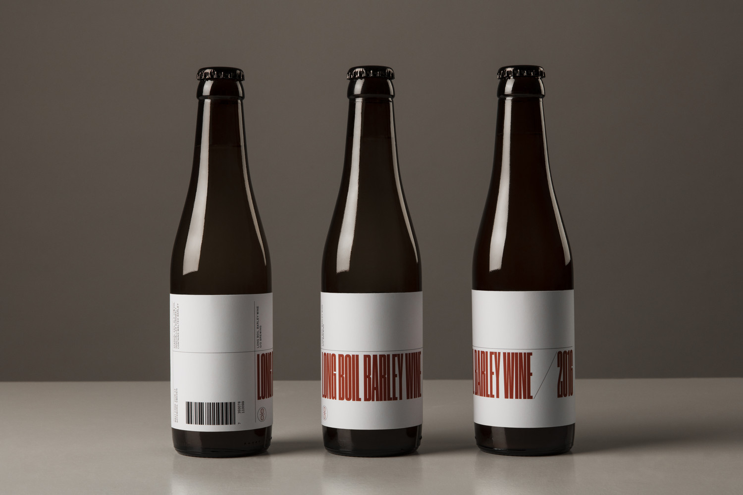
There are two components to this project, labelling and the art direction of product photography. For the sake of brevity, it is perhaps worth taking a look at what preceded these here, to get a better sense of the difference and continuity that each provides, respectively.
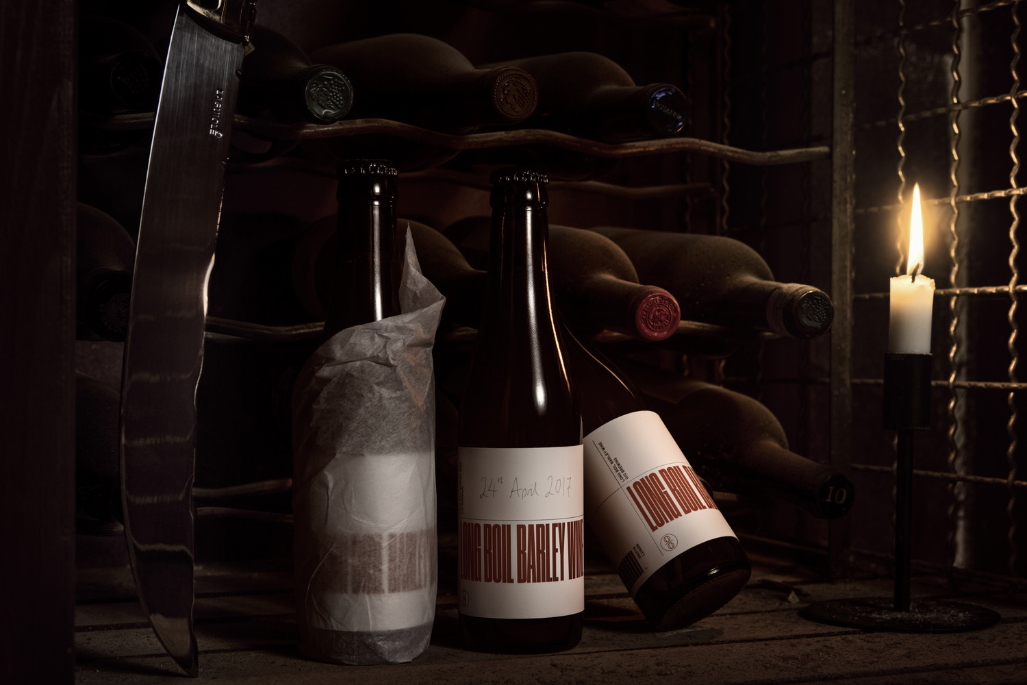
Labelling plays with a current favour for condensed type. It allows for a large headline that delivers an initial impact and detail up close, whilst making sure that the system can accommodate releases with different name lengths in the future. There is a pleasant relationship between condensed type and barcode, fine and heavy lines, and a nice balance of solid type and empty space, with room to chalk up date, written large enough to really emphasise its aged nature.
Previous ranges made a direct connection with art and craft through the collaboration with artists and designers, and a strong use of image. The condensed characters of Commercial Type’s Druk, where legibility is challenging from a distance, now becomes a form of image. Combined with an observable grid, a mix of type orientation, and an interesting balance of positive and negative space, plays with the visual lexicon of modern art and design promotion. The idea, to make a connection between beer craft and art and design, is drawn from what came before, yet the interpretation differs and functions to divide.
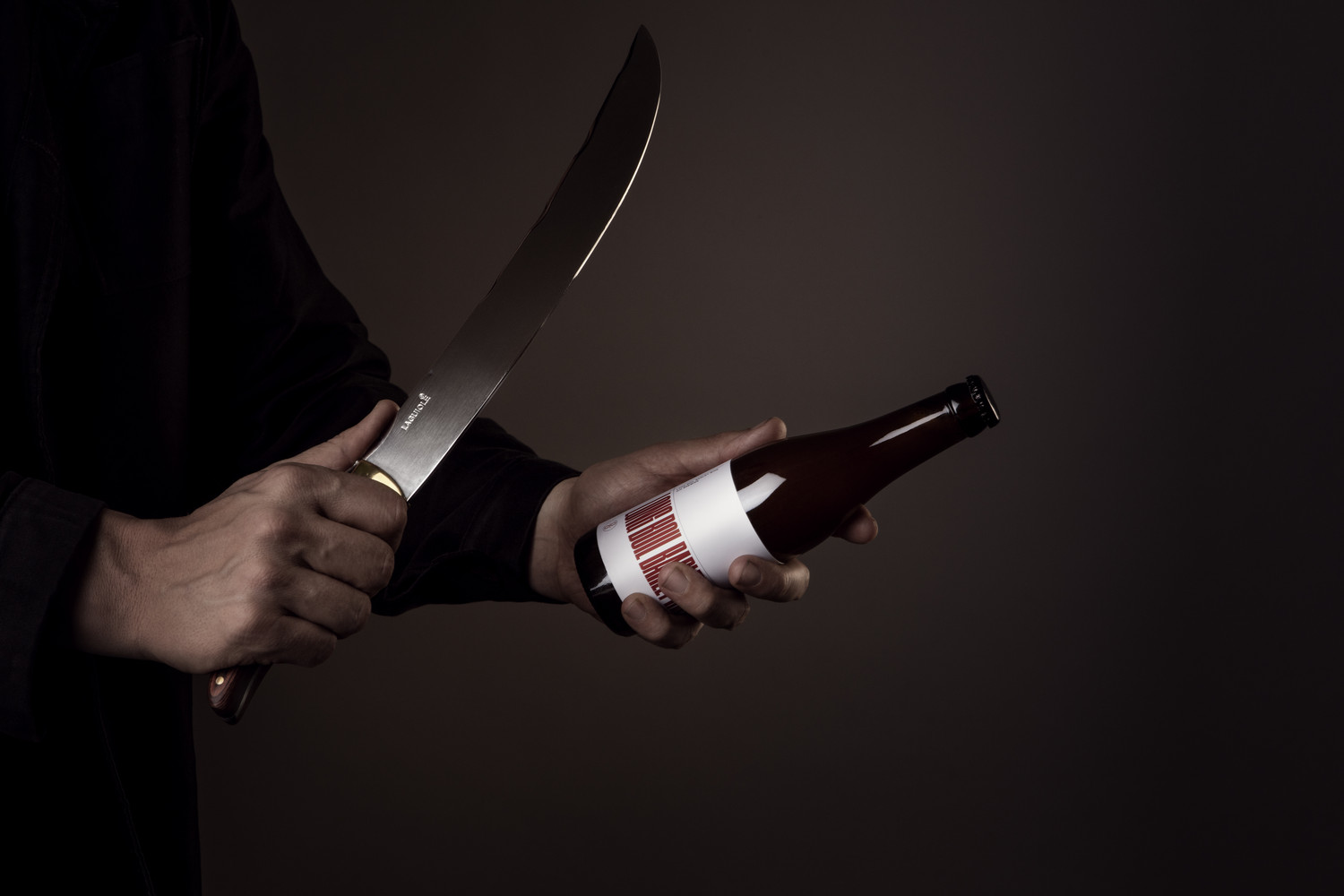
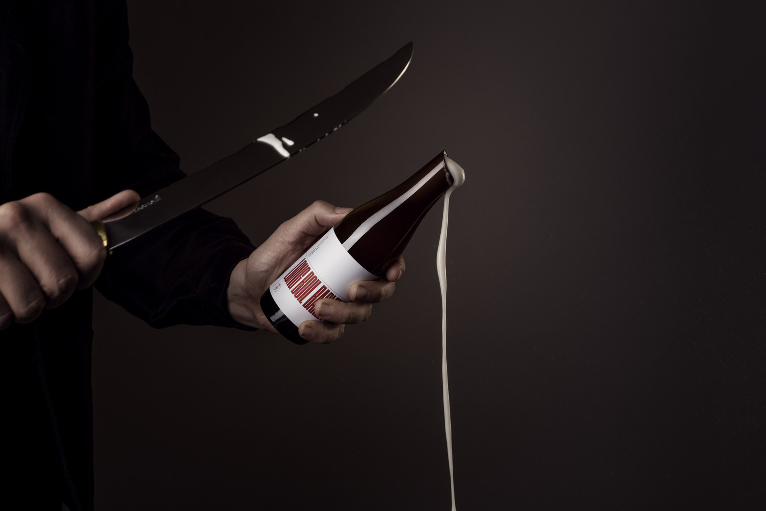
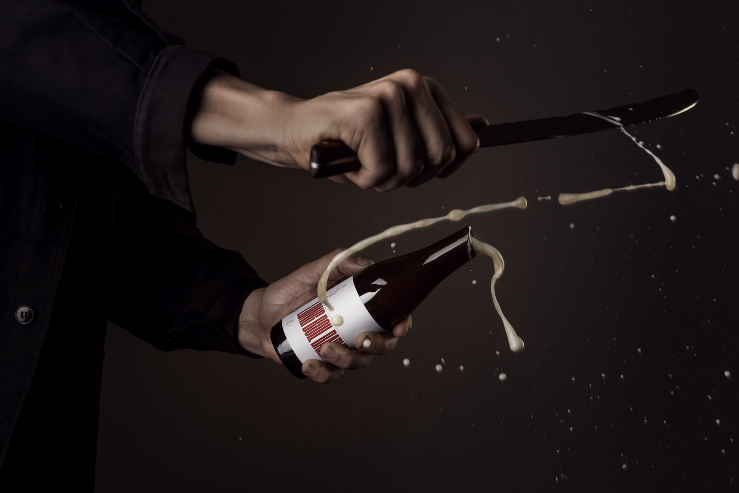
Art direction is fairly clear in its communicative intentions, making a link between wine ageing and sense of exclusivity in scene setting, which was shot in a local wine cellar, and in a three part sequence where a bottle is cut with a saber, a theatrical practice typically associated with Champagne. These are well lit, slightly tongue-in-cheek in their imagery, action and dressing, while colour works well to find a middle ground between beer and the rich and earthy qualities of wine. More work by Lundgren+Lindqvist on BP&O.
Design: Lundgren+Lindqvist. Opinion: Richard Baird. Fonts Used: Druk.
What do you think of Lundgren+Lindqvist’s packaging design work for O/O Brewing? Share your thoughts in the comment section below or get the conversation started on Twitter.
