The Best of BP&O — July 2017
Opinion by Richard Baird Posted 1 August 2017
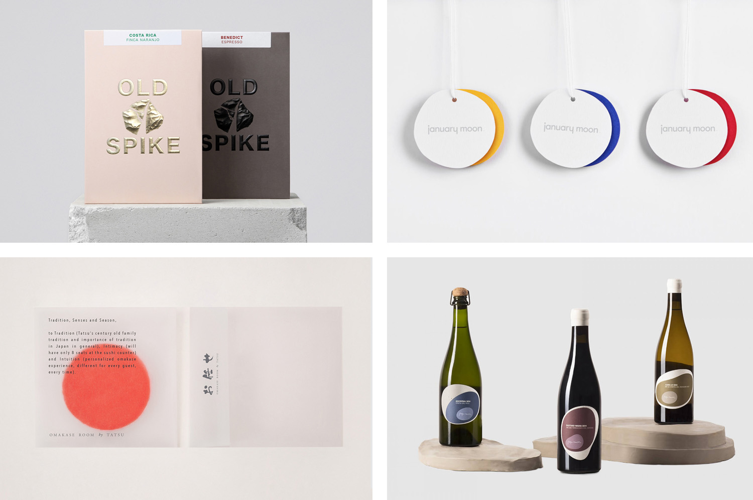
July’s highlights included Commission Studio’s work for Institute, Francesc Moret Studio’s packaging for The Living Food, and Hey’s custom typeface for literature festival Kosmopolis. There were, however, five projects that stood out, and have made it into BP&O’s Best Of Series. These typically balance a strong singular concept, or an appropriate confluence of ideas, with a compelling stylistic character and clear communicative intention that appropriately plays with form, colour, type and layout, as well as material, texture, image and print finish.
Throughout the month BP&O also continued to expand on its collections series as another way to jump through to older posts on the site. New additions include Property and Furniture. Updated projects included Bunch’s work for Galerija Kranjčar.
Omakase Room by Savvy, United States
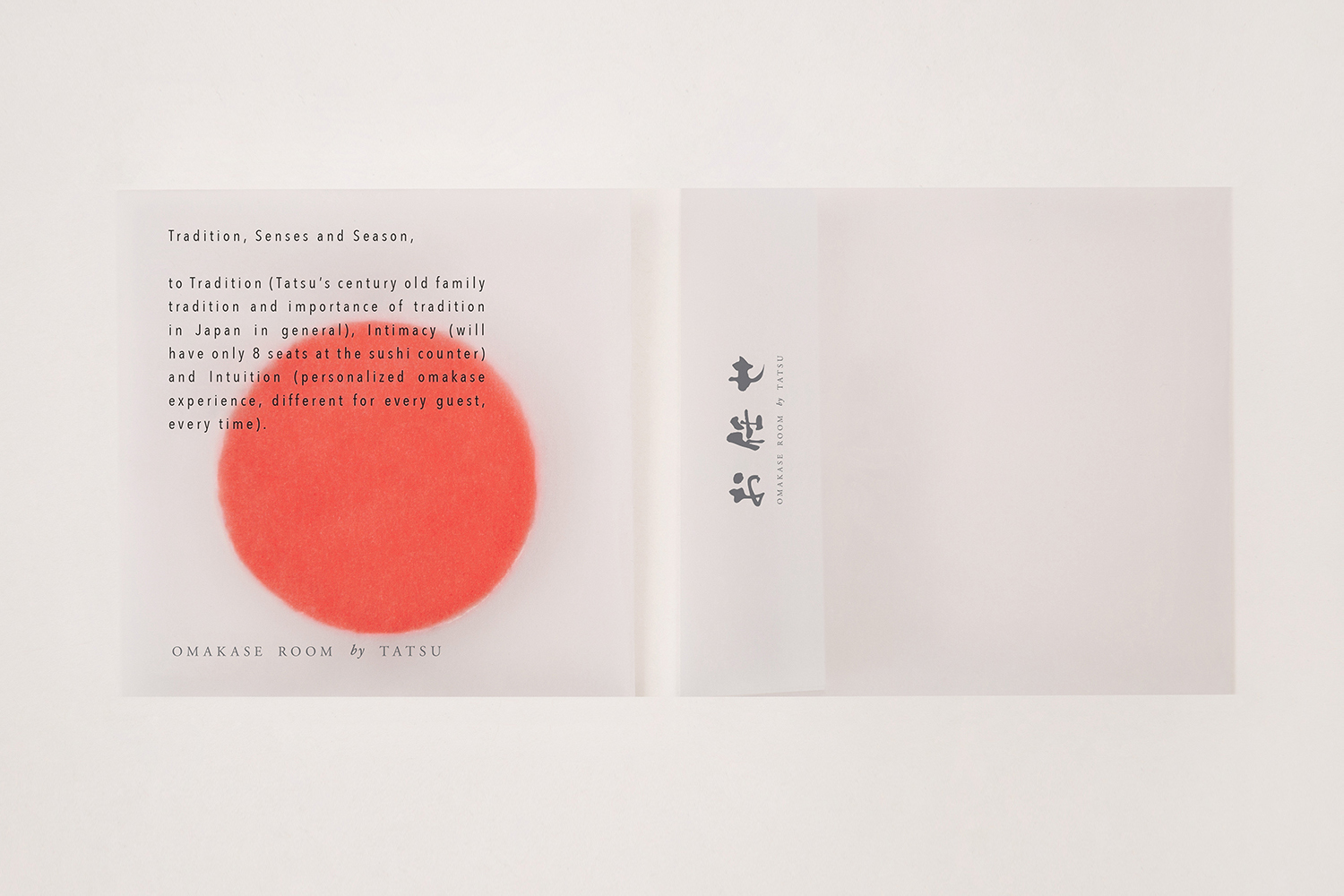
Omakase Room by Tatsu is a unique sushi dining experience located on New York’s Christopher Street. The concept is rooted in the centuries-old family traditions of Japanese Executive Chef and host Tatsu Sekiguchi and the celebration of the individual and personal. This can be experienced in the restaurant’s unique and intimate setting, one that seats only eight, and a menu carefully crafted by Tatsu for one evening and for that specific group of eight, based on their mood, curiosities and preferences.
The restaurant features a light interior design of soft bamboo and fabric centred around Japanese minimalist traditions. Materials a few but high quality, the ceiling is low, and the design of the table and layout of chairs lend the restaurant a quiet and earthy material quality with little distraction, and establish an intimacy with the chef, and focuses the mind on the food.
Building on this, design studio Savvy developed a multi-sensory brand identity, with a similar restraint, materiality and discretion. This offers something of its own subtle character but does not detract from the food, while also working in small thoughtful details such as scent and semi-transparent paper that links type with interior. The project included menus, stationery, business cards and a ceramic gift.
See more of this project here
Pepe Raventós Natural Wines by Mucho, Spain
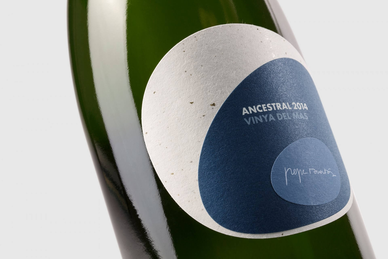
Bastard Negre, Xarel·lo and Ancestral are a small batch natural wine collection created, with minimal intervention, by Spanish vintner Pepe Raventós. Although Pepe is in charge of a vineyard that has been in his family’s hands for over 22 generations, and maintains the philosophies of his father and grandfather, this small collection was produced in the garage of his house, with the intention of crafting the highest quality wine from unrepeatable terroir.
Natural wines Bastard Negre and Ancestral, and sparkling wine Xarel·lo, are unfiltered and made without additives or sulphites, and have been produced from vines that around 50 years old. The land in which these have been grown are located at different heights and geographical positions, and made up of a variety soil compositions. This is expressed, alongside a process of minimal intervention, in the design of the wine label, created by Mucho, through the layering of paper, the use of colour and form, and material texture and composition.
See more of this project here
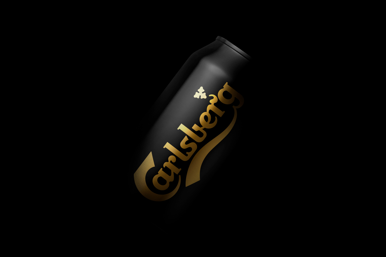
Carlsberg by Kontrapunk, Denmark
Carlsberg is a Danish beer brand founded in 1847 by J.C. Jacobsen. It is part of the Carlsberg Group portfolio which also includes Tuborg, Kronenbourg and Somersby cider, as well as Carlsberg Export and Carlsberg Black Gold. Carlsberg has a significant heritage. And, like many other beer brands, has largely conveyed this using the visual language and associated legacy of the beer bottle label, which then made it on to cans.
Carlsberg has begun a steady move towards a more current visual expression. This is characterised by a concise communicative intention and a stylistic simplicity. This can be seen, initially, in the design of the Carlsberg can for the German market, created by Copenhagen-based studio Kontrapunkt, and in the redesign of Carlsberg Black Gold, also by Kontrapunkt. Black Gold is a dark pilsner, brewed in the same manner as Carlsberg’s premium variety, only for longer, giving it a richer flavour profile and higher alcohol content. This difference is conveyed immediately using a black and gold print finish.
See more of this project here
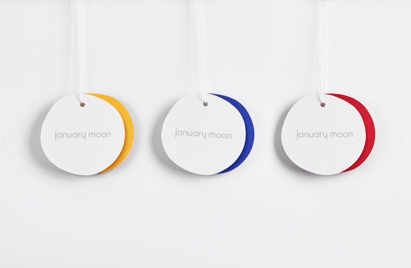
January Moon by Perky Bros, United States
January Moon is a range of contemporary teething jewellery from American artist and designer Jenny Luckett, created in response to the birth of her son and in the discovery she could no longer wear her favourite pieces. The range intends to satisfy the stylistic sensitivities of modern mothers while also aiding their child’s development. The range is characterised by a variety of large soft forms of both natural material detail and bold contrasting colour. Drawing on these qualities and inspired by the phases of the moon and Matisse, graphic design studio Perky Bros created a visual identity for January Moon rich in pattern, colour and hand cut shapes. This finds a balance between modern art and craft, and what the studio describe as a child-like wonder, and links a variety of assets that included hang tags, packaging, stationery and business cards.
See more of this project here
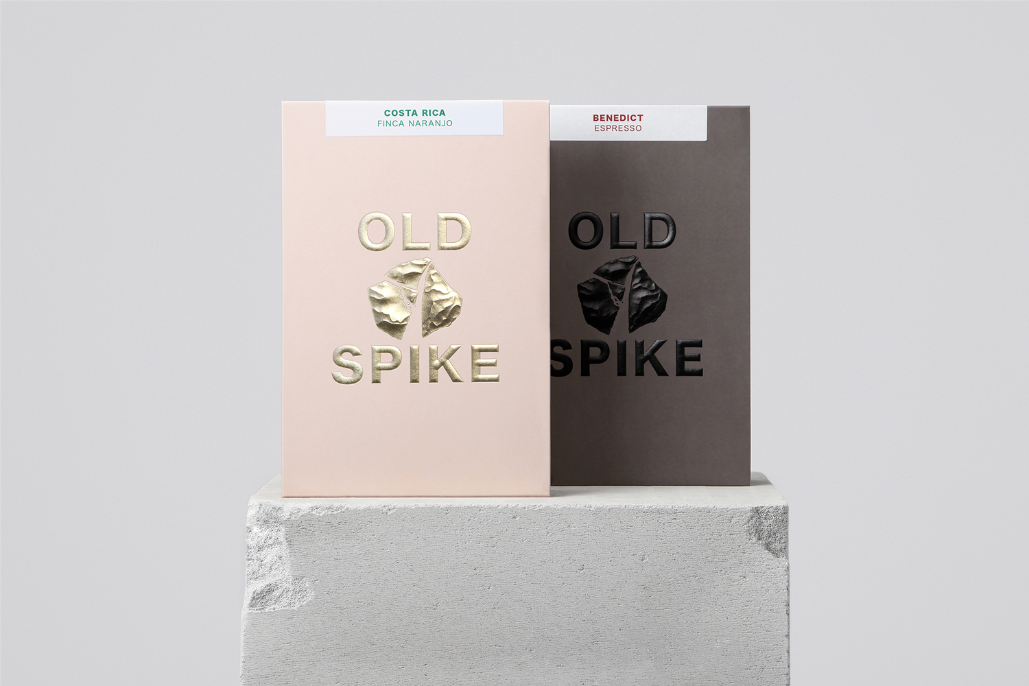
Old Spike by Commission Studio, United Kingdom
Old Spike is a coffee roastery, subscription service and wholesaler, cafe and social enterprise working with the homeless, located in South East London. It is situated on the site of a former workhouse, a place where the poor would break rocks over metal spikes for food and lodgings, and where the roaster gets its name. With a desire to separate the roastery’s commercial and social activities Commission Studio worked to develop retail and subscription packaging that avoided the conventions of the market, and worked together a sense of the artisanal and wholesome and the eye-catching and luxury.
See more of this project here


