BP&O Collections — Red In Branding
Opinion by Richard Baird Posted 16 August 2017
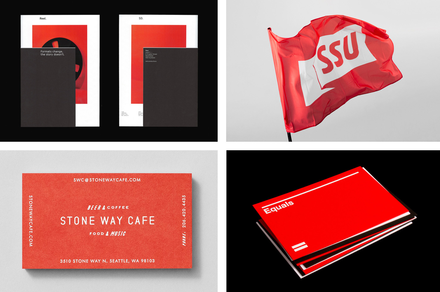
A collection of some of the very best brand identity and graphic design projects that effectively utilise red, reviewed and published on BP&O. This post features work by Toko, Bond and Character, and covers simple logo and stationery projects, and extends to broader brand identity programmes. These play with large areas of red, red as highlight or a small conceptual accent, and includes four-colour reds, spot colours, dyed papers and boards. Be sure to click the images to read more about the project and the intentions of each design. Check out more colour collections here.
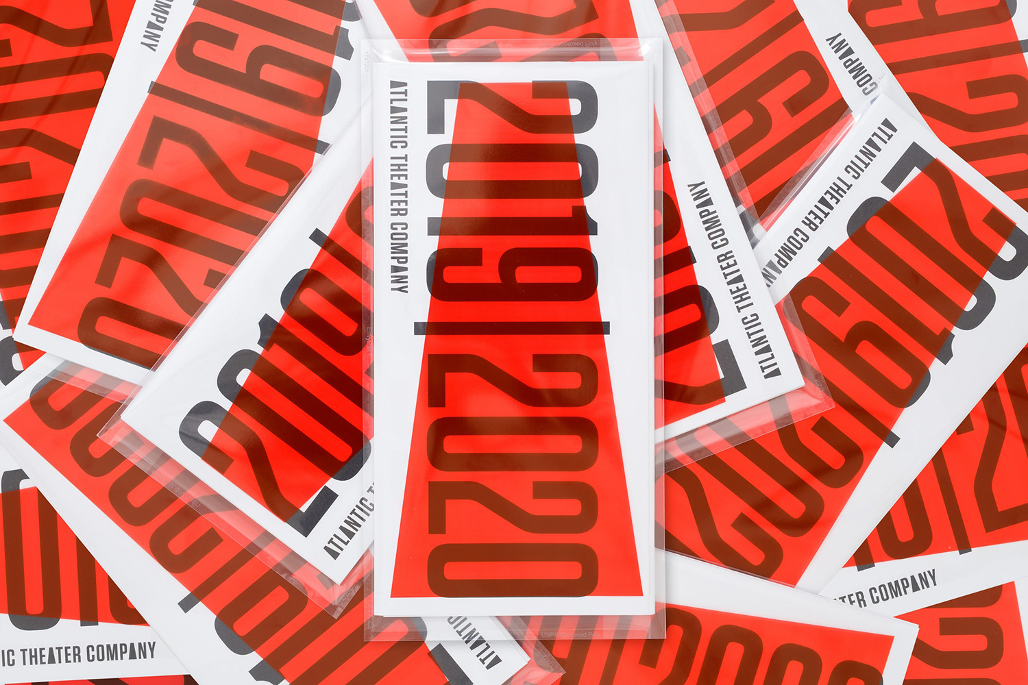
Atlantic Theater 2019 – ’20 Season by Pentagram, United States
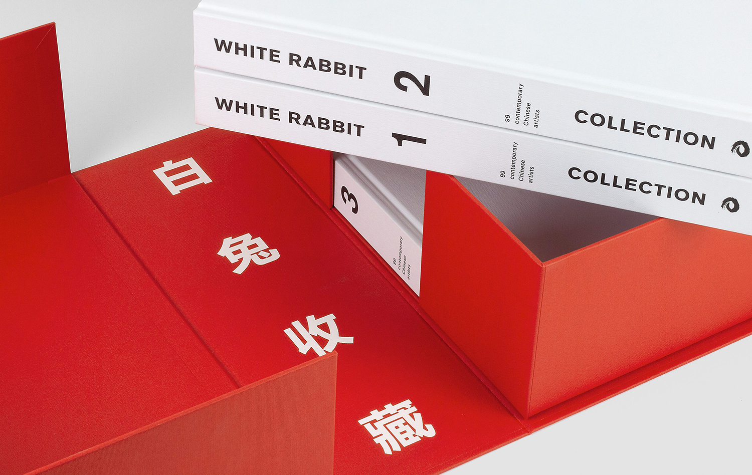
White Rabbit Collection by Toko, Australia
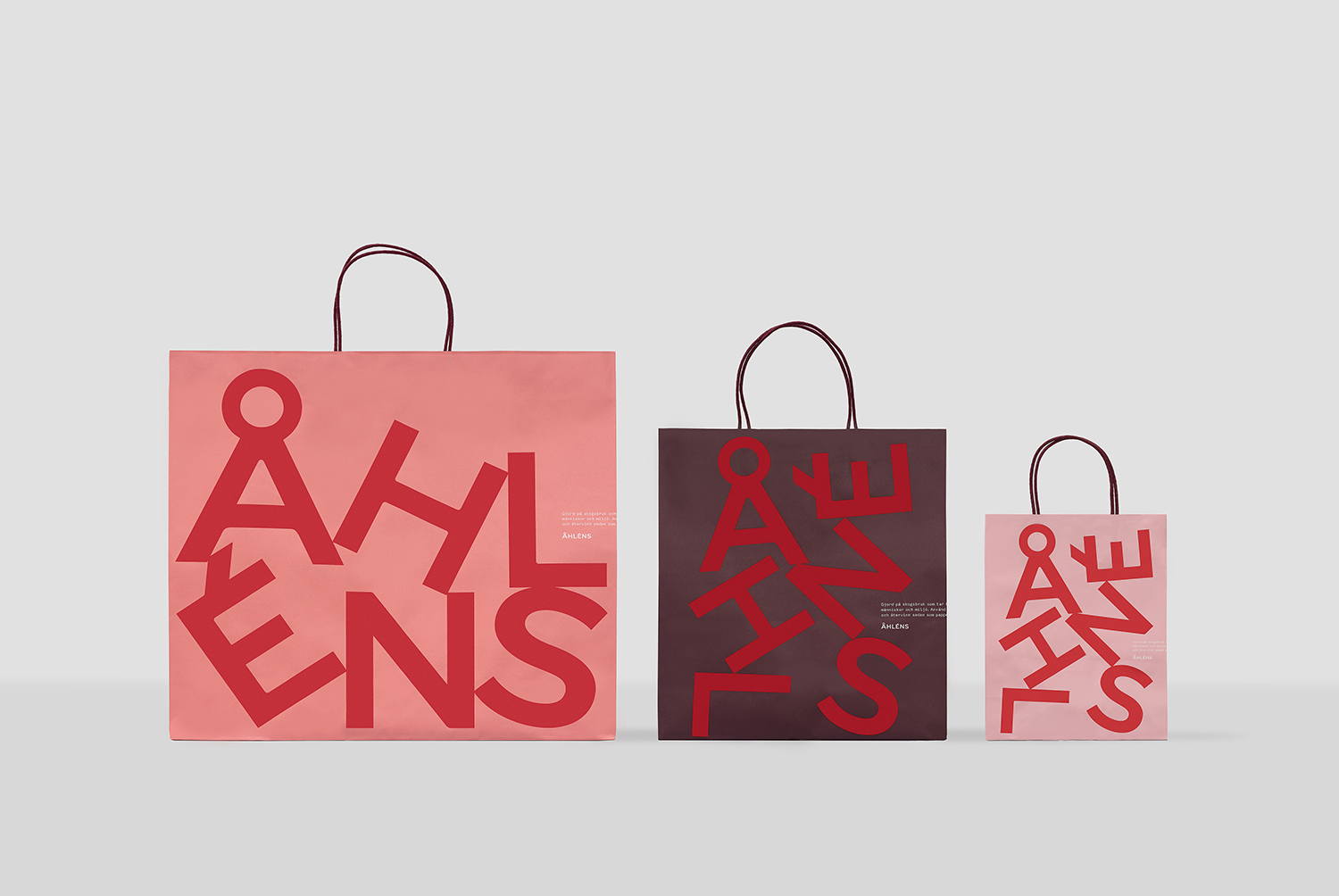
Åhléns by Happy FB, Sweden
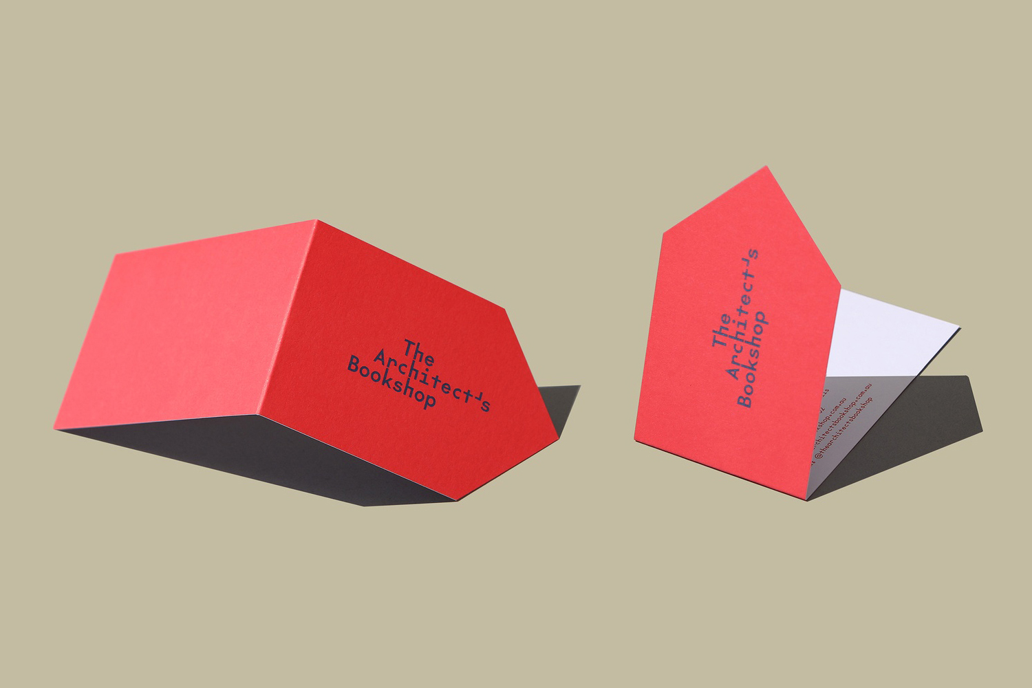
The Architect’s Bookshop by Garbett, Australia
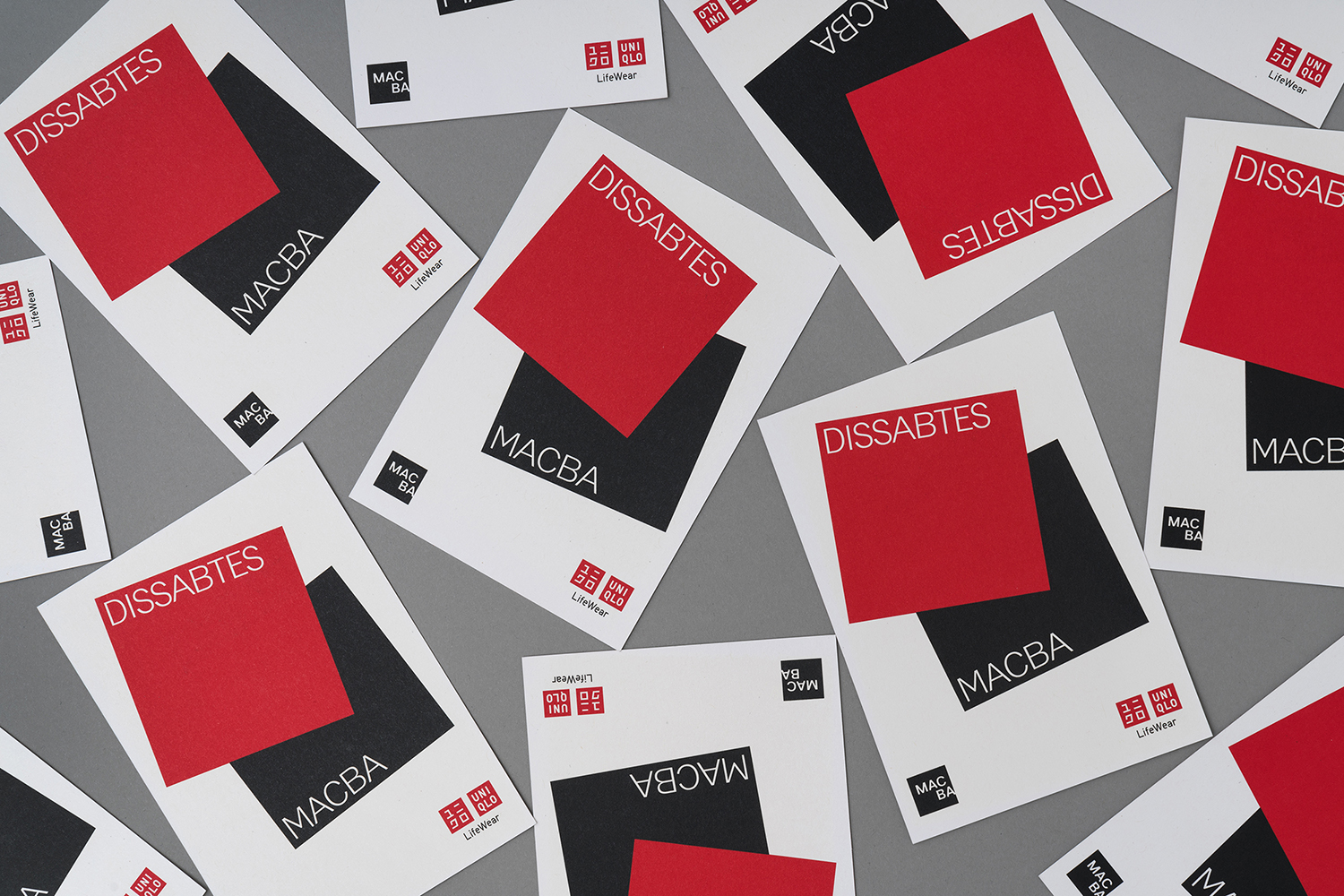
Dissabtes MACBA by Hey
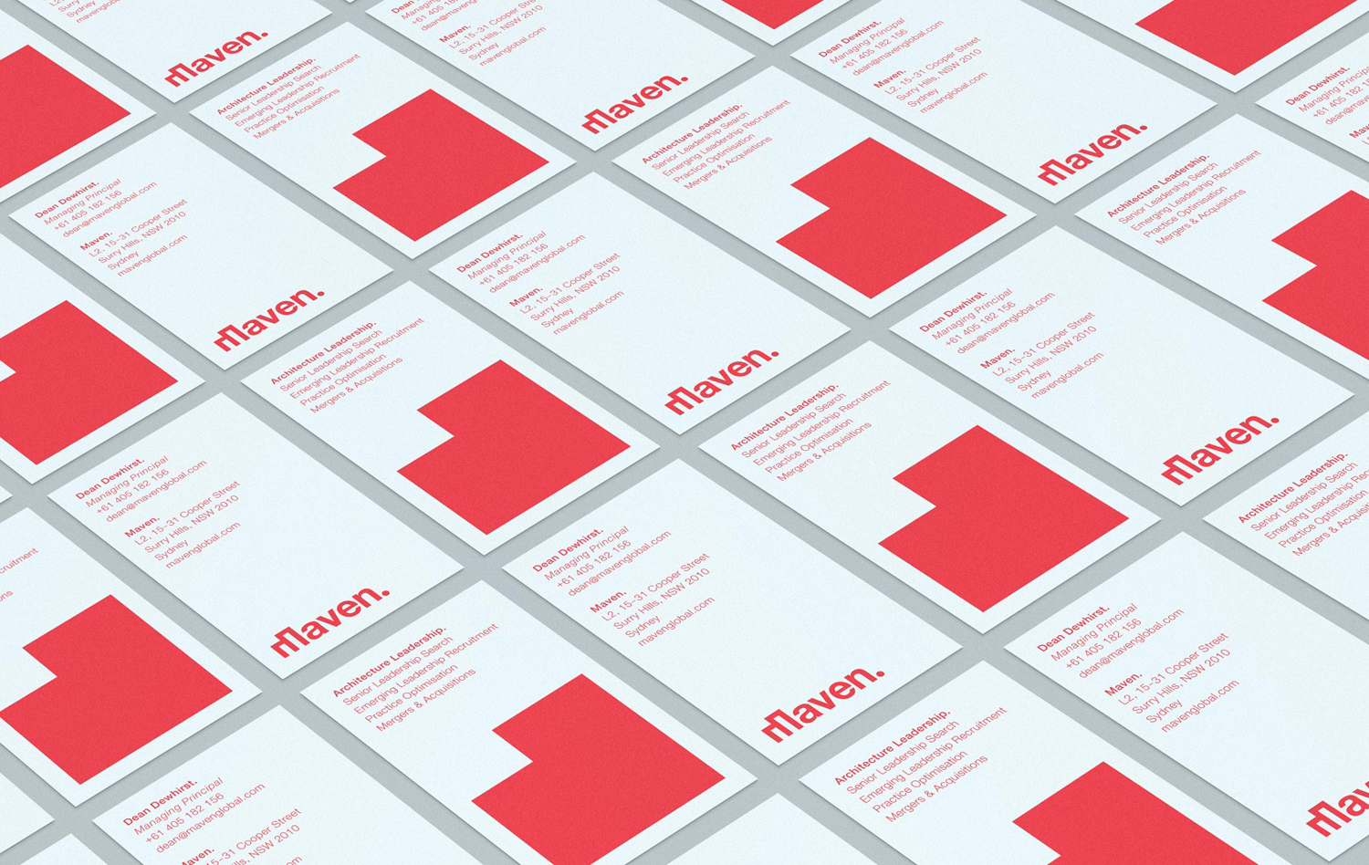
Maven by Design by Toko, Australia
Centre for the Study of Political Graphics by Blok, Canada
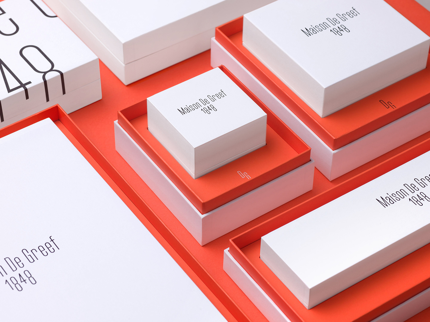
Maison De Greef 1848 by Base Design, Belgium
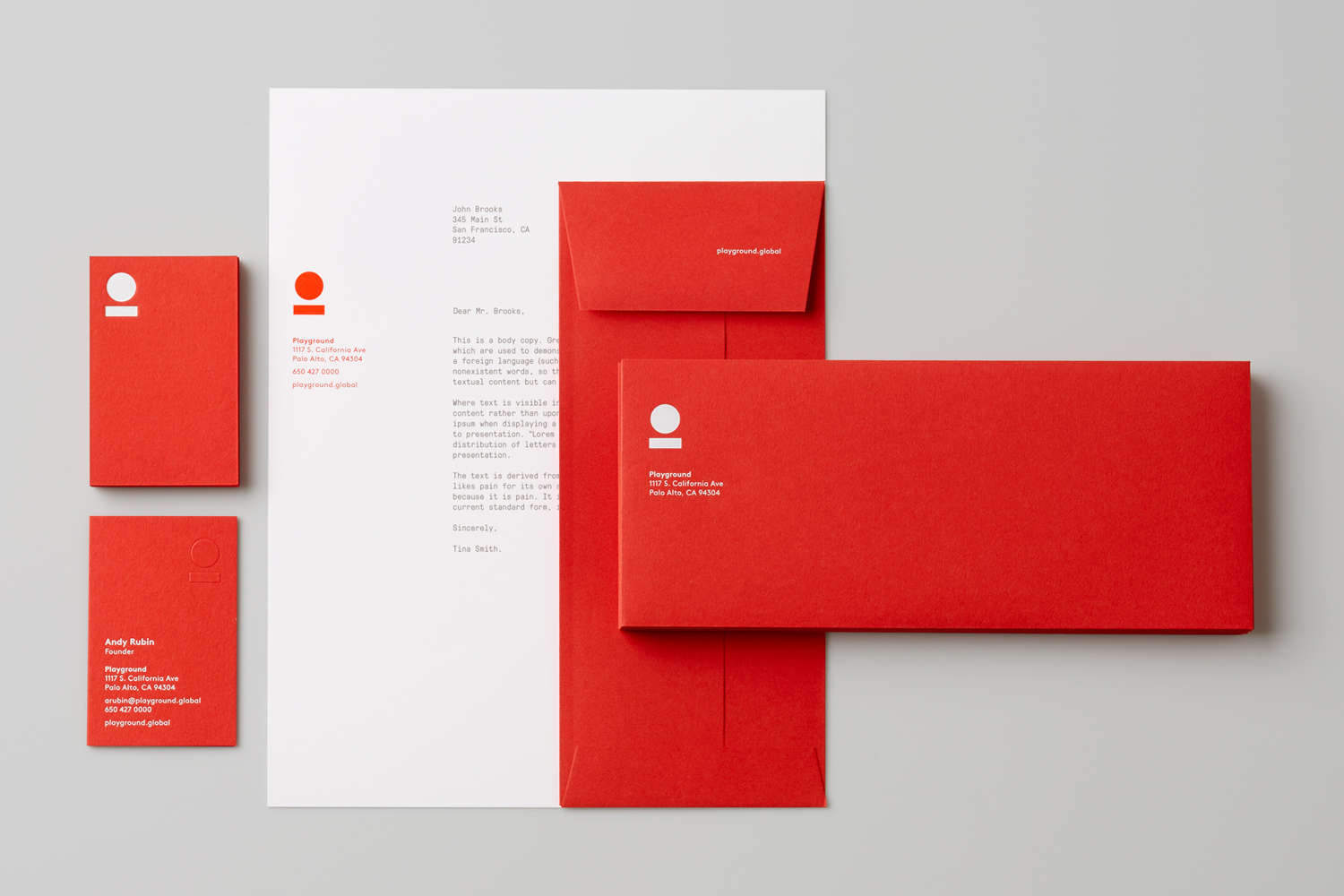
Playgound by Characters, United States
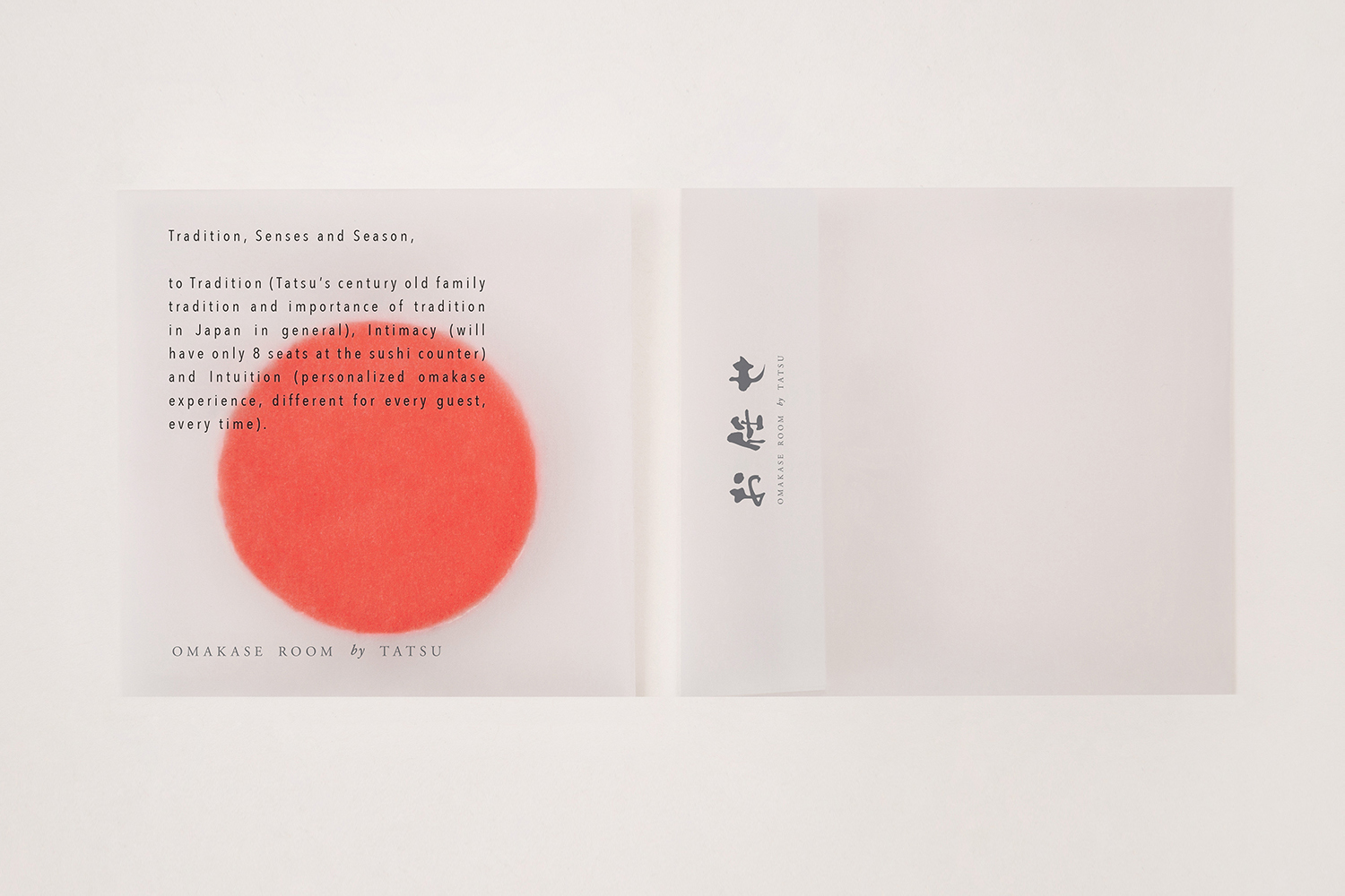
Omakase Room by Savvy, United States
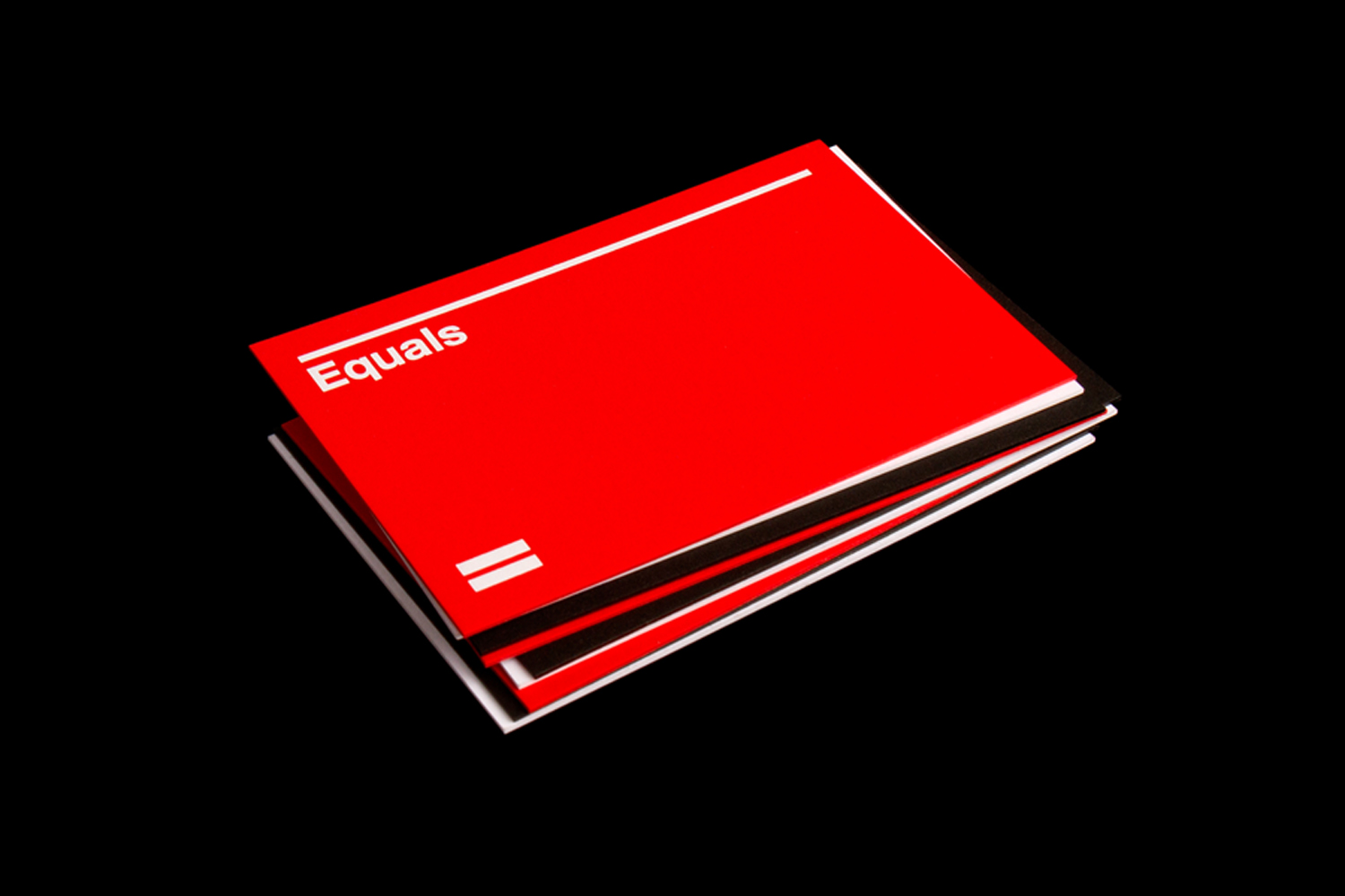
Equals by Spin, United Kingdom
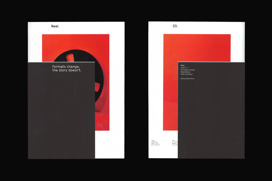
Reel by Richards Partners, New Zealand
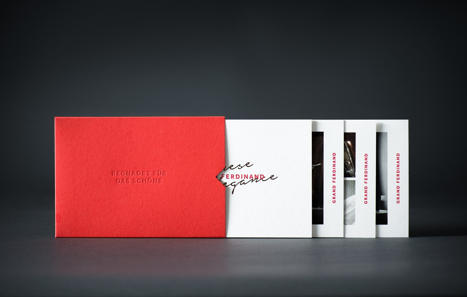
Grand Ferdinand by Moodley, Austria
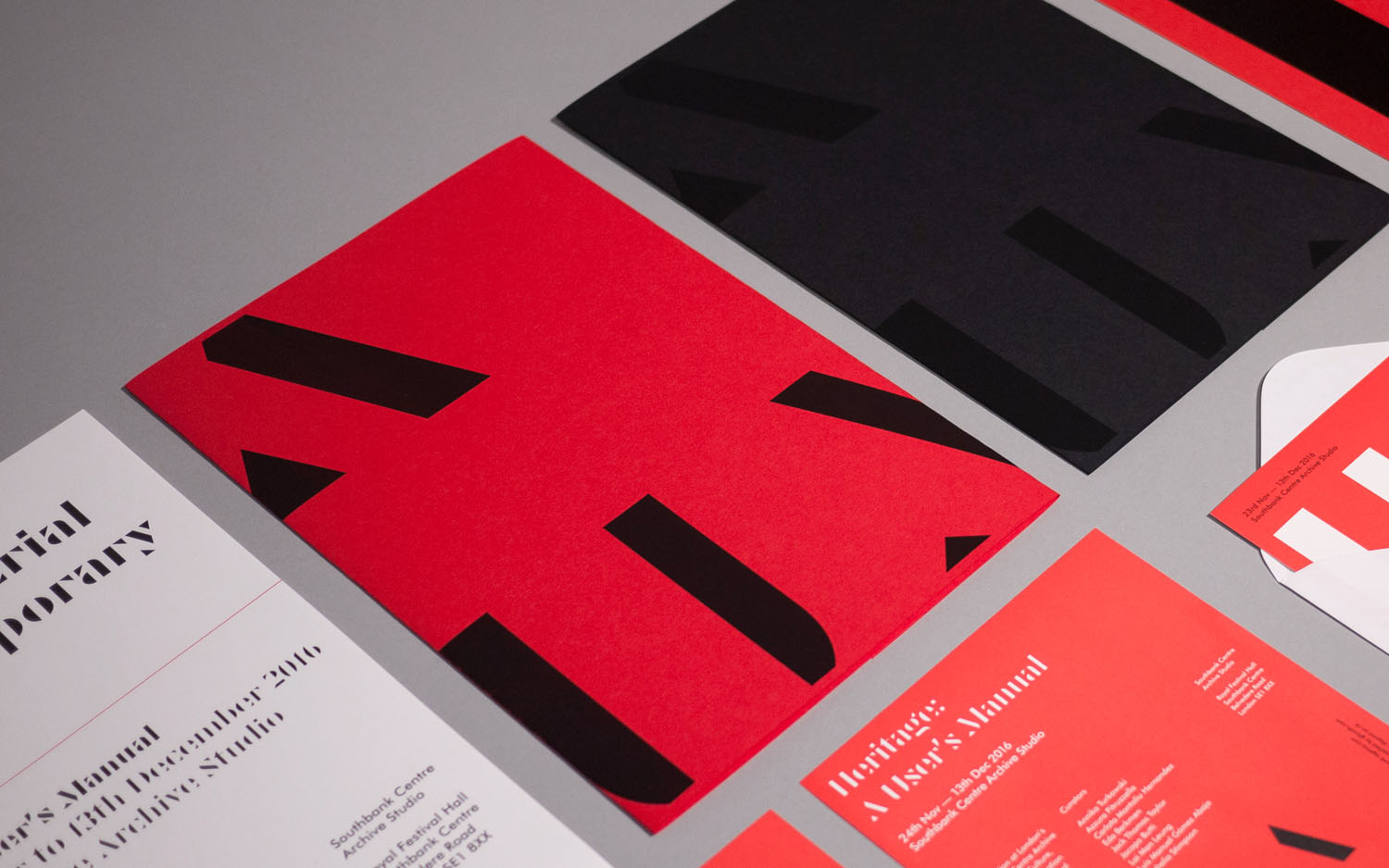
Heritage: A User’s Manual by Bond, United Kingdom
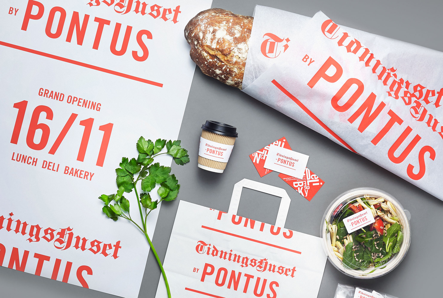
Tidningshuset by Pontus by Bold, Sweden
Faymus by Studio Brave, Australia
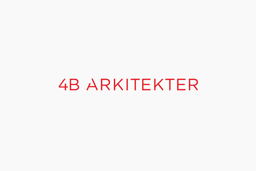
4B Arkitekter by Commando Group, Norway
Bubu by Bob Design, Switzerland
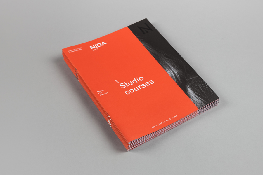
NIDA by Muad, Australia
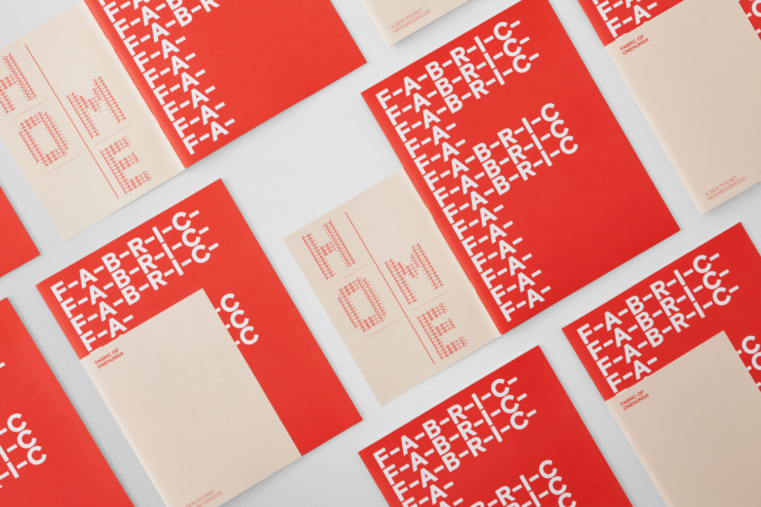
Fabric of Onehunga by Richards Partners, New Zealand
SSU by Snask, Sweden
Cult 20 Years, Event & Exhibition by Toko, Australia
Kosmopolis by Hey, Spain
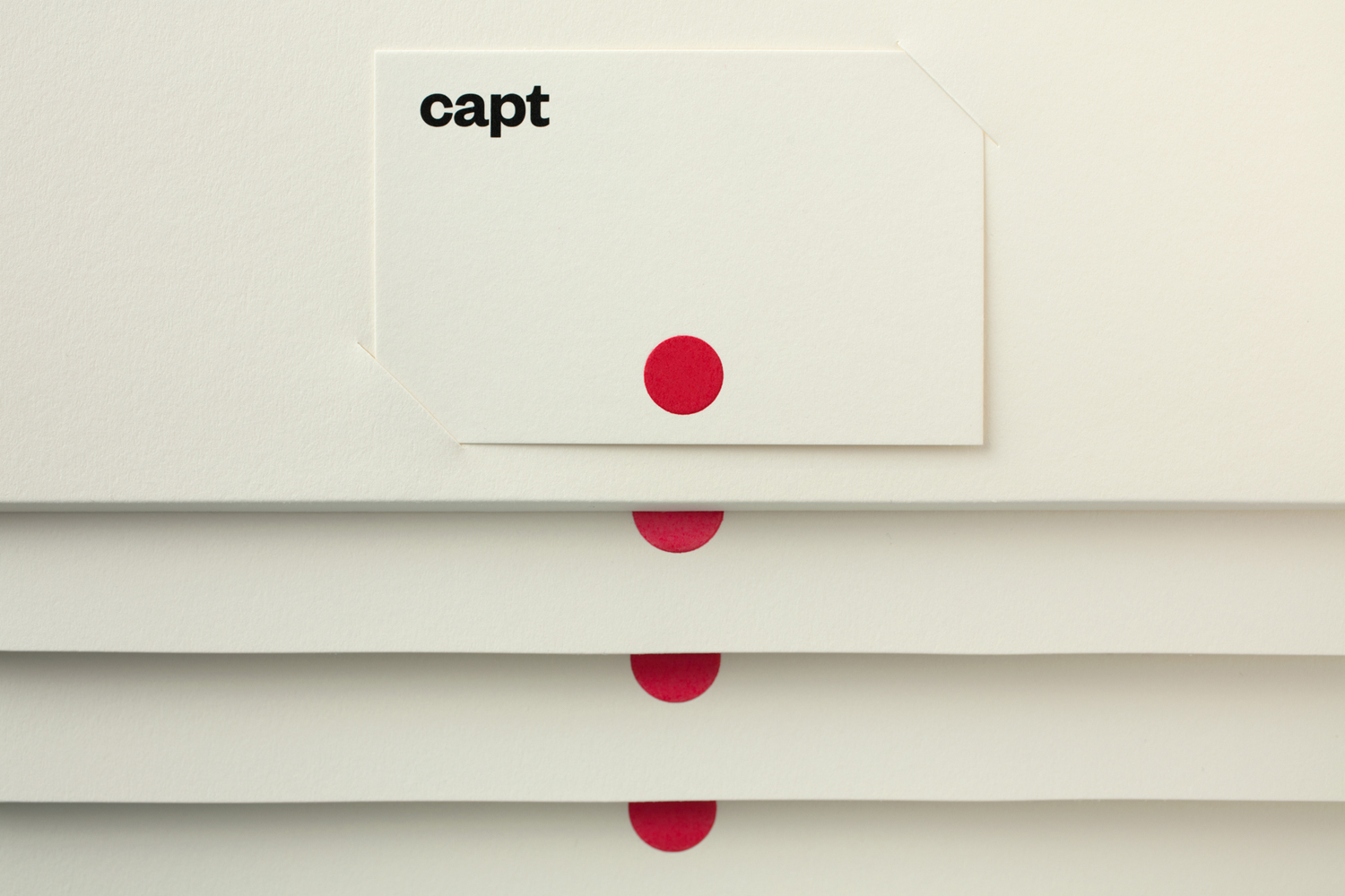
Capt by Bunch, United Kingdom
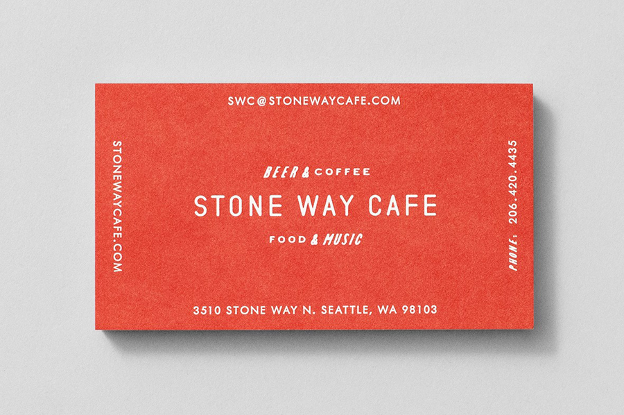
Stone Way Cafe by Shore, United States
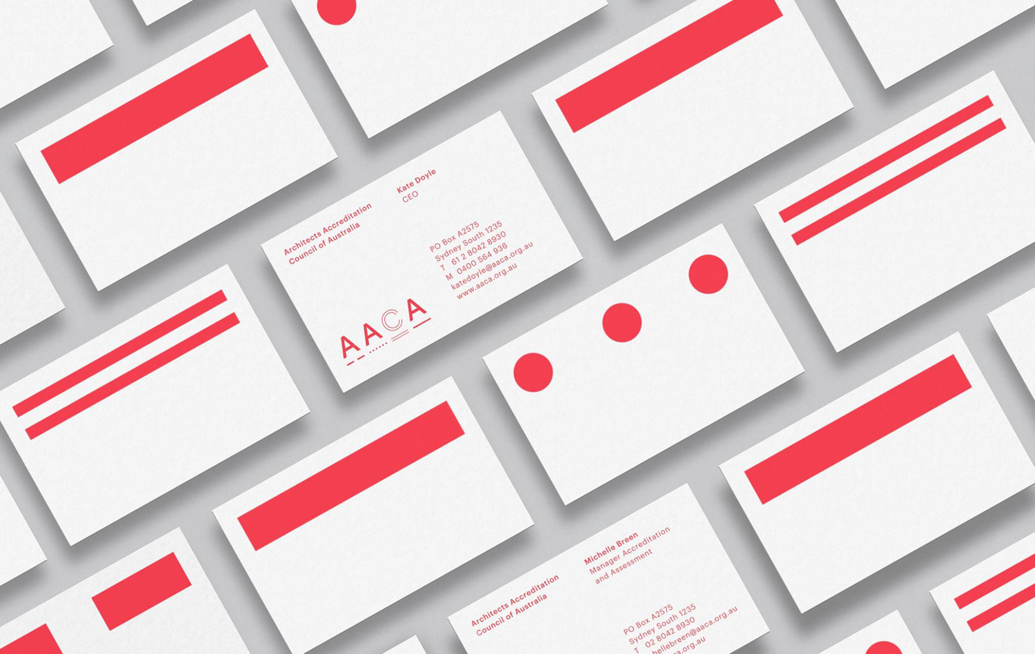
Architects Accreditation Council of Australia by Toko
