NAU by Toko
Opinion by Richard Baird Posted 17 August 2017
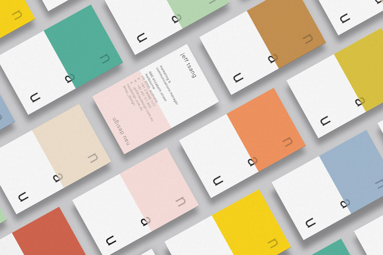
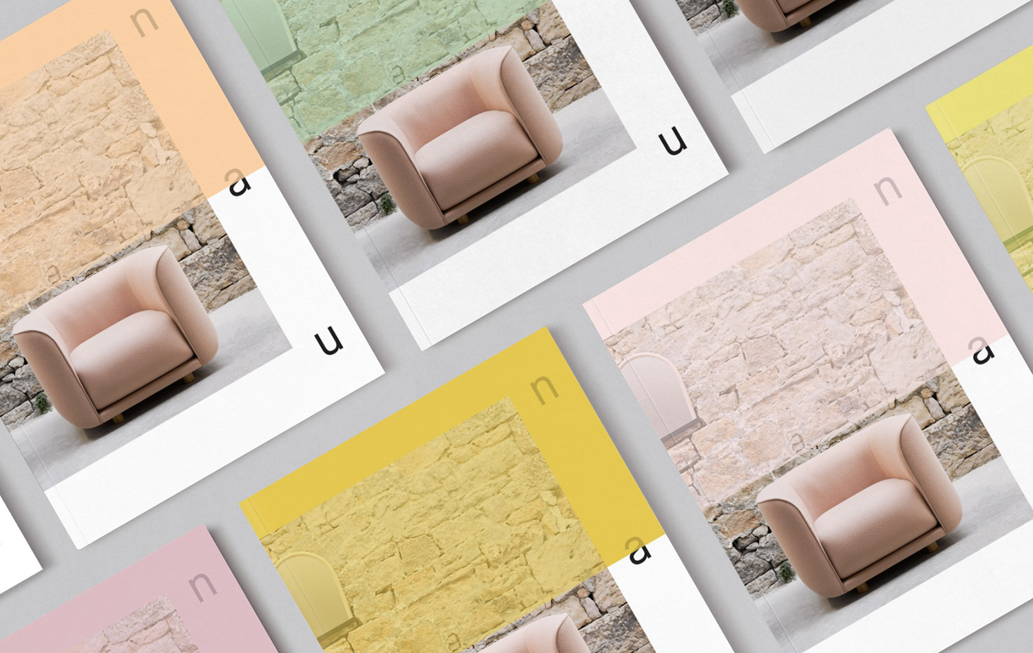
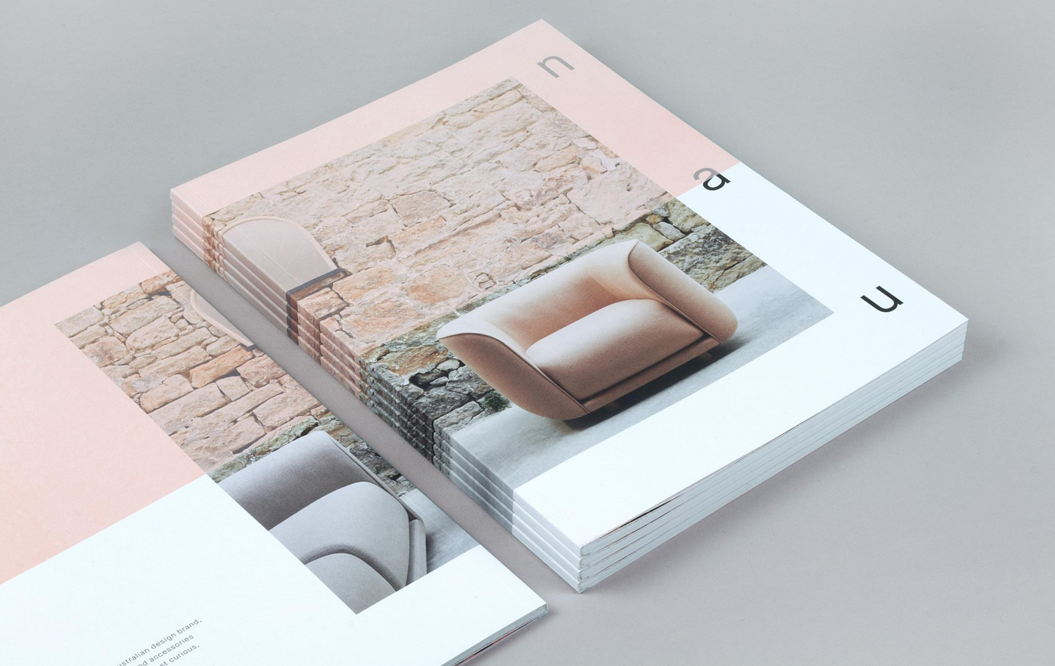
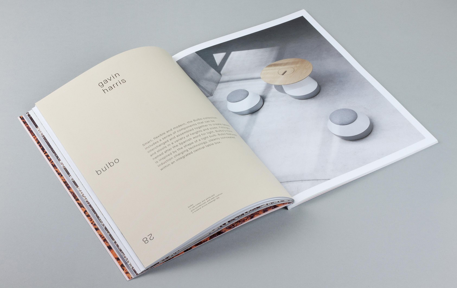
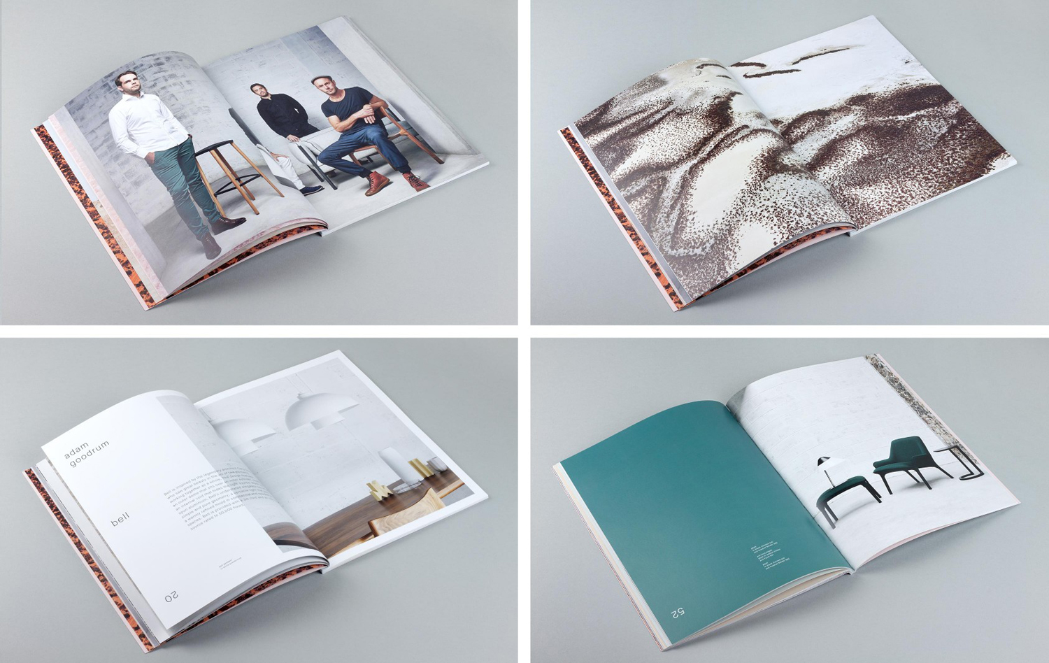
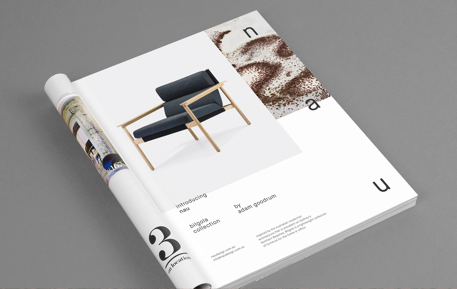
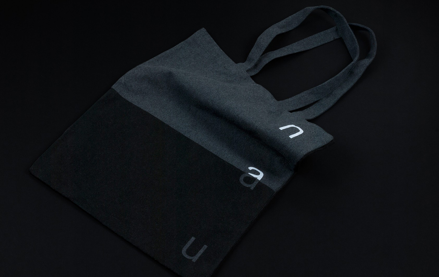
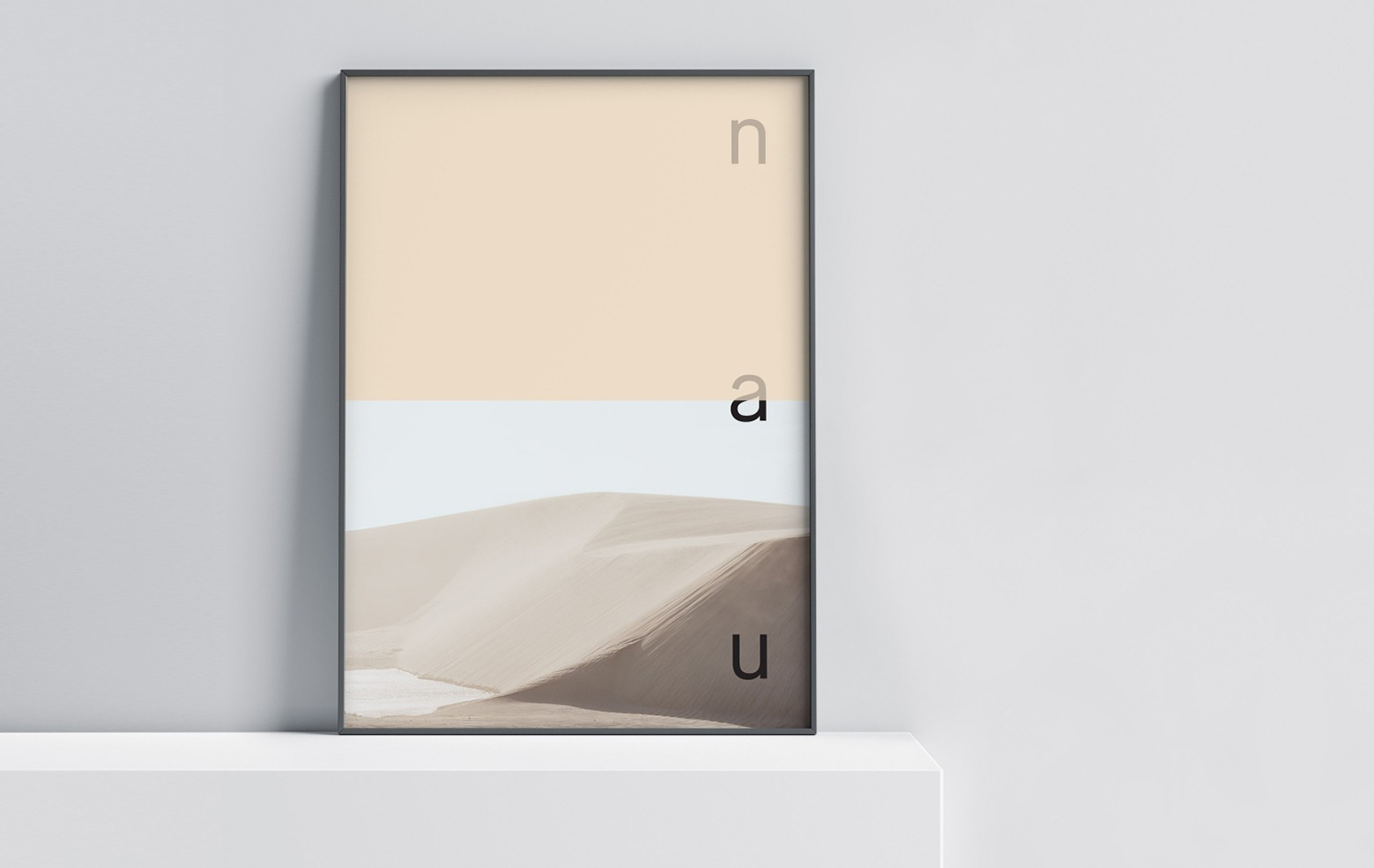
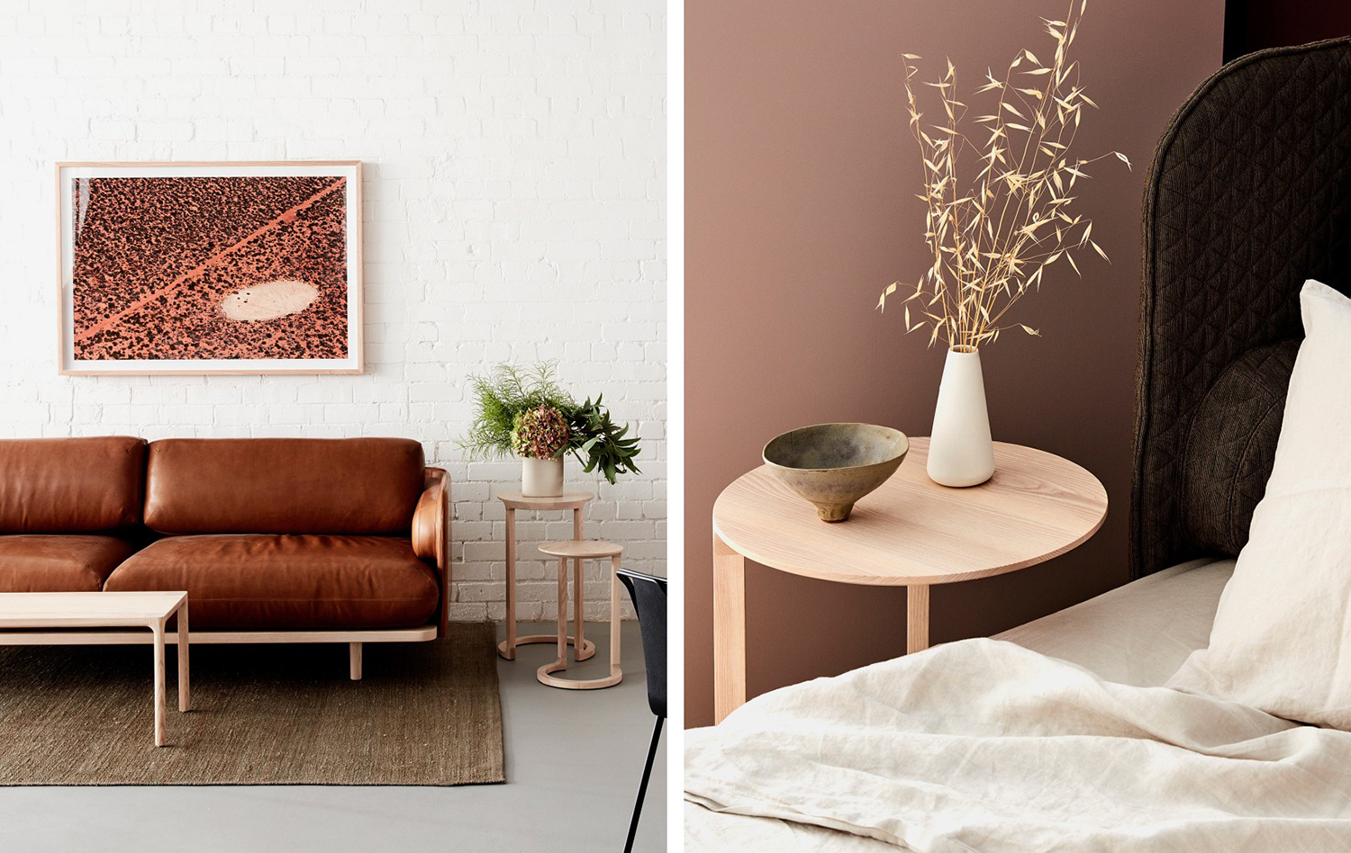
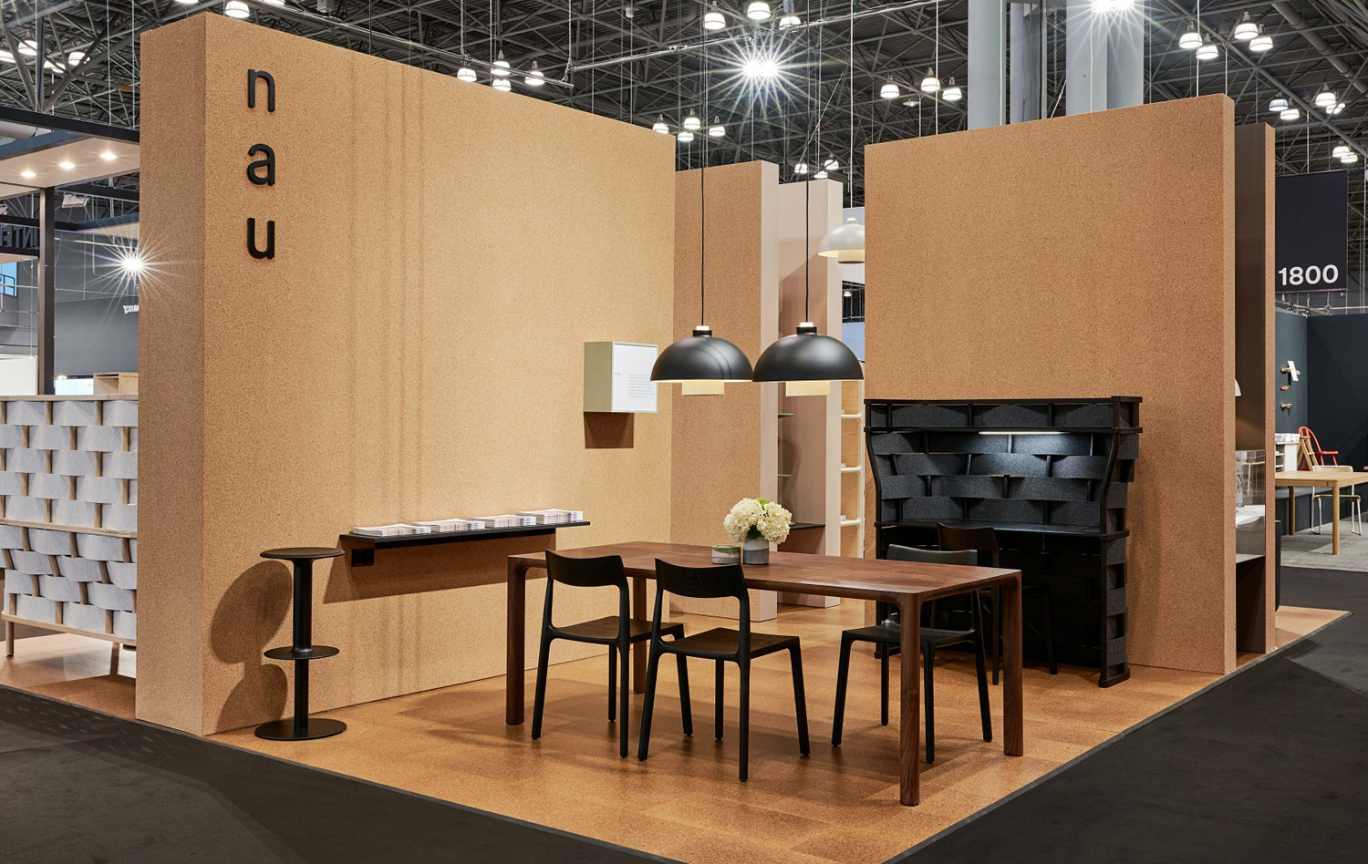
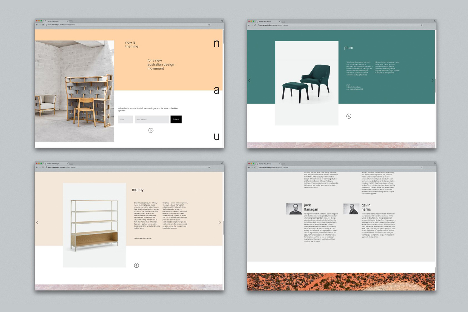
NAU is a new Australian furniture brand created by the premium designer furniture and lighting retailer Cult, and features work by futurist designer Gavin Harris and Adam Goodrum, a designer that believes an object justifies its existence through story and detail. Design by Toko worked with Cult to develop name, and create a logo and graphic identity for NAU that would extend across business cards, stationery, brochure, tote bag, exhibition stand and website. This is inspired by and makes a connection with Australia’s unique and diverse landscapes through compelling photography by Brooke Holm, and using a broad but complementary colour palette.
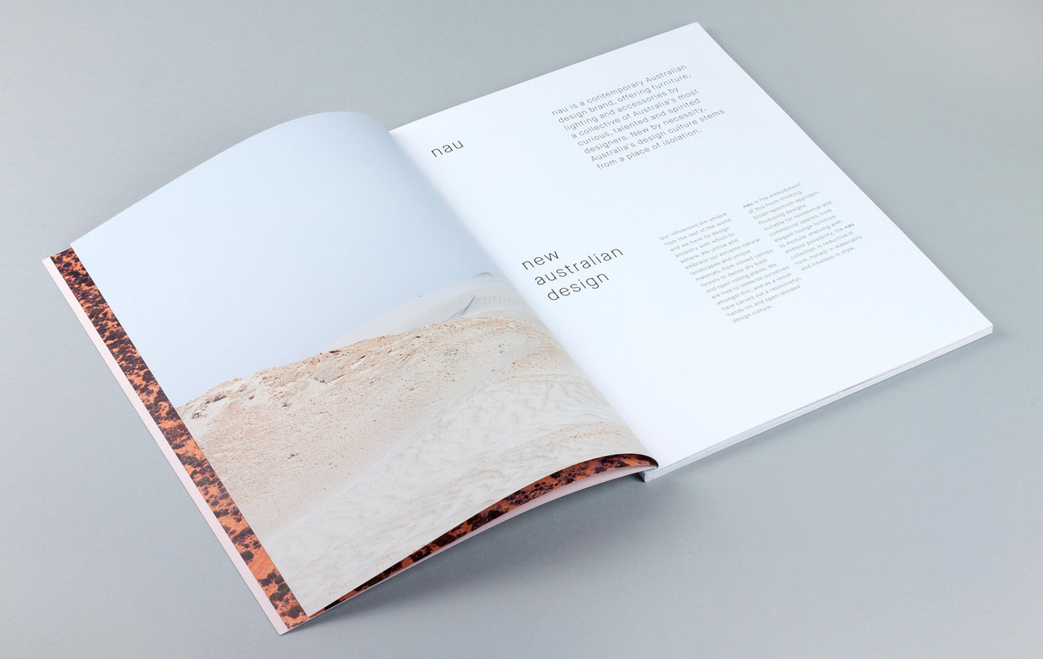
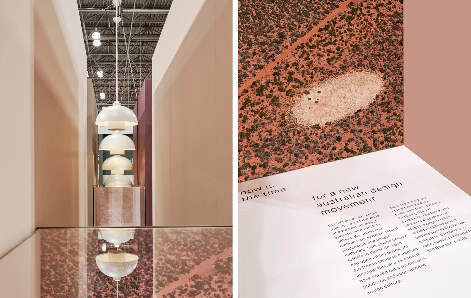
“Our influences are unique from the rest of the world, and we have no design ancestry with which to adhere. We utilise and embrace our extreme natural landscapes and unique materials, from closed canopy forests to dense dry bush and open rolling plains. We are free to immerse ourselves amongst this, and as a result have carved out a resourceful, hands-on and open-minded design culture.” – NAU
BP&O looks for ideas and stories, expressed in an intelligible and concise way. The correlation between the copywriting above, the landscape photography of Brooke Holm, and colour palette establish a compelling story, rooted in provenance and encapsulating both design philosophy and materials. Clase bcn’s work for Enea and Raw Color’s work for Arco employ a similar approach, yet the results are quite different.
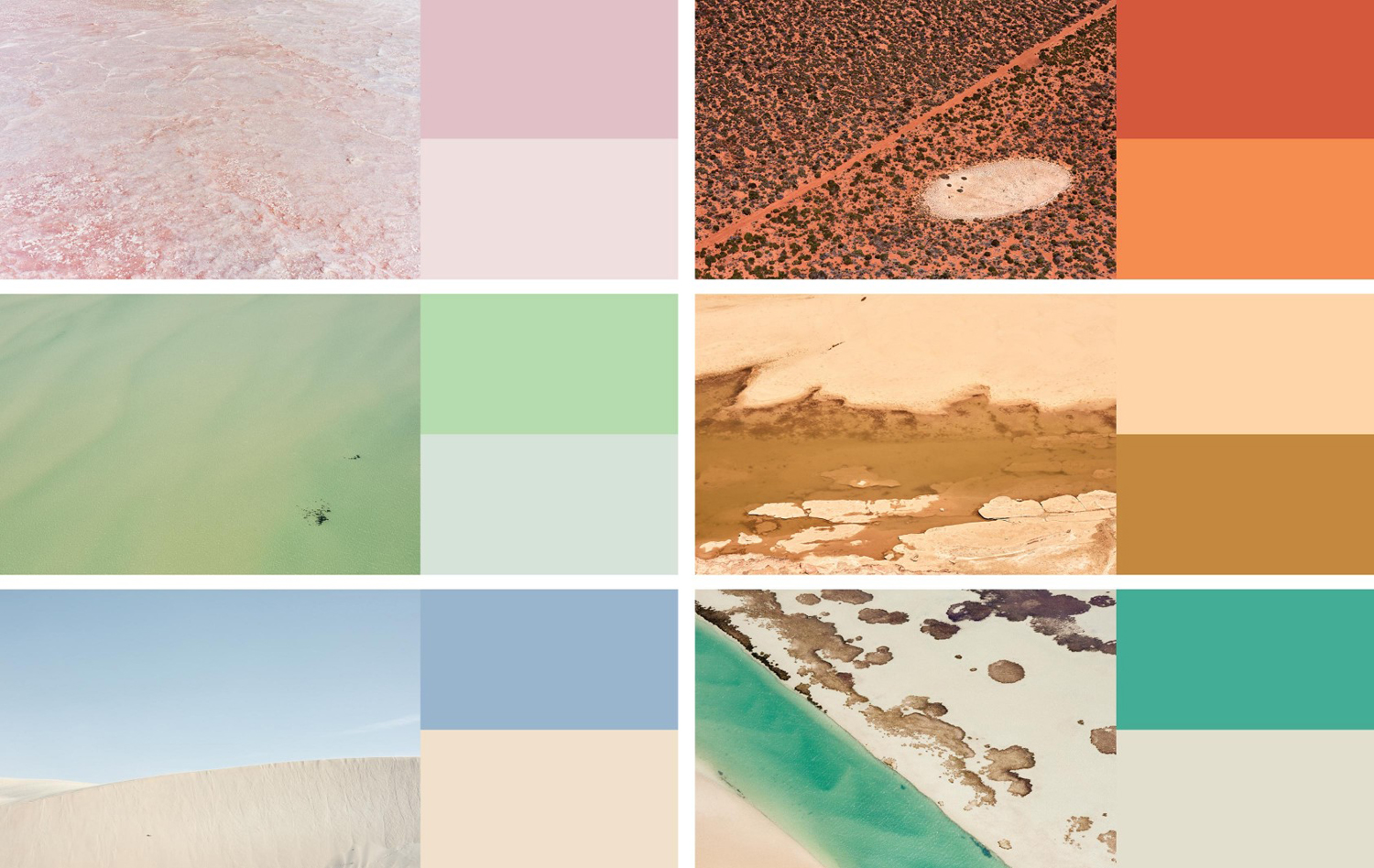
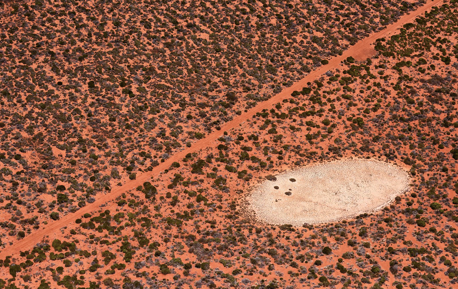
The highlight, and the real differentiating quality of the work lies in photography and colour choice. Brooke Holm’s images manage to capture the tones and textures of large unspoilt landscapes. There is a strange, intriguing and almost designed quality to these in their colour, shape and natural contrasts, a testament to the quality of framing and consistency of white balance. These are effectively used to punctuate product brochure and divide content, and make a visceral connection to Australia and the way landscape influences NUA designers and the materials that they use.
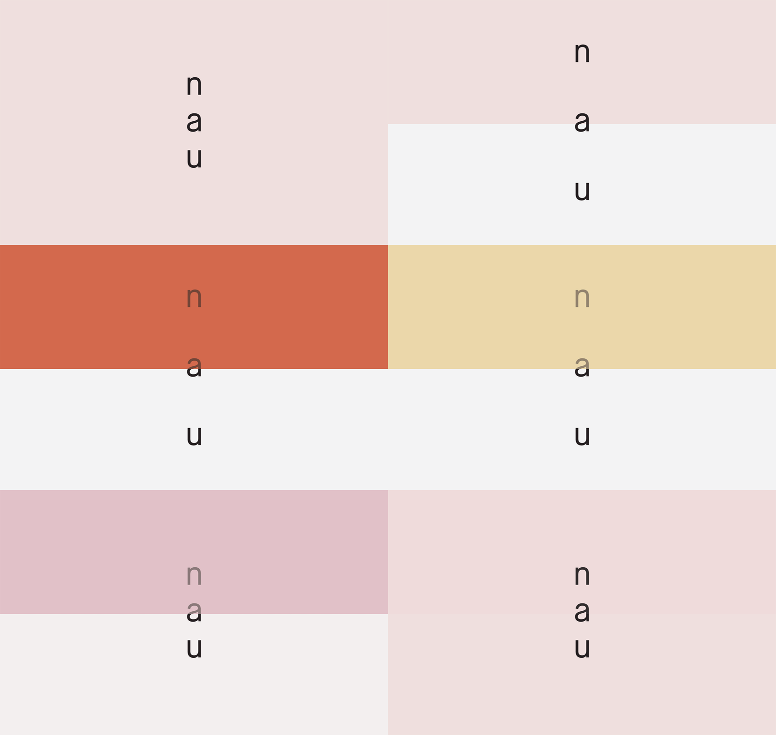
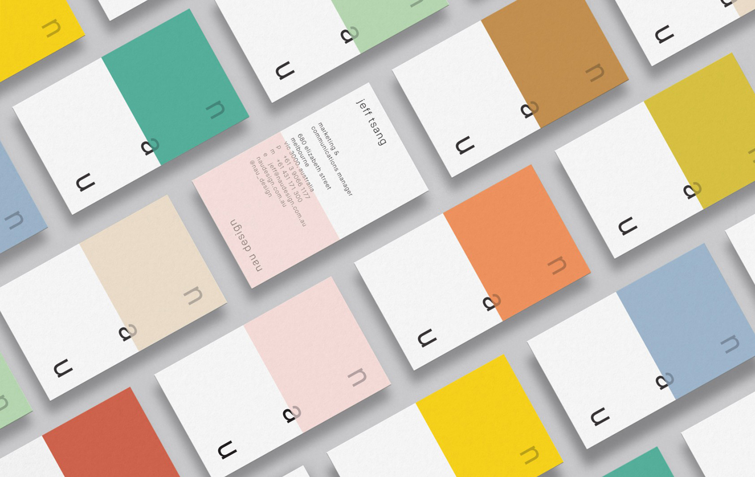
Although each image is compelling, what really works is the diversity, a unique feature of the continent. This is captured and distilled down by Design by Toko in the breadth of the colour palette, and the endless horizon-like quality of their linear composition across stationery. These are modern and natural, and distinctive in their combinations, and where colour choice can often be arbitrary, or simply grounded in differentiation, the connection to image also gives colour a conceptual value.
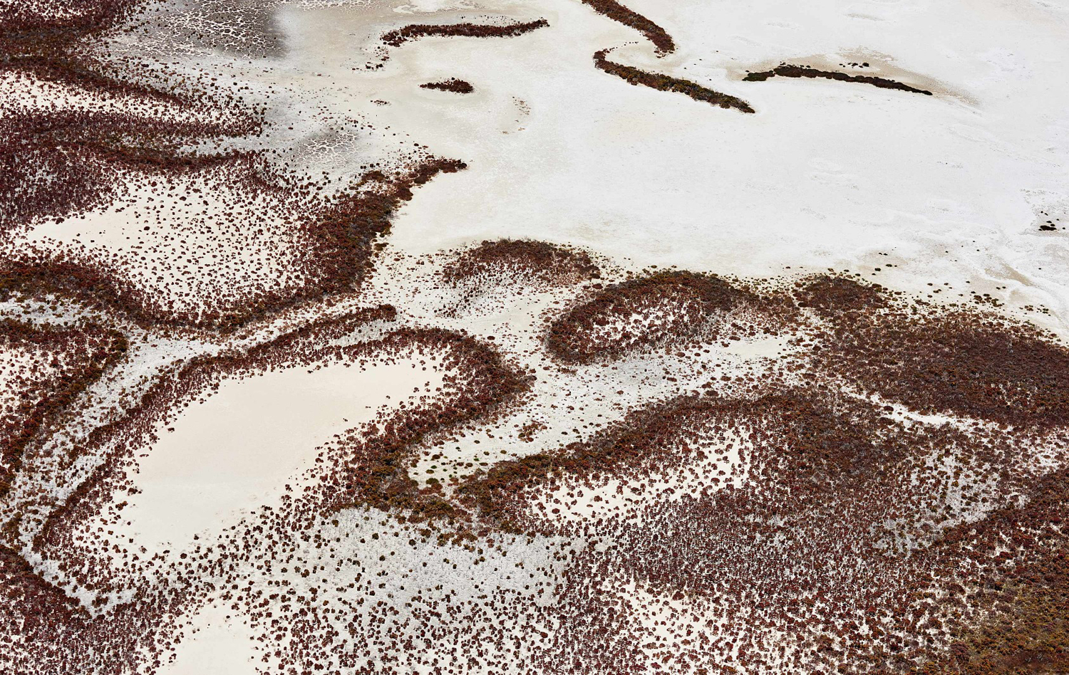
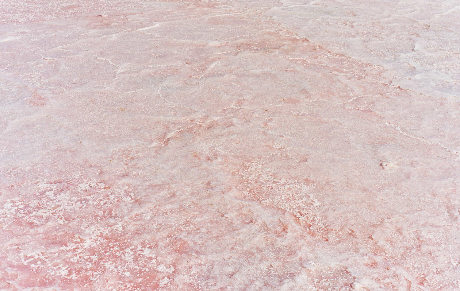
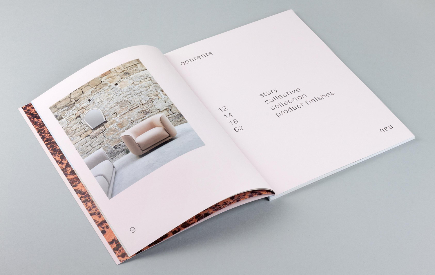
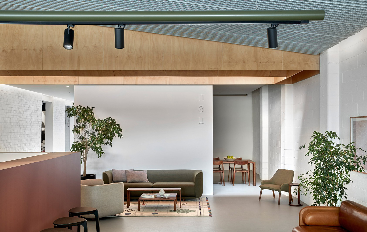
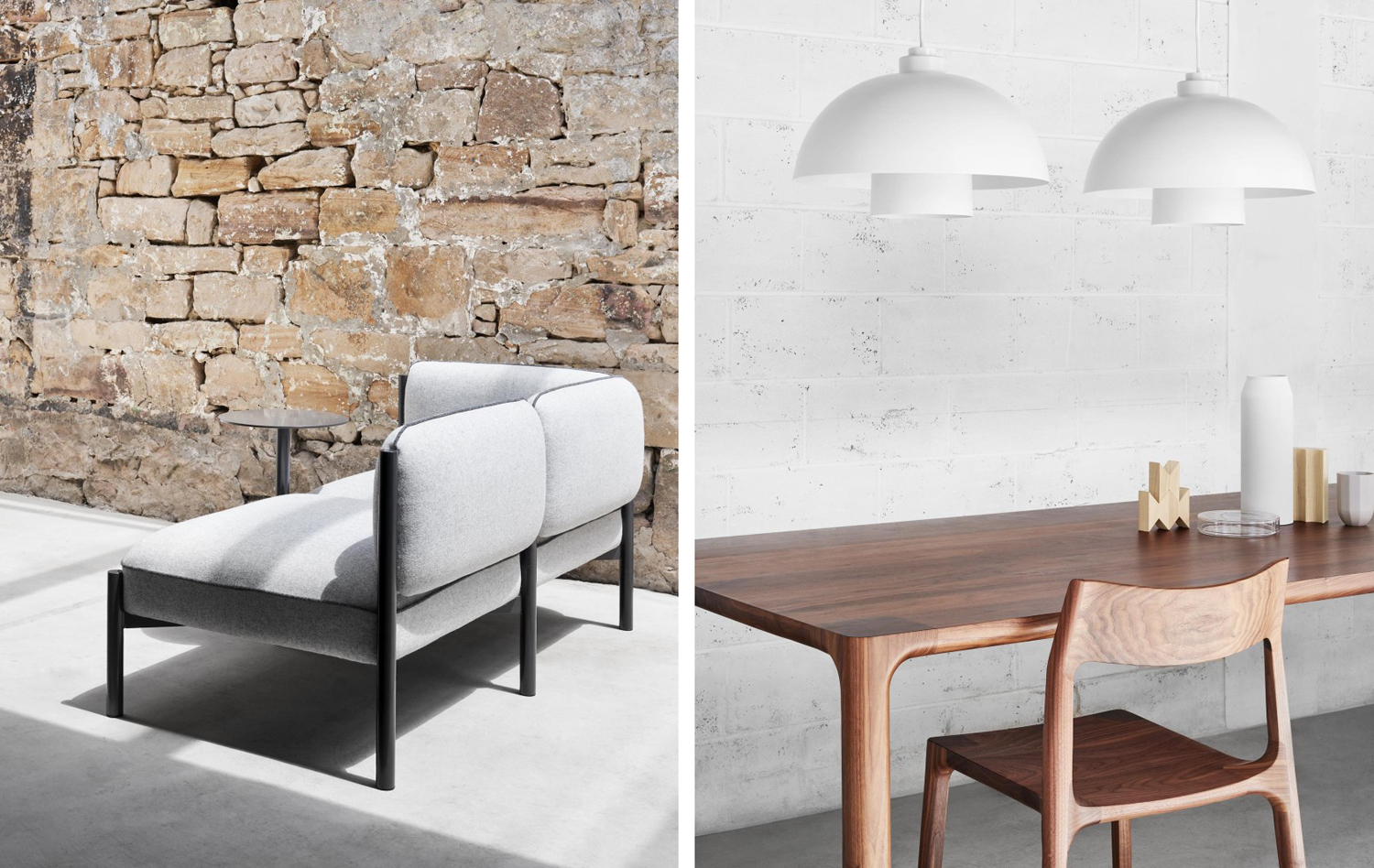
Other highlights include the continuity established between landscape photography and the art direction of product photography. There is a pleasant relationship between the natural environment and the built environment in texture, but tension in the organic and the structured, a neat analogy for the materiality and form of the furniture.
The approach to wordmark shares a commonality with the balancing of colour, particularly in the mirroring of the N to form the U, and its vertical expansion and contraction. The harmony, rythem and flow of Miason Neue, lowercase lettershapes, generous spacing and type proportion on the page feel current, with a strong sense of arrangement and space, alongside colour blocking that borrows something from the design and furnishing of contemporary spaces. This is translated well online, with a strong relationship established between print and digital experience.
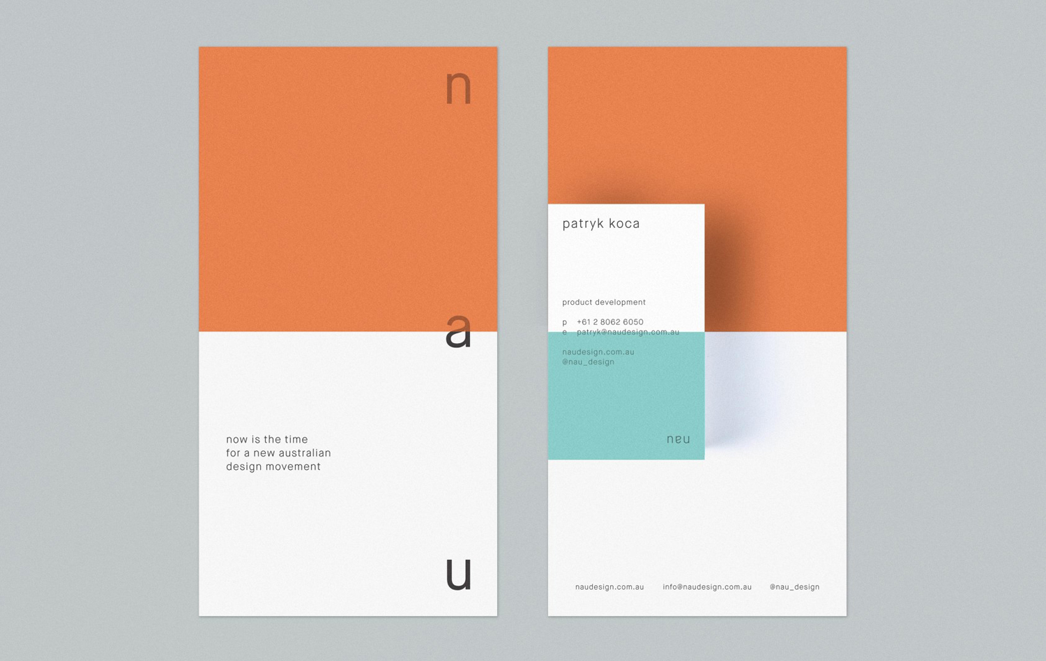
Cult’s original desire was to bring European design to Australia. With NAU it intends to bring Australian design to the international market. NAU’s visual identity feels like an interesting articulation of this exchange, in type and layout, in colour and image. More work by Design By Toko on BP&O.
Design: Design by Toko. Photography: Brooke Holm. Opinion: Richard Baird. Fonts: Maison Neue.
