Kisumé by Fabio Ongarato Design
Opinion by Richard Baird Posted 6 September 2017
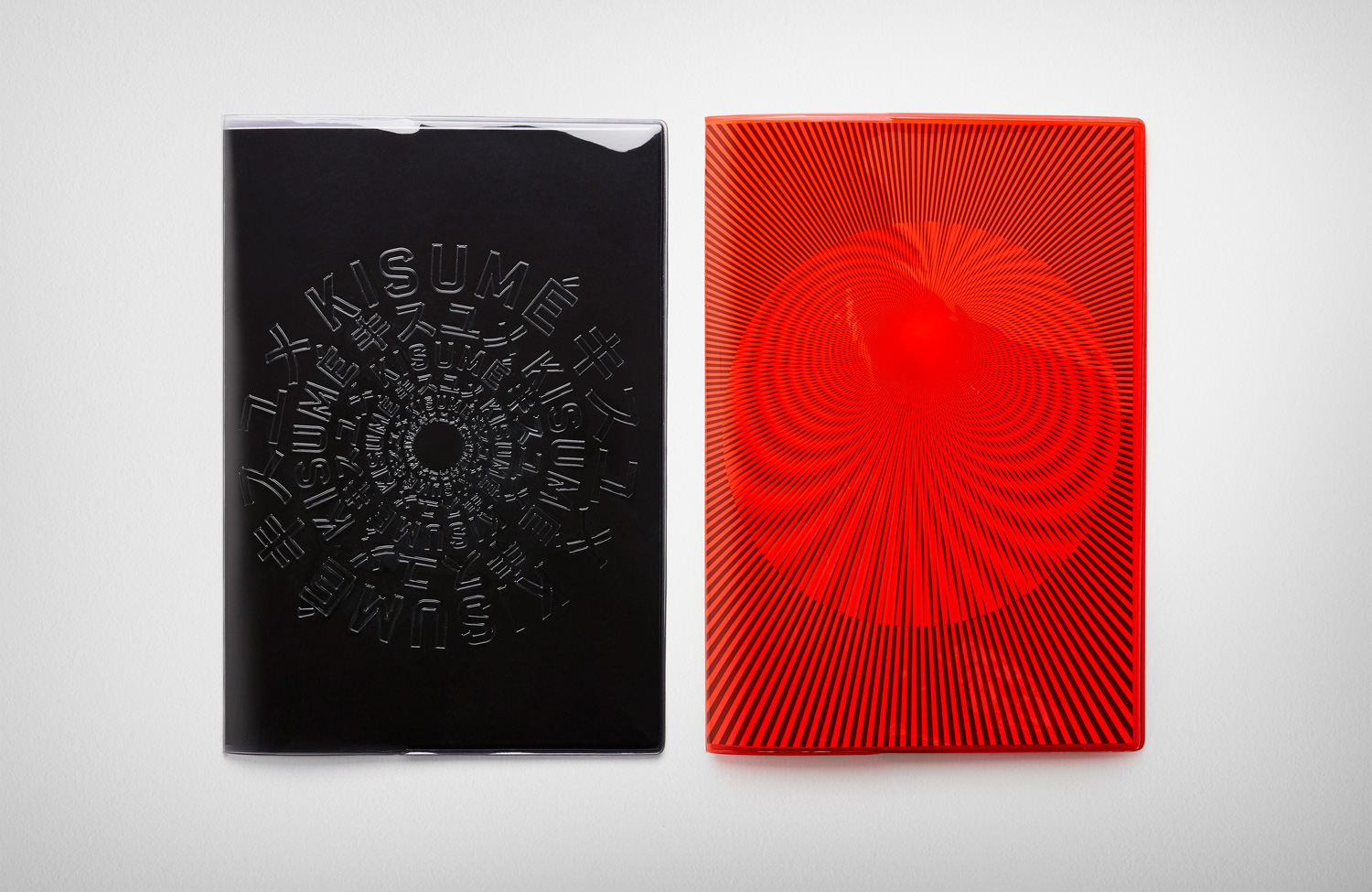
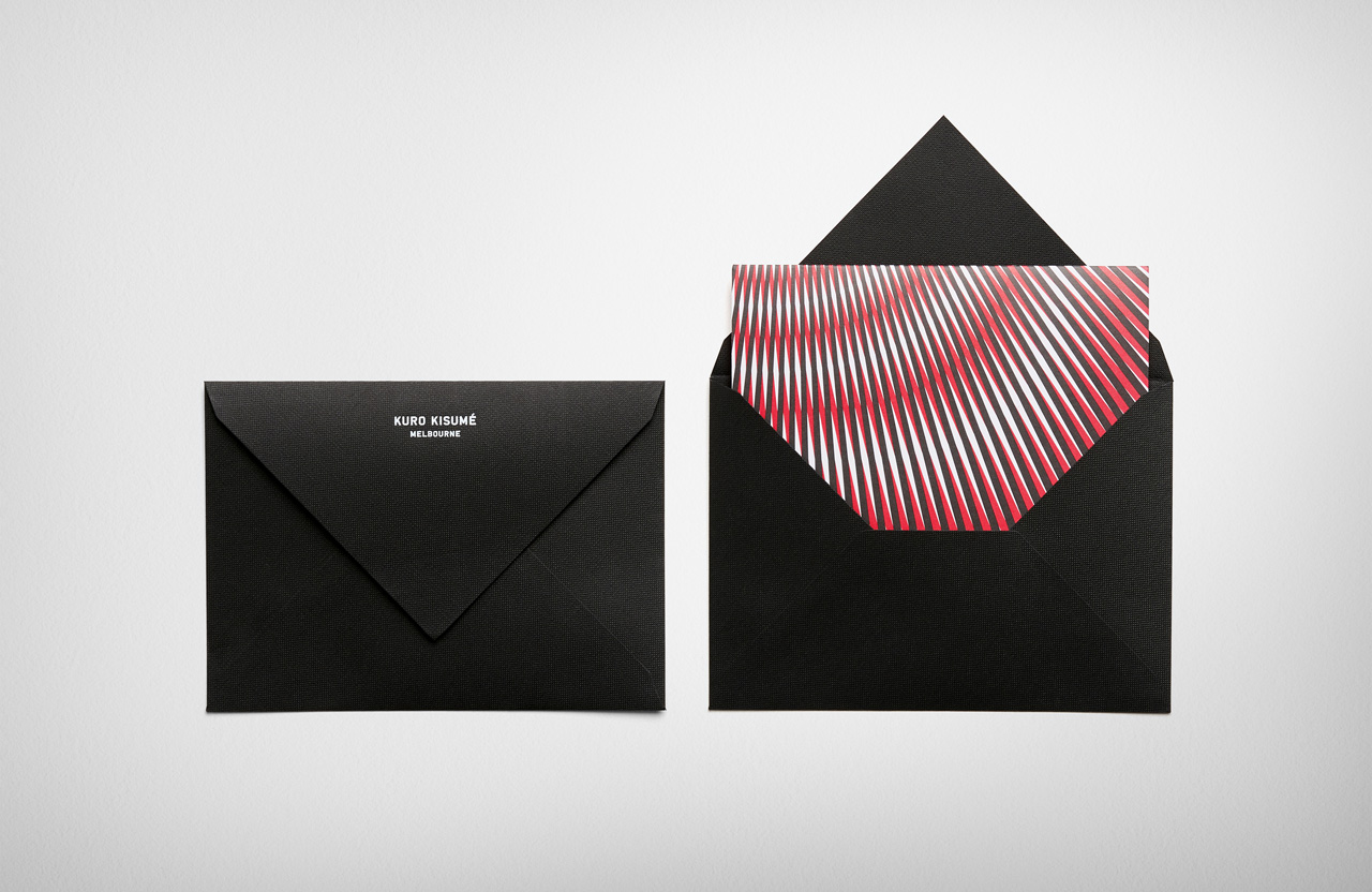
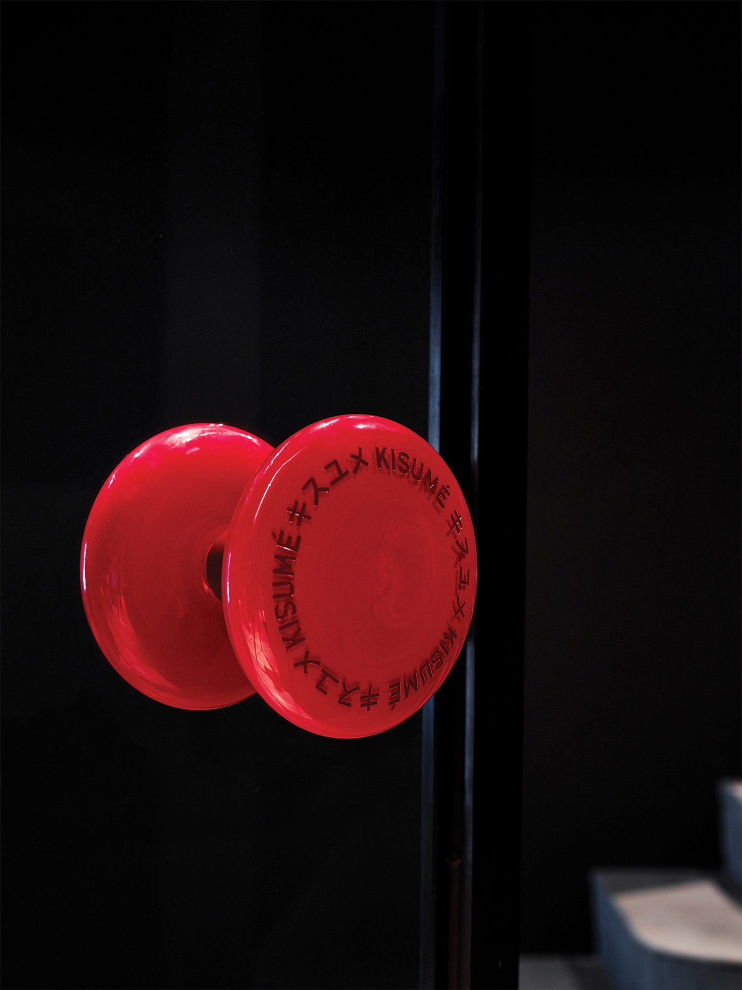
Kisumé is a Japanese restaurant located on Melbourne’s Flinders Lane. It is described by Fabio Ongarato Design, the studio behind its visual identity, as an unconventional, slightly twisted and artfully executed experience. The restaurant intends to immerse guests in an intriguing view of Japanese traditions, and fuses these with the owner’s obsession with beauty and sensuality. This is expressed by a “brutally sophisticated and minimal interior design” created by Wood Marsh Architecture which features curated artworks by Japanese photographer Nobuyoshi Araki as well as Polly Borland, and in the break from the conventions of a typical Japanese dining experience in the movement and colour of visual identity. This links business cards, stationery, menus, window and lighting decals, posters and website.
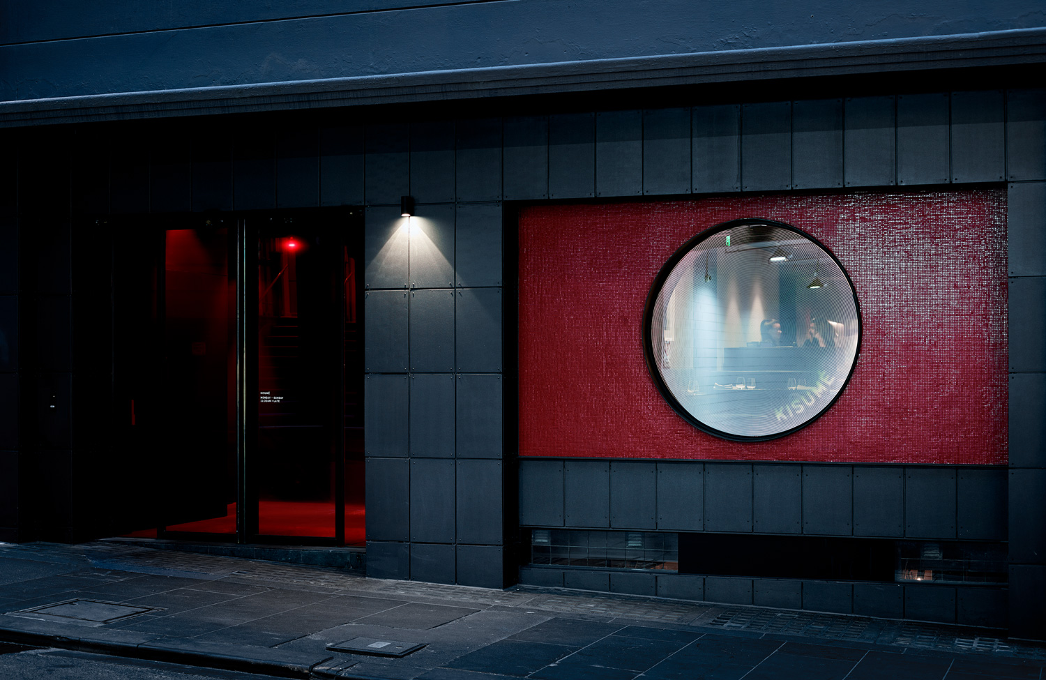
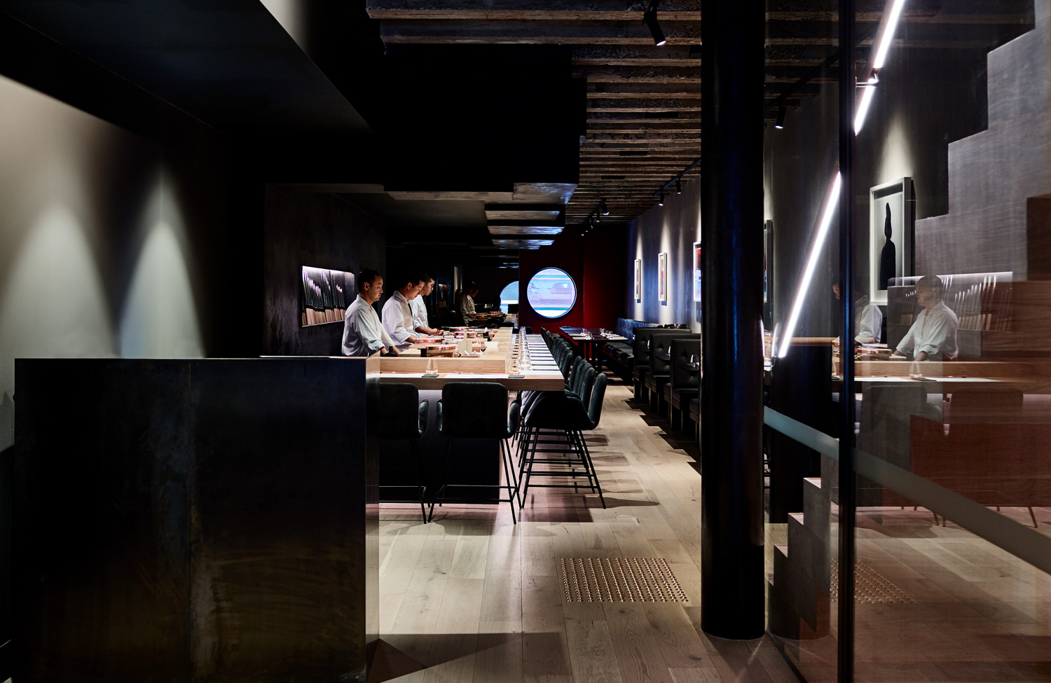
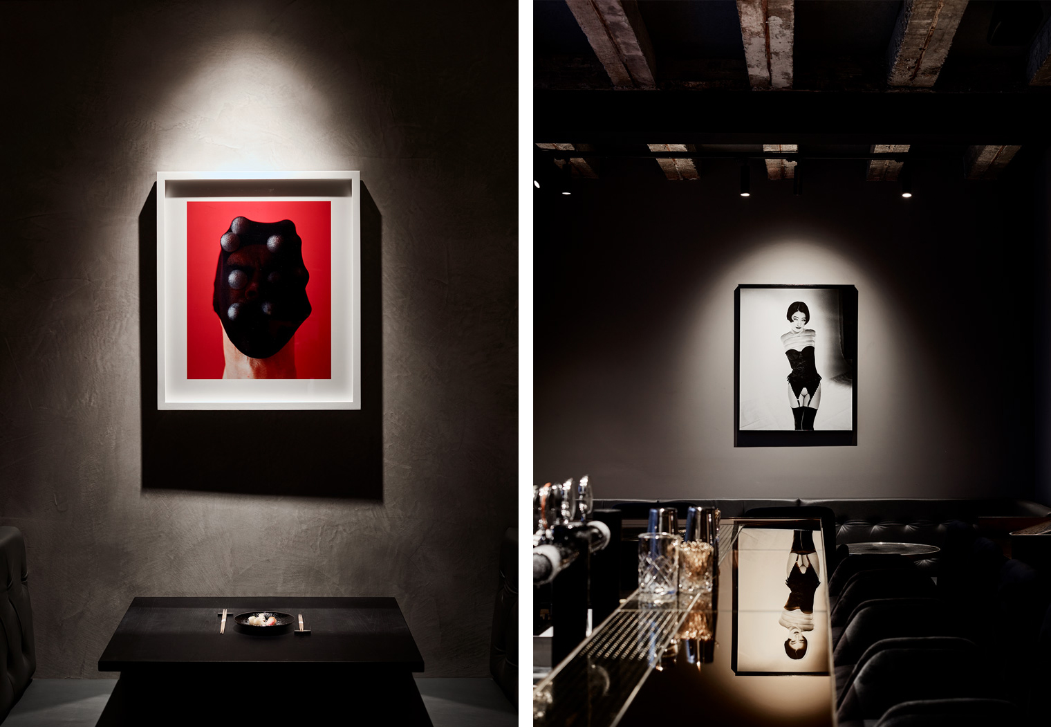
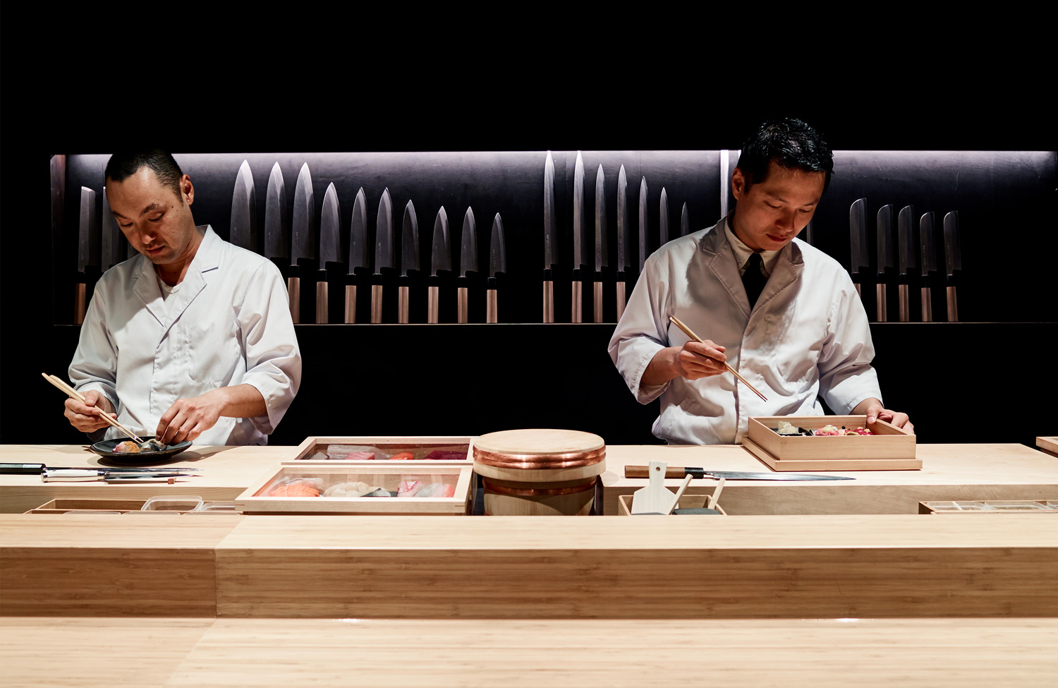
Interior is a curious mix of traditional Japanese influnces, more brutal forms and surfaces, stark use of light and dark, and sensual imagery. It is a space of contrasts, and a challenge to convention, yet well-resolved. Visual identity does something similar. Rather than the calm continuity and natural materiality often associated with the Japanese dining experience, logotype, graphic expressions, colour and texture punctuate interior, playing with energy rather than tranquility, colour contrast rather than harmony and the synthetic rather than the natural.

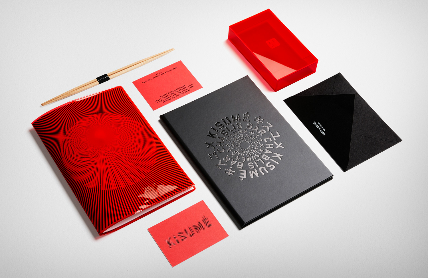
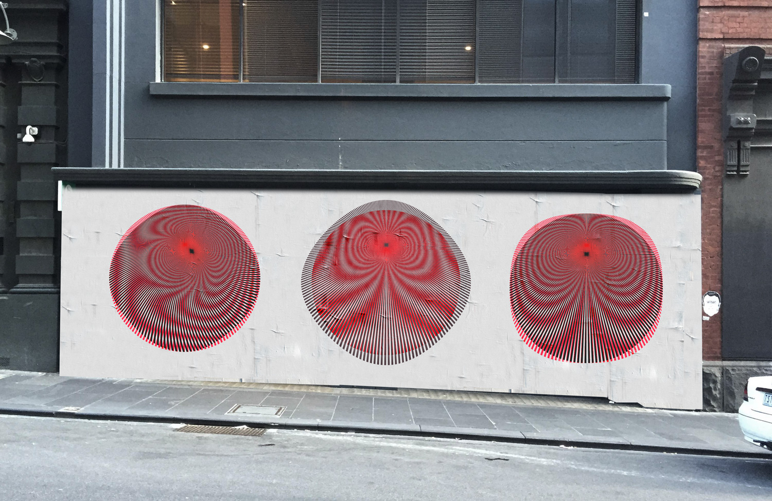
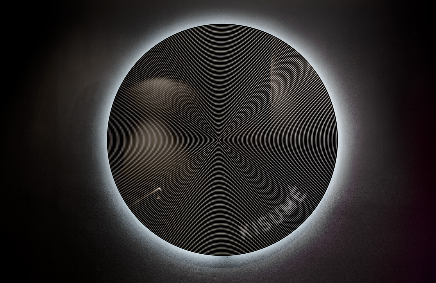
Optical illusion is effectively used to add motion and energy to static contexts. These function to make a connection between print and environment, and establishes an unexpected and distinctive visual voice. There is a pleasant variety to the implementation of this idea, in the window and lighting decals, in the rending of the wordmark, radial typesetting and motion online. Kisumé’s dinning experience is said to be intoxicating, the graphic equiverlant might be hypnotic, so an optical illusion plays well to this idea.
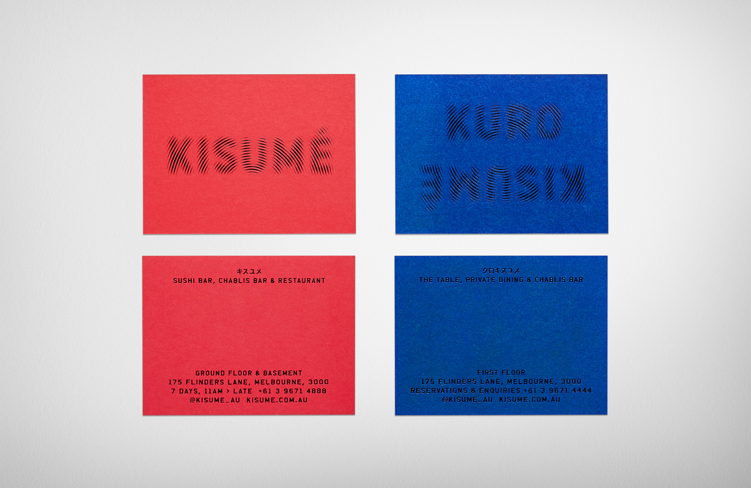
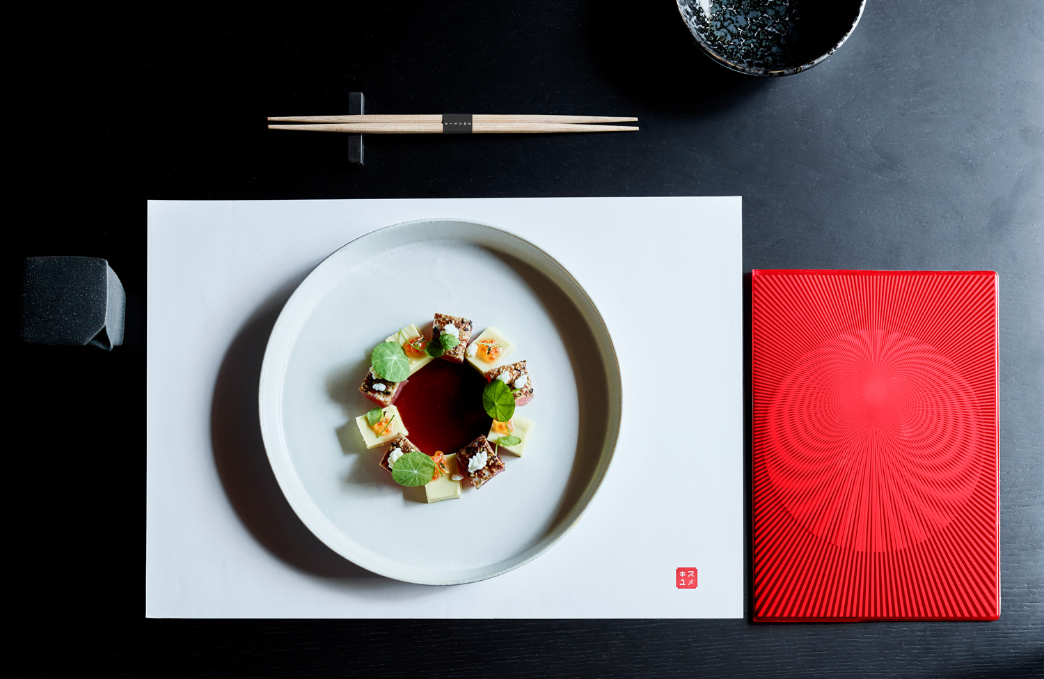
There is a neat and knowing interplay between leather upholstery, sensual imagery of Nobuyoshi Araki and the glossy plastic of menu covers and boxes. The use of blue and red sleeves, in conjunction with blue and red ink further enhance the changing qualities of visual identity.
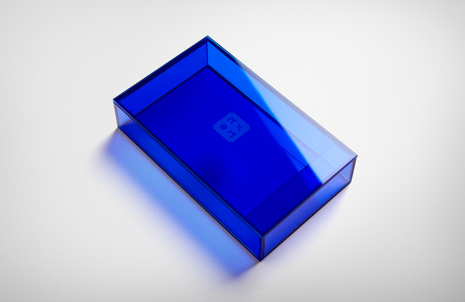

Fabio Ongarato Design was briefed to break the conventions of a typical Japanese dining experience and to define a new and unexpected territory for their client. The mix of colour and striking graphic certainly does this. There is a continuity to its implementation. It contributes to interior experience, reinterpreting the ideas that informed it rather than simply reiterating it.
Design: Fabio Ongarato Design. Art: Nobuyoshi Araki & Polly Borland. Interior: Wood Marsh Architecture. Opinion: Richard Baird.
