Maldini Studios by Jens Nilsson
Opinion by Richard Baird Posted 20 November 2017
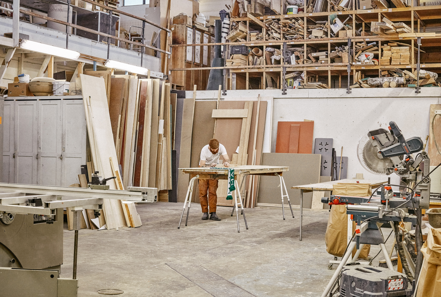
Maldini Studios is a Stockholm-based interior design and carpentry studio made up of project manager and carpenter Rasmus Moberg, interior designer Elina Johansson and carpenter Theo Klyvar. The studio’s work often uses precise lines and geometric forms to elevate the irregular detail and texture of natural materials. There are moments of utilitarian and ornamental juxtaposition, times at which this feels subtle and transitional, others where it is more severe and abrupt. Much of the studio’s work displays a contextual sensitivity, either in its continuity with or intentional opposition to space.
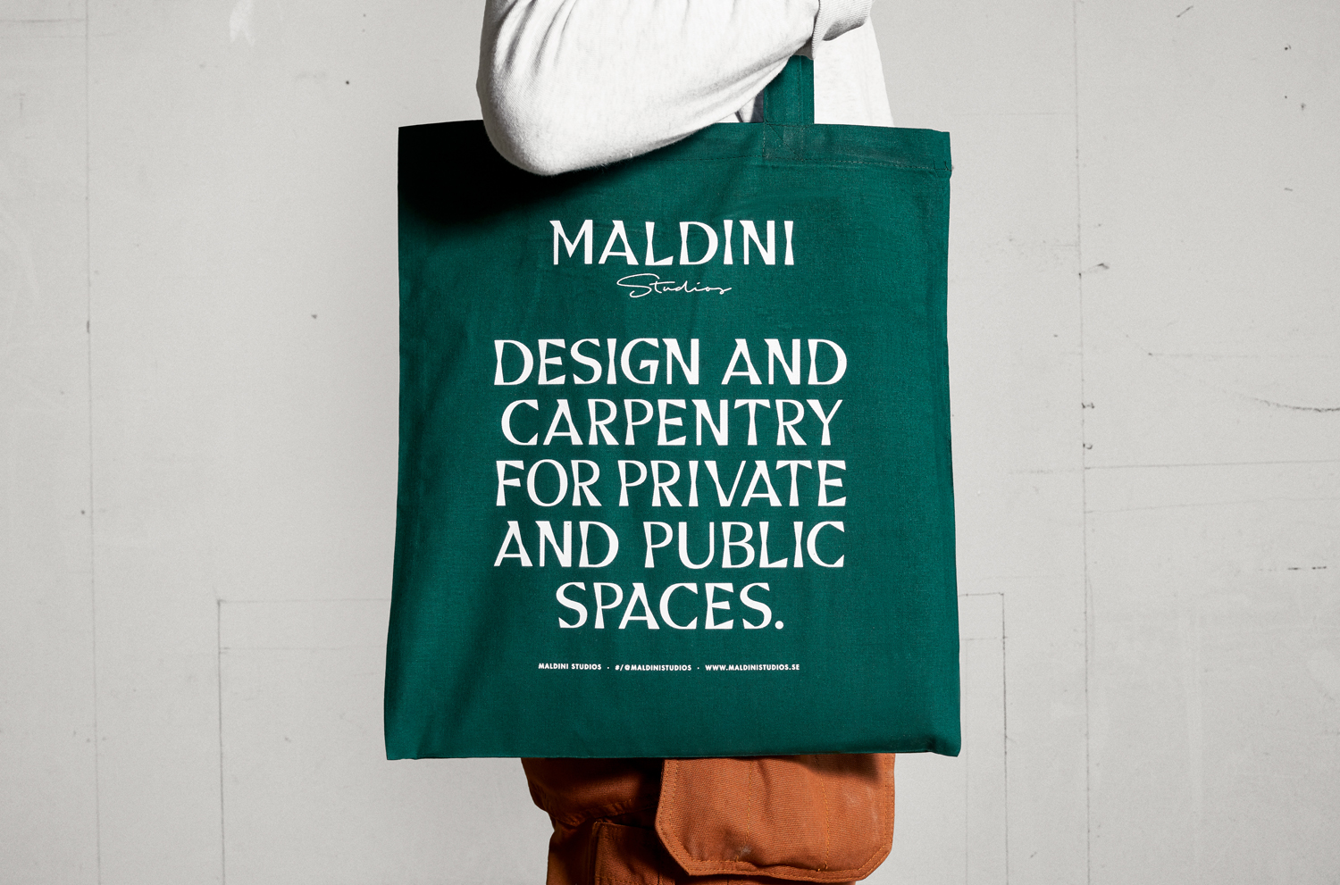
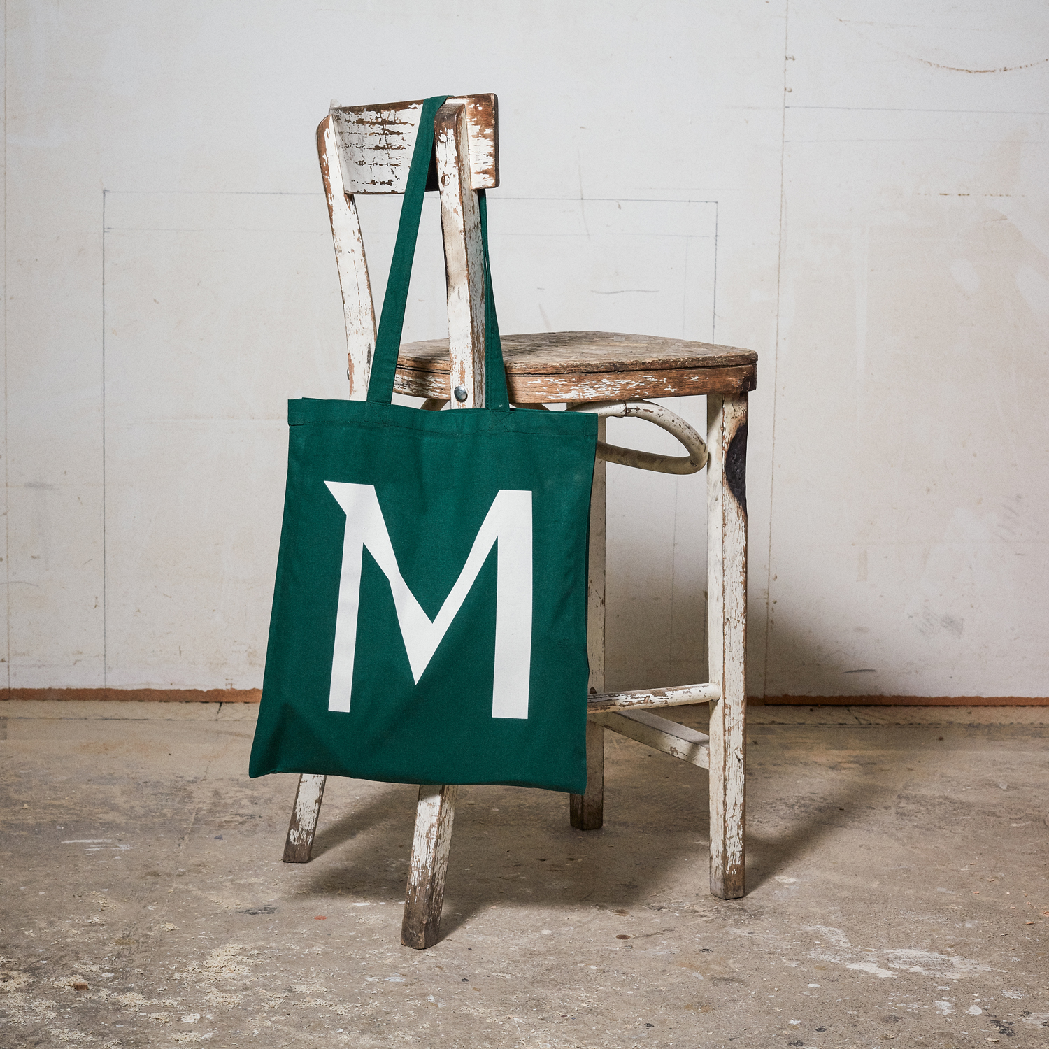
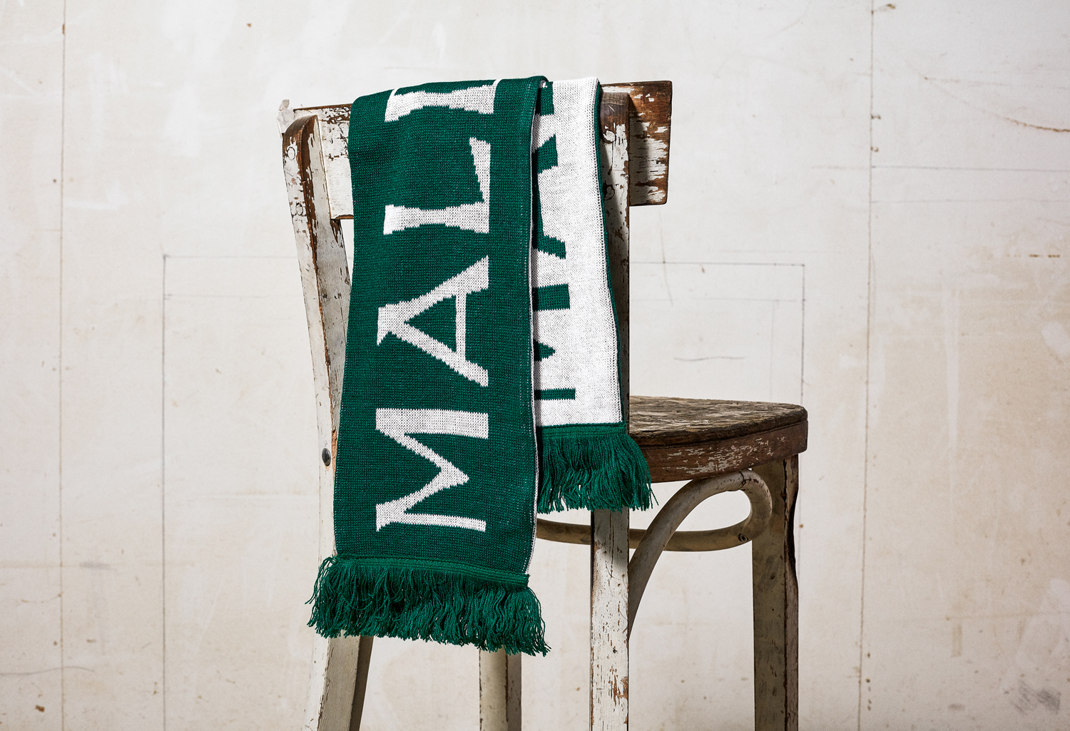
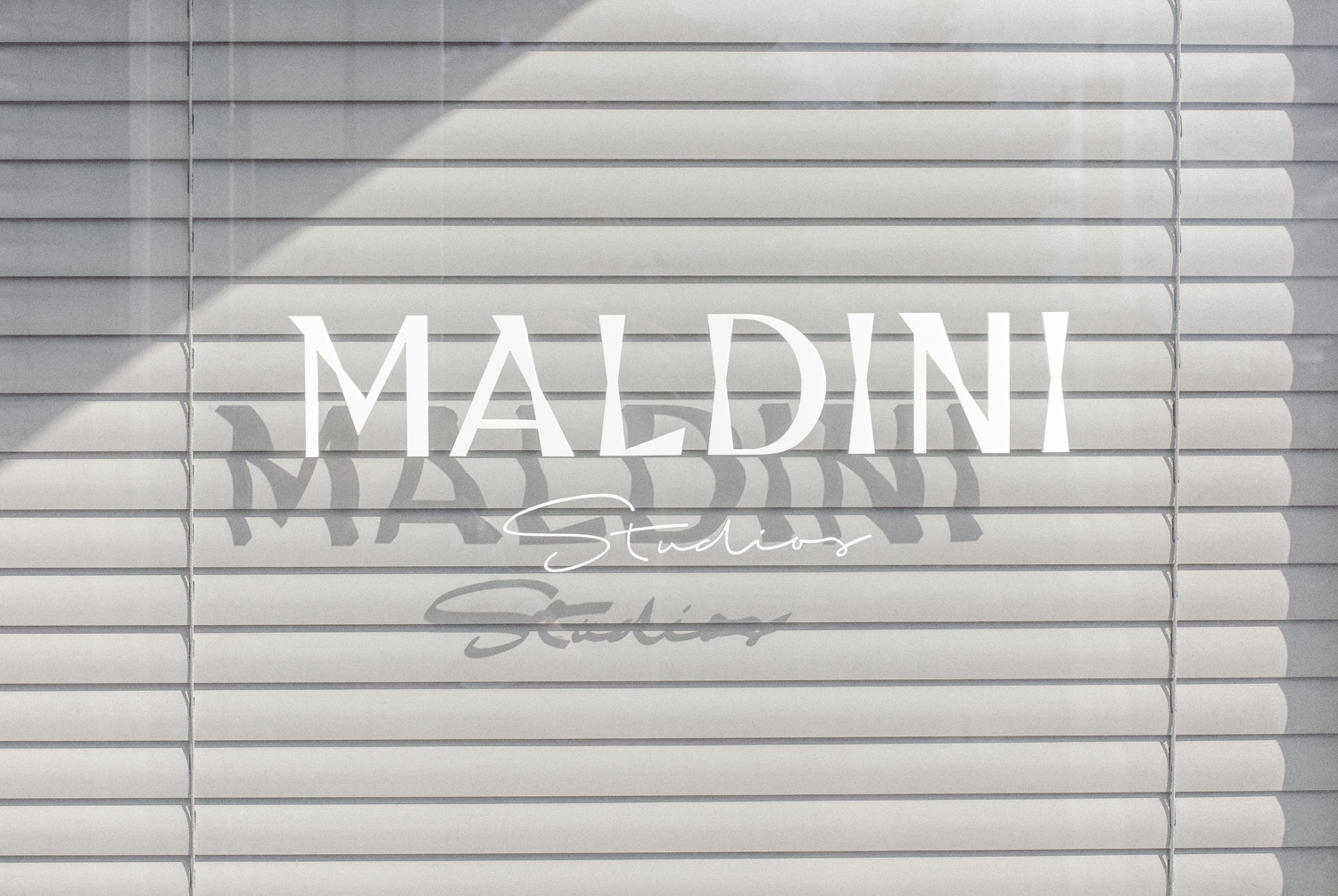
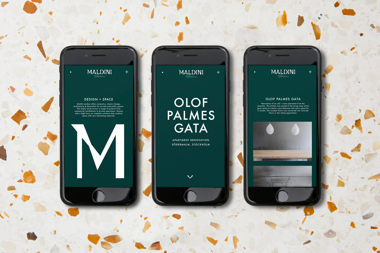
Drawing on the forms, materials and woodworking craft of the studio, as well as its understanding of object and space Swedish designer Jens Nilsson, former Design Director at Snask, built an identity that explores the intersection of the functional and the sculptural, material pleasure and communicative intention. This is done through the distinctive typographical forms of a custom typeface, a material variety, and by employing letterpress as a bridge between the two. Graphic identity runs across website and a variety of printed assets, these include stationery and business cards, branded items such as tote bags and scarves, as well as signage.
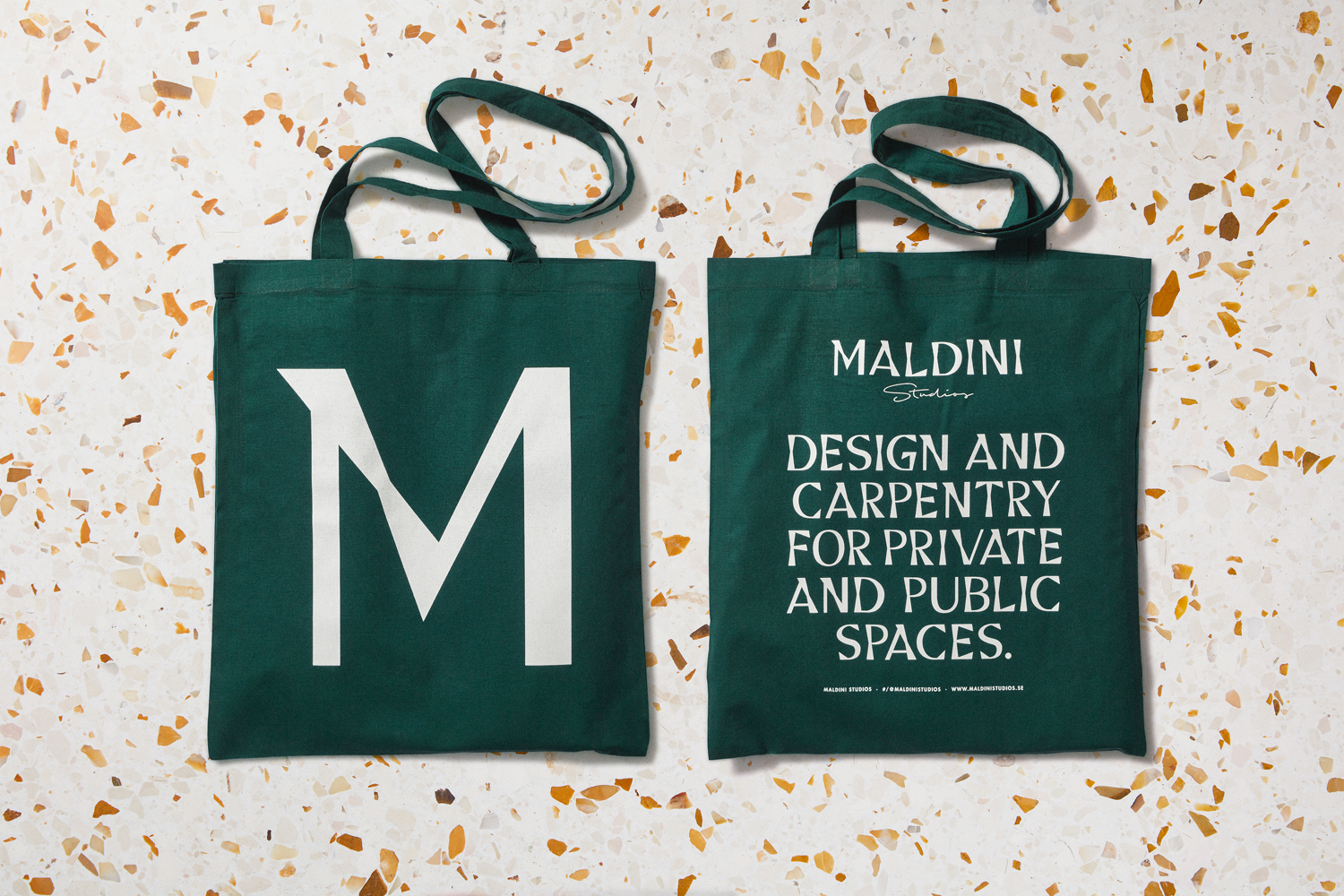
Donadoni, a custom typeface designed specifically for Maldini Studios by Jens Nilsson, is a curiosity and highlight. As a central part of graphic identity it finds a neat spot between visual character and conceptual integrity. It plays with the unusual intersection between familiar monolinear strokes and irregular forms. There is an equality here between the functional and the sculptural. It is this expression, rather than the obvious material expense, that feels the more thoughtful, and is emphasised in the proportions employed across brochure, in the of cropping words to focus on individual letterforms, and in the size of letters across tote bags.
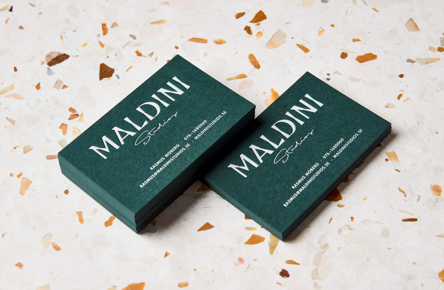
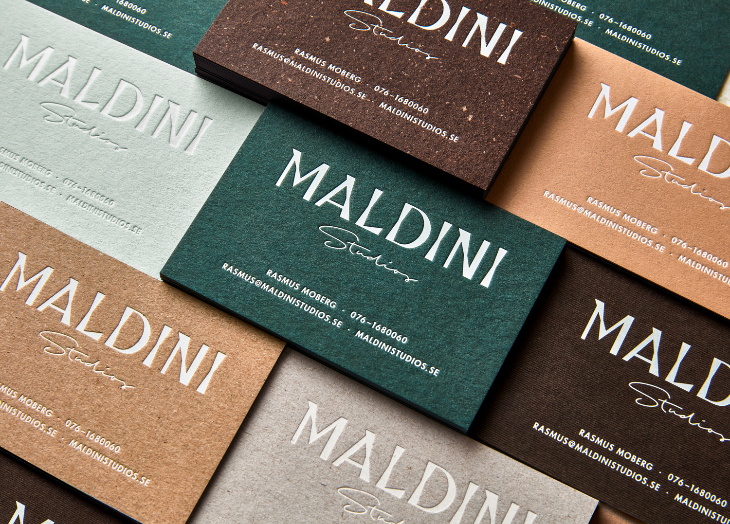
There is a pleasant relationship between the graphic forms of type, the physical composition of stationery, and the letterpress that functions as a bridge between the two, forcing the graphic right into the material world. Often, material excess and print finishes are employed as a way to obfuscate reflexive graphic design, here there is a symbiosis at play, a continuity of craft, in type, in the flecks and fibre of dyed boards, and in the impression of letterpress.

There is a material abundance in the letterpressing of a variety of G.F Smith and Arjowiggins papers and boards. If there was ever a justification for such an expense, this feels like it. The combination of colours has character, while mixed-fibre boards, in their universal made associations, channel something of the materials and craft of carpentry. Much like the duality of type, material selection moves between those that might be perceived as functional such as kraft paper and the grey and unbleached, and those that are ornamental, in colour and surface texture.
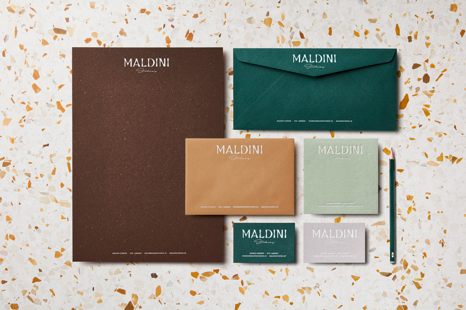
Papers & Boards:
Green: Keaykolour Holly
Brown: Gmund Bier Bock
Orange/ Light Brown: Nomad Omar
Brown: Nomad Terrain
Light Grey: Nomad Bedrock
Light Green: Colorplan Powder Green
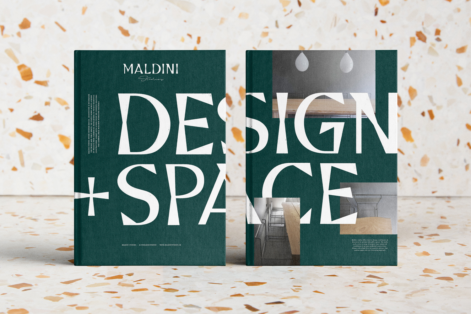
There is a communicative precision at play. Each asset, isolated and individually, whether graphic or material, speaks of craft. These do lean heavily into the design and build side of the business, however, the proportion and layering of type and image across brochure begins to touch upon interior design and its spacial considerations and arrangement.
There is a lot to like about this project. And although it occasionally struggles, the script of “Studio”, while rooted in the personal craft of the studio’s woodworkers, feels a touch unresolved, locked into a large mark and with light lines that get lost, and perhaps a couple of papers too many, it is conceptually intelligible and materially appealing.
Design. Jens Nilsson. Opinion: Richard Baird.
