BP&O Collections — Framing
Opinion by Richard Baird Posted 14 March 2018
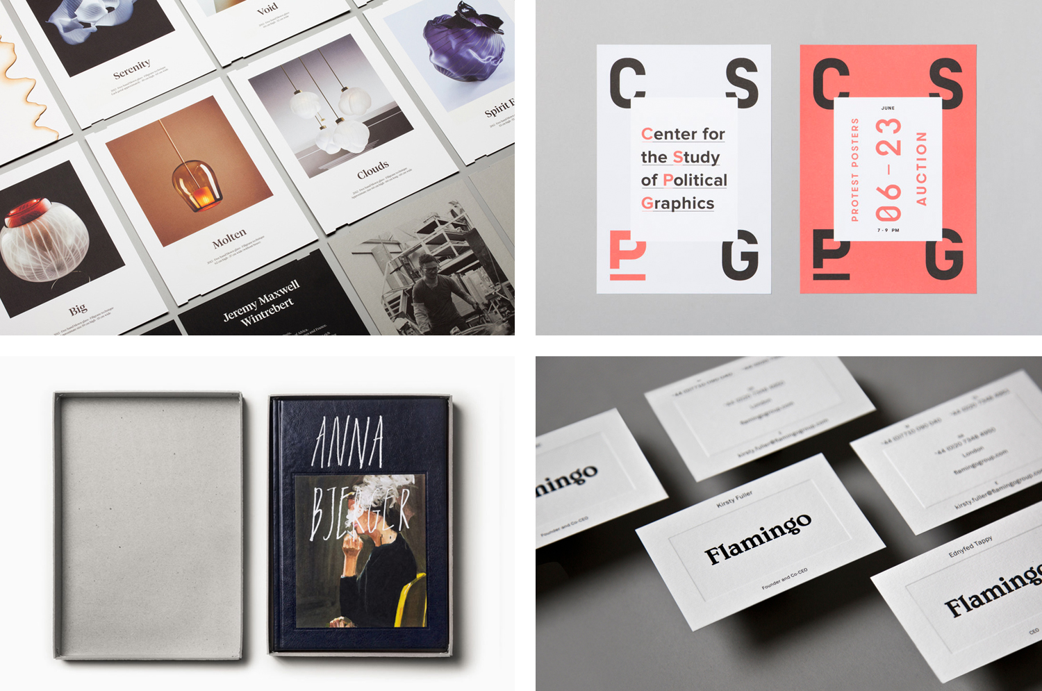
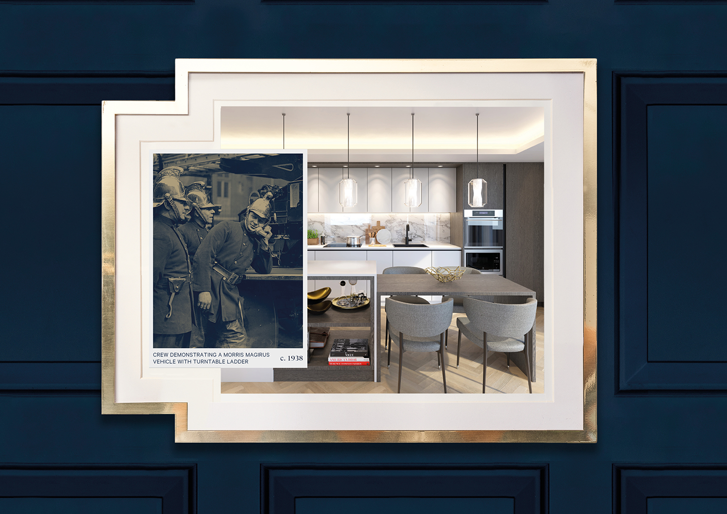
A continually updated gallery of graphic identity design work, reviewed and published on BP&O, that feature the framing of space, image, type or product. This collection includes simple white borders, containers that expand and contract, subtle framing through blind emboss, literal frames created by die cutting, and type used to define or imply a boundary. There are times where a contrast of colour, shape or texture are used to draw the eye inwards, moments where the blank and the detailed are inverted, where frames are created through the proportionality of paper, or alluded to in the cropping of type. Many of these are rooted in a broader concept rather than employed as a final material or graphic flourish.
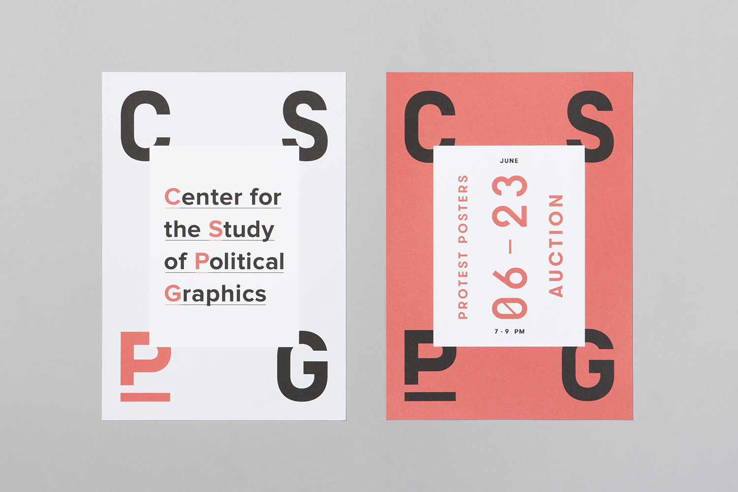
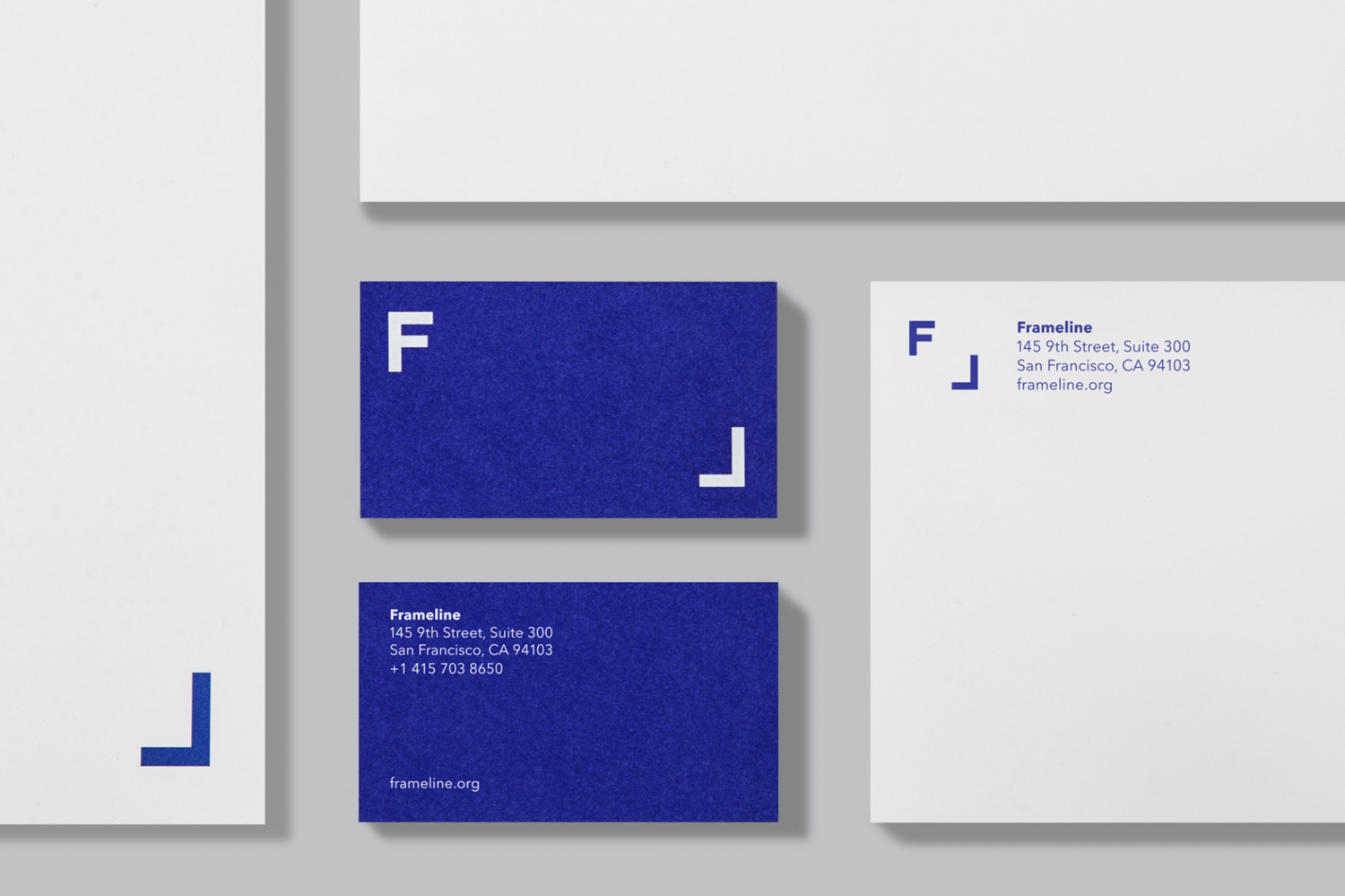
This post features work by Studio Hi Ho, Multiadaptor and Bibliothèque, and covers a variety of projects, from poster archival and study to film festivals and photographers. Highlights include Blok’s typographic framing of rich imagery for CSGP, the oversized portfolio-like cover of Studio Hi Ho’s brochure for Whitlam Place, and the expanding and contracting frame of Mucho’s logo for Frameline.
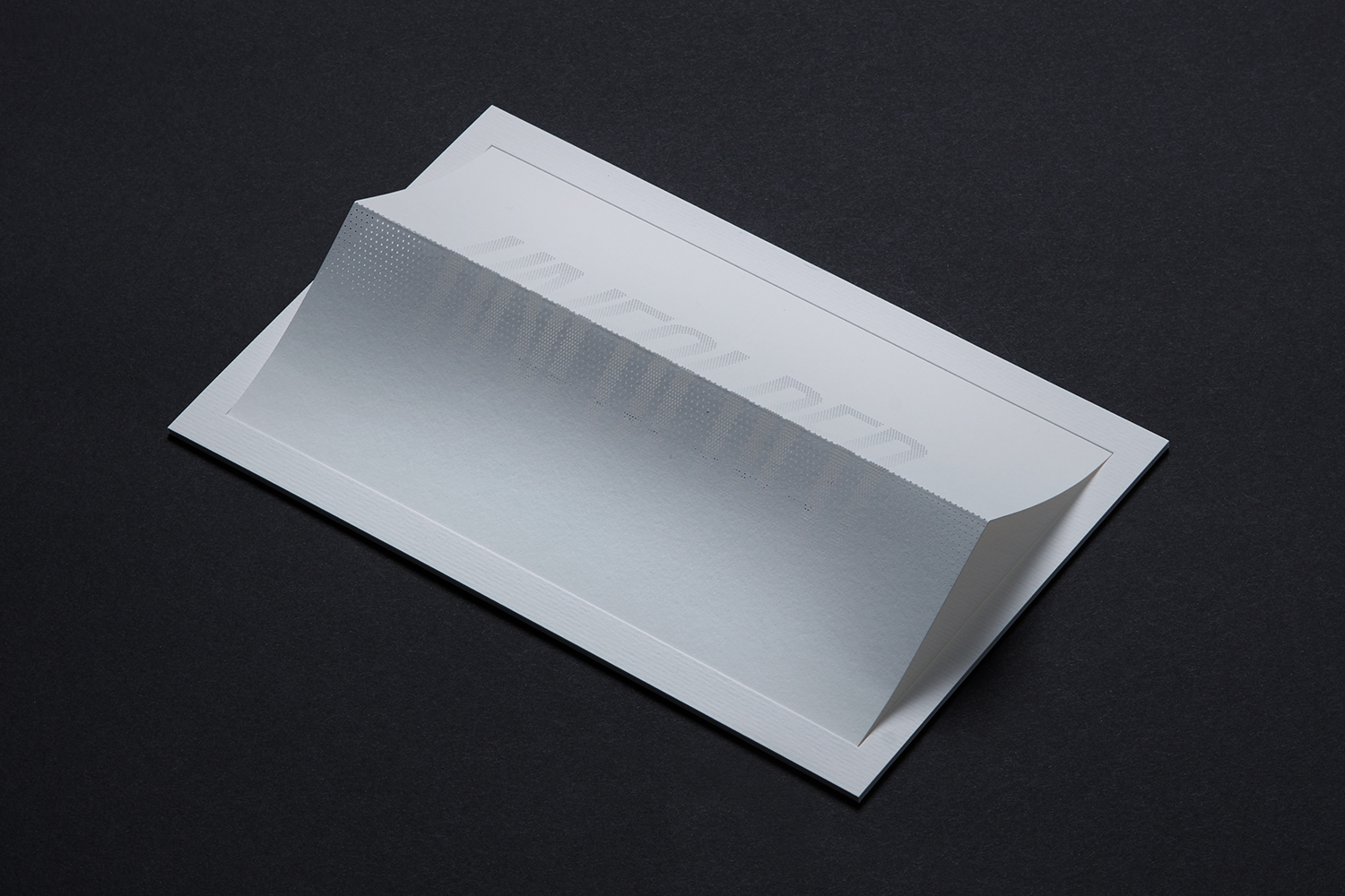
Unfolded by Commission
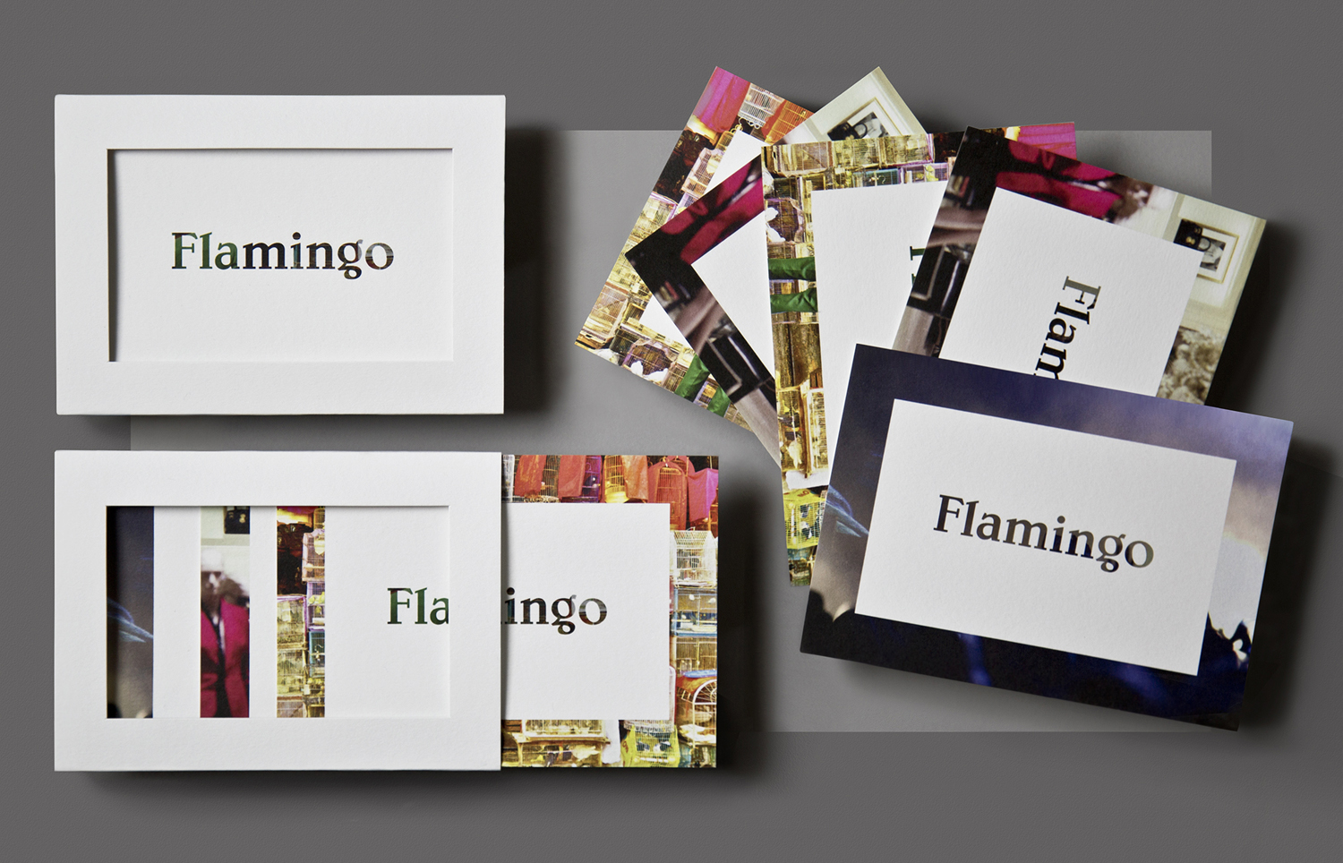
Flamingo by Bibliothèque
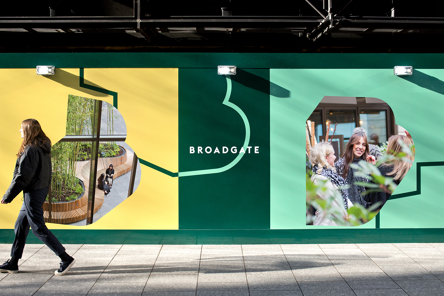
Broadgate by dn&co
Center for the Study of Political Graphics by Blok
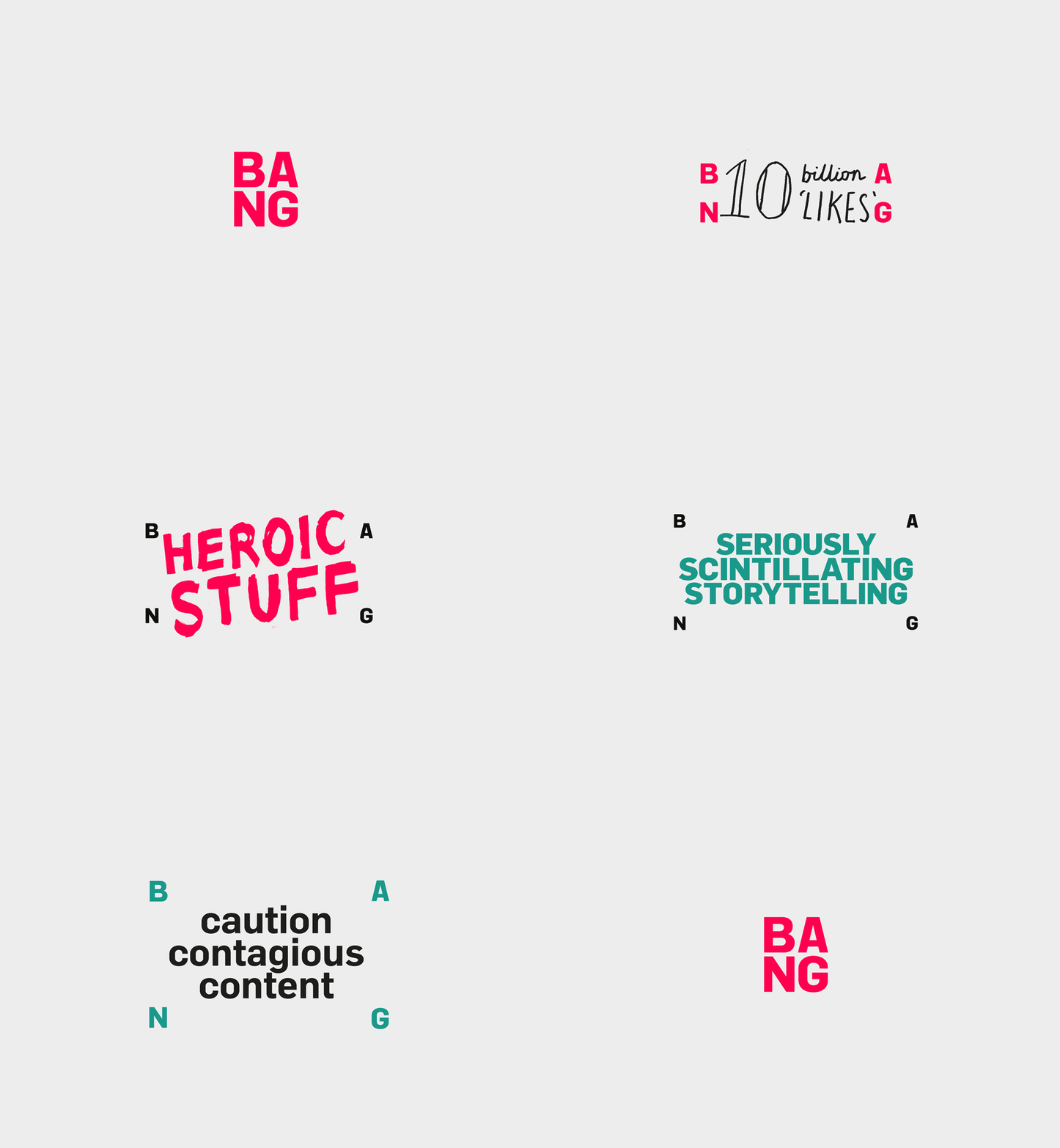
Bang PR by RE Sydney
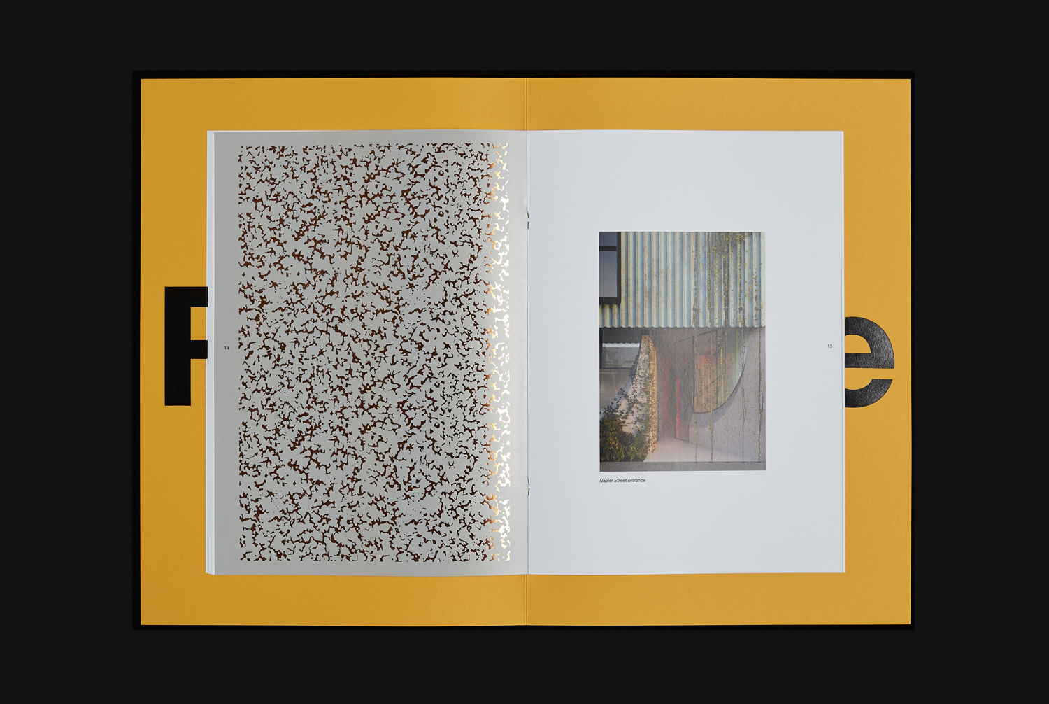
Whitlam Place by Studio Hi Ho
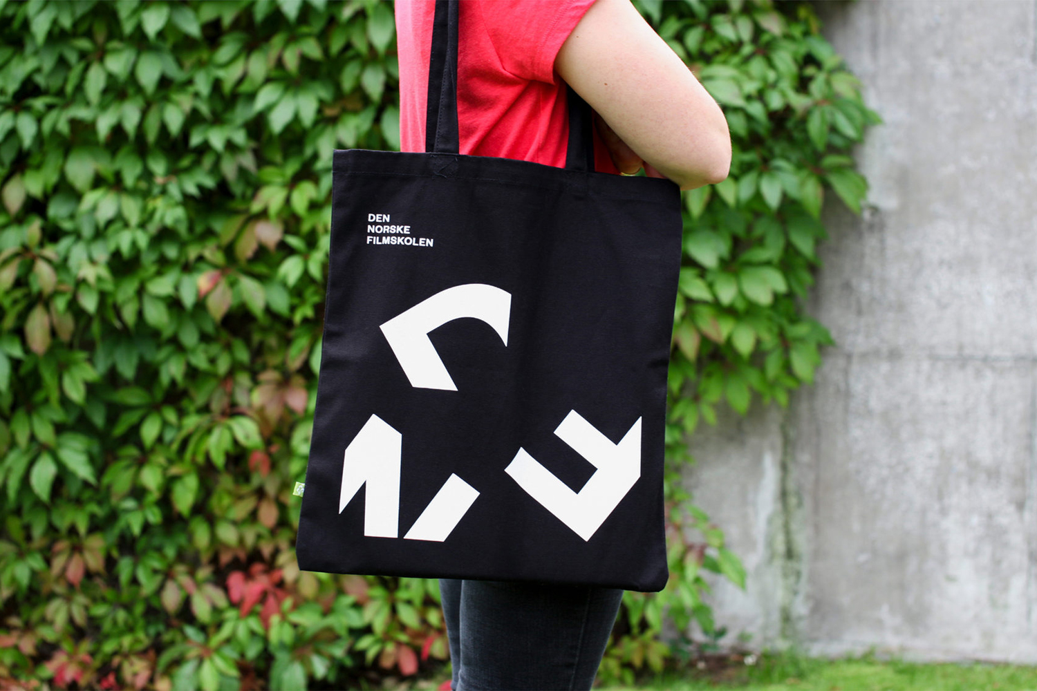
Den Norske Filmskolen by Neue
Frameline by Mucho
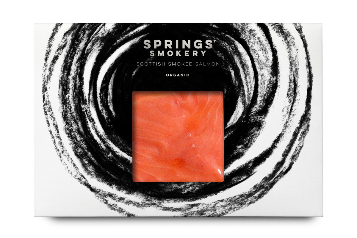
Springs’ Smokery by Distil Studio
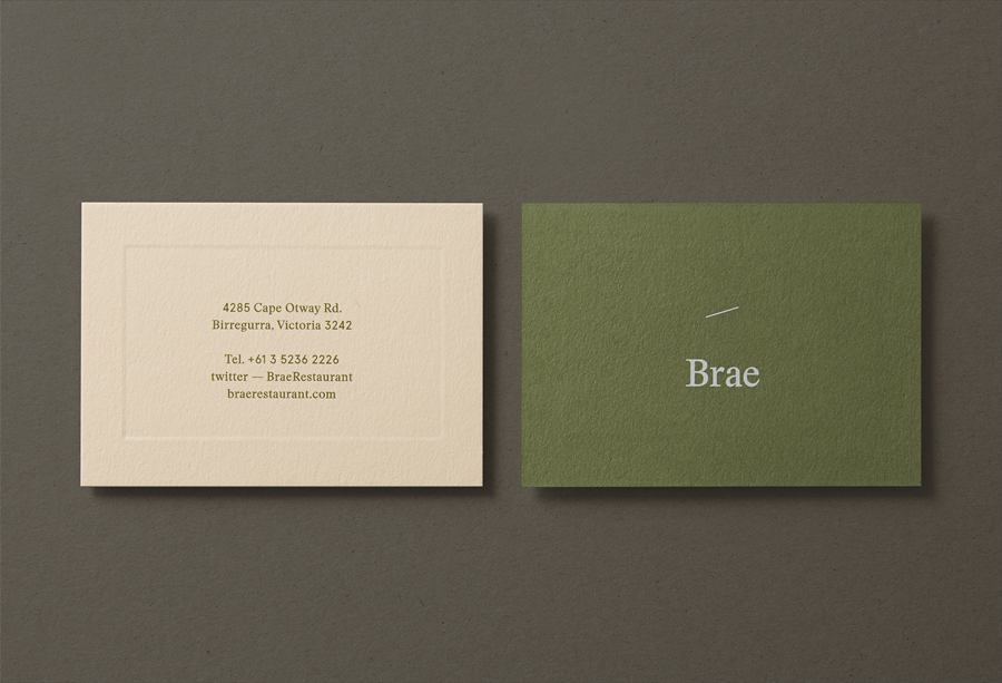
Brae by Studio Round
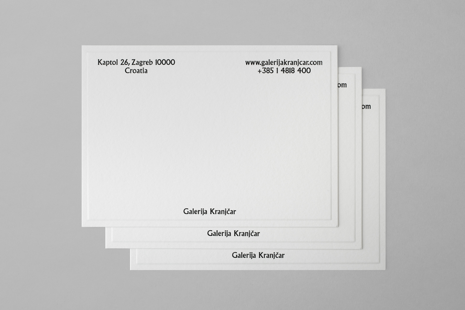
Galerija Kranjčar by Bunch
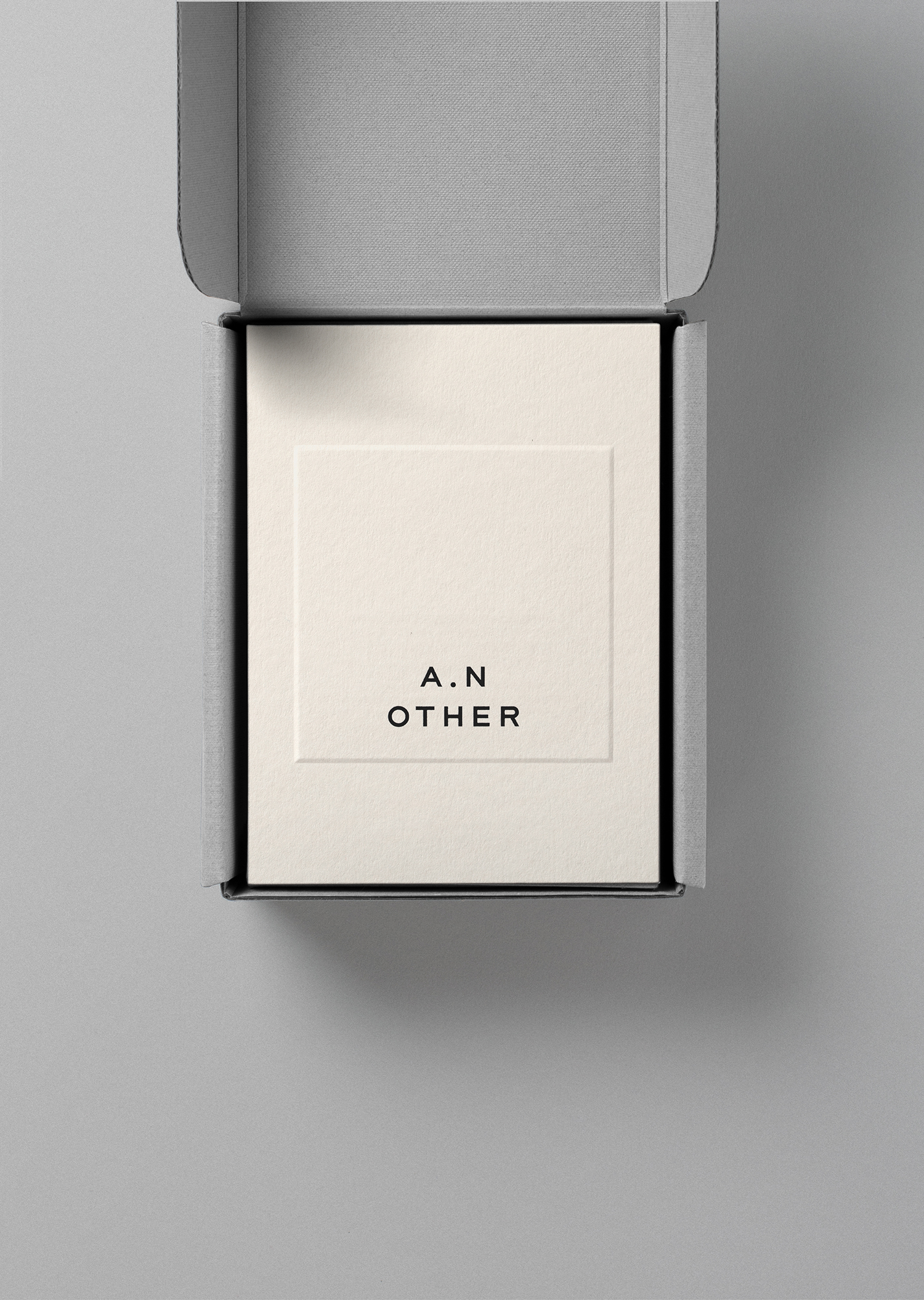
A.N Other by Socio Design
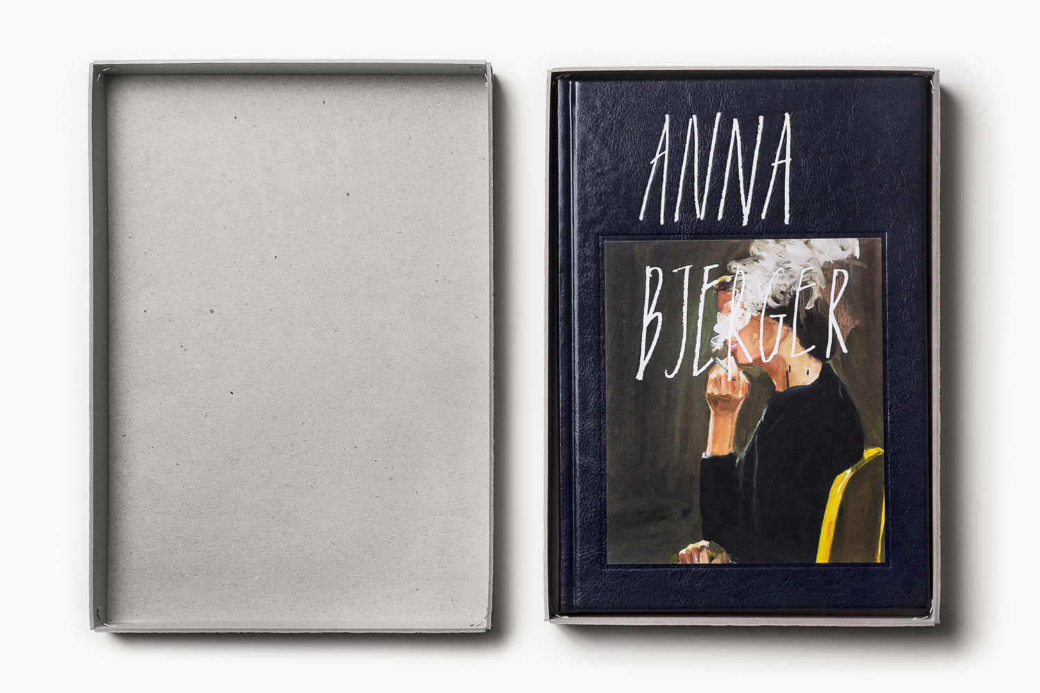
Anna Bjerger by Bedow
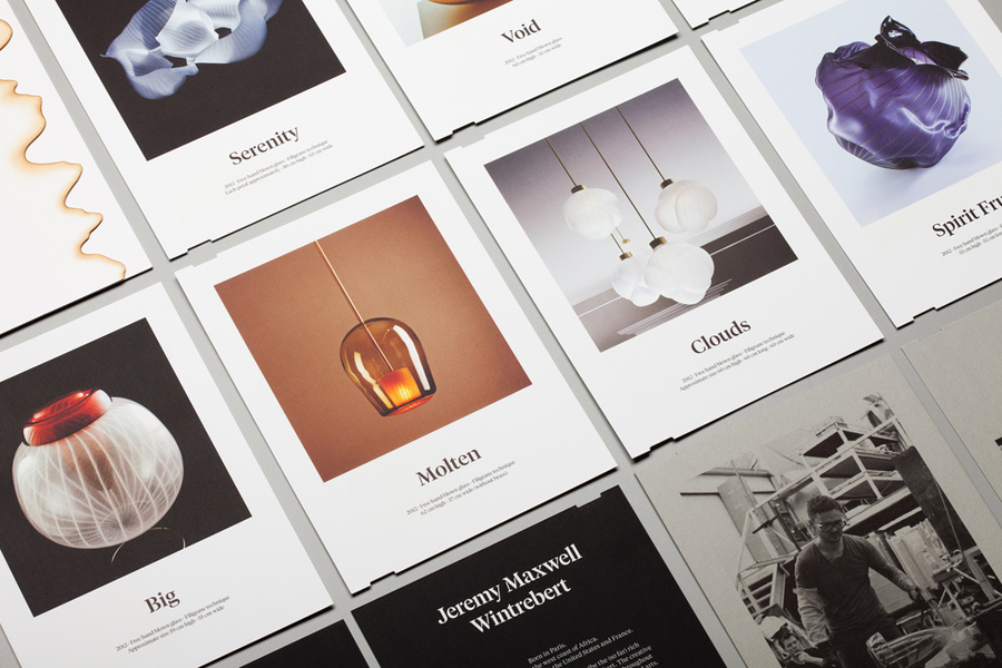
Jeremy Maxwell Wintrebert by Hey
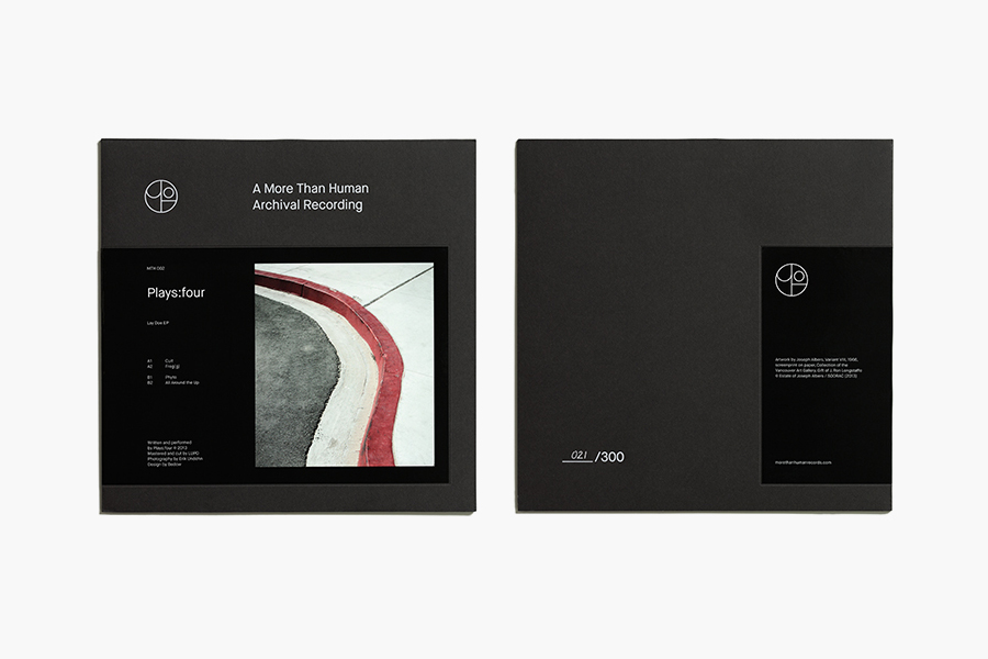
More Than Human by Bedow
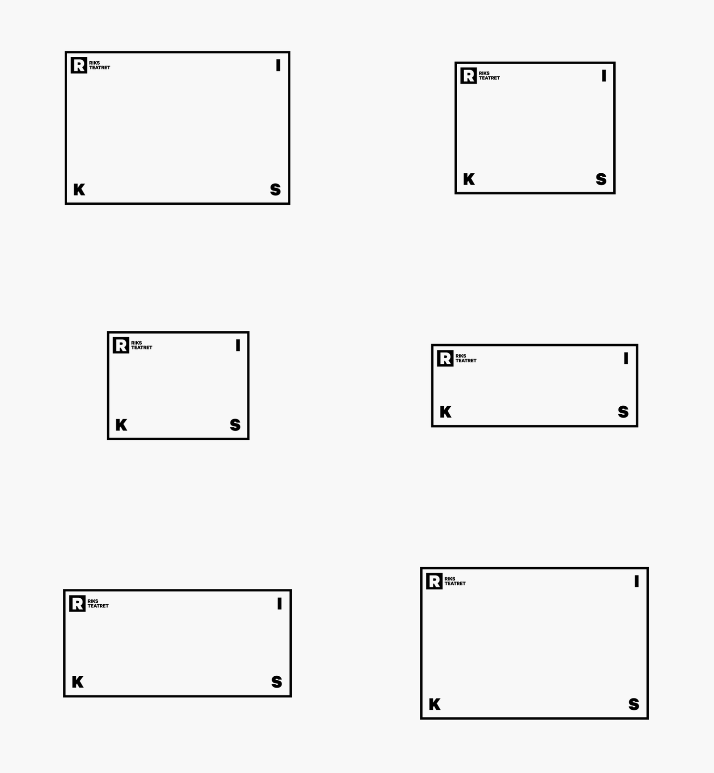
Riksteatret by Bleed
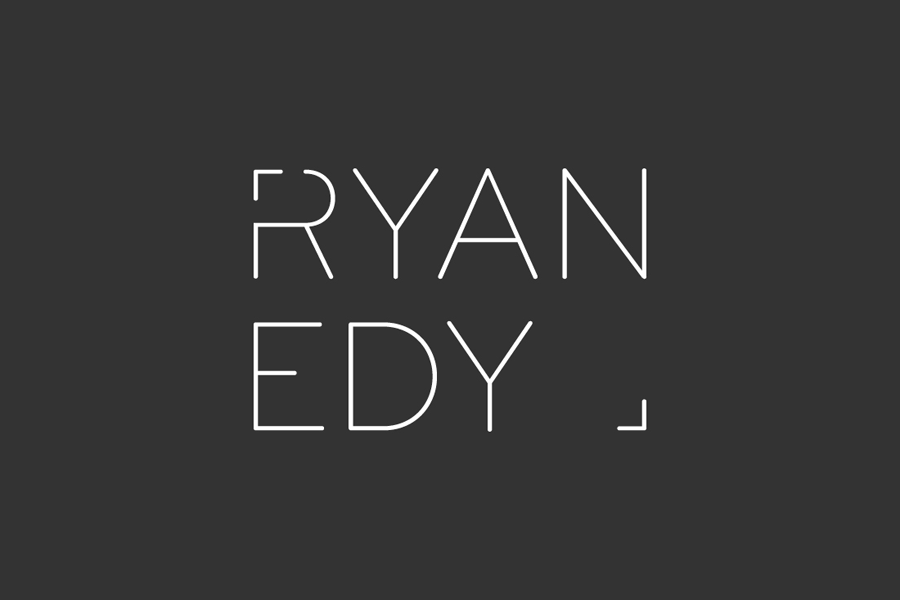
Ryan Edy by Founded
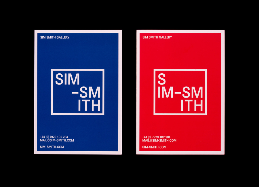
Sim Smith Gallery by Spin
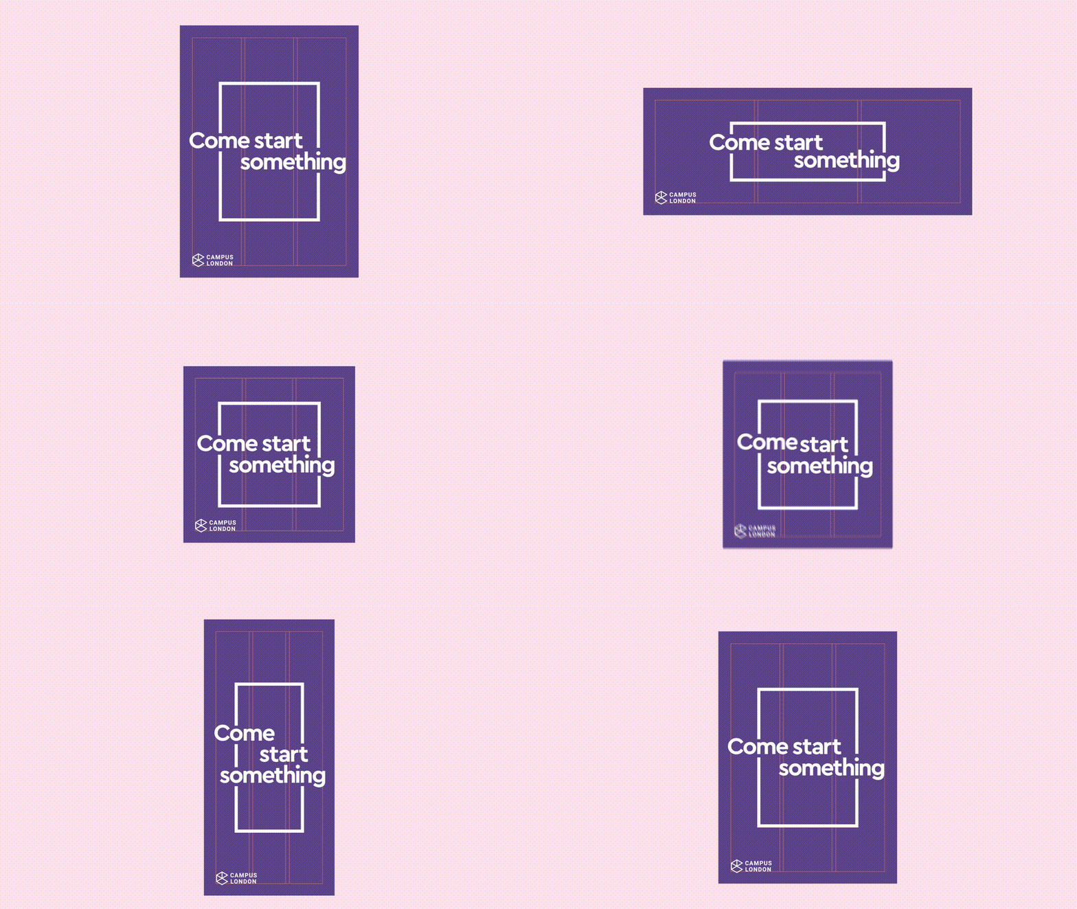
Campus by Multiadaptor
Space Division by Inhouse
Brigade Court by Jack Renwick Studio
