The Best of BP&O — April 2018
Opinion by Richard Baird Posted 1 May 2018

April’s highlights included dn&co’s generative identity for Broadgate, RE’s work with the Sydney Design Festival and Studio South’s collaboration with illustrator Egle Zvirblyte for Gogo Daddy. There were, however, five projects that stood out and have made it into BP&O’s Best Of Series. These typically balance a strong singular concept or an appropriate confluence of ideas with a compelling visual character and clear communicative intention that appropriately plays with form, colour, type and layout, as well as material, texture, image and print finish.
BP&O, in this end of month review, tries to recognise both the smart use of small budgets—those that channel spending into the most appropriate assets—and those projects with a broad and holistic quality, establishing a continuity (conceptual and/or visual) across multiple touch points. Many of the projects share a concise aesthetic expression, yet there is nuance and strategic weight to these, so do click through and read more about each of these.
Throughout the month BP&O also continued to expand on its collections series as another way to jump through to older posts on the site. Additions to this were Business Cards for Architects and included a new Studio Showcase feature which brought together the work of Studio fnt and Bond.
Mitsulift by Base Design

As the built environment expands, as it seeks new places to fill and accommodate a growing populace, time spent in and our reliance on modern conveyance systems develop in tandem. Reliability is central to this experience. Mitsulift is an elevator specialist tackling this need, balancing what is described as a Japanese technical expertise with exceptional Middle-Eastern service. Its graphic identity, however, failed to communicate this. Base Design worked with Mitsulift to bring this up to date, to better reflect the ambitions of the company, its insight and support, to move it from a product-vendor to a service-driven company. Base built an identity that maintains something of a utility yet manages to establish a distinct visual and verbal expression of connections. This links a variety of printed and digital assets. These included brochures, stationery, business cards and supergraphics, as well as website and mobile app.
See more of this project here

Cult 20 Year Anniversary Event & Exhibition by Toko

In 2017 Australian furniture retailer Cult celebrated its 20th anniversary. They marked this with an event and exhibition and worked with design studio Toko to develop a graphic identity to unify these and bring to light their extensive catalogue. Through a mix of bright illustrative silhouettes across invitations, packaging, postcards, flags and banners, the art direction of some Cult’s ranges, and an eye-catching bright red die cut cover, Toko play with a graphic immediacy and follow this up with layers of material and photographic detail.
See more of this project here
The East Cut by Collins
The East Cut unifies the three distinct downtown San Francisco areas of Transbay, Folsom and Rincon Hill into a single and modern metropolitan community. It is a unique an area, now recognised by Google Maps, that contains the newest and largest building in the city but also those that are the oldest and historically rich. Collins worked to develop a name and graphic identity for this new neighbourhood that would resolve and express its historical context and its reinvigorated and modern outlook. This links a variety of print and digital communications that included posters, business cards, hoardings, signage and website.
See more of this project here
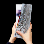
Platform 10: Live Feed by Pentagram

Platform 10 is the latest edition of the Harvard University Graduate School of Design’s annual abstract of student work, events, lectures and exhibitions. Under the theme “Live Feed” and inspired by social media feeds, Pentagram’s Natasha Jen and team have collated and formalised the 2016-2017 school year, in reverse chronological order, presenting this as a timeline of images drawn from a crowd-sourced database of 117,518 files. The pages of Platform 10 are bound by a French fold, giving the book the quality of a single continuous stream of paper, which is augmented by the sequencing and cropping of images, and the way that these occasionally disappear into the crease.
See more of this project here
Helsinki by Werklig

In August 2017 Scandinavian design studio Werklig was commissioned to develop the graphic identity for the Finnish city of Helsinki, a capital with an urban region of roughly 1.4 million inhabitants and 751,000 jobs. The challenge was to resolve a disparate and fragmented visual system that represented a broad range of public services, departments and development projects that were helping and informing a diverse group of people. These included locals, national and international visitors, those looking to make their home in Helsinki or seeking asylum. Although each entity had its own logo, these were often tenuously linked by the city’s coat of arms. This served as the beginnings of a new and integrated identity program.
See more of this project here