The Best of BP&O — September 2018
Opinion by Richard Baird Posted 28 September 2018
September’s highlights included Folch’s packaging for DOIY’s new range Honom, OK-RM’s work on Mies in London and Foreign Policy’s new magazine Critical Mass. There were, however, five projects that stood out and have made it into BP&O’s Best Of Series. Between them these typically balance a strong singular concept or an appropriate confluence of ideas with a compelling visual character and clear communicative intention that appropriately play with form, colour, type and layout, as well as material, texture, image and print finish.
BP&O, in this end of month review, tries to recognise both the smart use of small budgets—those that channel spending into the most appropriate assets—and those projects with a broad and holistic quality, establishing a continuity (conceptual and/or visual) across multiple touch points. Many of the projects share a concise aesthetic expression, yet there is nuance and strategic weight to these, so do click through and read more about each of these.
Throughout the month BP&O also continued to expand on its collections series as another way to jump through to older posts on the site. This included a collection of projects that feature fluorescent inks or papers.
Tatau by Inhouse

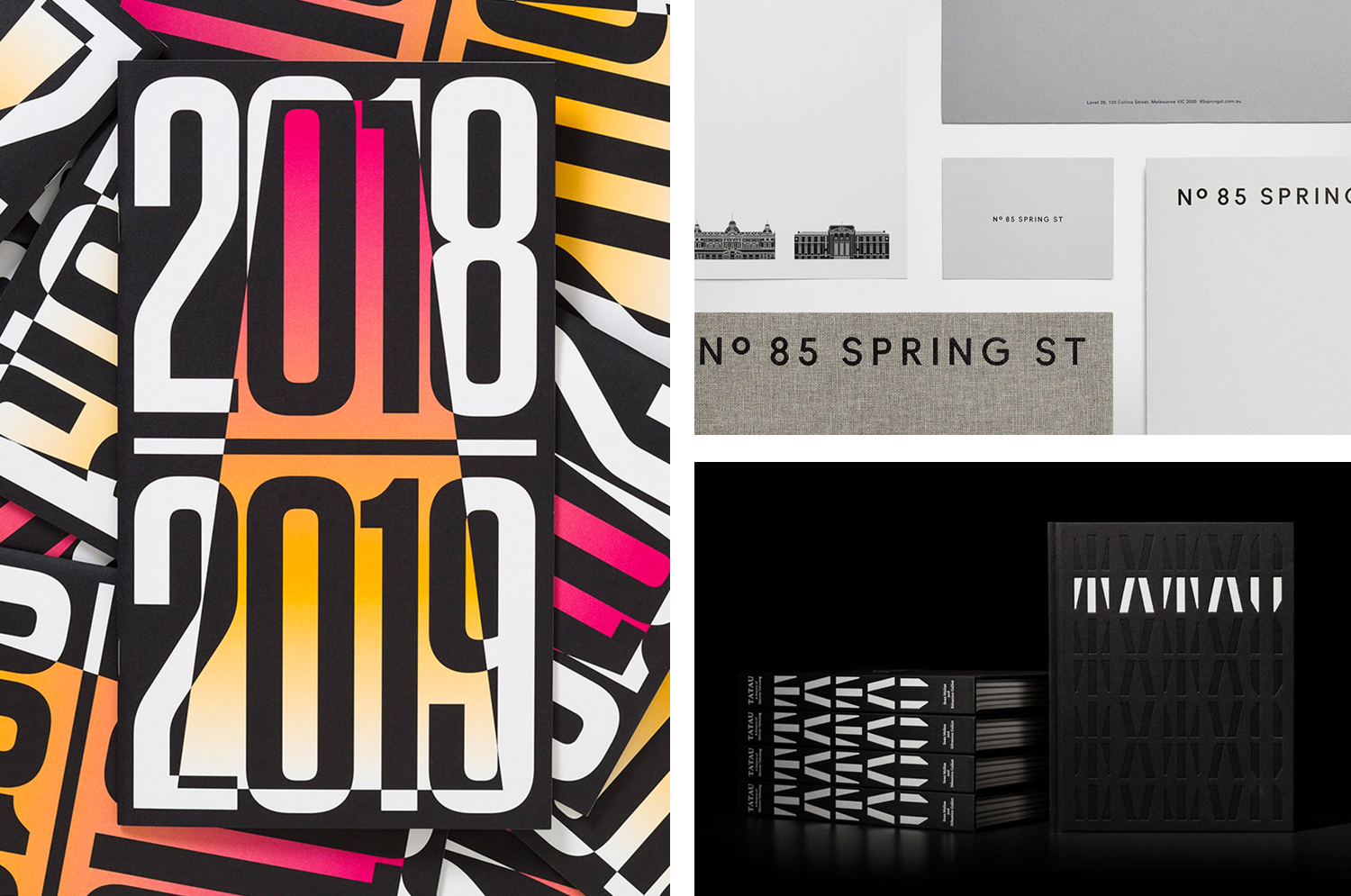
Tatau chronicles the rich cultural history of Sāmoan tattooing, from its beginnings 3,000 years ago to the practices of today. Tatau takes the form of a 320 page hardback book (255 x 200mm) illustrated with historical photographs from the nineteenth, twentieth and twenty-first-century, diagrams, film stills and images of posters and related artefacts. These were brought together by Sean Mallon and Sébastien Galliot, and set alongside texts that explore how Sāmoan tattooing has been shaped and reshaped over an extended period by regional and international forces, with graphic and editorial design by New Zealand-based studio Inhouse. The book features a distinctive debossed cover, custom typeface and a reversible half jack with examples of contemporary male and female tatau by photographer Greg Semu.
See more of this project here

Atlantic Theater 2018 – ’19 Season by Pentagram

Atlantic Theater Company continues to work with Paula Scher and her team at Pentagram, this time on the campaign for their 2018–19 season. This is characterised by a contrast of bright fluorescent gradients and solid black ink. These fill, define and intersect the condensed sans-serif letterforms and graphic emblem of the theatre; the megaphone A, designed and introduced in 2015. This runs across a printed programme of upcoming productions, kids programming and educational opportunities.
See more of this project here
Migrant Journal by Offshore Studio

Migrant Journal is a six-part exploration of migration in all its forms. Indeed, it covers the very current and pressing political and socio-cultural implications of the migration of people fleeing from persecution, seeking better economic opportunities or under pressure from shifting environmental conditions, yet it also touches upon the more abstract movement of objects and ideas around the globe. Migrant Journal, in its breadth but continuity of theme, intends to reclaim the word migration, to make a break from the prejudices and clichés of migrants and migration.
This is a hands-on review, BP&O holds and has read issues 1,3 and 4, but unfortunately is missing Issue 2. Migrant Journal began as a Kickstarter project, is edited by Justinien Tribillon, Michaela Büsse and Dámaso Randulfe, co-edited and designed by Isabel Seiffert and Christoph Miler of Offshore Studio.
See more of this project here
Innsbruck International, Biennial of the Arts by Studio Mut

Innsbruck International, Biennial of the Arts is a 16-day event set over 10 locations presenting the work of over 20 international artists who are invited to make use of Innsbruck’s historical and contemporary venues. Together, these works reach across the wide spectrum of the visual arts; from painting and sculpture, film and sound to performances and installations. Although events of this kind are, by their very nature, politically charged; the worldviews of a few artists presented to an international audience, the 2018 event brought this right to the forefront under the theme of “Agents Of Social Change”. Capturing the spirit of this Italians Studio Mut developed a graphic identity for the 2018 Biennial that included posters, advertising, programmes, brochures and website. This is marked by a visual language of both the personable and mechanical, motion and pause, yet, united by an immediacy and urgency.
See more of this project here
85 Spring Street by Studio Ongarato

85 Spring St is a residential property development of 132 apartments by Golden Age Group, designed by Bates Smart and located in the Australian city of Melbourne. It will be marked by its total work of art philosophy, or Gesamtkunstwerk, which embraces a multitude of artworks to compose one singular piece, but also its distinctive, sculptural and high-rise modernity within an area of significant architectural heritage and many low-rise structures. Although disparate in its form and height, its stonework seeks a connection with the surrounding urban environment.
Studio Ongarato worked with the developer to create a visual identity and strategy for the marketing of the property. Mixing commissioned artworks, material craftsmanship and a modern graphic simplicity of type and colour the concept captures the essence and total design philosophy of the building and using archival materials and illustration recognises and brings to light the significance of the site. These ideas link a variety of communications modes that included stationery set and brochure packs, signage, direct mail and display suite.
See more of this project here