The Architect’s Bookshop by Garbett
Opinion by Richard Baird Posted 13 February 2019
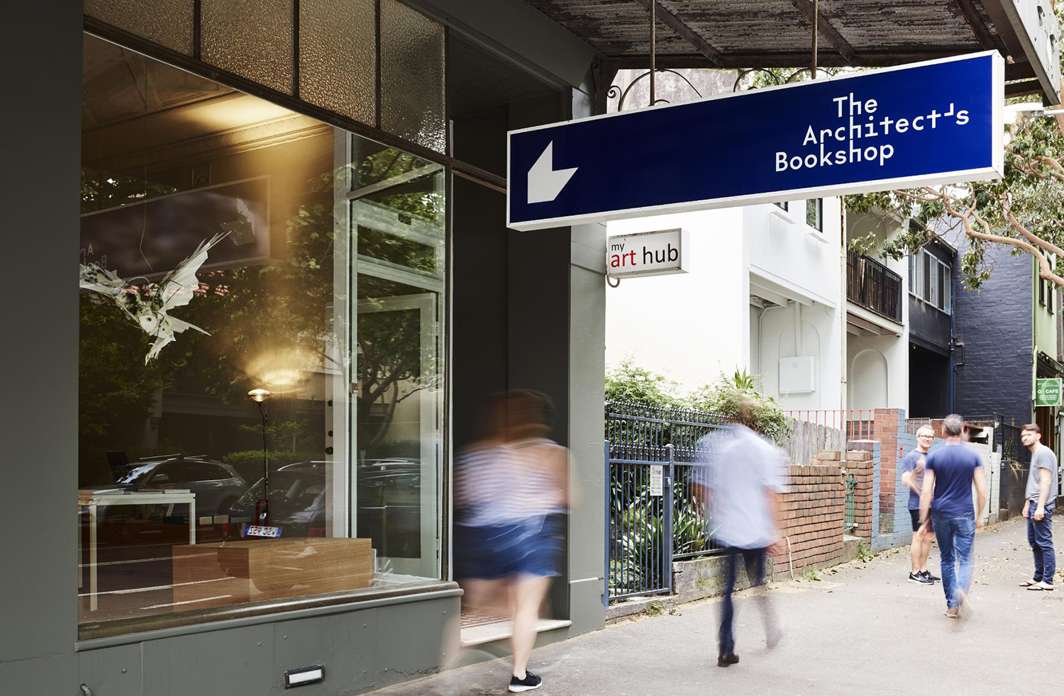
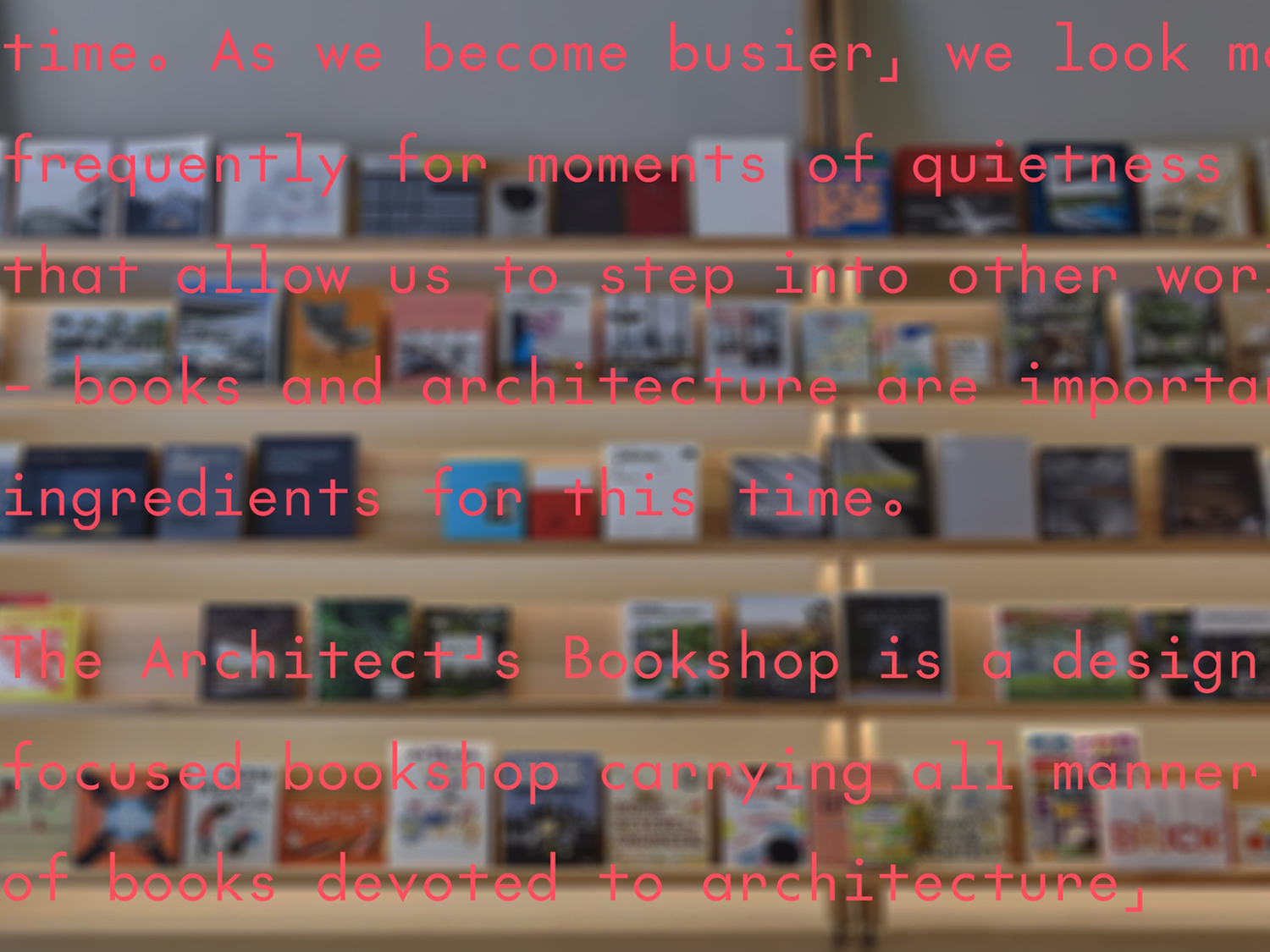
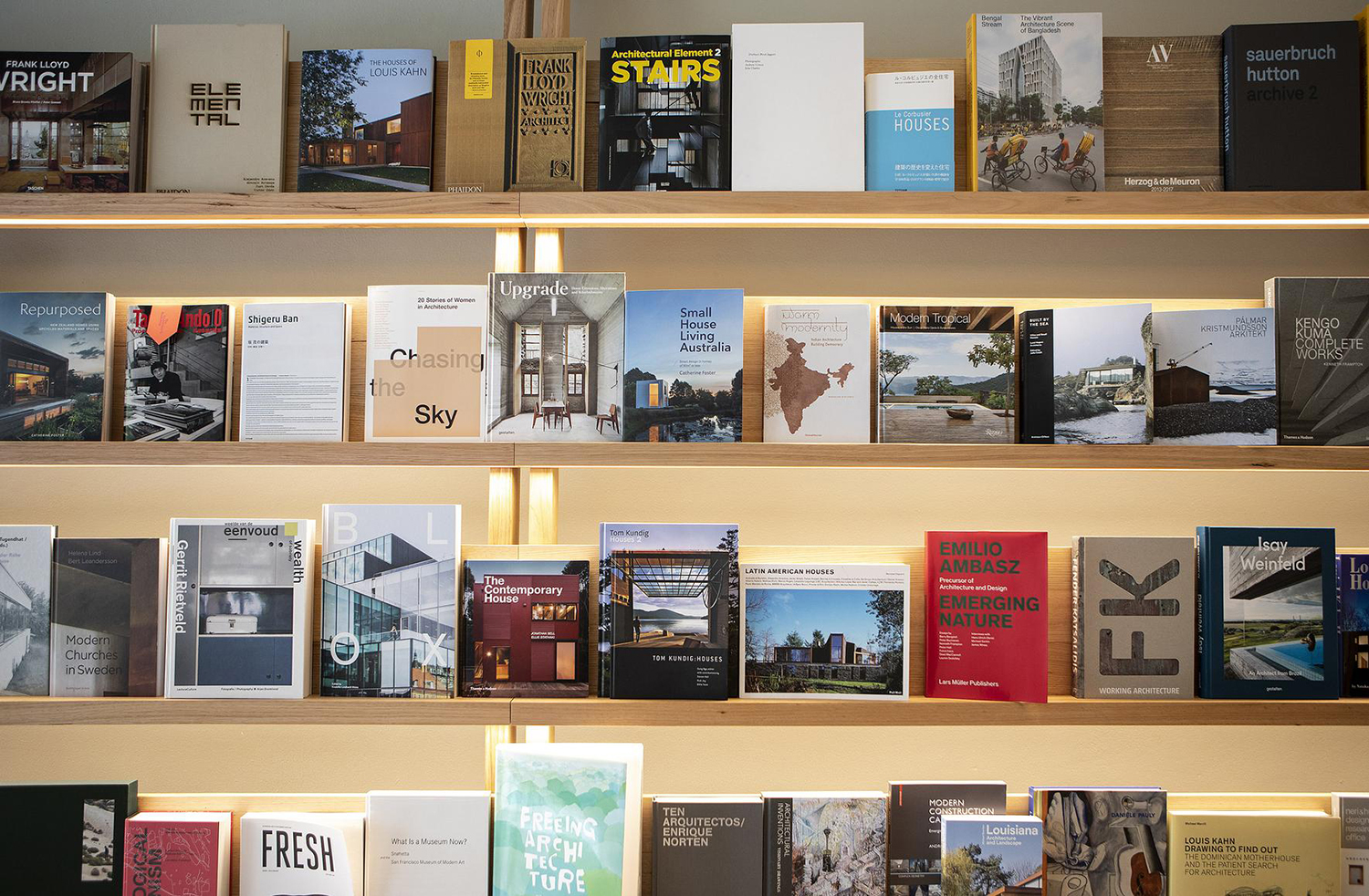
The Architect’s Bookshop is a new design-focused retailer, located in Sydney’s Surrey Hills, devoted to the books of architecture and interior design, landscaping and urban development. The space was conceptualised as being more than a bookshop but a place to take time out to browse, a chance to engage with the material and form of the books, and as a place for those interested in all things related to the built environment to meet and engage in informal conversation and design discourse.
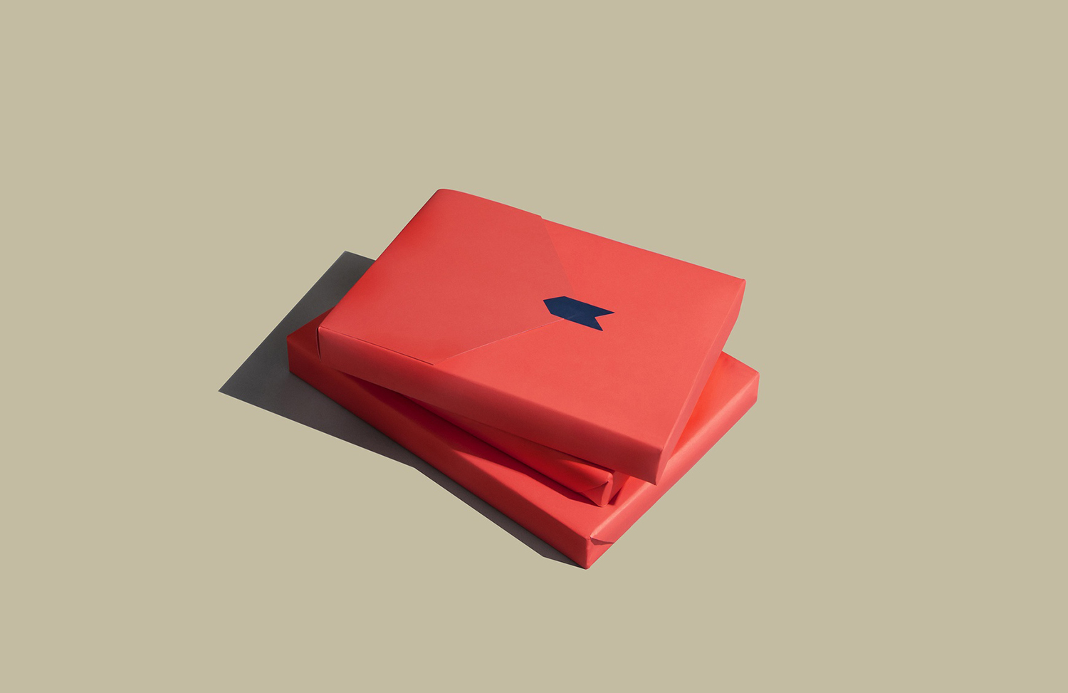
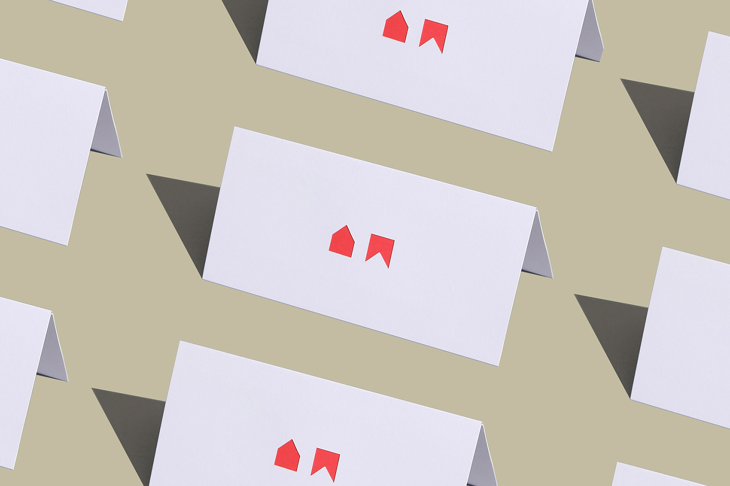
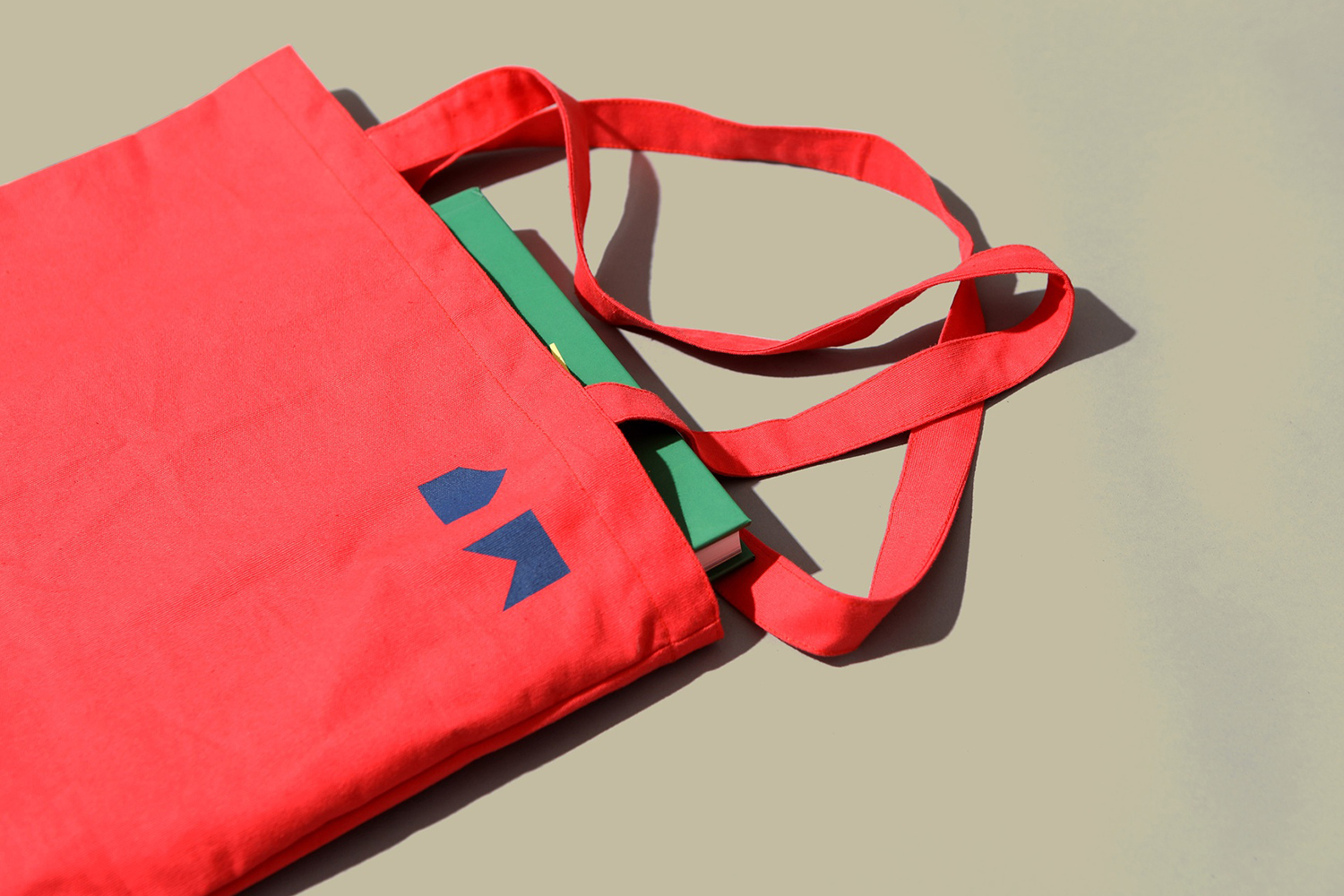
Australian design studio Garbett worked with The Architect’s Bookshop to develop a visual identity that would capture the spirit of the space, the positioning ‘a place for architecture lovers’ and comfortable with and distinct from a material and graphic sophistication of architectural publishing, channelling the universal, enduring and immediate form language associated with architectural structure and book reading. This project covered, alongside logotype, tote bag, bookmark/business card, bookstands, signage, price stickers, gift cards and art direction.
The abundance of online content, as well as the speed and frequency of its creation, has imposed itself on the material world. Form and content, which had, increasingly become isolated from one another, has, due to these new pressures (and in acknowledgement of emerging trends such as minimalist, mindful, sustainable and slow-lifestyles), found a way back to one another in order to justify a time, spatial, material and environmental expense as much as the financial.
New independent niche publishers, conceptualising and working with designers, have responded with books that have a graphic immediacy and material sophistication in tune with content; ideas emerge in the relationship between content and form and not just in the literal reading of the texts. As the built environment is intrinsically sensitive to these considerations, and with the expanding interest of the non-practising curious outsider, the creation of a bookshop exclusively catering to this field is no surprise.
The set up here is that the space of the architectural bookstore is one of material and graphic surprise and delight. An audience aware of form and material language, and by extension type and colour. Their expectations and insight demand a thoughtfulness whilst being simple and refined enough to be distinct from, yet unite a space of diverse publications. Garbett’s visual identity for The Architect’s Bookstore manages to find a balance between being invitational by way of colour, form and typographical quirks, and smart in the intersection of an architectural language of the visual and the useful that extends out both graphically and materially.
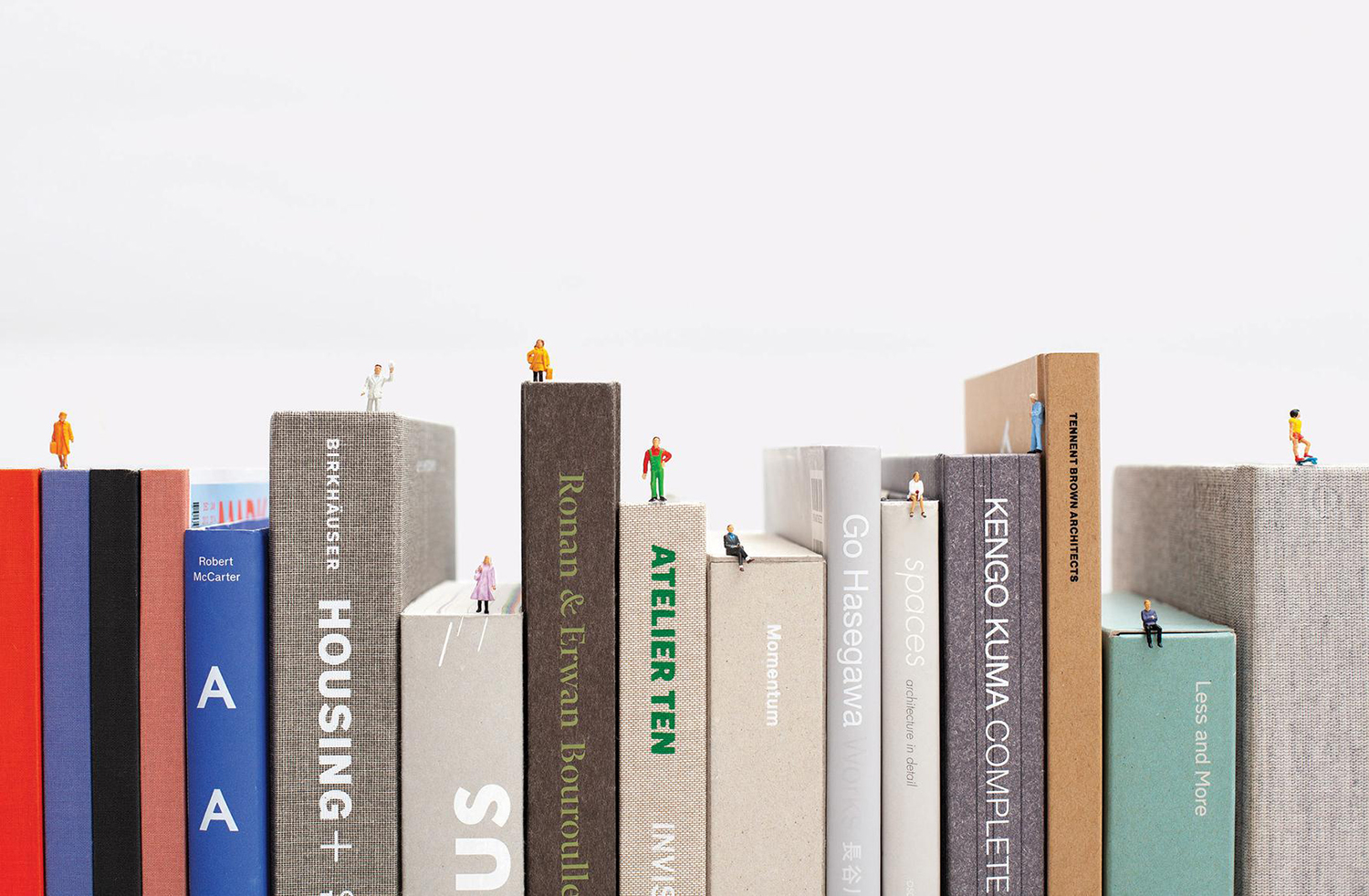
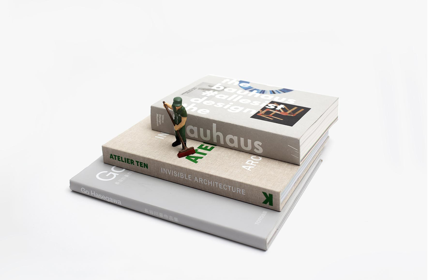
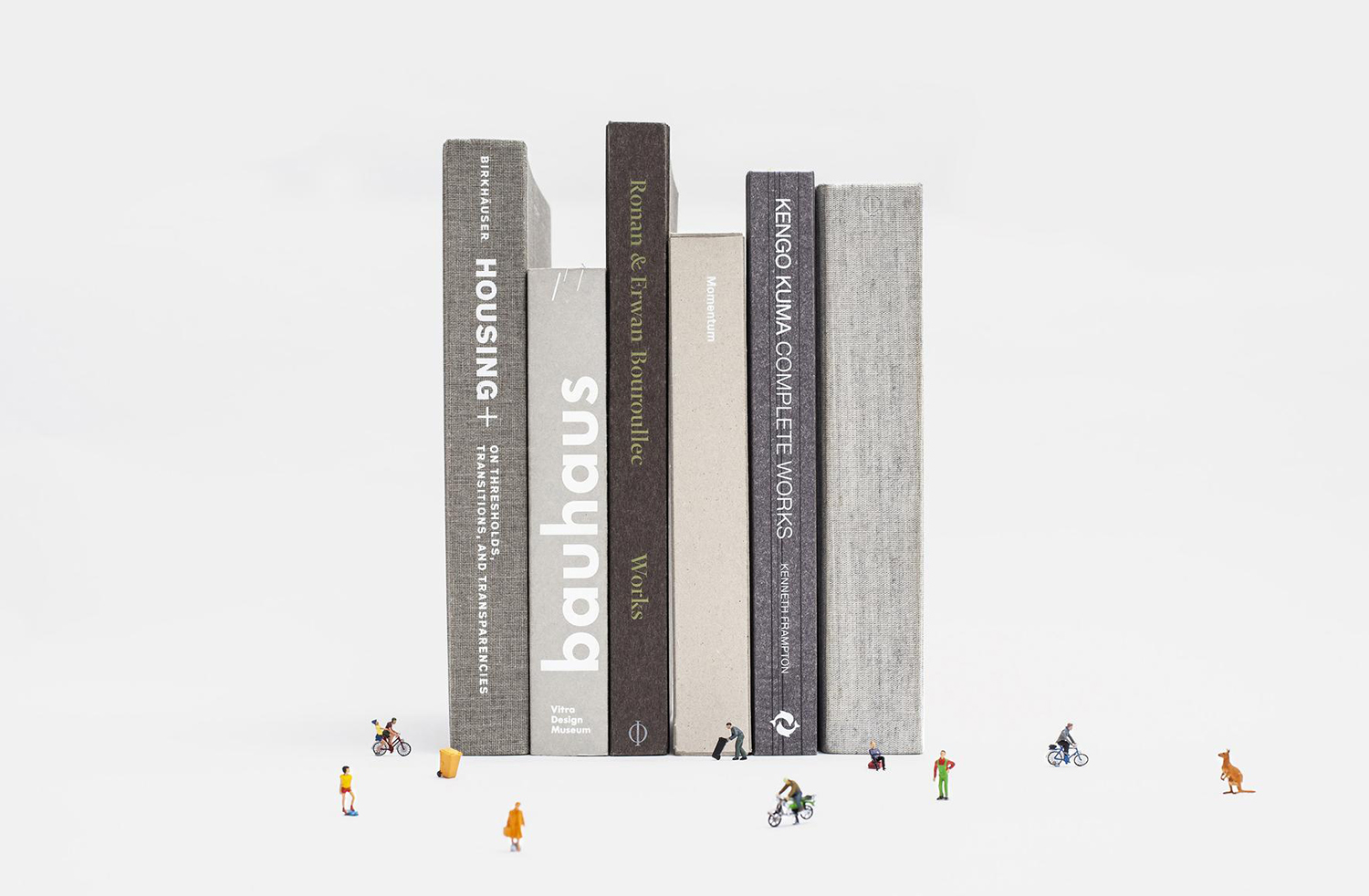
There are four components at play. A typographical, colour and form language, and an approach to art direction that uses scale and the diverse materialities of the books stocked to create a metaphorical landscape in which to explore and discover.
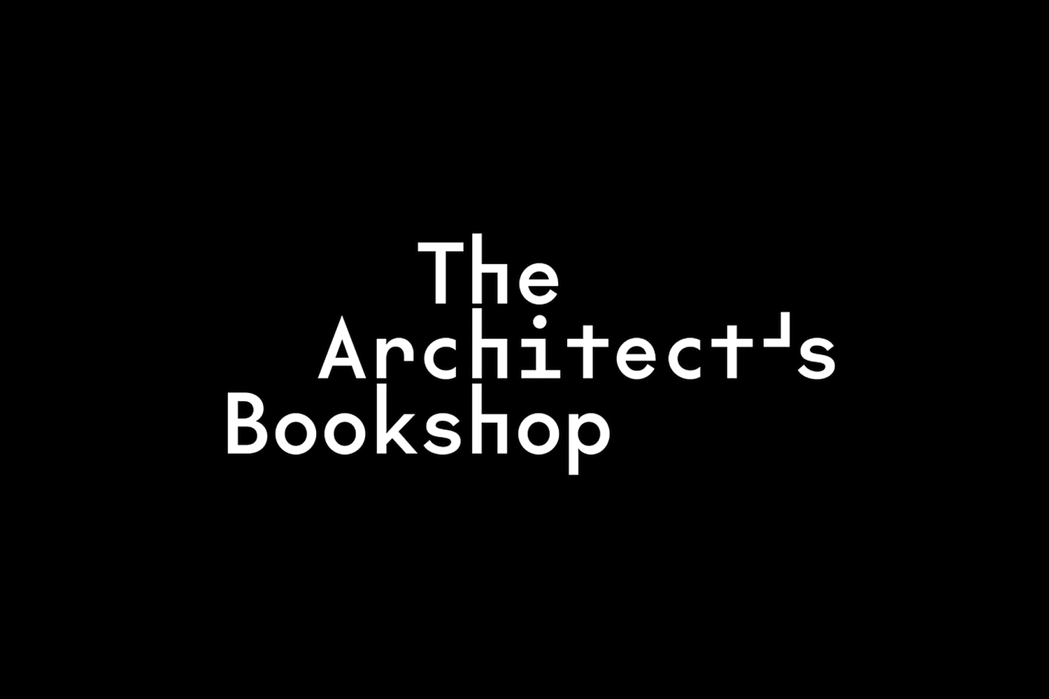
The logotype touches upon architectural themes such as modularity, repetition, reductive geometric structure, the mechanical by way of a monospaced, monolinear typeface of geometric sans-serif forms. The visual language of letterforms reinforces the name. The repetition of the H, drawing the mind to some meaning, could be read as a space for sitting or as structure. It is quirky, a little awkward but full of character, even though it is derived from the mechanical origins of monospaced typefaces. The oversized and right-angled commas and apostrophes are a recurring detail throughout, carrying identity through to other forms of communication.
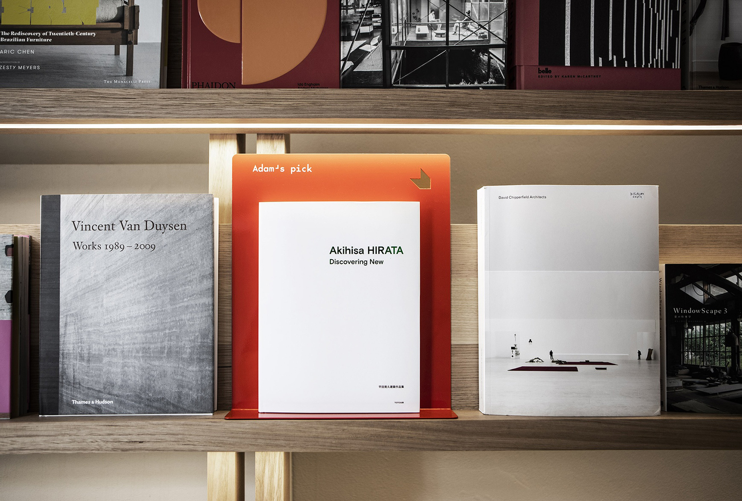
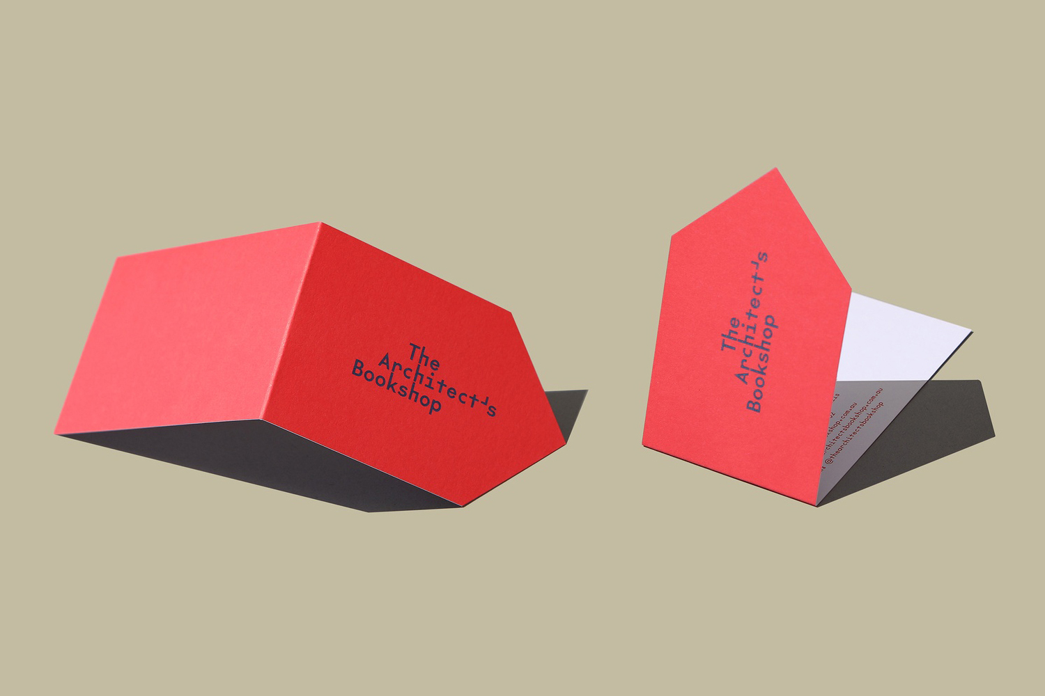
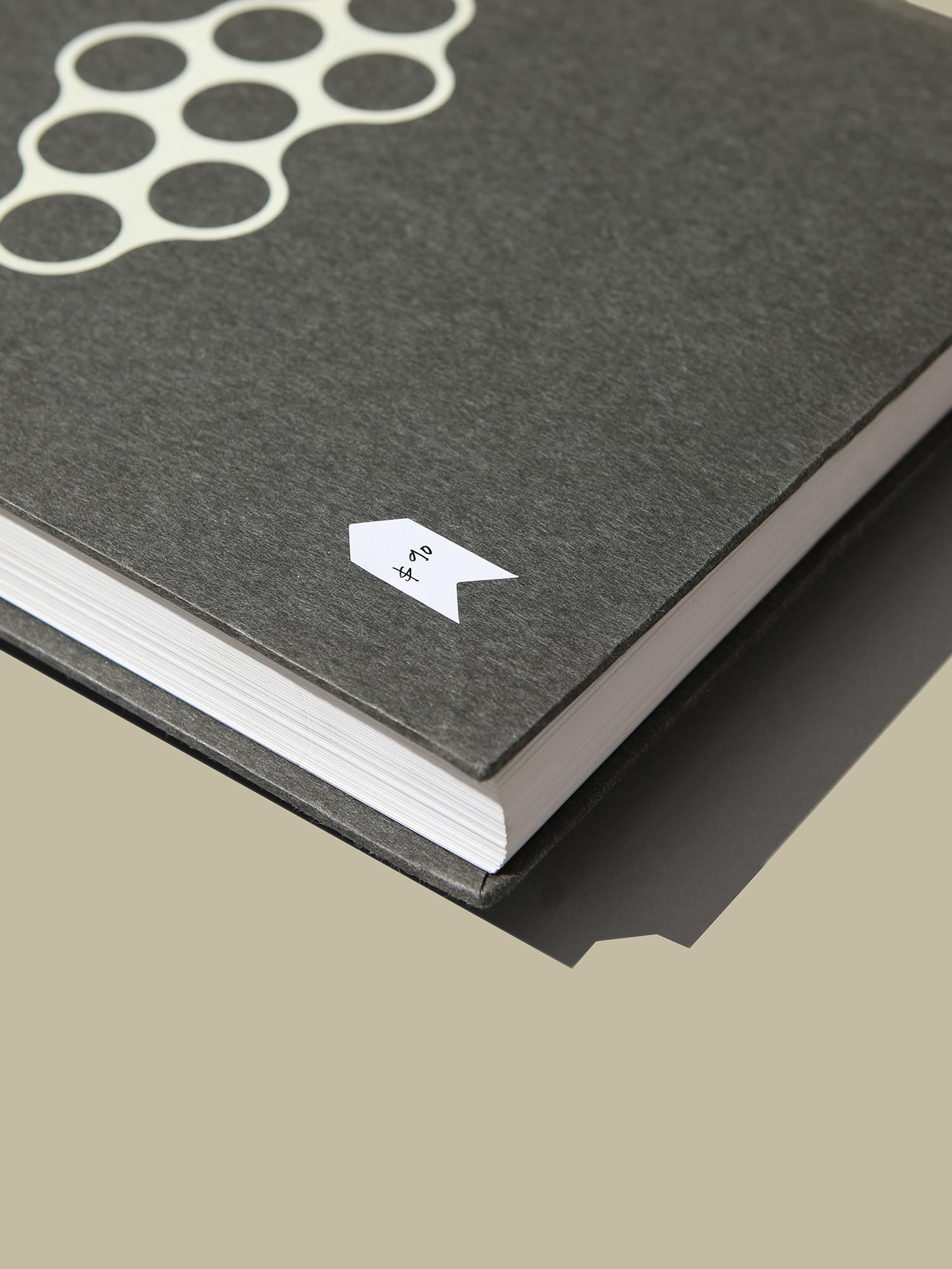
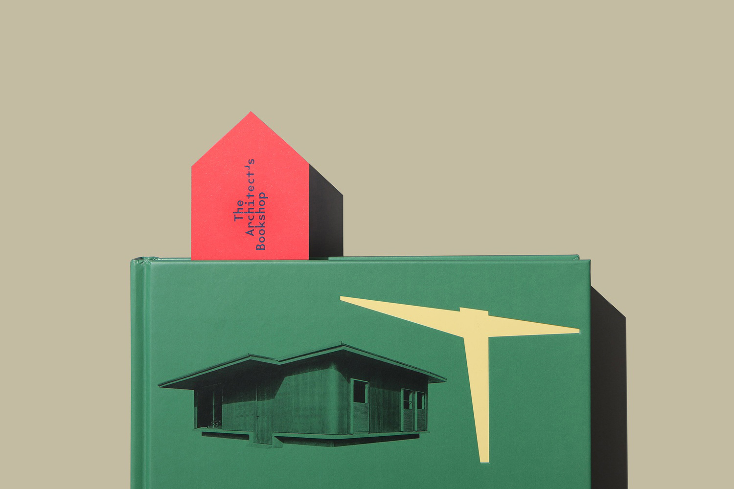
Below the logotype and typeface is a bookmark/house motif that moves between the graphic and the material, the visual and the functional, utilised as an arrow, literal bookmark and business card combination, die cut into book stands, or as a simple price sticker. Occasionally this graphic device is used as a long singular motif or cut into two, or appearing as a classical book ribbon. There is a simplicity yet range here. Solid colour and a strong form language allows it to distinguish itself but not detract from the diversity of publications held in store.
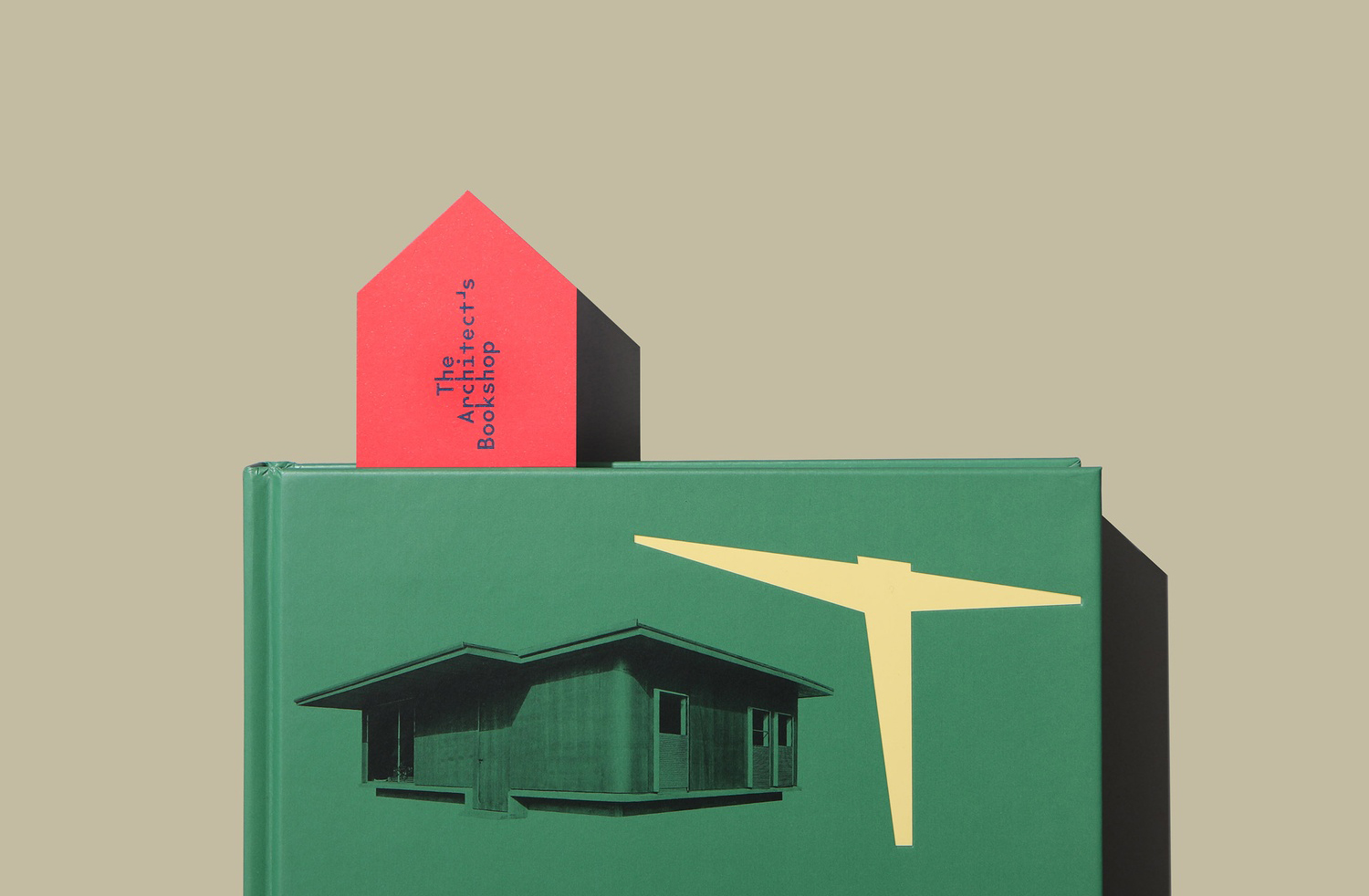
Other highlights include the colour palette. A Monopoly red, or the enduring red of the book ribbon, establishes a foundation of warmth and character while an eye-catching plan blue introduces contrast. Further, the interplay of the graphic and the useful by way of orientation, evolving the motif into a directional symbol (and further giving it a dimensionality), or a fold to transform a bookmark into a business card, are intelligent, sensitive to architectural considerations.
Garbett get a lot out of a simple device. And there is probably more to get from this, particularly materially. The way that the house and bookmark motif are entangled has an ease and simplicity to it that it intelligible to those curious to step into a niche bookshop and sophisticated enough in its observation and extent of applications blurring the boundary between visual play and usefulness without imposing on the books in a way that should work for those practising architecture. More from Garbett on BP&O.
Design: Garbett. Opinion: Richard Baird. Fonts Used: The Future Mono.
