BP&O Collections — Best Awards Winners 2019
Opinion by Richard Baird Posted 20 October 2019
The Best Awards is an annual celebration of interactive, graphic, product and spacial design work from New Zealand and Australia, run by The Designer’s Institute. This year’s event took place on Friday the 4th October at Auckland’s Spark Arena where winning studios where awarded a Gold Pin for best in category, a Supreme Pin for best in discipline or a Purple Pin for those considered to have raised the bar of design.
Other awards include The John Britten Black Pin, which will be given to an individual for their leadership, vision and achievements nationally and internationally, and The Designer’s Institute of New Zealand Black Pin for Outstanding Achievement. This will be awarded to a member who has made a lasting and valuable contribution to the design profession and design culture in New Zealand. The judges for each catagory can be seen here.
To coincide with the publication of the winners BP&O looks back at those projects reviewed on the site and picking up awards in October.
We Compost by Seachange
Catagory: Design Craft & Small Brand Identity
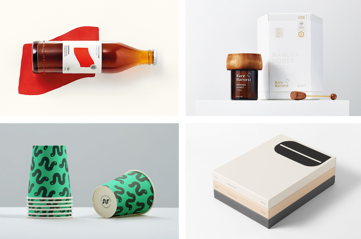
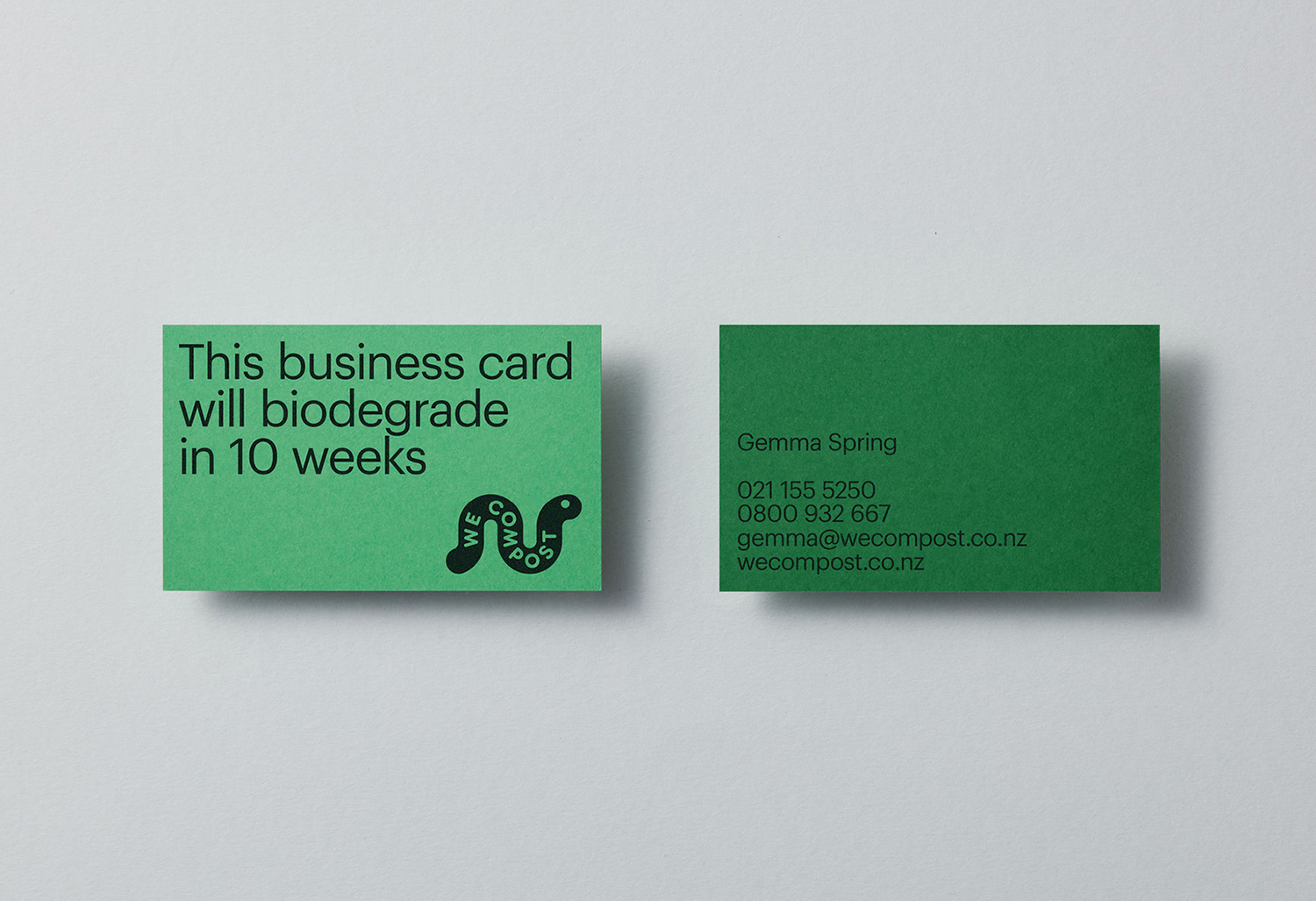
When organic waste breaks down in landfill, methane, a potent greenhouse gas, is released. This has been identified as a significant contributor to climate change. Through composting, this organic waste can be repurposed as a soil nutrient which can then play a role in developing local and sustainable methods of regional food production. The challenge of turning this into a consistent resource comes down to good waste management, both on the part of households and collection services. Few of the latter exist, however, in Auckland, We Compost intends to make this a widespread reality. Collecting over 40,000 kg of organic waste and diverting it from going to landfill each week We Compost has grown over the last seven years to become the city’s leading commercial compostable waste collection service.
With a desire to continue this growth, We Compost worked with design studio Seachange to help with brand positioning and visual identity, to better align it with their ambitions, make it an every household mainstay and to move it beyond those already invested in ecological challenges and solutions. To achieve this, Seachange’s strategy sought to find a fresh graphic approach to compostable waste management and collection, to find a fun, modern and accessible route that would be an invitation to all ages and types of households to get involved. The studio achieved this by way of a custom typeface that draws on the crucial role worms play in the process of composting, and pairs this with a variety of greens. A range of patterns and statements deliver a convivial and recognisable immediacy across differing of contexts, these included bin liners, t-shirts, business cards, posters and website.
See more of this project here

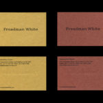
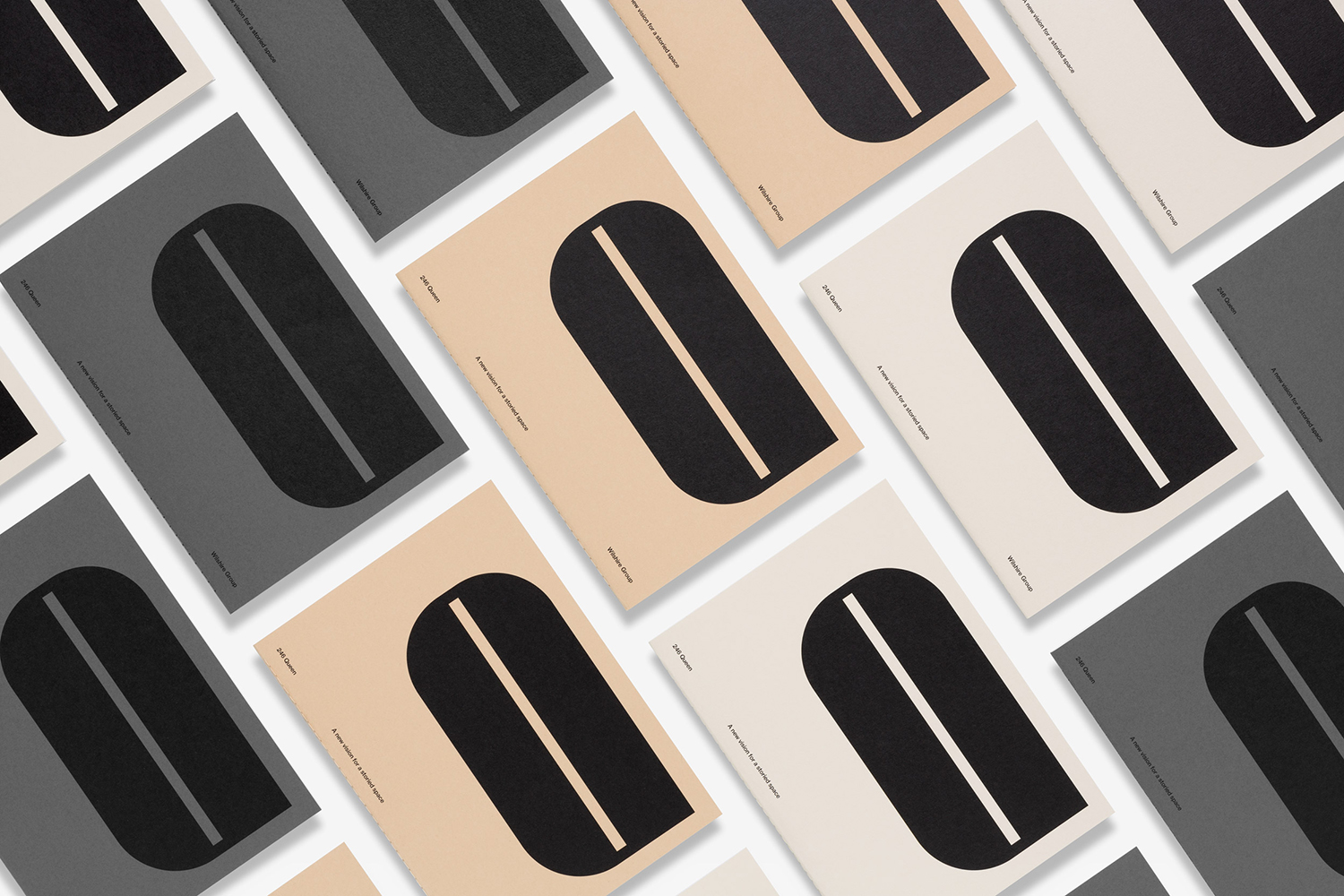
246 Queen by Studio South
Catagory: Design Communication
246 Queen has a long and storied history. Opened in 1964 on Auckland’s Queen Street, it heralded a new era of modern architectural vision, exclusive boutique-based experience and an urban post-war retail sophistication. The building played host to fashion shows, designer concessions, furniture showrooms and contemporary dining. However, the architectural ideas drawn up by the original architects Rigby Mullan (Alan Rigby and Antony Mallen), remained only partially realised. These are now being paid homage to in the building’s renovation by the Wilshire Group working in collaboration with architects Fearon Hay, once again becoming a mixed-use space of food and drink, retail and commercial opportunities across eight floors.
Architectural details include a distinctive fascia of curved windows and accents, floor to ceiling central glass light well, exposed ceiling and concrete floors. This sits within a district of 20th-century architecture and mid-century landmarks, a broad range of coffee shops and casual dining, the Auckland Art Gallery and the century-old Albert Park.
The marketing of the building and its spaces is aimed at what are described as design-savvy directors. Those with companies within the creative sectors, smart PR, marketing, bespoke legal and financial services, those who have developed award-winning digital experiences or are tech innovators. Essentially, those with clients who expect the structure and space to fit the nature of the companies they intend to work with. In this way, modernist architecture functions as a material symbol of the pioneering spirit that now exists within the less material worlds of the service led and digital sectors.
The marketing language and the graphic identity of the building, designed by Auckland-based Studio South, draws on the history and original vision of the building. This revolves around the modernist, and aimed at those that recognise or are drawn in by mid-century architectural heritage and an associated graphic history, and desire access to contemporary international food and high-quality services in building and locally. This manifests itself through type and text, colour, material and structure, and through a graphic motif that is inspired by the building’s curved accents and large rounded windows.
See more of this project here
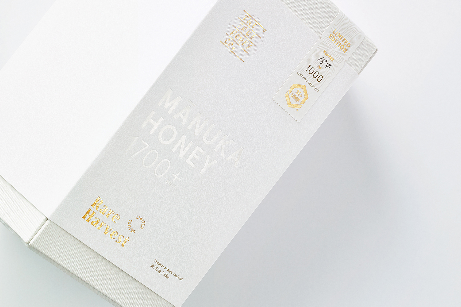
Rare Harvest by Marx Design
Catagory: Packaging
The True Honey Company (TTHC) dedicates itself to the production of mānuka honey, a monofloral variety produced in Australia and New Zealand from the nectar of the mānuka tree. It has a unique colour and texture and a high level of dietary Methyglyoxal, an organic compound with antibacterial and antiviral properties.
With a price range starting at 60.00AUD and rising to 230.00AUD per jar, and working in a market flooded with sub-standard honey and dishonest marketing, communicating the value of the product and the commitment of TTHC to quality and ethical production through an impactful and engaging brand identity and packaging design was paramount. This task was given to Auckland-based graphic design studio and packaging specialists Marx Design who played with a material and structural language to express the rarity and value of such a product.
Marx Design returned to the project in 2019 to develop packaging for Rare Harvest, a limited edition mānuka honey from TTHC certified at an unprecedented 1,700+ MGO (31+UMF), the highest ever recorded. Marx Design, working in collaboration with Think Packaging, further the material language of value and rarity that characterised the first range, and fold in the theme of Mānuka blossoms.
See more of this project here
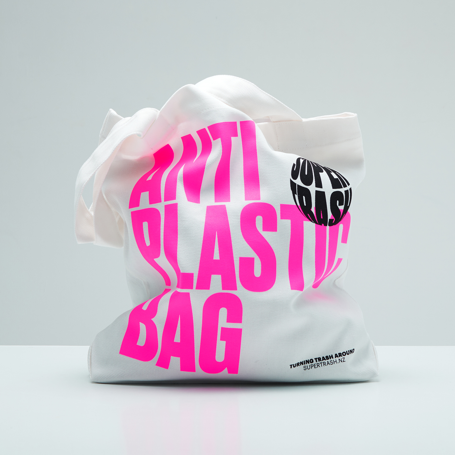
Supertrash by Seachange
Catagory: Small Brand Identity, Environmental Graphics
Supertrash is a family-run New Zealand-based refuse collection service that helps to divert waste from landfill by employing circular solutions; these are typically recycling, reusing or repurposing. Although small they have big ambitions and are innovative and disruptive in their approach and ideology. Since 2012 Supertrash has diverted almost 6m kg of waste away from landfill. It is a challenge posed to and question asked of the incentives corporate firms have to build revenue streams largely around burying rubbish.
Built around the strategic positioning statement (and visible strapline) “Turning trash around” design studio Seachange developed a visual identity around the youthful, innovative and energetic disruption of what they describe as a tired and disingenuous industry. This is achieved through a striking palette of white, fluorescent pink and black, the tall condensed letters of Commercial Type’s Druk, an explosive graphic device and spherical spinning logo. These are applied across and link tote bags, lorry livery, business cards, mailers and website.
See more of this project here
LoCal Soda, Packaging
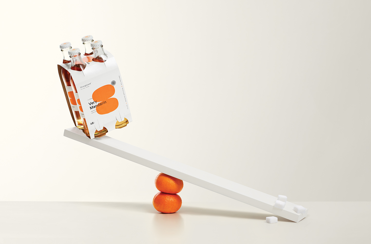
StrangeLove is an Australian soft drinks brand that began with a four flavour range of energy drinks. Although mass-produced, each of these was created with the intention of evoking a taste of the homemade through carefully sourced and high-quality organic ingredients. The range was developed in response to energy drink brands who StrangeLove believed had failed to live up to their premium positioning.
Keen to avoid the tricks and tropes of the category and secure a witty, eye-catching and original look, New Zealand-based Marx Design worked with StrangeLove to improve on the illustrative character that had been used across the brand’s earlier bottles, developing simpler compositions surrounded by plenty of white space and paired with sharp and humourous copywriting. Check out the BP&O review of these here.
StrangeLove went on to create a range of mixers, organic soft drinks and source a mineral water, each with its own unique visual language. 2019 sees the brand continue to expand their range and explore and challenge the drinks market, further working with Marx Design, this time on a range of “Lo-Cal” sodas.
See more of this project here