Lagotto by Studio Hi Ho
Opinion by Richard Baird Posted 21 October 2019
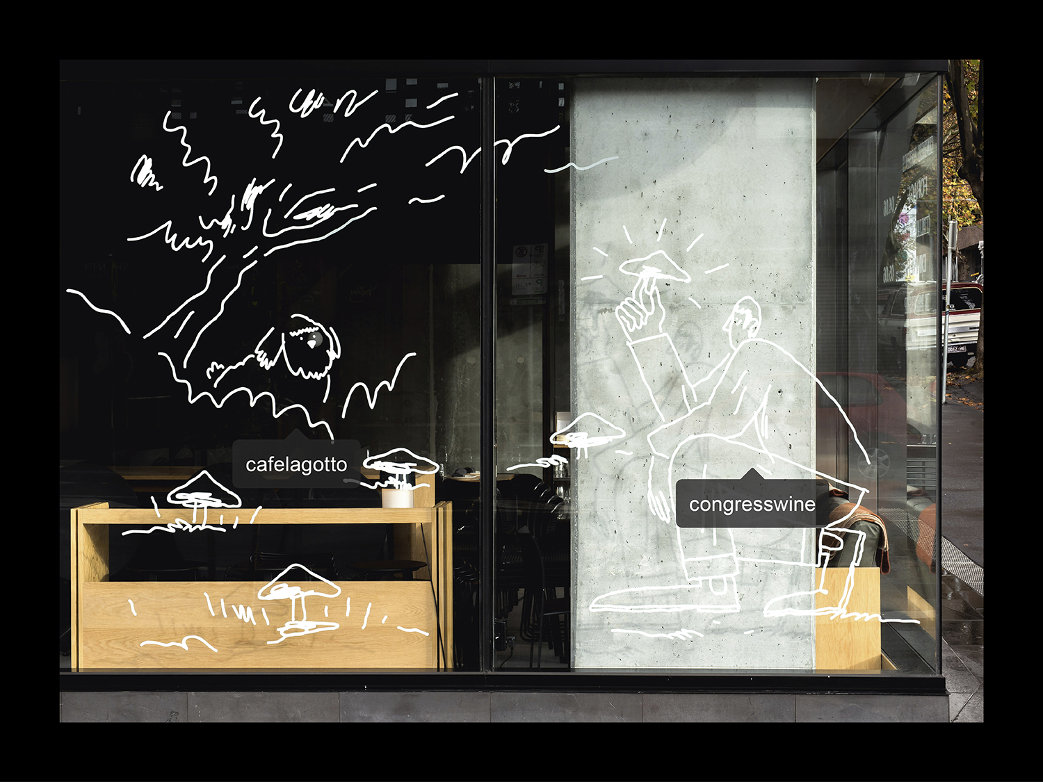
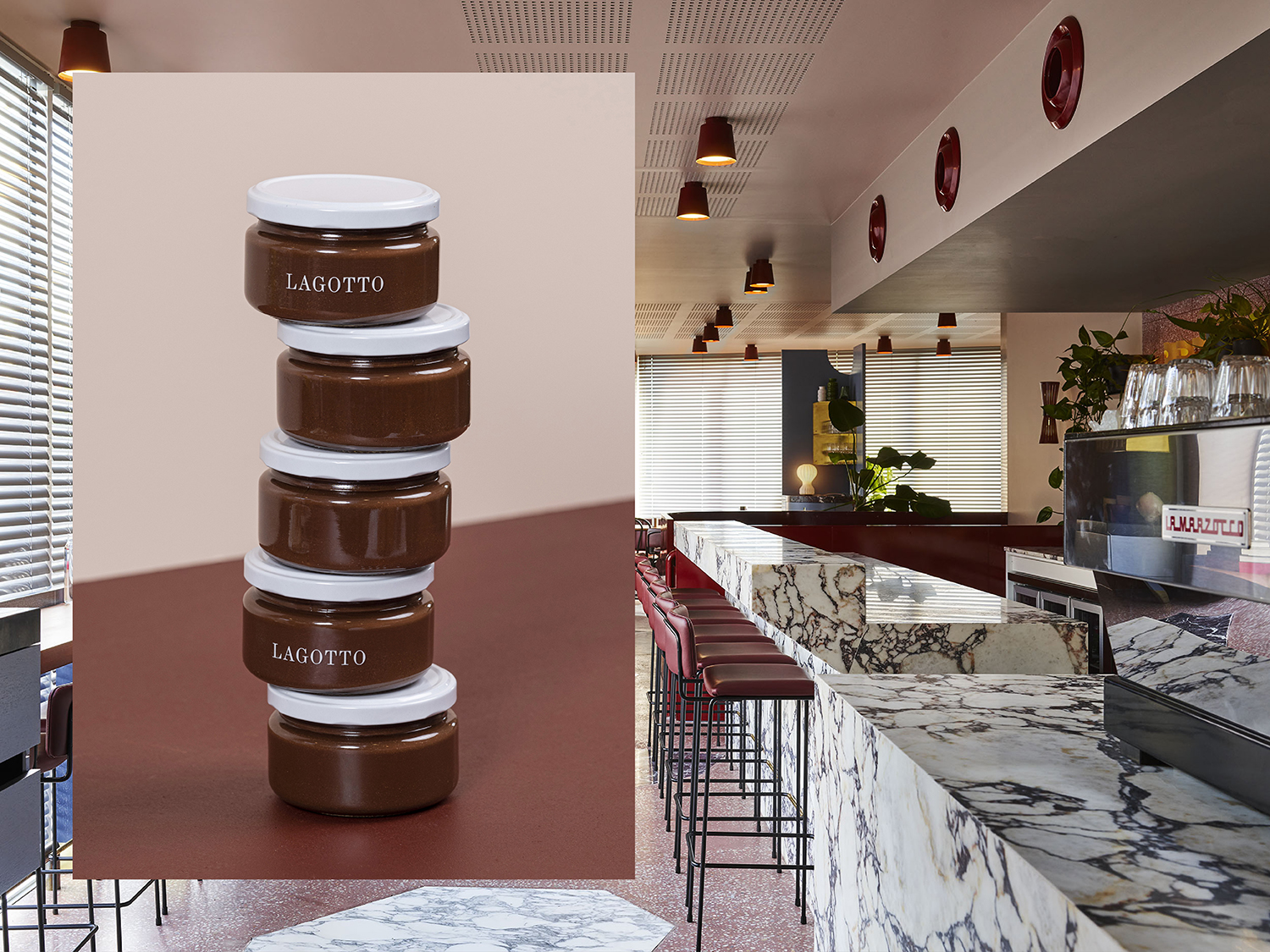
Lagotto is a new all-day café, wine bar and food store situated inside Nth Fitzroy, a residential property development project from Milieu located at the heart of Melbourne’s, inner north. Named after the truffle-hunting Italian dog breed, the café offers a relaxed European surrounding in which to enjoy an Italian menu with a “joyful vibrancy that avoids kitschiness or pastiche”. Studio Hi Ho, also responsible for the visual identity of the Nth Fitzroy development, was commissioned to put forward a proposal for Lagotto that would resonate with the distinctive interior design scheme, the local community’s tastes and Mediterranean migrant history. This was achieved through type pairing, materiality and playful illustration by Ted Parker.
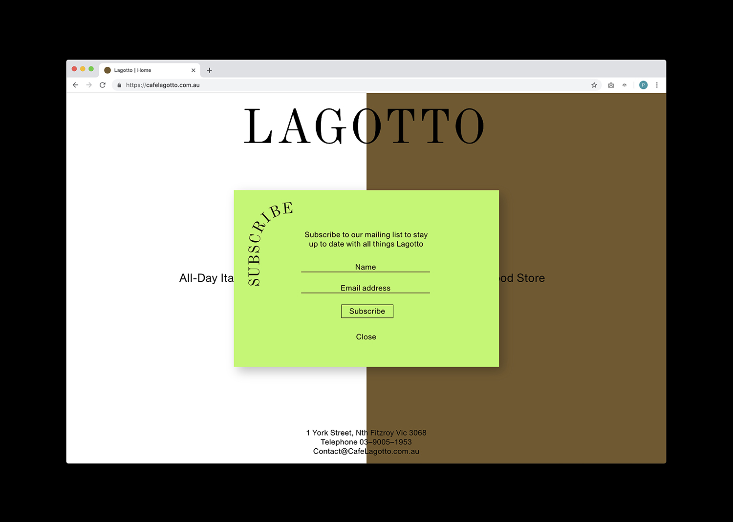
Studio Hi Ho worked with the interior design company Flack Studio to develop brand assets that seamlessly aligned and integrated with Lagotto’s interior space and vision, coming up with naming and visual identity which was applied across menus, business cards, signage, packaging, website and a series of Instagram assets.
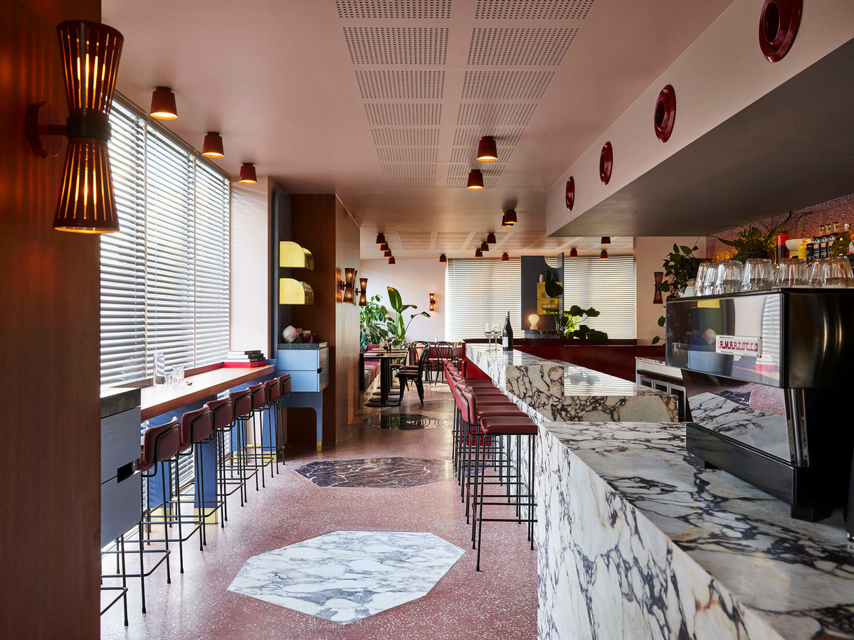
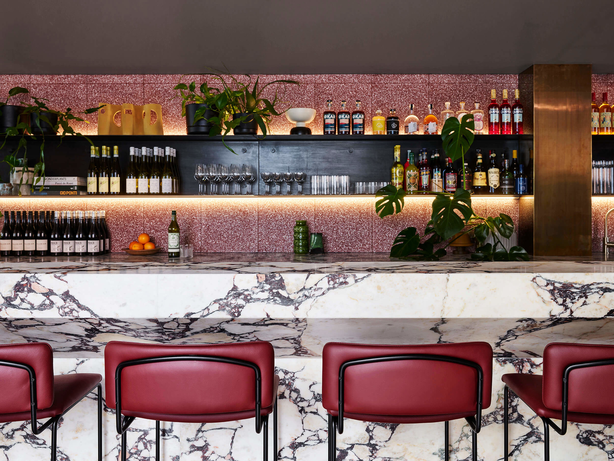
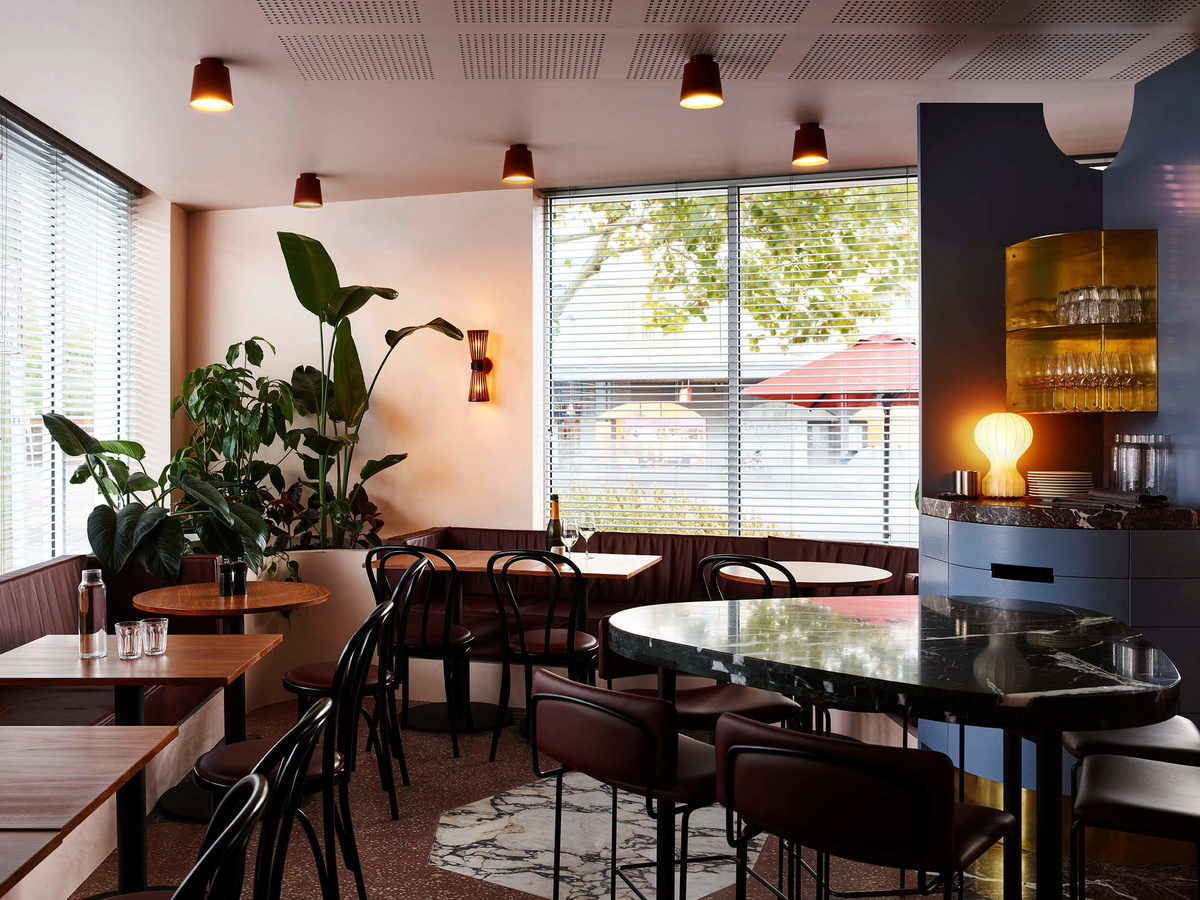
Just as Nth Fitzroy sort to create living architecture that established a neighbourly connection–read more here–so does the interior design of the development’s new eatery Lagotto and To Go experience. Throughout, a tapestry of materials are woven together, with the forms of Italian modernism establishing a continuity. This is exemplified by the flooring which sees different materials inlaid as geometric shapes, and the solid marble of the bar alongside the fine delicate and tall legs of the bar stools. There is plenty to discover within the interior. Texture, form, space, colour and light all have been used to great effect, appearing distinctive and its referential nature apparent but not blunt of kitsch.
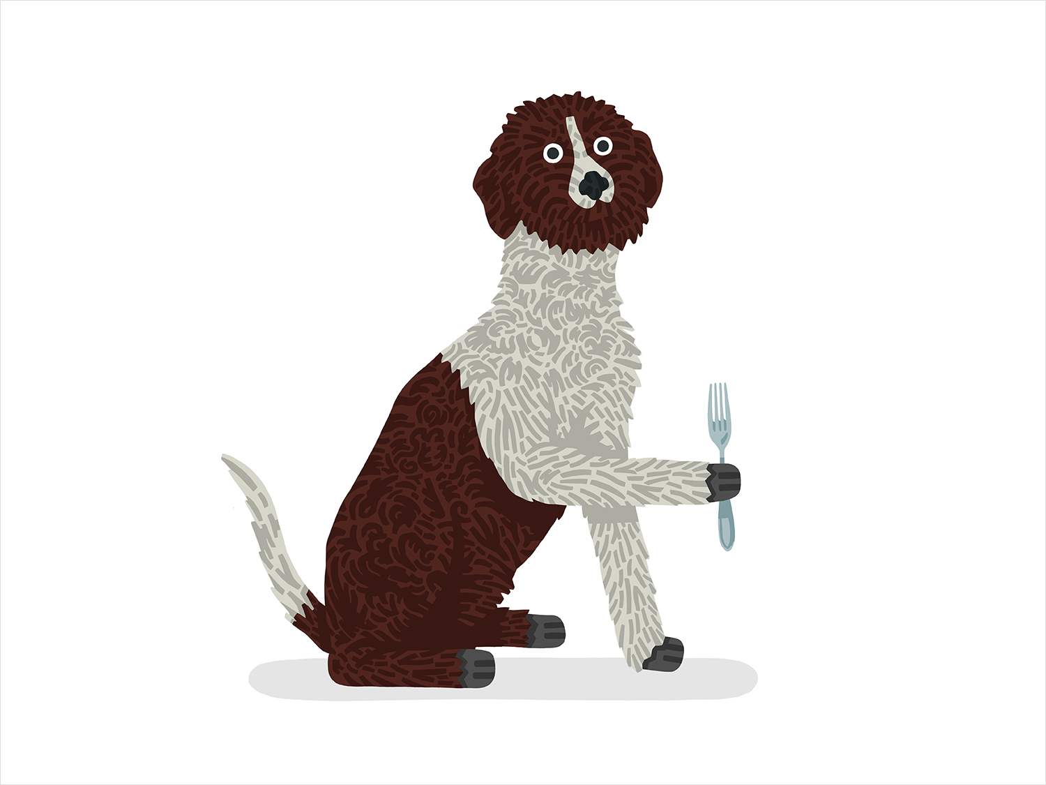
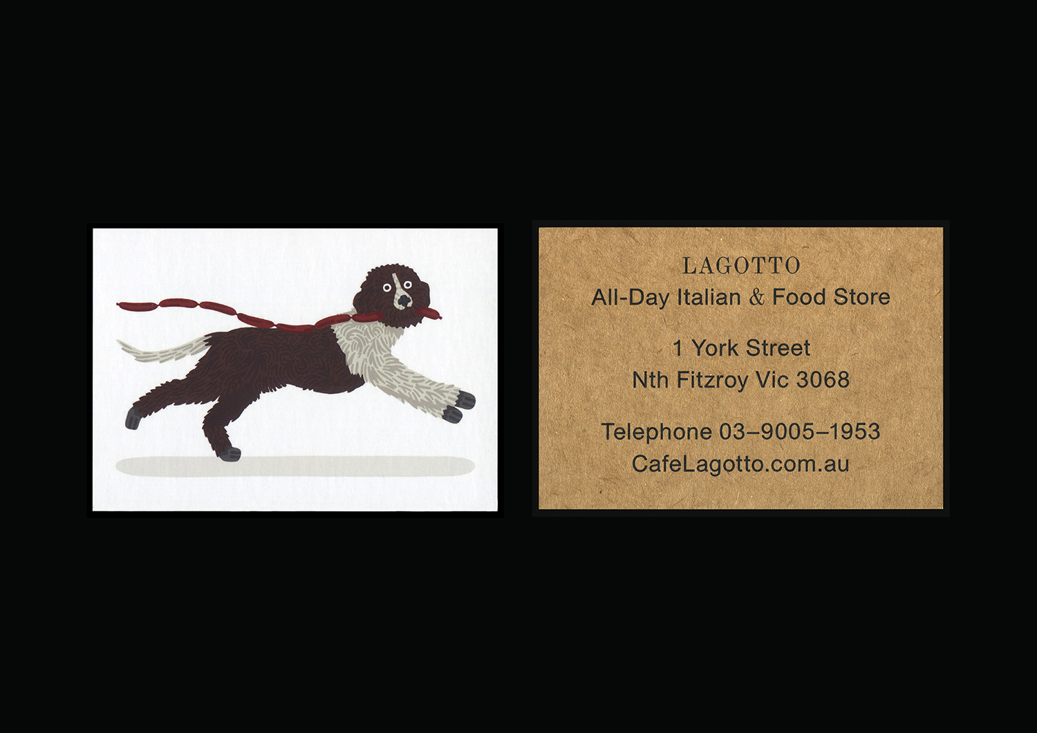
There is a conviviality infused into the space. This largely comes through in the interplay of simple forms and a material detail. This sentiment also appears in Lagotto’s visual identity in the dialogue between two distinct type styles; the classical detail of a serif and the enduring modernist forms of a sans-serif, and alongside the unexpected cheerful character of Ted Parker’s dog illustrations.
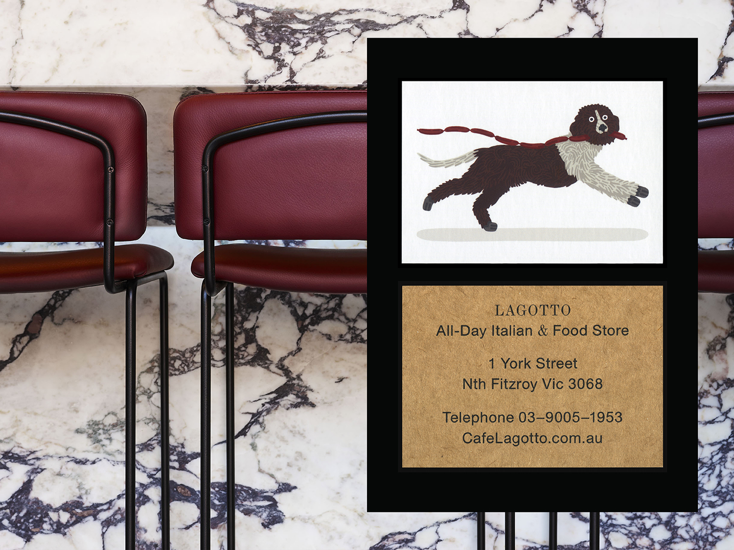
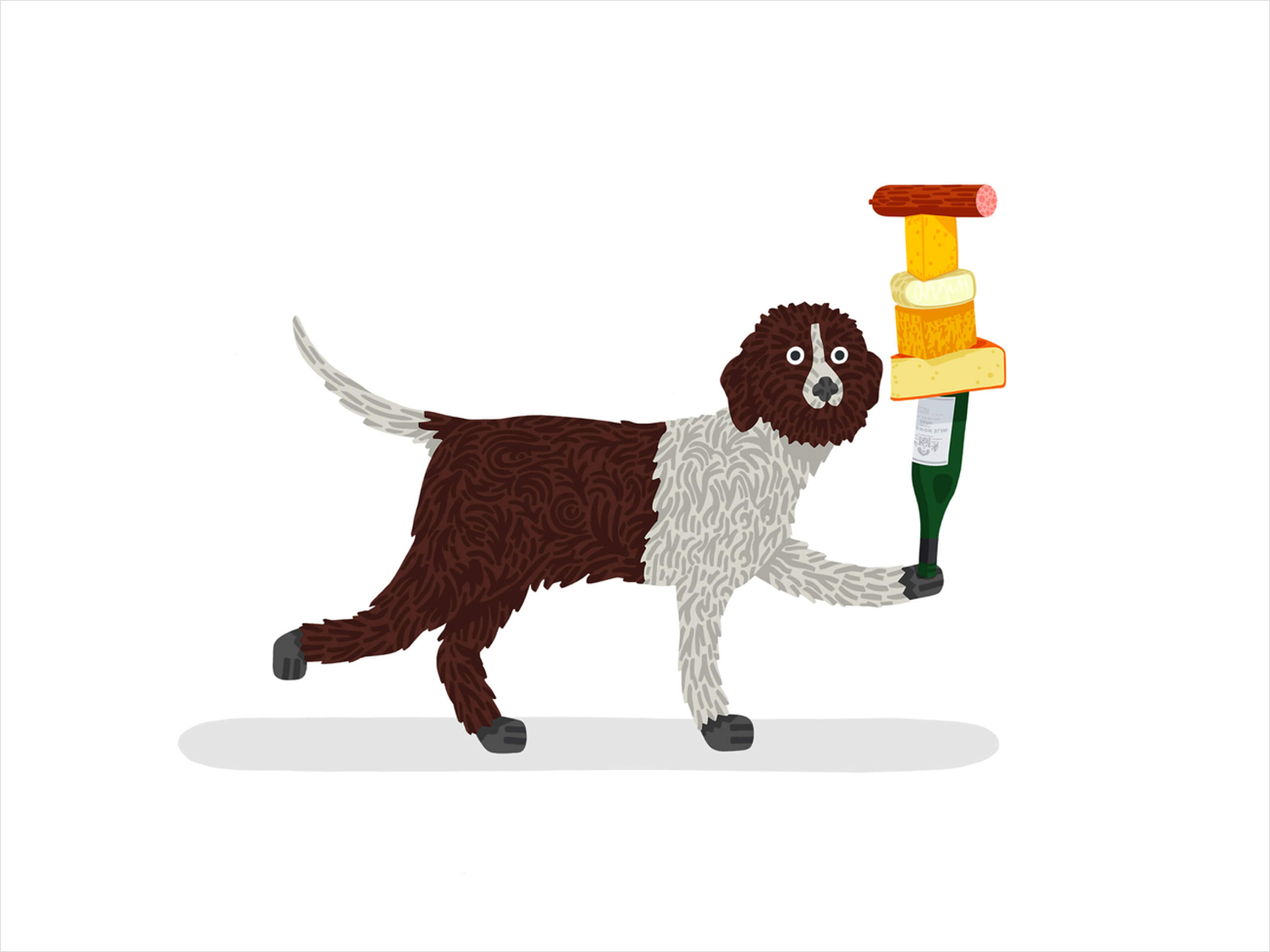
The dog is a useful symbol of daily community interaction. There is a sense of joy and occasional silliness in Ted Parker’s work. Here, it is unexpected and distinctive, offering a lightness and life to the website and social media feed, static and in motion. The style also appears detached from a specific time and place, and in this way comfortably exists within a space of Mediterranean and Italian modernist influences, in Melbourne. Other small details include the motion and flow of type online, pops of colour and art direction that draws on that which was set up for Nth Fitzroy; arranged around a time of day and the life of the architecture.
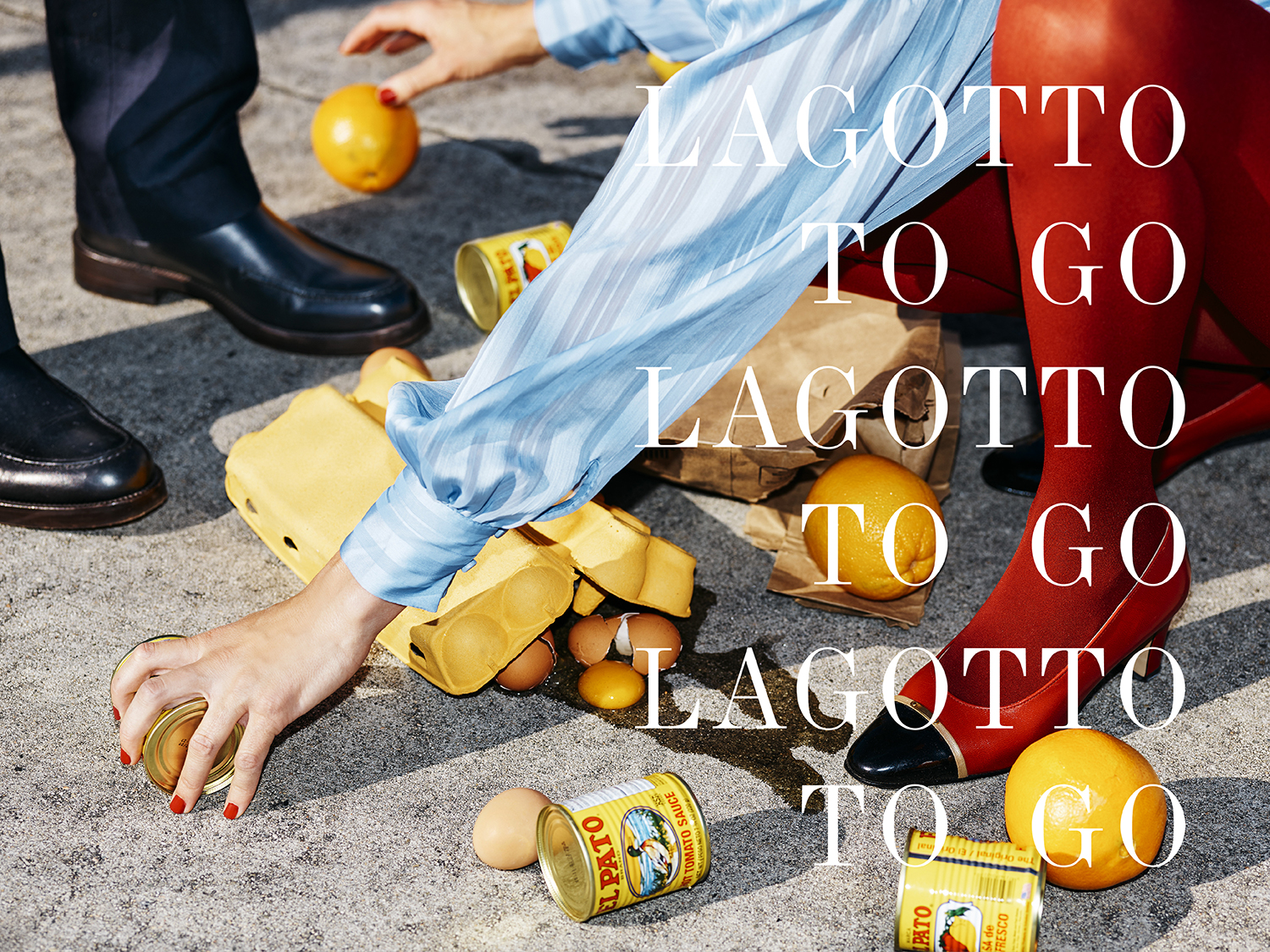
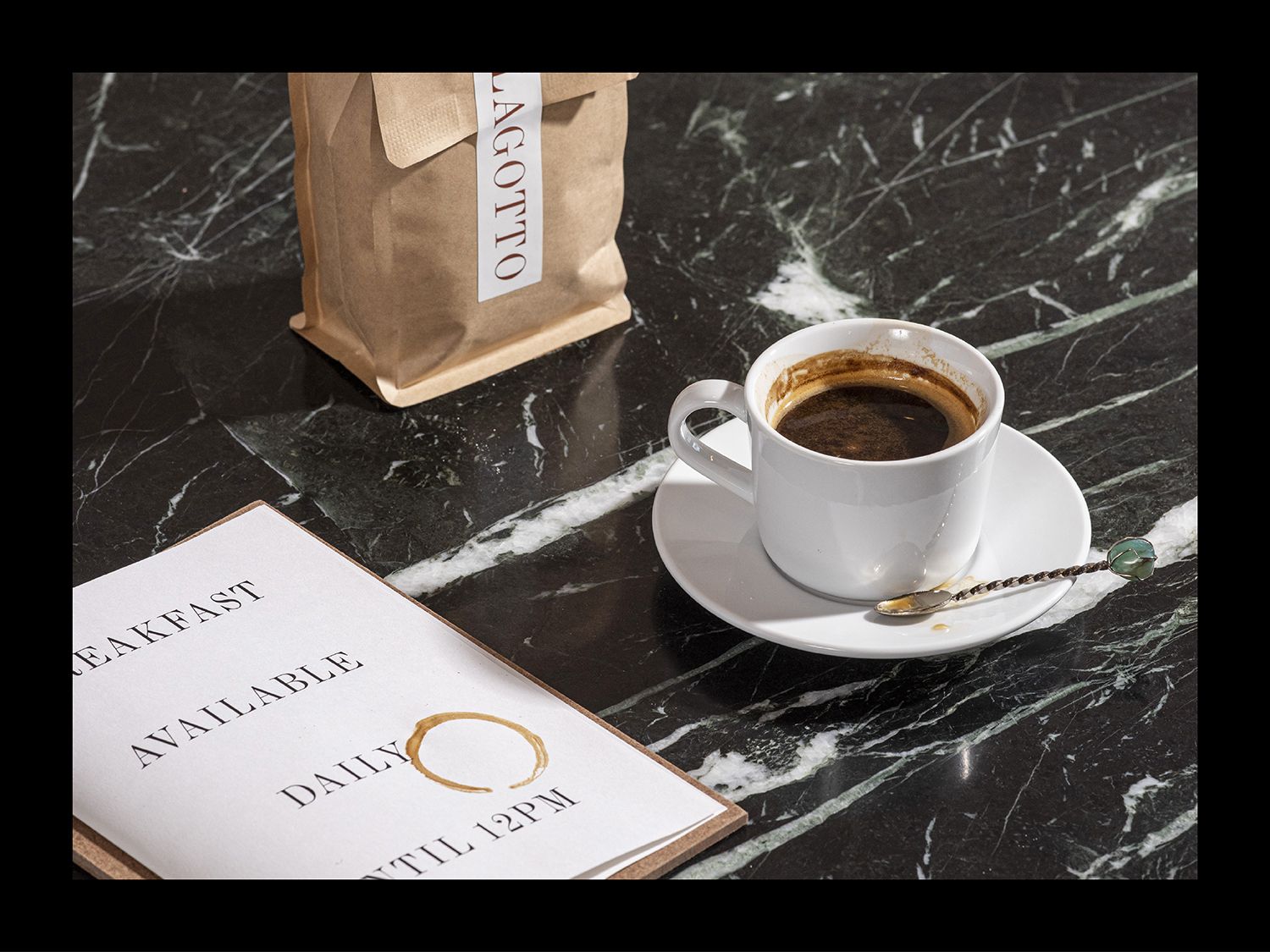
The sub-brand, Lagotto To Go, differentiates the food store and home delivery offering from the café and wine bar proposition. There is a pleasant play with words and letters that make it memorable and recreating the typographical repetition you might see in Italian print from the mid-century, which also comes through in the styling of photography. Again, there is a playfulness and art in the imagery; in the mise en scène, the use of colour, materials and props by Scottie Cameron.
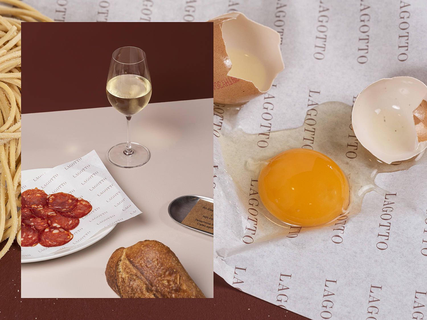
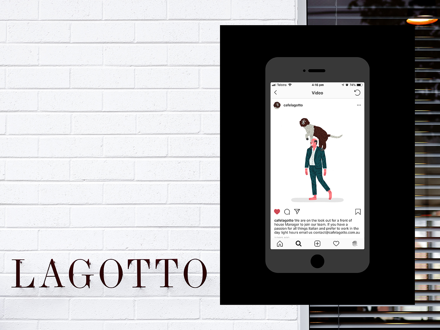
The result is a smart mix of a few but compelling assets that are distinct from, but ultimately informed by the tone and refrences of the space, and the dialogue the architecture intends to have with the surrounding community. There is a nuance (in reference) and quirk to type pairing inline with interior, while illustration brings a personable warmth and play. That this feels like it is tied to community, the casual interactions dog walking fosters, is a smart little detail. More work by Studio Hi Ho on BP&O.
Design: Studio Hi Ho. Brand illustration: Ted Parker. Brand Photography: Scottie Cameron. Product Photography: Josh Roberstone. Interior Photography: Anson Smart. Window Illustration: Hayden Daniel. Fonts: Union
