Natural History Museum by Pentagram & Nomad
Opinion by Emily Gosling Posted 24 August 2023
If you grew up in the UK, the Natural History Museum is likely synonymous with two things: the massive blue whale suspended from the ceiling, or the equally large diplodocus skeleton. For many British kids, the museum is a childhood staple – either from school trips, or days out with parents who, rather savvily, combine a widespread fascination among youngsters (dinosaurs) with an educational execution (and one that’s free to access, to boot).
Sited on exhibition road in West London, which is also home to attractions like the Science Museum and the V&A, the Natural History Museum was established in 1881 and is the most visited museum in the United Kingdom, according to 2022 figures. Spanning five main collections – botany, entomology, mineralogy, palaeontology and zoology – the museum houses life and earth science specimens comprising some 80 million items, some of which were collected by Charles Darwin.
The museum recently unveiled a new identity designed through a collaboration between London-based studio Nomad and Pentagram London. According to Pentagram, the rebrand was born of the fact that while the museum’s collections are an invaluable scientific resource, it had to ‘reassert its position as a leading scientific voice in the discussions on the future of our planet and climate emergency’ as it approaches its 150th birthday.
The initial brand strategy was developed by Heavenly, which has offices in London, Cardiff, and New York City. Pentagram and Nomad combined as one team to then interpret the brand strategy using ‘both deep cultural experience and digital-first thinking,’ to deliver the resulting new identity. This intends to help assert the Natural History Museum’s vision of ‘a future where both people and planet thrive’, as well as activating engagement with both existing and new audiences in all of its work, including entertainment, education and activism.
‘The team created a mindset shift from passive catalogue to active catalyst – creating advocates for the planet,’ says Pentagram. ‘More than museum [sic], more than history, a pioneer in science and advocacy, at a crucial inflection point in time.’ As such, the identity is based around the idea of ‘Moving the Museum from catalogue to catalyst’.
While this is a subjective opinion, for me, it seems strange: most people, I’d wager, never saw the institution as a ‘catalogue’ – the idea implies something two-dimensional, untouchable, static, dry. In the UK at least, for anyone who’s visited (or likely even heard of it), it’s a place of awe and wonder, those massive ancient skeletons – of fun days out – rather than taxonomy. So yes, it’s great to reposition the museum as a catalyst for change in the face of climate crisis, but to suggest that there’s a widespread view of it as a ‘catalogue’ seems a little negative and misguided.
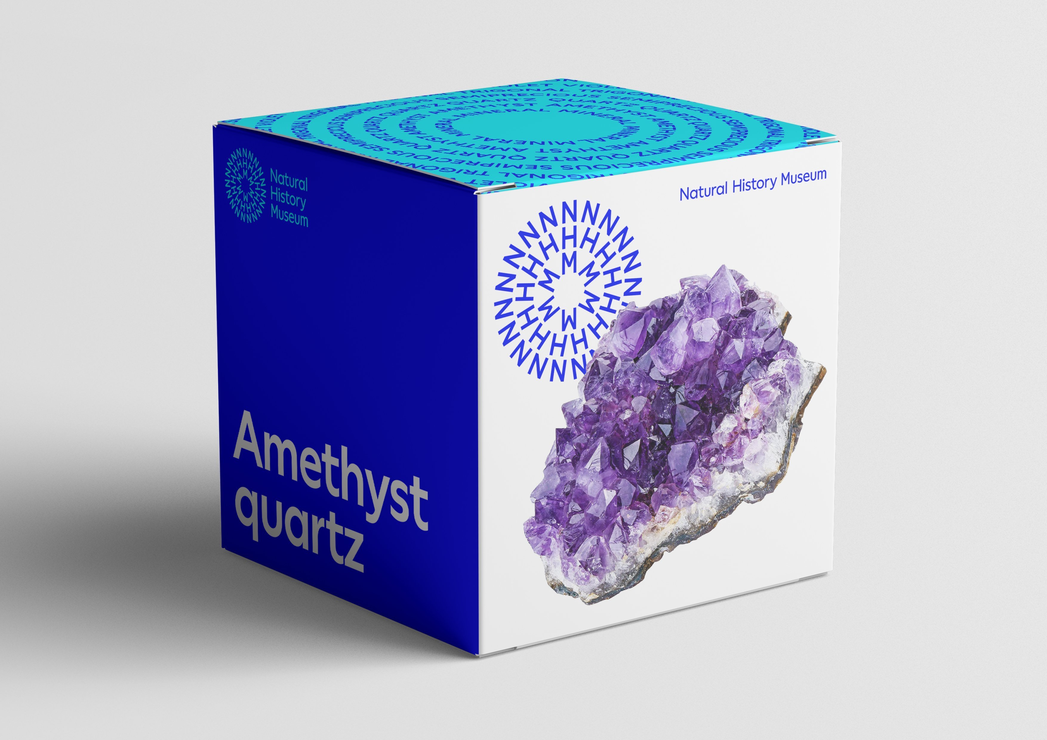
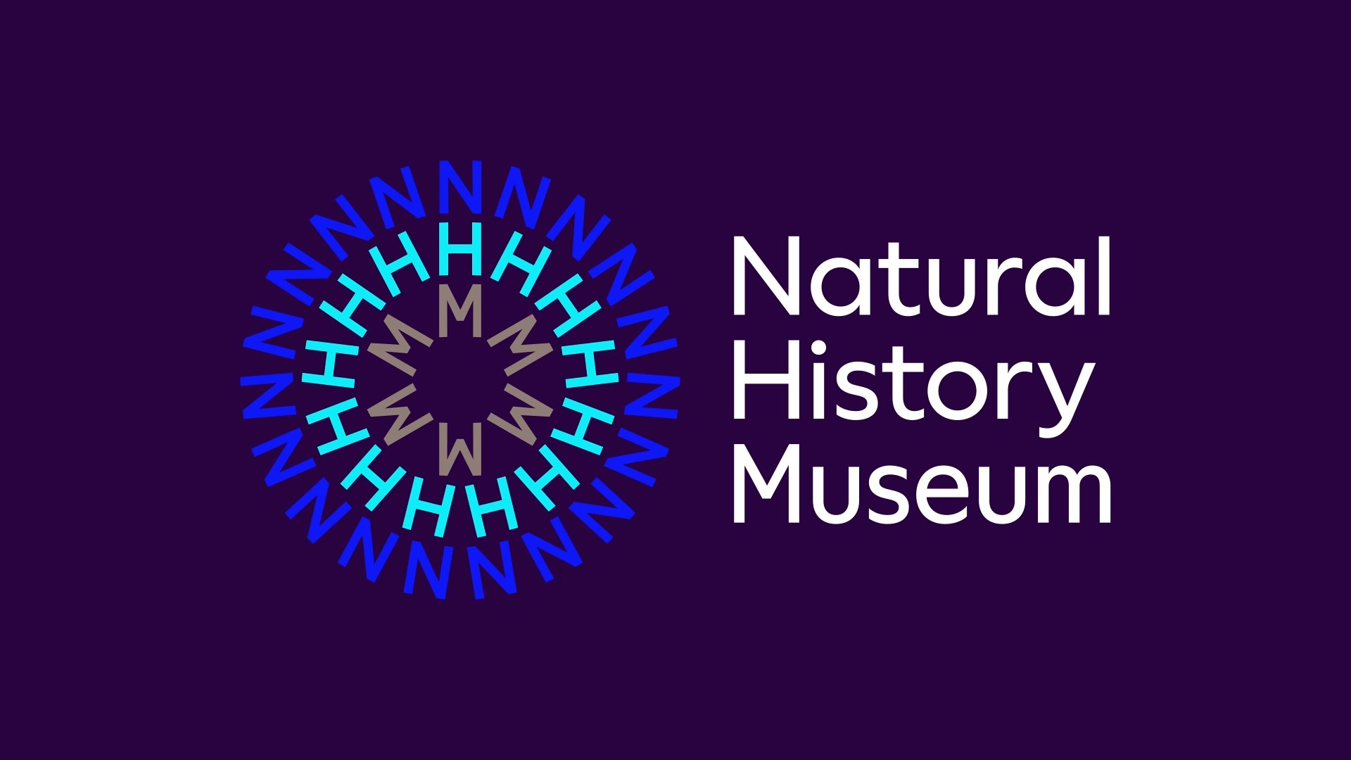
A new circular symbol was introduced that reduces the museum’s name to its acronymic abbreviation, NHM; with each letter forming a circle, or a circle within a circle. The idea was that this symbol would reference ‘our planet and the universal connection between everything in nature,’ and represent ‘the energy of a ripple effect, which pulsates from the centre to form a three-colour sunburst’. According to Pentagram, ‘It’s a shape born from nature – embodying the collective energy and positivity that reflects the Museum’s mission to become an agent for change’.
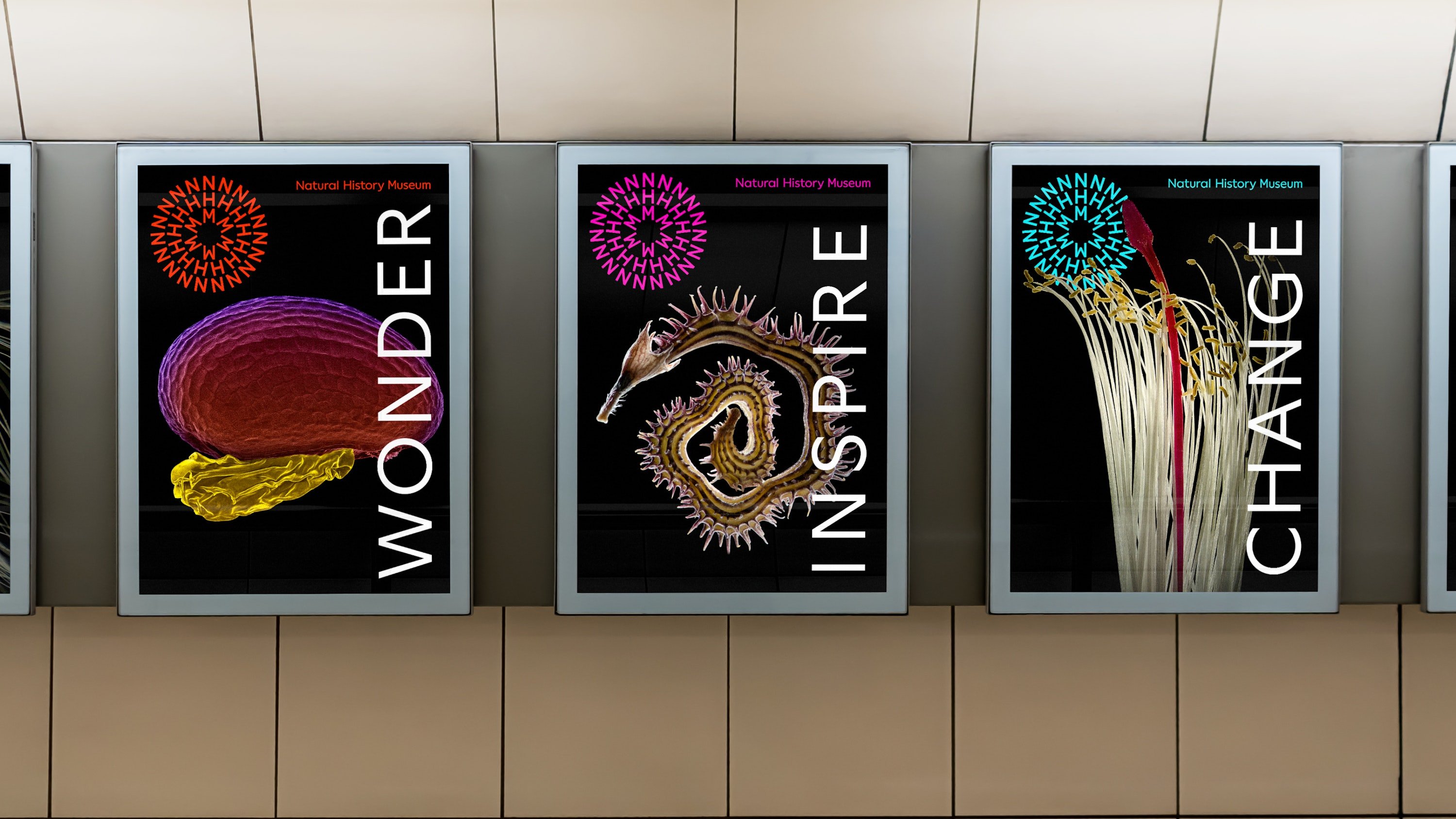
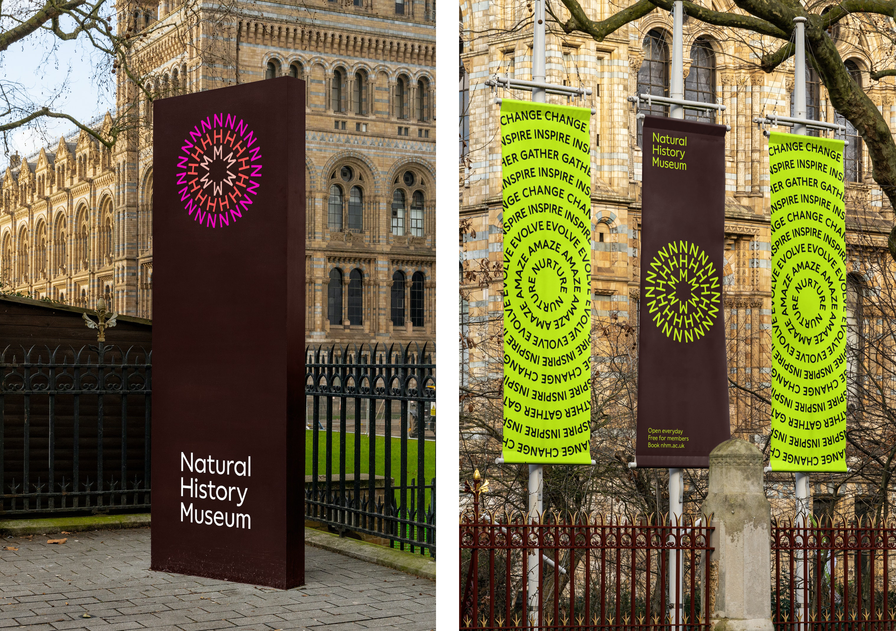
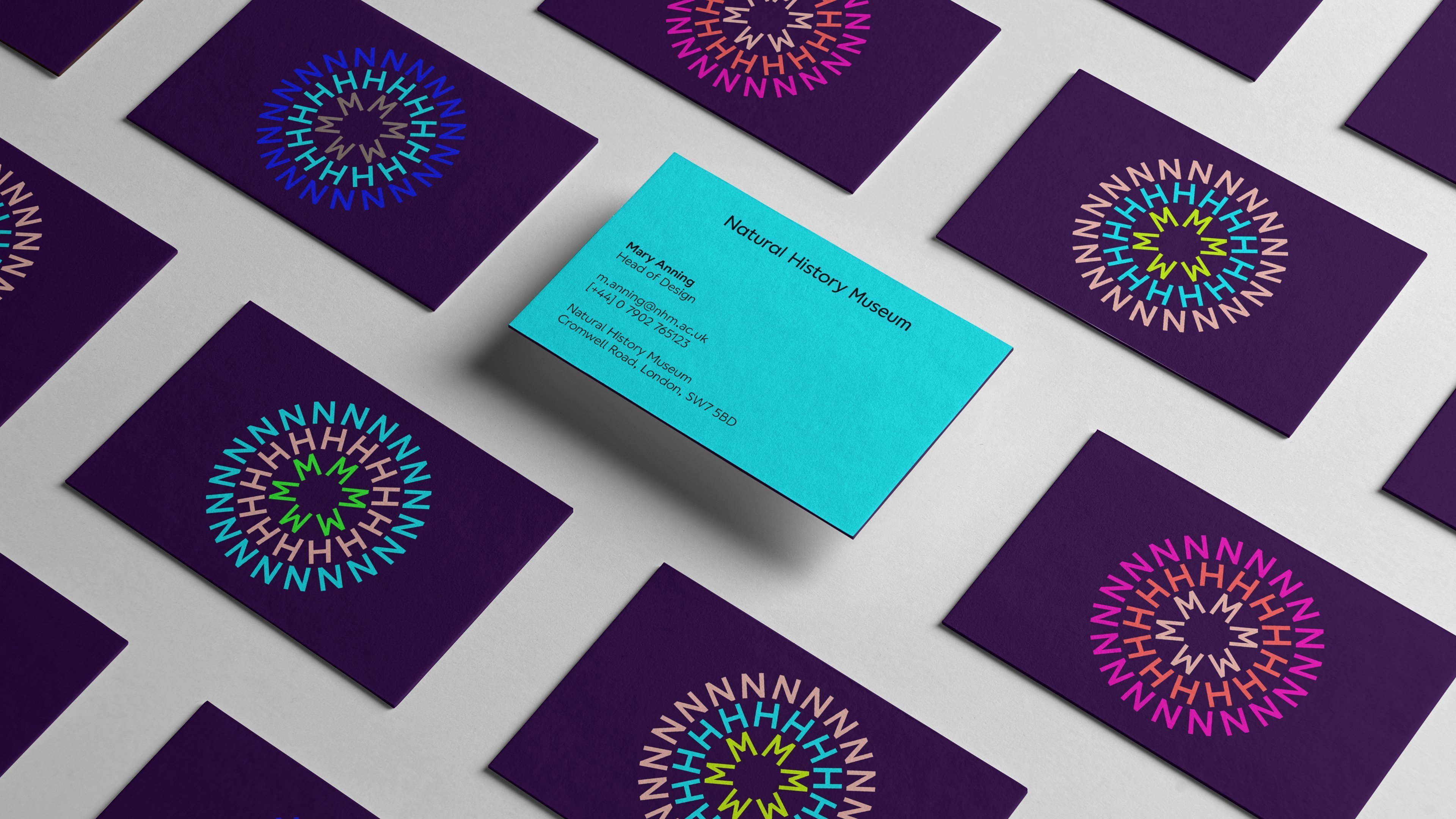
It’s certainly a snazzy symbol, especially with its vibrant, hyper-modern colour combinations, and one that’s smart in how it can be used across all the museum’s sites: its main outpost in London’s South Kensington, and its lesser-known siblings in Tring, Hertfordshire, and Harwell, Oxfordshire. The initials NHM can also connect to the long-form name in different compositions for various museum locations and parts of the offer. While at first glance, the palette of neons and similarly bold hues might seem like a grasp for instantly hip-looking modernity, according to Pentagram the colours look to ‘reflect the diversity in nature and life and invites audiences of all backgrounds and origins to participate and enjoy its activities’.
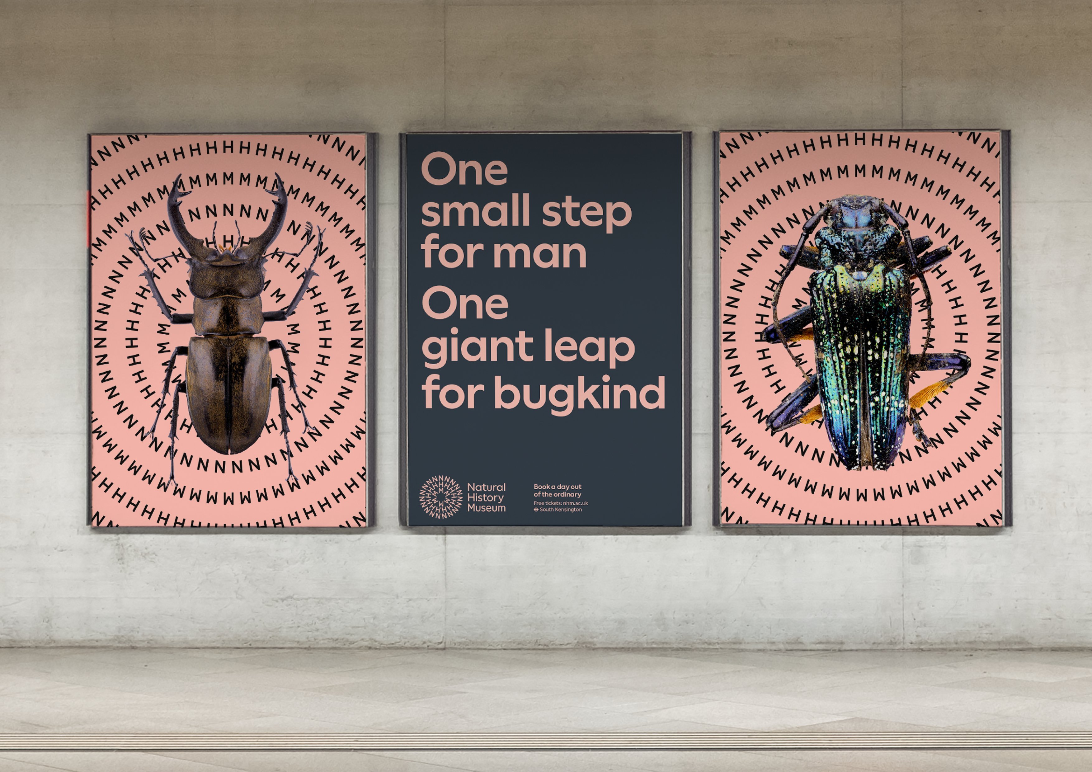
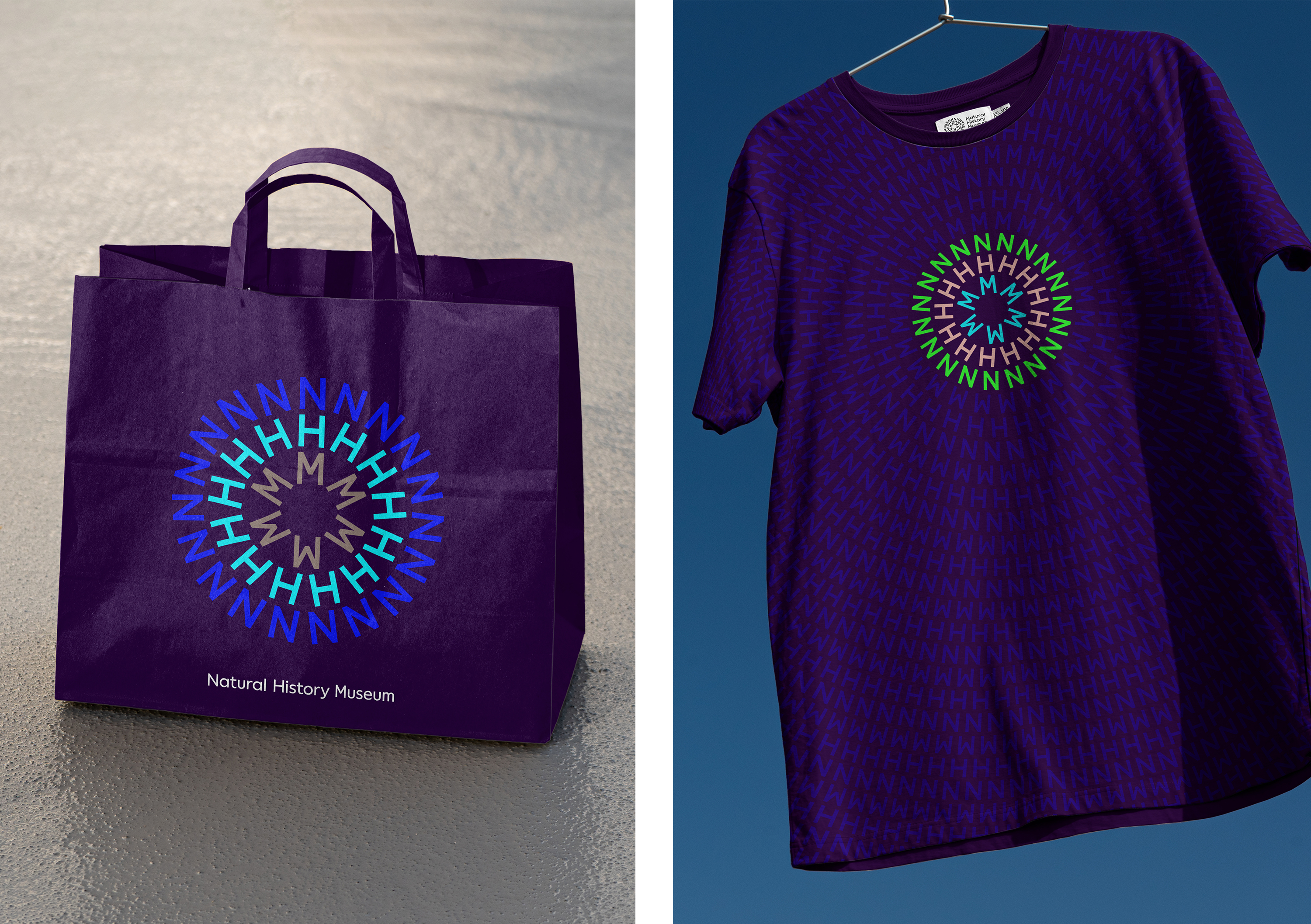
The symbol isn’t without its issues, though. While some institutions are well- or even better-known by their acronyms, such as the Victoria and Albert Museum (V&A) or the Museum of Modern Art (MoMA), you’re hard pushed to find the average person who’d instantly make the connection between NHM and the Natural History Museum. Said out loud, you’d think it was something to do with the NHS, or cheap apparel behemoth H&M. But visually, sure, it is striking.
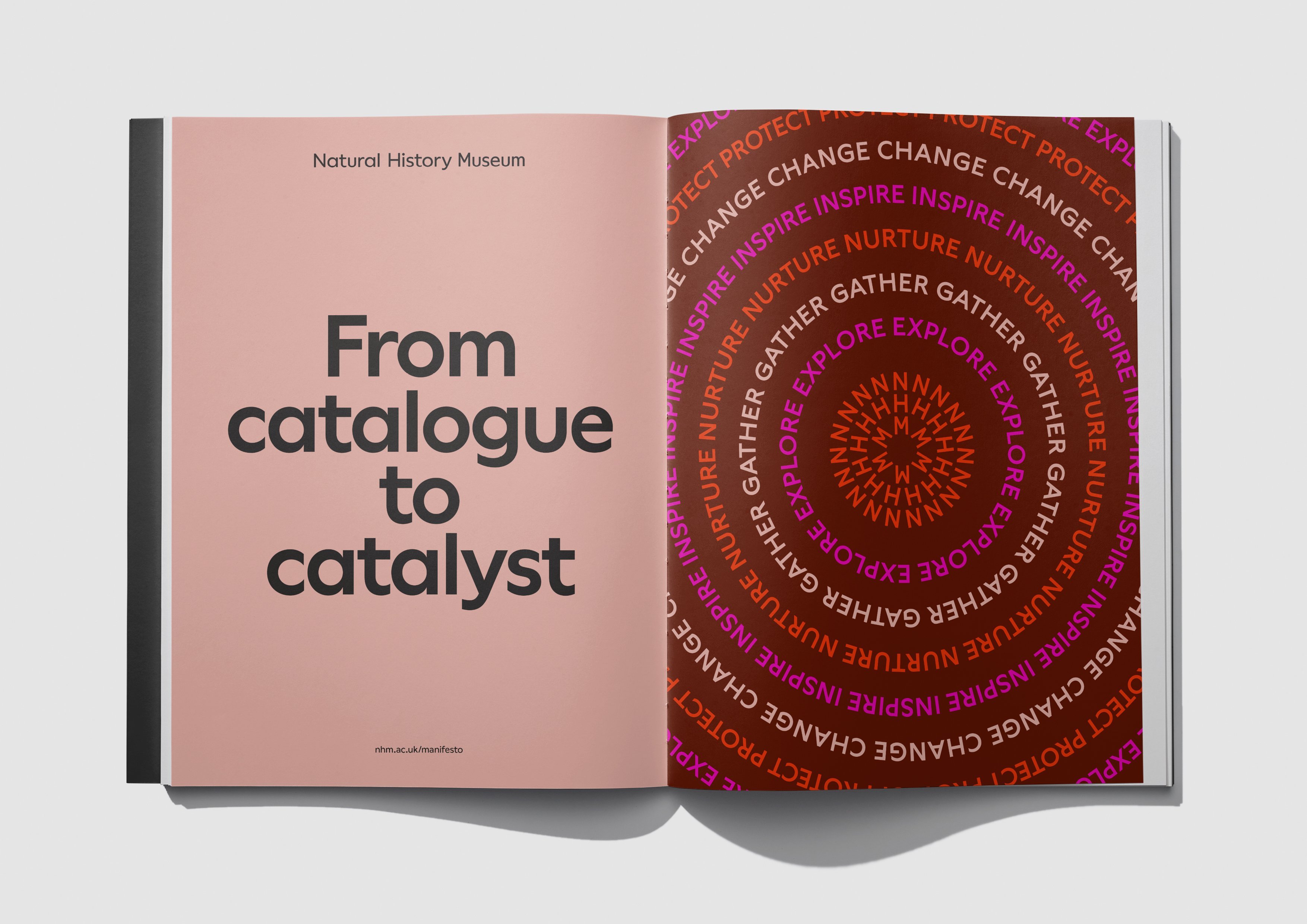
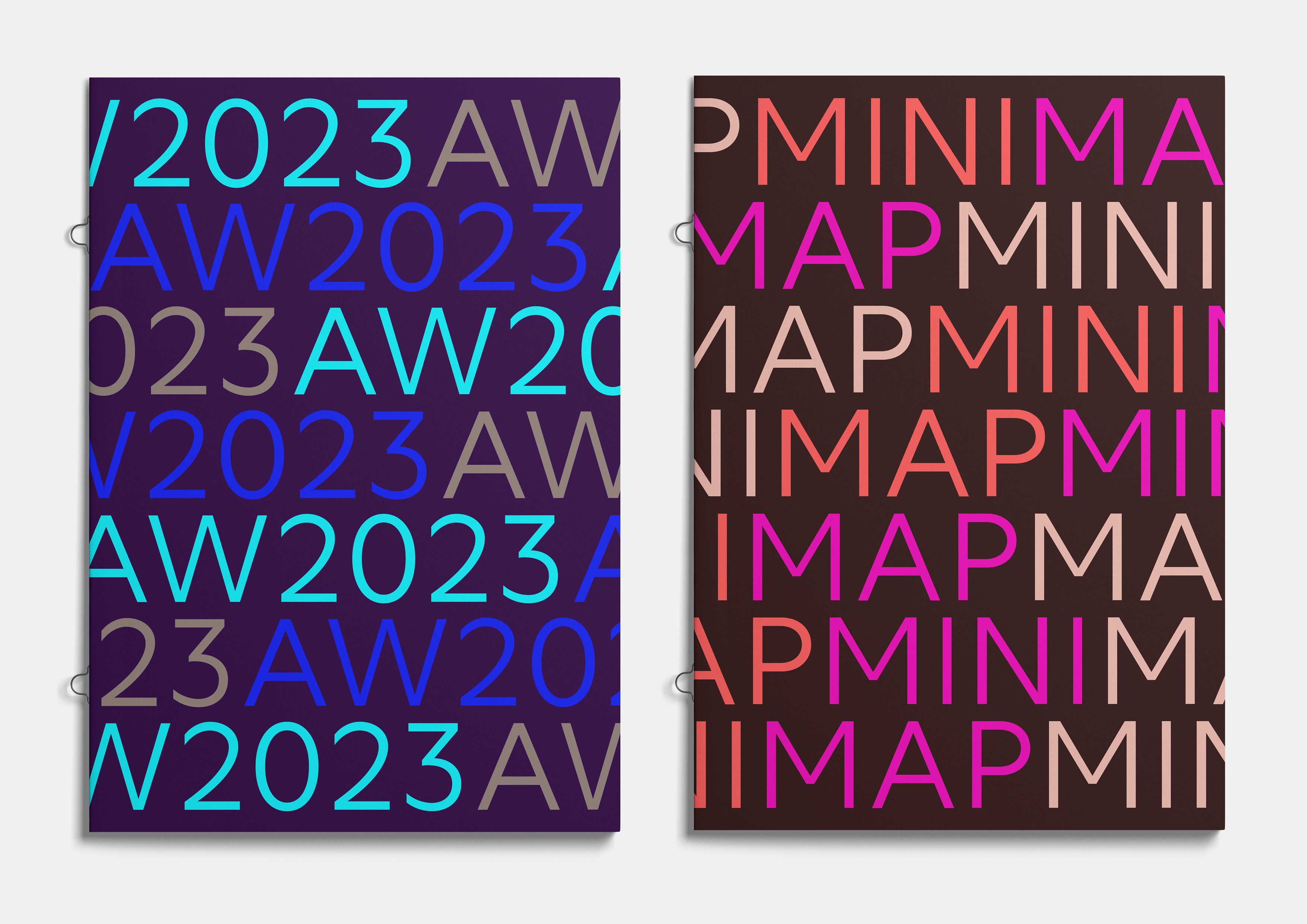
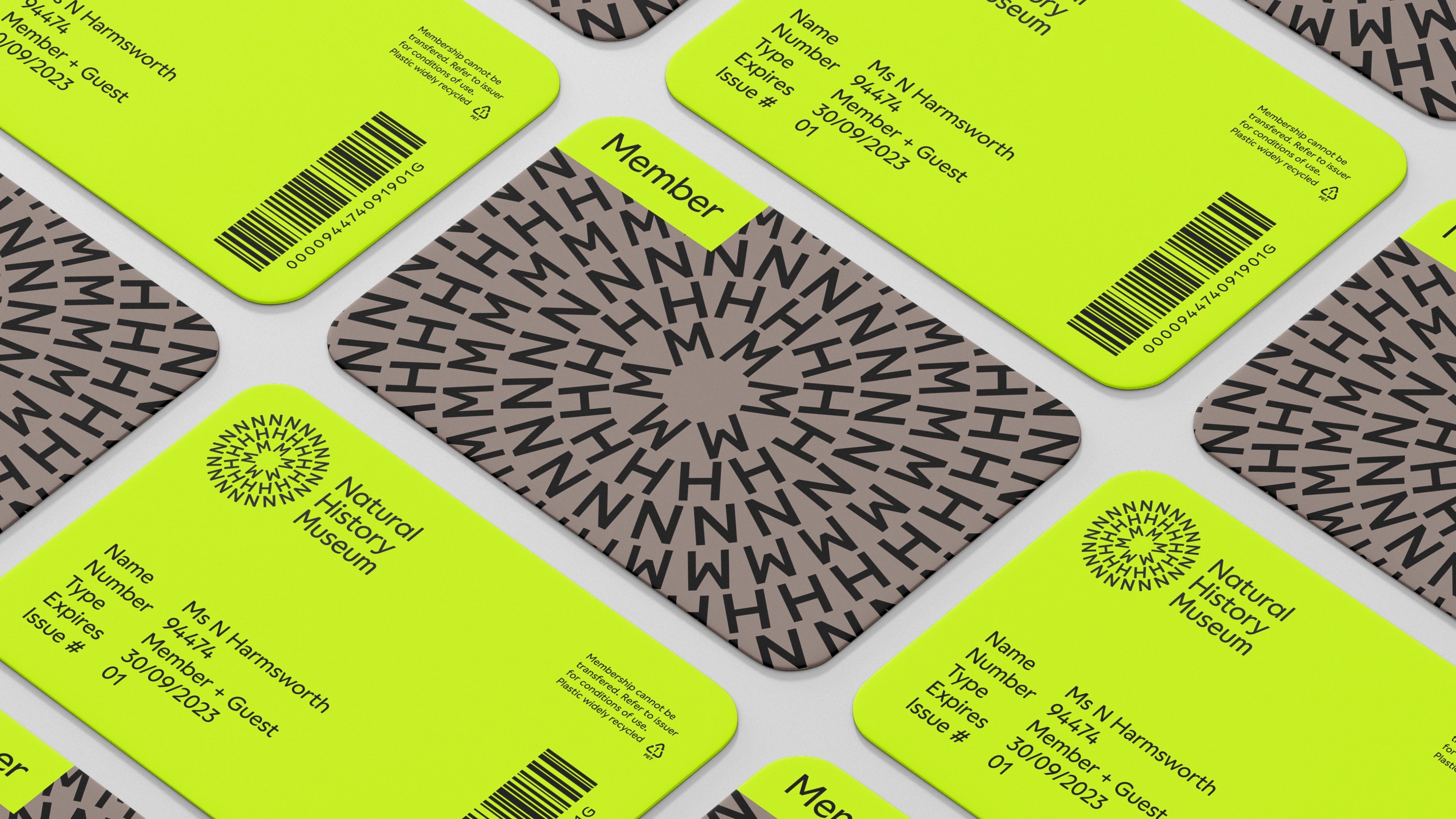
The circle device is repeated throughout the identity and its various applications as patterns and ‘Word Rings’ that all connect with the symbol. These appear as both static marks and as moving devices, looking to underscore the idea of a catalyst, represented visually: ‘They can move, grow, expand, change form and communicate, creating an instantly recognisable element that brings colour and energy.’
The ‘Word Rings’ can also be used with images or as text-only devices to display ‘contextual words’. Nomad and Pentagram also created a generator tool to allow the Natural History Museum’s internal teams and other designers working with the brand to design their own patterns in both static and motion forms.
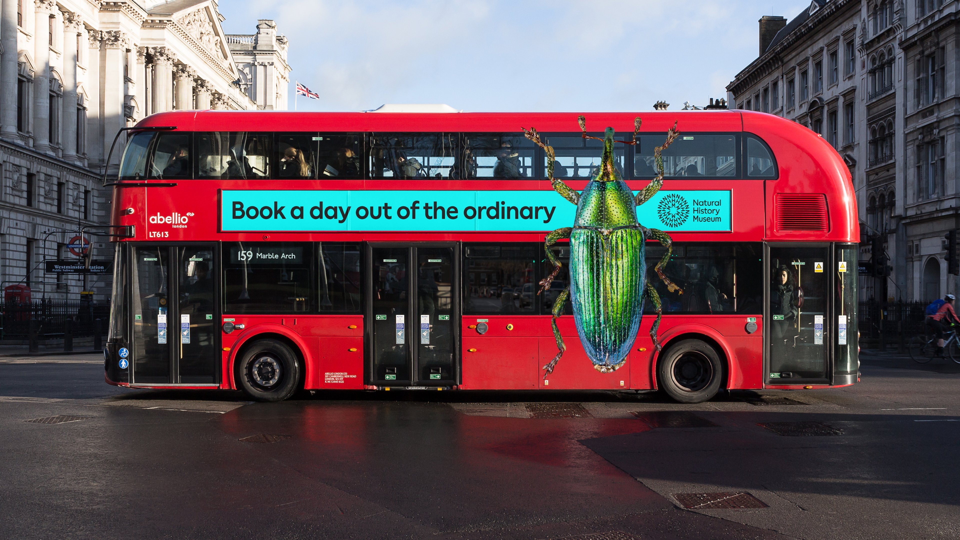
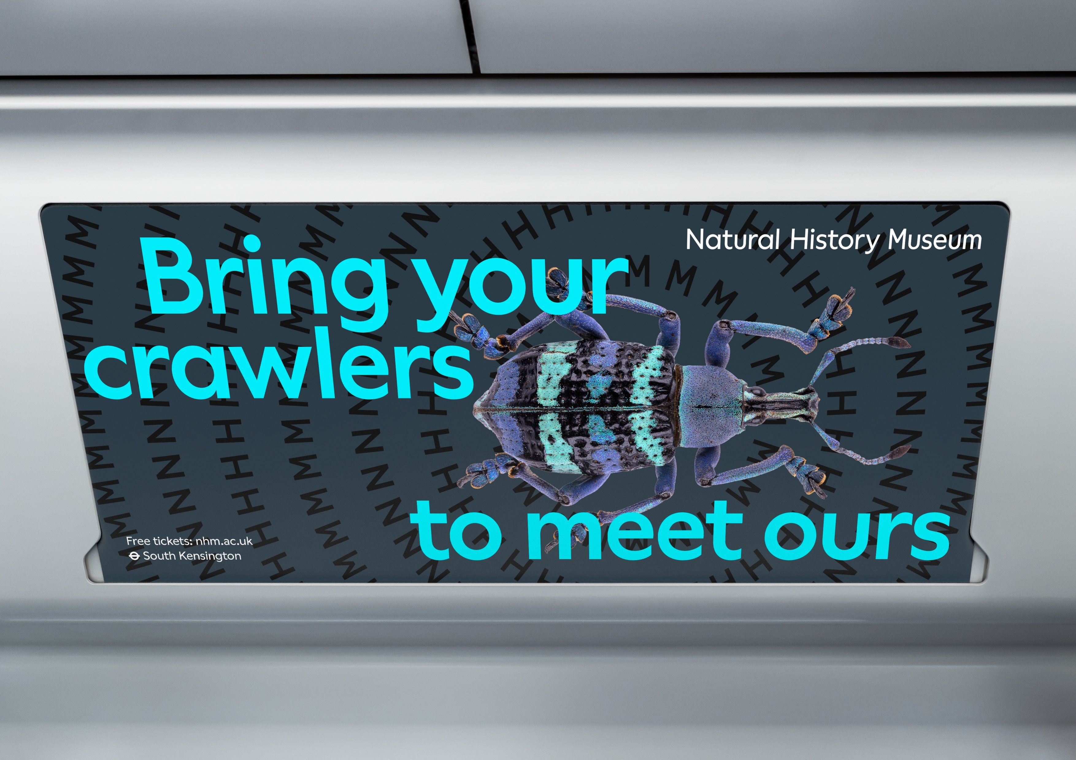
The museum’s new typeface is beautifully friendly and no-nonsense. Nomad and Pentagram created something new for the project, dubbed NHM Wallop, which is a custom version of Prague-based foundry Displaay Type’s Wallop. It straddles the line between playfulness and seriousness perfectly, and manages to feel at once both kid-friendly and effortlessly cool in its modernist confidence.
The boldness and simplicity of the designs work well: the colours are striking, the patterns are fun, and the emphasis on motion certainly shakes off any general assumptions about museums equating to stuffiness, or being stuck in the past. However, as many detractors have pointed out, in certain applications the identity does little to tell us what the ‘NHM’ actually is and does – the designs could just as well be used for a modern art museum, or a science expo, or a coding club or night spot. They do a great job in terms of accessibility and inclusivity, but perhaps cast the net too wide, and in doing so, don’t do the museum and its exhibits enough justice.
