From the United Kingdom
Hip Pop by Robot Food
Running a design blog sharpens your eye for category conventions. Stick with it long enough, though, and you’ll start to see those conventions unravel. What once felt fixed begins to flex. This creates a challenge for writing about design: you’re constantly assessing the landscape, but that landscape is always shifting. Take minimalism, for example. Once the dominant aesthetic of the...
PAIST by Two Times Elliott
Toothpaste hasn’t historically needed to do a lot, design-wise: it’s a category based on functionality and efficacy, over trends and aesthetics – sensitive teeth, whitening processes, goth-adjacent charcoal formulas, weird little crystals, and so on and so forth. That function over form thing has meant that over the years, toothpaste packaging has become incredibly monotonous – usually a predominantly white,...
Kettle Kids by Two Times Elliott
The once laudable claim to have started a thriving business with ‘a small loan’ from a doting family member may have been muddied beyond recognition by the truth-stretching of serial tax-offender and part-time Presidential candidate Donald Trump. Despite this, turning ‘one thousand pounds from nan’ into a luxury watch and diamond dealership with a sparkling flagship store in Mayfair remains...

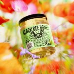
Black Bee Honey by OMSE
It was yesterday I made a run to the local supermarket to pick up some essentials. I had two choices, turn left to Waitrose or right to Morrisons. Despite being somewhat price conscious, I enjoy looking at the packaging at the higher-priced Waitrose, so went left–let’s say it’s the cost of being a designer. Anyway, honey was on the list....
Partech by Koto
Certain sectors lend themselves beautifully to innovative, eye-catching design – things like craft beer, perhaps; or beauty; or small-run editorial publications. Investment firms aren’t traditionally among those sectors that engender more outre, bold design work. And that’s partly the reason that this work for Partech, a global tech investment firm headquartered in Paris, stands out. Created by brand and digital...
National Portrait Gallery by Edit Brand Studio
In June 2023, a giant of British cultural life awoke from a three year slumber. The return of the National Portrait Gallery evokes a joy that is made all the keener when one recalls the troubled time in which it closed its doors: March 2020, as the COVID-19 pandemic took hold and public life evaporated in the announcement of that...
Natural History Museum by Pentagram & Nomad
If you grew up in the UK, the Natural History Museum is likely synonymous with two things: the massive blue whale suspended from the ceiling, or the equally large diplodocus skeleton. For many British kids, the museum is a childhood staple – either from school trips, or days out with parents who, rather savvily, combine a widespread fascination among youngsters...
Florentia Village by DNCO
On first hearing, ‘Florentia Village’ is a ridiculous name for a warehouse complex in South Tottenham, as if Hyacinth Bouquet had somehow risen from the grave and gained a seat on the borough council in order to render floridly Italianate a grimy chunk of East London. However, the name does in fact arise from an organic nomenclatural etymology: indicating ‘flourishing’ or...
Top of the Mornin’ Coffee by Earthling
Anyone over about 25 would likely feel that of all people, big-time YouTubers aren’t exactly in need of a coffee fix: high-octane, breathless excitement and endless, pause free chitchat don’t exactly scream ‘3pm slump’. However, Irish YouTuber Seán McLoughlin, aka Jacksepticeye – who boasts more than 52 million social media followers, and nearly 16 billion views on YouTube alone –...

Eager by Ragged Edge
The visual ‘territories’ of design and the strategic routes of marketing and advertising run in cycles, parallel to consumer culture. Ideas that fall by the wayside one decade are rediscovered, remixed or recycled in another. Challenger brands grow, take on the established and are either acquired, expire or, sometimes, find a sweet spot for growth that allows them to remain true...
Sing King by Nomad
I’m going to break with a decade of convention and jump right in. I love this. I was sold as soon as I saw the logo, it’s in the BP&O Gallery. It’s rare you see this kind of logo today. It’s mostly, and understandably, logotypes that prevail today. Those that are striped down to function well on multiple devices. Blanding?...
Future Factory by Dutchscot
‘Lead generation for creative agencies’. It’s one of those lines that makes complete sense to some but sounds like gobbledigook to everyone else. ‘Lead generation’ is a general mystery, unless your job depends on it. And what is a creative agency after all? But of course, so far as branding is concerned, ‘everyone else’ really doesn’t matter. Hitting the spot...