Dark Arts Coffee by NOT Wieden+Kennedy
Opinion by Emily Gosling Posted 4 February 2025

If a brand that fuses memes, hot takes, occultism, and coffee is going to succeed anywhere, it’s probably in east London. Dark Arts Coffee started out in 2014 in a Homerton railway arch, and managed to corner that distinct subgenre of goth/metal/biker-ish aesthetics which opts for craft ale over snakebite; Hackney over Camden; self-care over self-destruction.
Where the old guard, Classic Goths of yesteryear likely spent their school years being shy-to-the-point-of-mute/picked on/tending to a pet reptile – and still play Dungeons and Dragons – this is a thoroughly different, defiantly hip, frequently bearded breed. The new wave revels in irony, cool detachment; it does things well if it does them at all. It’s hard to imagine much irony in Camden, despite being the home of things like CyberDog and a raft of men in hyper-tight jeans and winklepickers.
Dark Arts Coffee undoubtedly caters for this new guard, but transcends it, too. Founded by biker and coffee-enthusiast Brad Morrison, the brand has evolved significantly over the decade since its naissance, expanding from a single roastery and cafe (called I WILL KILL AGAIN, obviously) to a new E9 branch, a Shoreditch coffee stand and even a site that isn’t in East London, Soho outlet Nowhere in collaboration with fashion line Aries Arise.

Things really picked up during lockdown: Dark Arts Coffee’s sales grew a whopping 1,000%, in part thanks to the decision to launch its own YouTube channel of branded videos which reveal a lot about the brand’s earlier years: it’s all post-NuRave neons, Cooper Black, remnants of internet culture as viewed by a man delivering a knowing wink through thick plastic rimmed glasses.
This was all well and good, but ten years in, the brand was due a refresh. As such, it brought in London-based studio NOT Wieden+Kennedy (confusingly, this is in fact a design and brand-focused arm of Wieden+Kennedy), which was tasked with reimagining the identity without forgoing its distinctive personality.
![]()

The new designs are based on a concept the studio has dubbed Joyful Nihilism – a succinctly self-explanatory shorthand for blending irreverence with existential-dread-laden humour; as well as subtly articulating that Dark Arts takes coffee seriously, if not itself.
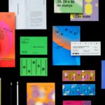
One of the main shifts has been a gently swerve away from the overtly occult-focused imagery of the former look and feel, replacing the more EdgeLord-leaning symbolism with a suite of more oblique images and motifs articulated in styles ranging from naive pencil crayon to blocky graphic prints to surreal manipulated photography.
Both as individual packs and as part of the overarching brand system, it all looks superb – as does the new bold, stark colour blocked linocut-inspired illustrations. Their whiff of Tarot sensibilities feels rooted in the occult without being confined by it – a nice echo to the brand’s heritage – but the illustrations evolve overt motifs into an aesthetic where rebellious impulses are tempered by dry wit.
The former reliance on Cooper Black remains, because it works: as the font’s surge in popularity over recent years has shown, it has some serious range – album covers of pretty much any genre to a Dallas cafe, beer, Topshop, and so much more.

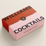
A real masterstroke of this project is its new packaging system, which really seems to underscore a more premium, grown up side of Dark Arts. NOT Wieden + Kennedy developed a series of innovative minimalist black boxes with windowed panels showing unique cards to represent each coffee blend in the range.
This is where that suite of imagery comes into play, as the cards become more than pack decoration: they play into the existing Dark Arts cult following as collectible miniature artworks designed to reflect the personality of each roast. They’re also functional, detailing the blend’s tasting notes and origin. This modular system allows Dark Arts to maintain its fast-moving rotation of over 100 coffee varieties annually, with an initial launch of 50 different designs.
NOT Wieden+Kennedy creative director Justin Hallström, who headed up the project, has said that the windowed box concept was “the perfect solution,” since it enables the boxes’ black framing to remain a consistent base “while treating each new coffee as an opportunity for creative expression.”

The brand’s logo – simply a cracked smiley face – beautifully sums up the whole ‘joyful nihilism’ thing. It’s also just quite funny, taking something so ubiquitous and knowingly using it as a brand mark with just a slight, bleak adaptation.


At its core, Dark Arts’ new identity is less a radical departure and more a sharpening of what was already there. It’s still rooted in East London if you’re looking for it to be, but the refresh has moved Dark Arts outside of the confines of postcodes beginning with E and into the territory of cult lifestyle brand with all the merchandise to go with it.


By leaning into Dark Arts’ established personality – one wholly unlike those of other coffee brands – the new identity won’t alienate the loyalists, but it feels altogether more refined. It’s creative through and through, but it’s also smart, subtle, future-facing in its flexibility. On a very basic level though, it’s just an absolute joy to look at. It’s Very Cool – but not in a way that looks down its nose at you or blanks you at house parties; and never, ever in a way that tries too hard.