So Energy by Studio Blackburn
Opinion by Emily Gosling Posted 13 January 2026
I’ve said it before and I’ll say it again: it’s all well and good making some striking, retina-toastingly fluoro, brave as hell design work for, say, a kombucha startup or CBD lube or a record sleeve or an art book. These things are by dint of their very existence, context, and audience, already sort of cool. But the real creative chops emerge in brand design projects for things that are already sort of aren’t – i.e. things like energy companies. It takes a wild/deranged imagination to make electricity bills seem sexy and interesting, after all.
Studio Blackburn, then, has more than proved its worth here with this brilliant (see what I did there) work for So Energy: not only is this refreshed identity and new campaign work visually striking, modern, and – dare I say it – fun, it also manages to be super-camp (yay!!!) and pretty hilarious all at the same time.
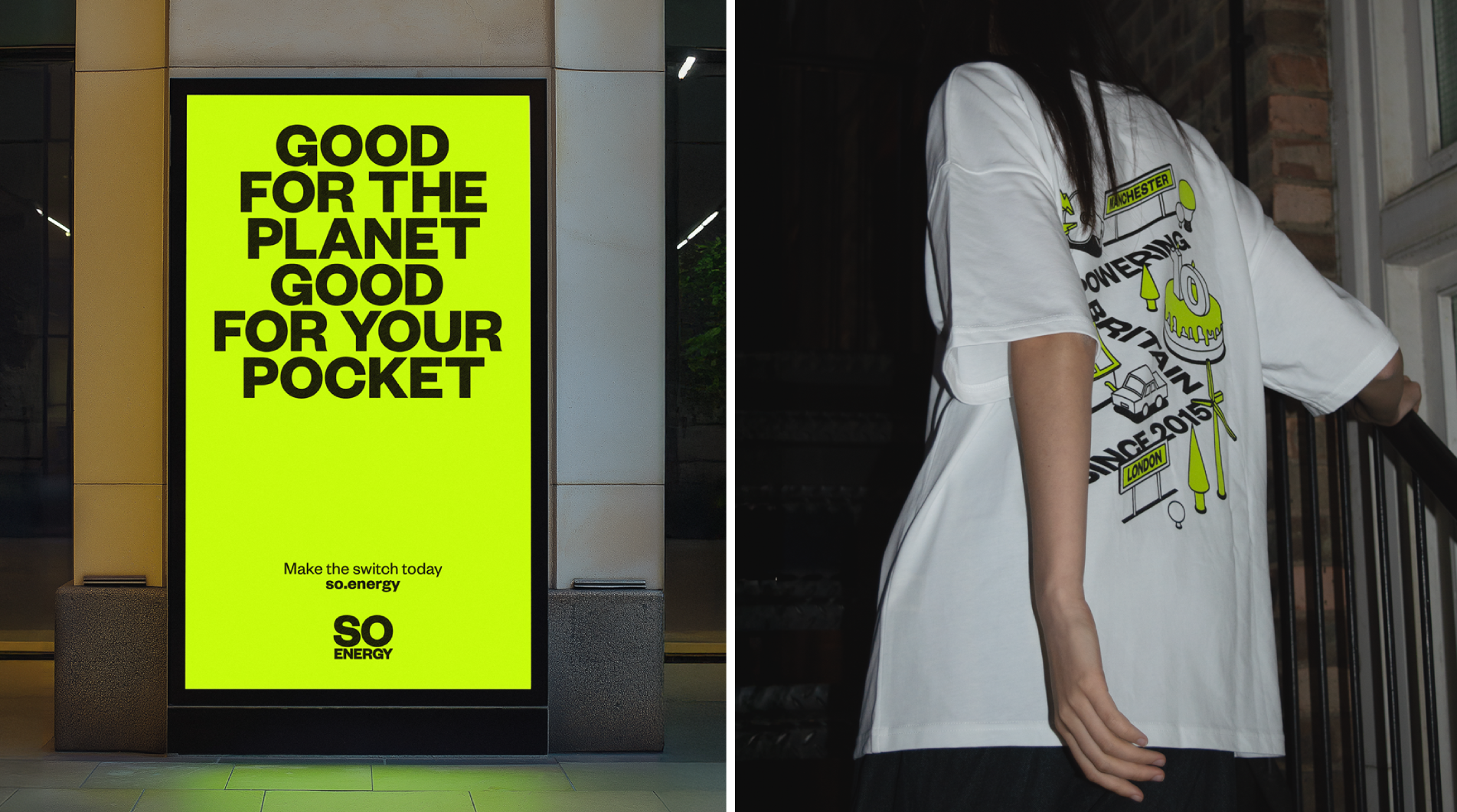
So Energy began life in 2015, and delivers only renewable energy, as well as offering smart tariffs, and solar solutions. Its vision remains the same: to make sustainable energy “accessible for every home”. It’s now used by around 300,000 homes across the UK.
Based in London, Studio Blackburn (Olympic Museum, Ventura Foreman, Limelight Sports) initially worked on So Energy’s branding back in 2020 – but as the agency points out, both the company and the energy marketplace more broadly have changed a fair bit in the half-decade since.
As such, Studio Blackburn has worked on an identity refresh that it says is “designed to stand out and challenge in a crowded market” and which “represents a new era for So Energy… building on that challenger spirit at the heart of the brand”. The studio adds that “from strategy to execution,” the refresh centres clarity and confidence.
That sense of So Energy as having a long-standing, singular, focused vision is articulated beautifully in Studio Blackburn’s brand design. Likewise, the brand’s clear point of difference – i.e. its use of only renewable, green energy – sets it apart from the ‘Big Six’ energy companies, as Studio Blackburn puts it, in terms of both the way it operates and the way it looks and communicates.
According to Studio Blackburn, this refresh was all about making renewable energy “relatable, easy to understand, and, most importantly, impossible to ignore”. It continues, “At the heart of the refresh is So Energy’s new external voice, ‘Live Life Energised’. The phrase captures the spirit of a company that wants customers to spend less time thinking about energy and more time enjoying what it enables.”
The whole ‘Live Life Energised’ idea looks to run through each and every aspect of both the refreshed branding and the new campaign, acting as the central concept that shapes the brand’s overarching tone of voice, visual identity, motion design, illustration style and more.
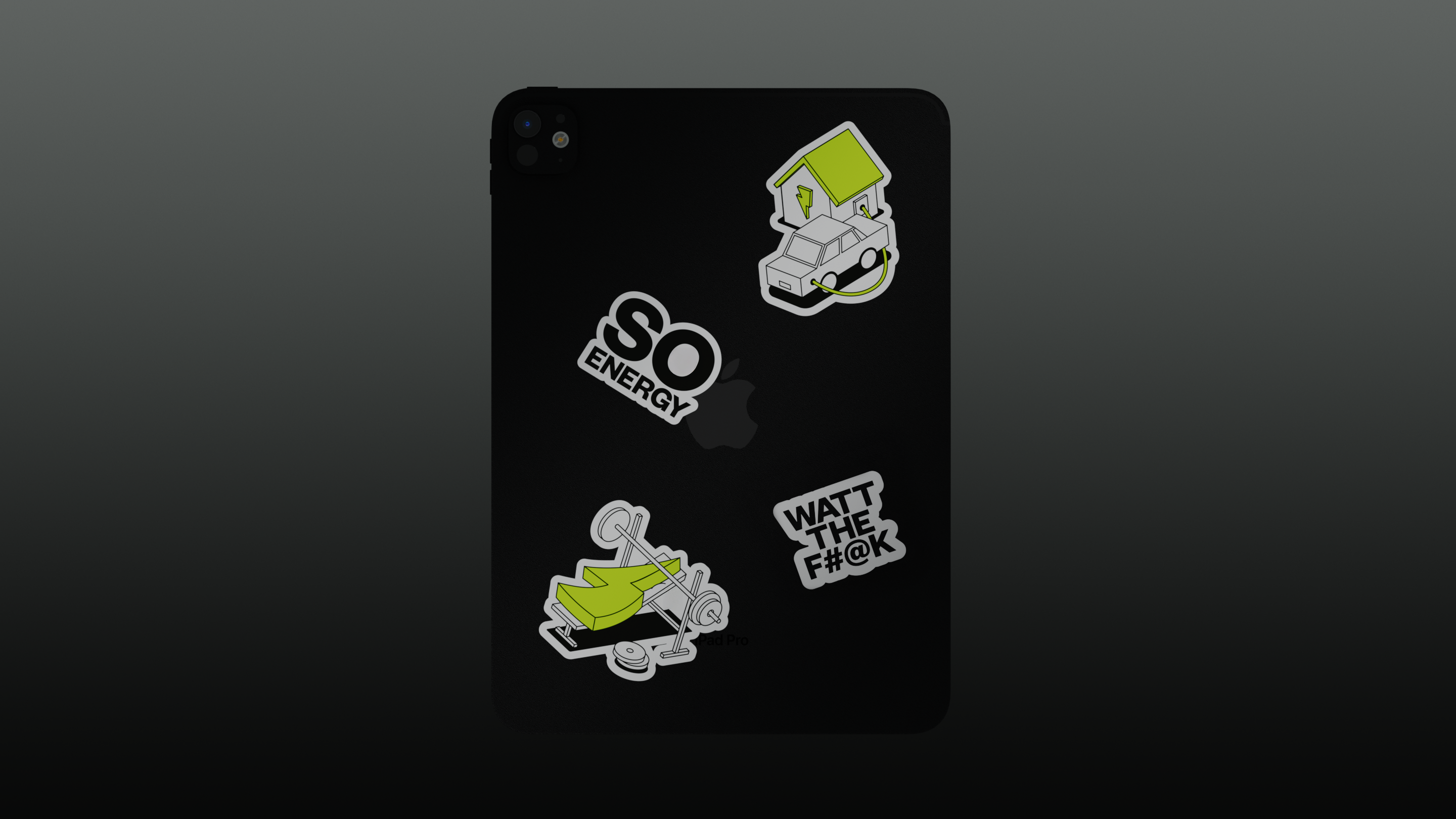
Everything about this identity seems to prioritise clarity, ease of use, accessibility and – crucially – modernity. The colour palette is about as striped back as it could be: even i the delightful illustrations and icons (more on which in a moment), the branding uses only black, white and a distinctive shade of lurid greenish-yellow/yellowish-green. So yes, it’s sort of green, but in a way that even the most cynical would struggle to determine as cliched or obvious.
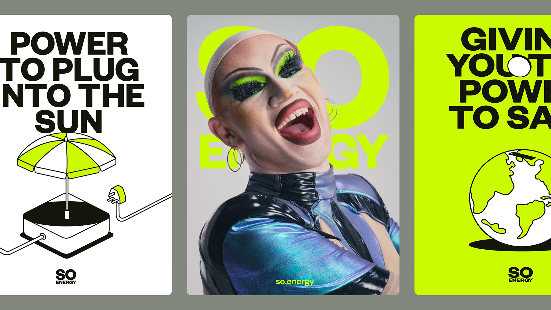
Studio Blackburn dubs this hue “Electric Yellow”: “It feels unhuman yet natural, loud yet approachable,” the agency says, adding that the use of this resolutely eye-catching and distinctive shade creates a unifying visual language across digital ads, comparison sites, social content, and customer communications.
Just as the colours are stripped right back, packing a real punch in doing so, typography is kept about as straightforward as it can get: just one font is used across the hefty letterforms of the wordmark – a hulking bold wordmark that owes more to ‘FRANKIE SAYS RELAX’ than anything else we’ve seen in the energy sector – and all other brand copy, albeit in different weights.
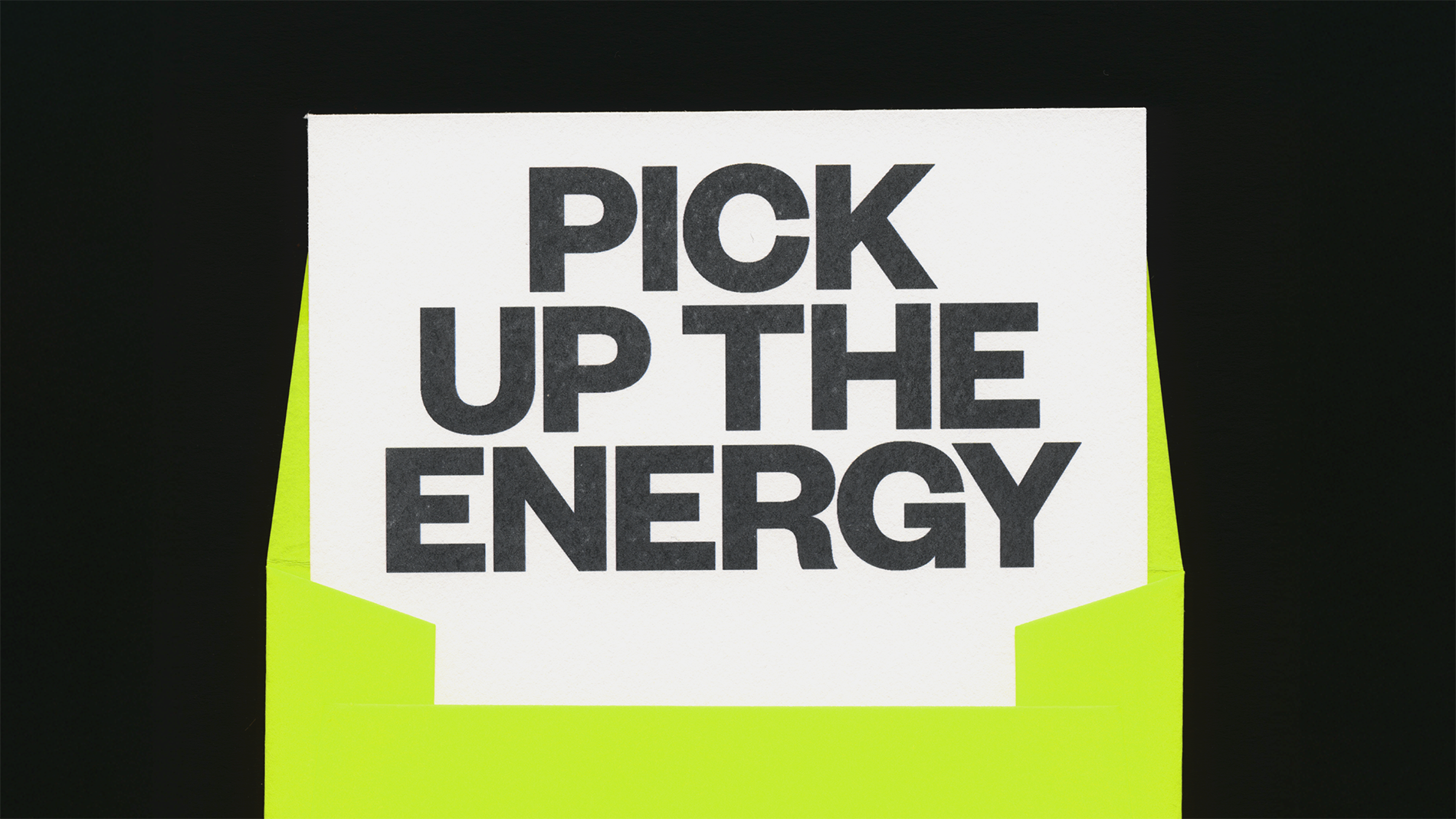
Said font is Founders Grotesk by New Zealand-based Klim Type Foundry, described by its creators as “a contemporary amalgamation of classic grotesks” that combines geometric precision with some softer “serpentine curves”.
Thanks to those subtle but palpable nuances, as well as the narrow aperture of certain forms and “tight spacing strategies [borrowed] from Helvetica’s Halbfett (Medium) headline-sized metal cuts from the late 1950s”, Founders Grotesk is absolutely a workhorse, flexible enough for any size or application you can throw at it, but it’s very much a charming one that feels friendly and warm both in spite and because of all its doggedly useful legibility.
The only part of the new work I’m not 100% sold on is the campaign strapline “We Do Energy, You Do You” – I’m just not sure it has the same oomph or clarity as the rest of the brand voice, as articulated through the brand design elements like they colour palette, type and iconography. Yes, So Energy does energy – but the name alone implies it does little else. And perhaps this is subjective, but now, in 2026 ‘you do you’ has evolved to imply something overwhelmingly snarky, rather than liberating.
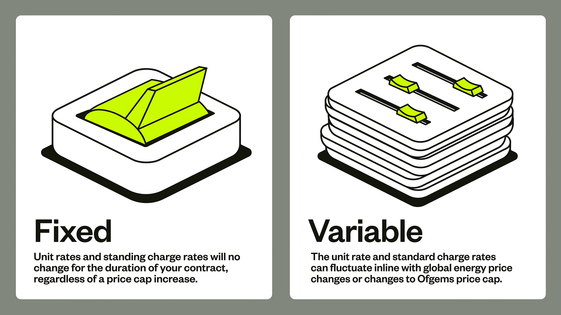
For me, the standout in the refreshed identity is the brand illustrations and their motion-led counterparts: using stark, thick black line-work and flattened graphics, they reverently recall the sort of standards manual designs that have made their way from pure mid-century functionality to aspirational coffee table book fodder.
Put simply, they look really, really strong – no one would bat an eyelid if these were tastefully framed on the walls of a hip co-working space, coffee shop or creative agency. Yet they’re still resolutely functional, both as decoration and descriptor of the service or product in question.
That merging of fun and functionality is even more crystalline in the suite of icons created by the brand for Studio Blackburn: there’s an adorable little piggy bank here, a toaster there, a rather on the nose depiction of an energy bill being cut in half with scissors. It’s no mean feat to make a light switch look both cute and captivating, but my god have they pulled it off.
Interestingly, in a LinkedIn post the studio seems to be taking a subtle, yet arguably rather prescient swipe at the character-led trend we’ve started to see a hell of a lot of lately: “Not a cutesy mascot in sight,” it says in describing the new work. But then a mascot isn’t necessary in an identity where the most banal elements of modern life suddenly look so compelling.
