Richard Baird

On Rye by Pentagram
On Rye is a fast-casual sandwich shop, with a space in the US capital of Washington DC, inspired by the Jewish deli. It has a menu of unexpected recipes that dial down the salt and bumps up the veggies, uses natural and wholesome ingredients, and gives traditional dishes a modern twist. On Rye has an interior that brings a contemporary finesse to retrospective detailing and...
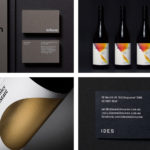
BP&O Collections — From Australia
A round-up of some of the best logo, brand identity, print and packaging design projects from across Australia reviewed and published on BP&O. Featured studios include Studio Round, Seesaw, RE and A Friend Of Mine, and cover a variety of clients, industries, and categories, from food and drink to architectural studios. This collection encompasses simple logo and stationery projects, broader brand identity experiences and...
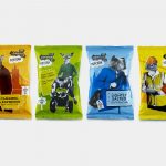
The London Popcorn Co. by B&B Studio
The London Crisp Co., a hand cooked British crisp brand available in local pubs throughout the capital, has expanded to include popcorn. Local graphic design studio and packaging specialists B&B Studio returned to the project that they help establish the visual language for. This time, introducing anthropomorphised animals inspired by what the studio describe as modern London tribes, and include yummy mummies, Hoxton...
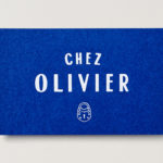
Chez Olivier by Swear Words
Chez Olivier is an authentic French bistro located in the centre of Greville St village, Melbourne, that intends to share its passion for French food, wine and culture with the community. It features an intimate European-style interior design of stained woods, classic furniture, photography and period advertising. It also has a unique bar of padlocks, inspired by Pont des Arts, engraved with messages of love...

Caldo Coffee by 25ah
Caldo Coffee is a café serving organic coffee and fresh salads, sandwiches and pastries from its location in the Scandic Continental, a hotel in the centre of Stockholm. It features a distinctive and modern interior design of light wood, tall shelves and a long wood panelled and marble topped counter. It also includes a large custom-built menu board, neon signage and a...

Someone Somewhere by Sociedad Anónima
Someone Somewhere is a clothing and accessories brand. Each of its products are designed and made in Mexico by small communities of textile artisans. The social and cultural contexts that are the foundation of brand are expressed by its new visual identity, created by Mexico City-based graphic design studio Sociedad Anonima, through naming and a graphic device that calls out maker and origin....

Printed by Somerset by Leo Burnett
Somerset is described as being Canada’s top printer, known for its precision, attention to detail and ability to pull off complex jobs. Alongside reproduction services, Somerset, a family-run business, also provides extensive print finishing services. Inspired by this, the stacked paper of the press, and with the intention of engaging a new generation of designers, Toronto based studio Leo Burnett developed a new brand identity...
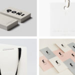
BP&O Collections — Fashion
A collection of brand identities designed for fashion-related businesses reviewed and published on BP&O. Featured studios include Two Times Elliott, Zak Group, and Hey, and cover a variety of fashion-related clients, from trend-watchers and model agencies to fashion labels, shops and tailors, as well as footwear and accessories. The work featured is reductive but not sparse, aesthetically restrained and communicatively precise, often...

Qoñi by Leo Burnett
Qoñi is a small artisan community in the Peruvian city of Puno creating hand knitted socks, scarves, gloves and shawls from alpaca fleece. With a desire to present itself as a modern fashion brand and with the intention of entering the international market, Qoñi worked with Toronto-based graphic design studio Leo Burnett to develop a new visual identity; from naming to wordmark, brand story to lookbook, and...
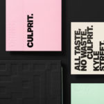
Culprit by Studio South
Culprit is a bar and restaurant located on Auckland’s Wyndham Street. It has a menu made from ingredients supplied by local New Zealand producers, growers and farmers, and is inspired founder’s Kyle Street & Jordan MacDonald’s travels across the United States and Europe. Culprit has a modern interior design in a converted loft space created by Kirsty Mitchell. This is characterised by large exposed beams and brick...
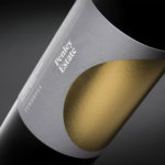
Penley Estate by Parallax Design
Penley Estate is a family run winery established in 1989 by Kym Tolley and located in the wine growing area of Coonawarra, Australia. It produces wines that are described as having discernible regional character and are made from fruit grown in Terra Rossa soil; a red clay type created by the weathering of limestone. Penley Estate, since its inception, has...

Verso Architecture+Interiors by Studio South
Verso is a small Auckland-based architecture and interiors business working within the residential and commercial sectors. Drawing on the oppositional nature of name and using a mix of simple typographical form, high-quality materials and print finish Studio South developed a new visual identity for Verso that is described as being both sophisticated and playful, whilst effectively working in some universal architectural principles. This links a variety of printed...