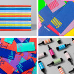
BP&O Collections — Multi-coloured
A continually updated collection of graphic identities and packaging design work, reviewed and published on BP&O, that feature a distinctive multi-coloured component. Between them, and in conjunction with form and context, these bring to light how the use of three or more colours can catch the eye and convey creative energy without appearing complex or overwhelming. This post includes a...
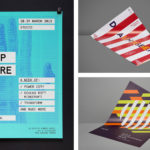
BP&O Collections — Posters
A continually updated collection of poster designs created as part of a broader brand identity programme, reviewed and published on BP&O. Between them, these bring to light how colour, type, form, orientation, layout and contrast, as well as substrate and print technique, contribute to a distinctive and expressive brand identity. These often catch the eye from a distance and follow...
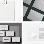
BP&O Collections — Blind Embossing
A continually updated gallery of brand identity, packaging and graphic design, reviewed and published on BP&O, that feature a blind emboss or debossed detail. This post features work by Bibliothèque, Triboro and Bedow, and covers a variety of projects, from restaurants and lighting architects to galleries and fashion labels. Blind embossing has been used in a few different ways. These...
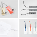
BP&O Collections — Swing Tags
A continually updated collection of distinctive swing tag designs created as part of a broader brand identity programme, reviewed and published on BP&O. Between them, these bring to light how colour, type, form, image, layout and contrast, as well as material choice and print finish, contribute to a distinctive and expressive brand identity. This post includes dyed papers and foils, illustration,...
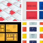
BP&O Collections — Business Cards No.16
A collection of distinctive business cards designed as part of a broader brand identity programme, reviewed and published on BP&O. Between them, these bring to light how colour, type, form, layout and contrast, as well as material choice and print finish, contribute to a distinctive and expressive brand identity. This set includes dyed papers and foils, illustration and pattern. Featured studios...
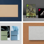
BP&O Collections — Photographers
A continually updated collection of some of the best brand identity design for photographers and photography exhibitions, reviewed and published on BP&O. This post features work by Bedow, ice Design and S–T, and includes simple logo design and stationery sets, and extends to those that cover printed and online portfolios. Projects largely favour the subtle, the framing of image, often...
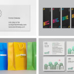
BP&O Collections — Film Industry
A continually updated collection of some of the best brand identity design work for film festivals, cinemas, awards, production companies, distributors and film educators, reviewed and published on BP&O. This post features work by Pentagram, Studio fnt and Heydays, and includes simple logo design and stationery sets, and extends to those that cover signage, photography, custom typography and lighting. Projects...
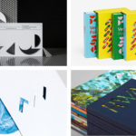
BP&O Collections — Die Cutting
A continually updated gallery of brand identity, packaging and graphic design, reviewed and published on BP&O, that include a distinctive use of die cuts. This post features work by B&B Studio, Neue and Believe in, and covers a variety of projects, from simple stationery sets to broader brand identity systems. Die cuts have been used in a variety of ways. These...

BP&O Collections — Beer
A continually updated gallery of beer branding and packaging design, reviewed and published on BP&O. This post features work by Robot Food, Perky Bros and O Street, and covers local craft beers and international brands, individual beers and packaging as part of a new brand identity system. These take a variety of approaches, from the illustrative to the typographic, the abstract...
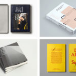
BP&O Collections — Books & Magazines
A continually updated gallery of book and magazine design, reviewed and published on BP&O. This post features work by Blok, Toko and Bedow, and covers both fiction and non-fiction. Projects include approaches that, through space and structure, pace the reader, augment content with material concepts and play with flow through different paper sizes, colour and gradation. These move between the striking,...
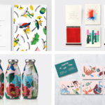
BP&O Collections — Illustration In Branding & Packaging
A continually updated collection of some of the very best brand identity and packaging design projects that effectively utilise illustration, reviewed and published on BP&O. This post features work by Studio fnt, Conductor and B&B Studio, and covers a variety of projects that have illustration as a recurring and central component. These play with the striking and memorable, the idiosyncratic and nuanced,...
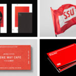
BP&O Collections — Red In Branding
A collection of some of the very best brand identity and graphic design projects that effectively utilise red, reviewed and published on BP&O. This post features work by Toko, Bond and Character, and covers simple logo and stationery projects, and extends to broader brand identity programmes. These play with large areas of red, red as highlight or a small conceptual accent, and...