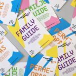
Guggenheim Helsinki NOW by Kokoro & Moi
NOW was a free exhibition presented by The Solomon R. Guggenheim Foundation that took place throughout May at Taidehalli in Helsinki. The exhibition unveiled the six shortlisted proposals for a Guggenheim museum in the capital, visualised, analysed and interpreted data drawn from the 1,715 projects submitted, and was also a chance to view the fifteen designs that received an honourable mention. The exhibition was extended to...
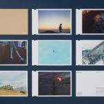
David Ryle by S-T
David Ryle is an internationally recognised and award-winning photographer with a studio in London. He has a portfolio of work that includes shots for The Sunday Times Magazine, JWT and Saatchi & Saatchi, and is represented across Europe and America by management agency The Peter Bailey Company. Drawing on his attention to detail and relentless pursuit of quality, design studio S-T developed...
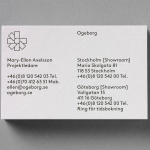
Ogeborg by Kurppa Hosk
Ogeborg is a Swedish, family-owned, manufacturer and supplier of high-quality carpet to the commercial sector, partnering with real estate owners, architects and interior designers since 1968. Stockholm based graphic design studio Kurppa Hosk worked with Ogeborg to develop a new strategy, visual identity treatment and website that would not only reflect some of the culture of the business but would help them...
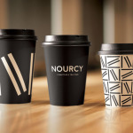
Nourcy by lg2boutique
Nourcy is a delicatessen that has been creating fresh, home-made and original products for thirty years from its location in Quebec City. While providing a contemporary dining environment Nourcy also offers catering services and lunch boxes to customers who have come to expect restaurant-quality at work and at home. In conjunction with a new menu of pastries, an expanded chocolate selection, exclusive gourmet delicacies and the development of a...
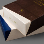
Antéoise by UMA
Antéoise is a creme dacquoise range from Anténor, a Japanese patisserie established in 1966 that creates French style cakes, cookies, tarts and variety of other confectionery. Antéoise’s brand identity and packaging treatment, developed by Osaka based graphic design studio UMA, draws on the range’s flagship positioning, high quality ingredients and the craft employed in its creation, the heritage and experience of Anténor, the streets of Kobe, and the...
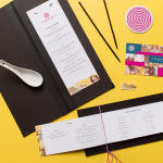
Tanoshii Ramen Bar by Mast
Ramen is a Japanese meat broth and wheat-noodle soup that originated in China and is now embraced internationally. While many enjoy instant versions, the best is said to be prepared over days and is the product, and some would say the art form, of a creative and experienced chef. These are the values of Tanoshii. As the first dedicated ramen bar...
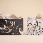
Candlefish by Fuzzco
Candlefish is a Charleston, South Carolina, store that stocks a carefully curated collection of scented candles from an assortment of brands including Rewined and Produce, and also plays host to a variety of workshops. The store takes its name from the Eulachon, better known as the Candlefish. After drying, and due to its high oil content, the Candlefish burns much like a candle and...
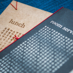
Chavez by Föda
Chavez is a contemporary Mexican restaurant located within the Radisson hotel, Austin, Texas. The restaurant has a Southwestern menu created by chef Shawn Cirkiel and inspired by his memories of family road trips taken to the Mexican coast and the cuisine he experienced there. These memories also informed the development of a warmly lit, wood and fabric furnished interior design by Michael Hsu Office...
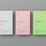
Laji Hair & Make by UMA
Laji is a hair and make-up studio located in the city of Osaka, Japan, with a distinctive interior design developed by dot architects. It features chipboard dividers and mirror frames, pegboard panels, strip lighting, exposed concrete ceilings, brick walls and utilities, concrete cast with wood surface texture, red stained floors as well as custom furniture created by Ryohei Yoshiyuki. It is a...
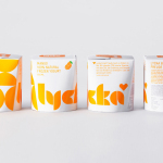
Lycka by BVD
Lycka is a 100% natural hand filled frozen yoghurt brand from Germany that donates 11 cents from each sale to Welthungerhilfe, a humanitarian aid project tackling issues such as world hunger, land grabbing in Cambodia and displacement across Syria and Iraq, amongst many other issues. Lycka’s brand identity and packaging, a mix of bright geometric forms which appears to draw some of...
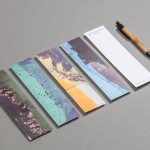
Junction Moama by Seesaw
Junction is a bar and restaurant situated within the tourist district of the Australian twin-towns of Moama and Echuca, both of which have histories that began in the middle of the 19th century and grew to share a border along the Murray River. Originally a wooden tavern built by James Maiden in 1840, and named the Junction Inn – a reflection of...
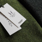
Croft Knitwear by Commission
Croft is a contemporary men’s knitwear brand that specialises in high quality cashmere and soft wool garments. These are available exclusively through online retailer Superdemin. Each garment is hand knitted on Scotland’s Shetland Islands by crofters, a name given to those using traditional batch production processes within small communities unique to the Highlands. Alongside a new logo, London-based design studio Commission worked with photographer Luke Evans to...