
Adisgladis by Bedow
Adisgladis is a Swedish clothing, accessories, outdoor gear and gadget retailer with premises on Stockholm’s Wollmar Yxkullsgatan street. It has a distinctive interior of copper pipe racks, die cut card hangers, wood fibre and chipboard surfaces, and a philosophy that embraces organic, up-cycled and positive living. Adisgladis’ new visual identity, developed by Stockholm based graphic design studio Bedow, draws on the...
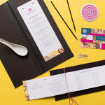
Tanoshii Ramen Bar by Mast
Ramen is a Japanese meat broth and wheat-noodle soup that originated in China and is now embraced internationally. While many enjoy instant versions, the best is said to be prepared over days and is the product, and some would say the art form, of a creative and experienced chef. These are the values of Tanoshii. As the first dedicated ramen bar...
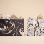
Candlefish by Fuzzco
Candlefish is a Charleston, South Carolina, store that stocks a carefully curated collection of scented candles from an assortment of brands including Rewined and Produce, and also plays host to a variety of workshops. The store takes its name from the Eulachon, better known as the Candlefish. After drying, and due to its high oil content, the Candlefish burns much like a candle and...
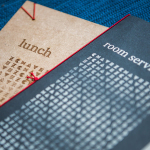
Chavez by Föda
Chavez is a contemporary Mexican restaurant located within the Radisson hotel, Austin, Texas. The restaurant has a Southwestern menu created by chef Shawn Cirkiel and inspired by his memories of family road trips taken to the Mexican coast and the cuisine he experienced there. These memories also informed the development of a warmly lit, wood and fabric furnished interior design by Michael Hsu Office...
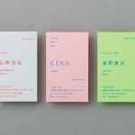
Laji Hair & Make by UMA
Laji is a hair and make-up studio located in the city of Osaka, Japan, with a distinctive interior design developed by dot architects. It features chipboard dividers and mirror frames, pegboard panels, strip lighting, exposed concrete ceilings, brick walls and utilities, concrete cast with wood surface texture, red stained floors as well as custom furniture created by Ryohei Yoshiyuki. It is a...
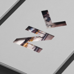
Luka Žanić Photography by Studio8585
Luka Žanić is a Croatian interior and architectural photographer who works with clients worldwide. He approaches each project individually, gathering information about objects, spaces and their purpose before beginning a shoot. His brand identity, designed by Studio8585 and which included stationery, poster and portfolio folder, takes advantage of a typographically challenging set of characters in the form of a monogram and uses this...
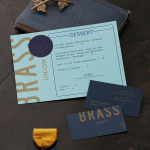
Brass Union by Oat
Located in the Union Square neighbourhood of Somerville, Massachusetts, Brass Union is a pub and cocktail bar with a small plate dinner menu. It takes over the space formerly occupied by the restaurant and music venue Precinct, both of which incorporated the historic nature of the building as a former police station into their names. To British readers, Brass Union would comfortably...
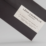
Léon Courville Vigneron by lg2 boutique
Léon Courville is a Canadian vintner growing grapes and producing wine from a 18 hector vineyard surrounding his home near Ville de Lac-Brome, Quebec. The uniquely rocky, chalky and clay soil, the region’s later farming seasons and the warmth from Lac-Brome gives Léon Courville’s wine a distinctive flavour profile, one that has secured international recognition. As well as being interested in...
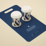
Pablo & Rusty’s by Manual
Pablo & Rusty’s is a small-batch coffee roaster, wholesaler, retailer and cafe with four locations in and around Sydney, and a company culture passionate about sustainability and the pursuit of perfection. San Francisco based studio Manual created a visual identity for Pablo & Rusty’s that would better reflect their values, was sensitive to local coffee culture and is described as having a level...
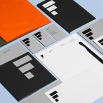
Estampaciones Fuerte by Hey, Spain
Estampaciones Fuerte is a Spanish cold metal stamping and pressing business with over forty years experience producing a variety of components for the automotive, domestic appliance and construction industries, as well as providing welding, finishing, threading and set assembling services. This year Hey worked with Estampaciones Fuerte to develop a new contemporary brand identity that would better reflect their industrial experience and professionalism....
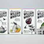
The Adventurous Blends of William Whistle by Horse
The Adventurous Blends 0f William Whistle is a small tea and coffee merchant crafting exotic flavoured teas, coffees and tisane from the highest quality ingredients sourced from across the world using an approach that is described as bringing together the very best discoveries of the past with the expertise of the present. This philosophy, as well as the merchant’s well-travelled and eccentric English nature, informed...
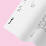
Korshags by Kurppa Hosk
Korshags is a family-owned seafood company located in Falkenberg on the Swedish west coast. Previously named Falkenbergs Lax (Falkenberg’s Salmon), Korshags has grown from a small local company specialising in smoked salmon, into an international player with a variety of products. With this in mind the company commissioned Stockholm-based Kurppa Hosk to establish a new name and brand identity that would better position...