
Hardpop 7 Years by Face
Hardpop is an electronic music venue located in the Mexican city of Juárez. It plays host to both international and national DJ’s and has been acknowledged twice by DJ Magazine as one of the best clubs in the world. Hardpop’s brand identity, a contemporary interpretation of military insignia, and a mix of conventional and unconventional typographic forms created by graphic design...
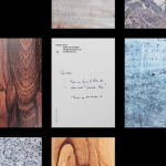
Markus Form by Lundgren+Lindqvist
Markus Form is a contemporary furniture company, founded with the intention of revitalising Sweden’s furniture industry, and with an ambition to produce relevant, practical and easy to match designs that are durable and sustainable. The company’s furniture will also draw on a significant Swedish and Scandinavian design culture and heritage that unites ergonomics, functionality, craftsmanship and a good working knowledge of materials, whilst also...
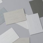
Decontoured by Bunch
Decontoured is a Milan based, by appointment only, fashion label that provides a bespoke service for redesigning existing garments. Its philosophy is firmly rooted in an aesthetic sustainability and value that transcends seasonal fashion trends, and acknowledges a shift in consumer behaviour from the mass-market towards conceptual products and personalised practices. The label’s approach is one of collaboration, craft, innovation...
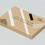
Husler & Rose by Post
Husler & Rose is an online boutique and occasional pop-up store that retails thoughtfully designed, carefully constructed and long-lasting furniture, homeware and lifestyle objects sourced from across the UK and Europe, professionally and sensitively restored by owner and furniture maker Ben Rowland. Inspired by Herbert Bayer’s Bauhaus posters and the jazz record sleeves of Duke Ellington, London based graphic design studio...
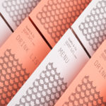
Sushi & Co. by Bond
Sushi & Co. is a restaurant and cafe on-board a cruise ship taking guests to destinations along the Baltic Sea. It has a modern interior design that mixes dark and light wood furniture, features warm low hanging lights, organic patterned upholstery, cool grey walls, exposed brick panels, slate floors and a visual identity developed by Helsinki based graphic design studio Bond. Extending...
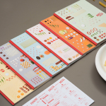
Marco Marco by Acre
Marco Marco is an Italian restaurant business with five locations across the city-state of Singapore and an affordable menu made up of international interpretations of classic dishes. These are created from simple recipes inspired by modern food culture using fresh locally sourced ingredients. The name, a reference to the adventures of merchant traveller Marco Polo, was chosen to reflect the international meeting...
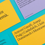
Urbanna by Forma & Co
Urbanna is a small Spanish tourist business, led by Anna Permanyer Jordi, that provides experienced guides who can speak Spanish, Catalan, German, French and English, to those visiting the city of Barcelona. Design studio Forma & Co worked with Urbanna to develop a visual identity solution that, rather than rely on ubiquitous images of the city, favours a convivial colour palette...
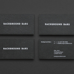
Background Bars by Campbell Hay
Background Bars provides bar, bar staff and equipment hire, pop-up and permanent bar design services, seasonal cocktail creation, bar management for corporate occasions, festivals, weddings and private parties, and income and report analysis. Alongside these, Background Bars also functions as a creative agency, helping brands to deliver compelling live events. Its visual identity, inspired by the name and which included website,...
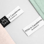
Mona De Castellarnau by Anagrama
Mona De Castellarnau is a US based luxury lifestyle brand that creates and retails a unique collection of crafted and meaningful objects that are said to reflect timeless beauty, simplicity and authenticity. Objects include home furnishings, accessories, bags and throws. Each are designed with an appreciation for tradition and provenance, an understanding of artisanal disciplines, and utilise simple forms, prints, patterns and...
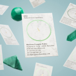
Ona by Mucho
Ona is a Spanish boutique travel agent providing its clients with personal, unique and private tours, day trips and stays in Barcelona and Catalonia. Its experienced guides offer professional insight into local culture, gastronomy, history, architecture, art and design, and provide round-the-clock assistance. Ona’s brand identity, designed by Mucho and based around the tagline “Tailored travel experiences”, is an unusual and distinctive...
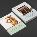
Balclis by Mucho
Balclis is a leading Spanish auction house, founded in 1979, with a varied catalogue of antiquities including jewellery, fine art, books and furniture. Quick to recognise the changing nature of the market and the way that people engage with the auction process, Balclis moved from local business to secure international recognition. With this in mind, and to keep up with industry changes,...
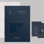
CC Bar by Freytag Anderson
Glasgow based design studio Freytag Anderson recently worked with Fraher Architects to develop the brand identity and collateral for Champagne & Cocktails at the Hilton Hotel, 22 Park Lane, London. Based around a monogram, midnight blue colour palette, hand crafted finishes of wood cut and etched glass detail, and both visual and material texture, Freytag Anderson delivered what they describe as a luxurious and old-world aesthetic that is...