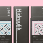
Hidraulik by Huaman
Hidraulik is a Barcelona based business producing rugs for contemporary spaces. These are inspired by cement panels hydraulically pressed, rather than fired, with a layer of coloured pigment. Hydraulic panels originated in the 1850’s and experienced a resurgence in the mid 20th century, these would often feature brightly coloured and detailed patterns, and were popular during an era of personalisation and interior expression....
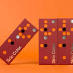
Fedrigoni Sirio Color by Design Project
Leeds based studio Design Project were commissioned by Fedrigoni, one of Europe’s leading paper manufacturers, to develop a material sample solution that would help them to promote their flagship paper brand ‘Sirio Color’ within the UK market. With the intention of allowing customers to experience the tactile characteristics and diverse colour palette of the range first-hand, Design Project developed a flat-pack...
From Babies With Love by Paul Belford Ltd
From Babies With Love is an organisation that sells organic baby clothes, blankets and accessories, as well as a range of greetings cards online. The money raised from the sale of these goes to SOS Children’s Villages, a scheme that supports babies who have lost parents to war, famine, disease or poverty, by placing them with families and within communities that are safe and stable. London based Paul...
Poseidon Helsinki by Kokoro & Moi
Poseidon Helsinki centralises the tasks of architect and builder with the intention of delivering higher quality construction projects based around visionary and uncompromising design solutions. Poseidon’s values are deeply rooted in a love for Helsinki, a belief in aesthetically ambitious architecture and expansive urban spaces, and improving the capacity and quality of the city through sensitive renovation and attic conversions. Poseidon’s visual identity, inspired...
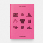
Zuzunaga by Folch
Zuzunaga is a homeware and fashion accessory business founded in ’07 by London and Barcelona based artist and designer Cristian Zuzunaga. Zuzunaga’s products, which include towels, tech covers, cushions, shawls, shoes and upholstery fabrics, are informed by contemporary living and seek to find a charm, warmth and humanity within the digital world. Products are characterised by lines, pixels, geometric abstractions and a...
VBMS by Studio Dumbar
Visser & Smith Marine Contracting is the market leader for subsea power cable installation in Europe. It provides and lays grid-to-grid connections for offshore wind farms and similar facilities. Following investment from and partnership with dredging and marine experts Boskalis, Studio Dumbar worked with VMSC, now named VBMS (VolkerWessels Boskalis Marine Solutions) to provide strategy, brand identity and creative direction that would help launch...
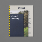
Enea by Clase bcn
Enea is a contemporary furniture manufacturer with a site in the Basque Country. Collaborating with designers Josep Lluscá, Gabriel Teixidó and the trio Lievore Alhterr Molina, Enea has developed a catalogue of versatile, comfortable, durable and functional products for the private and commercial markets. Seeking to differentiate itself from its competitors and with a desire to avoid cliches of the...
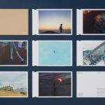
David Ryle by S-T
David Ryle is an internationally recognised and award-winning photographer with a studio in London. He has a portfolio of work that includes shots for The Sunday Times Magazine, JWT and Saatchi & Saatchi, and is represented across Europe and America by management agency The Peter Bailey Company. Drawing on his attention to detail and relentless pursuit of quality, design studio S-T developed...
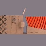
Finchtail by Believe in
Finchtail is dedicated to the design and manufacture of simple, useful and sustainable solutions to everyday problems. Its first product, a low-cost, flat-packed card tablet and mobile phone stand, features a distinctive brand identity and packaging design treatment developed by UK based graphic design studio Believe in. Monospaced type and corrugated card sit alongside die cut detail, white ink, a bold pattern...
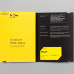
The National Institute of Dramatic Art by Maud
The National Institute of Dramatic Art is a national education and training organisation for the performing arts in Australia, and is responsible for developing the talents of some of the country’s biggest stars. With the continued democratisation of performance through digital platforms such as Youtube, and concerns that this had the potential to undermine NIDA’s conservatoire approach, NIDA pursues a...
Simon Pengelly by Spin
Pengelly Design is a British furniture and product design studio, founded by Simon Pengelly in 1993, that embraces a material and process led approach to problem-solving, and an aesthetic that has a lightness, simplicity and timelessness. Since its foundation, the studio has gone on to secure and complete a variety of national and international furniture, transport and product design projects in collaboration...
Design Museum by Bond, Finland
Designmuseo is a Finnish design museum, housed in a late 19th century building by architect Gustaf Nyström, and located on Helsinki’s Korkeavuorenkatu Street. The museum exhibits national and international work from the fields of fashion, industrial and graphic design, and, alongside its permanent exhibition of Finnish design from 1870 to the present, also hosts a variety of temporary exhibitions throughout the year....