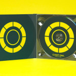
Giant Owl Productions by Alphabetical
Giant Owl is a London-based independent production company that creates television programmes, commercials and short films for clients such as Channel 4 and Rimmel London. Design agency Alphabetical recently developed a new brand identity solution for Giant Owl—which included an animated logo, flat colour palette, glow-in-the-dark paper and bold illustrative detail—that leverages a simple observation to balance an expected technicality with a playful...
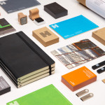
Haverstock by Spy
Haverstock is a UK based architectural practice that specialises in public-sector projects with a strong humanistic approach that enables “clients and the people who use the buildings to have a voice, and to shape the way their building ends up”. Following the retirement of Haverstock’s founding partners design studio Spy was commissioned to develop a new brand identity for the firm—which included a...
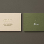
Brae by Studio Round
Brae is a restaurant, located in the Australian town of Birregurra, that describes itself as having a menu of unique and contemporary dishes built around a respect for nature and seasonality, and crafted from organic ingredients both locally sourced and grown on its own 30 acre site. Brae’s new brand identity—which included a new logo-type, menu, stationery set and website developed...

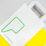
Mellbye by Heydays
Mellbye is a Norwegian architecture firm founded in 1954 with a “mindset anchored in modernism”. Design studio Heydays created a new brand identity for the firm based around a geometric M symbol built from the initials of their two main services, architecture and interiors. Executed as a combination of blind deboss and die cut detail across a earthy and urban...
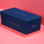
Oblique Paul Smith Edition by Graphical House
Graphical House and Derek Welsh Studio recently produced a special edition version of their distinctive domino set and collaborative project Oblique for Paul Smith. The dominoes, handcrafted in walnut using 45 processes, 8,400 hand drilled holes, 155m of walnut, 15m² of laminate, 75m² of 150 grit sandpaper, 20m² of 320 grit sandpaper and 18 hand files, come in a drawstring bag packed in...
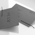
Seam by For Brands
Polish design agency For Brands were recently commissioned to create a new visual identity for Seam, a distributor of luxury clothing brands, that would convey a sense of craftsmanship and an eye for detail. For Brands mixes classic typographic detail with contemporary customisation delivered across tactile material choices with hand finished detail, fusing urban, craft and fashion sensibilities....
Cemento by S-T
Cemento is the UK distributor of an Italian lightweight concrete product that can be used for wall panelling and furniture. Inspired by brutalist design — a movement that grew out of early 20th century modernist architecture and described by Wikipedia as being “linear, fortresslike and blockish” — London based studio S-T developed a visual identity for Cemento that included logo, logotype, brand...
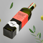
Olaf Olive Oil by Anagrama
Olaf is a Mexican cold-pressed extra-virgin olive oil produced by Olivarera Italo-Mexicana – a Mexican Italian collaboration – intended for healthy, home-cooked, family meals and makes up one-third of Olivarera ‘s olive oil range, which also includes Valentto and Olive Gold. Anagrama, the design agency behind Olaf’s new visual identity, print materials and packaging, describe their approach as taking “typical Italian visual clichés...
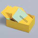
Sebazzo by Bunch
Sebazzo is the London based interactive studio of digital design duo Sebastien Hefel and Michael Azzopardi. The studio creates applications, websites and generative installations for a variety of brands and specialises in ‘innovative e-learning environments’. Design agency Bunch recently created a visual identity and stationery solution for Sebazzo that conveys digital design as a craft and the duality of the partnership...
Partick Dental by Freytag Anderson
Design studio Freytag Anderson were recently commissioned by Glasgow based Partick Dental to create a “fresh and vibrant visual identity” for their local practices. The studio saw the opportunity to create a clear concept that would avoid the “usual clichés associated with the industry” and have an inclusivity that would strike a solid balance between minimal, contemporary, inviting and established, through a...

Matthew Hilton Watch by Spin
Matthew Hilton is a designer working with De La Espada to bring together craftsmanship, premium materials and advanced manufacturing technologies to produce high quality furniture. Spin, the agency responsible for developing Matthew Hilton’s brand identity, have recently completed the packaging of his first time piece as well as the print for the launch event. Spin’s juxtaposition of low-fi corrugated card,...

Checklist by Anagrama
Checklist is a Mexican event planning business that specialises in ‘milestone occasions’ such as birthdays, anniversaries and graduations as well as corporate events. Checklist caters ‘exclusively for their client’s unique needs’ and can also provide options that are environmentally friendly. Design agency Anagrama recently devised an ‘institutional’ visual identity solution for Checklist that mixes the age and authority of a heraldic shield,...