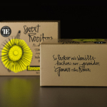
Teahouse Exclusives by Peter Schmidt Group
Teahouse Exclusives is a German company with a portfolio of high-quality black, green, fruit, and herbal teas, a philosophy that revolves around sophistication, quality and modern lifestyle values, and describes itself online as being trend-conscious. Based around the concept of individuality and strong character, integrated brand consulting business Peter Schmidt Group worked with Teahouse Exclusives to develop a new packaging treatment for its...
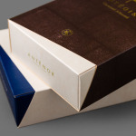
Antéoise by UMA
Antéoise is a creme dacquoise range from Anténor, a Japanese patisserie established in 1966 that creates French style cakes, cookies, tarts and variety of other confectionery. Antéoise’s brand identity and packaging treatment, developed by Osaka based graphic design studio UMA, draws on the range’s flagship positioning, high quality ingredients and the craft employed in its creation, the heritage and experience of Anténor, the streets of Kobe, and the...
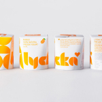
Lycka by BVD
Lycka is a 100% natural hand filled frozen yoghurt brand from Germany that donates 11 cents from each sale to Welthungerhilfe, a humanitarian aid project tackling issues such as world hunger, land grabbing in Cambodia and displacement across Syria and Iraq, amongst many other issues. Lycka’s brand identity and packaging, a mix of bright geometric forms which appears to draw some of...
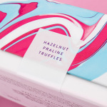
Costèllo + Hellerstein by Robot Food
Yvonne Costello and Ori Hellerstein are a husband and wife team making artisanal chocolate truffles using high quality ingredients and the processes acquired by Ori working as a pastry chef at well-respected restaurants. These skills were then refined whilst running his business The Artisan Bakery creating and supplying fine patisserie and chocolates to trade. Costello + Hellerstein’s philosophy is built around the complete sensory experience,...
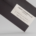
Léon Courville Vigneron by lg2 boutique
Léon Courville is a Canadian vintner growing grapes and producing wine from a 18 hector vineyard surrounding his home near Ville de Lac-Brome, Quebec. The uniquely rocky, chalky and clay soil, the region’s later farming seasons and the warmth from Lac-Brome gives Léon Courville’s wine a distinctive flavour profile, one that has secured international recognition. As well as being interested in...
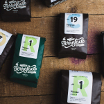
Torrefacto by Fork
Torrefacto is a Russian coffee roasting business founded in 2011 in response to what they describe as the difficulty of sourcing freshly roasted coffee beans in Moscow, and the time and trouble associated with importing it. Torrefacto prides itself on batch production and hand roasting processes, good consumer relations – which sees its owners personally answering letters and addressing website comments – and...
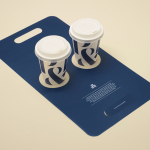
Pablo & Rusty’s by Manual
Pablo & Rusty’s is a small-batch coffee roaster, wholesaler, retailer and cafe with four locations in and around Sydney, and a company culture passionate about sustainability and the pursuit of perfection. San Francisco based studio Manual created a visual identity for Pablo & Rusty’s that would better reflect their values, was sensitive to local coffee culture and is described as having a level...
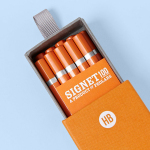
Signet 100 HB Pencils by Well Made Studio
Signet is a new pencil range developed by British home, outdoor and lifestyle retailer Pedlars, who applied their expertise to an own-brand product line following a lengthy international search for the perfect pencil. 100, the first of the Signet range and launched in November this year, is made from American basswood, finished in orange with a silver foil detail and crafted by a long-established family-run business...
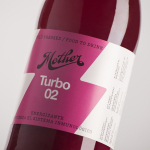
Mother Cold Pressed Juice by Mucho
Mother creates fresh cold pressed juices, milks, smoothies, cereal bars, snacks and detox systems from its location at the centre of Barcelona. Mother recently commissioned design studio Mucho to develop a name, visual identity and packaging treatment that would help express the love and care they put into crafting their range and the technological and industrial processes required to produce them....
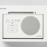
John Lewis Spectrum by Pentagram
Spectrum is a recently redesigned consumer electronics range created by and sold through British department store John Lewis. The range includes DAB radios, alarm clocks, speakers and iPad covers. These are bound by a cohesive aesthetic of soft plastic, geometric forms, bright colours and a packaging treatment created by international design studio Pentagram, led by partner Harry Pearce....
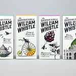
The Adventurous Blends of William Whistle by Horse
The Adventurous Blends 0f William Whistle is a small tea and coffee merchant crafting exotic flavoured teas, coffees and tisane from the highest quality ingredients sourced from across the world using an approach that is described as bringing together the very best discoveries of the past with the expertise of the present. This philosophy, as well as the merchant’s well-travelled and eccentric English nature, informed...
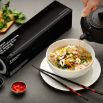
Ninjaplast by Kurppa Hosk
Ninjaplast is a Swedish plastic food wrap product with a unique packaging solution that addresses the difficulties often associated with cutting similar products effectively from a roll. Rather than a serrated card bar, Ninjaplast comes with a built-in and safe to use cutting blade that makes wrapping food a “fumble free” experience. The close relationship between product and packaging is enhanced by,...