Barnardo’s by The Clearing
Barnardo’s is the UK’s largest children’s charity, and it undoubtedly does much good in the world. However, its history up to this point is also littered with uncomfortable controversies. Certainly, the most outlandish transgressions are concentrated in the late-19th and early-20th centuries. Founder Thomas John Barnardo was taken to court 88 times for kidnapping children (or ‘philanthropic abductions’, as old...
Qasa by Bold
Now that the likes of ed-tech (education technology) and fin-tech (financial technology) have become a natural part of everyday parlance, it was surely only a matter of time before prop-tech (property technology) entered the equation, too. Proptech largely refers to platforms and services that use tech to help people buy, sell, research, market, and manage a property – ranging from...
Crumbl by Turner Duckworth
While we speak the same language, the cultural differences between us here in the UK and our pals in the US can feel vast. There’s pavement vs sidewalk, fringe vs bangs, ‘flavour’ vs ‘flavor’. There’s also biscuit and cookie – though where we draw the line between the two is another debate for another time. And seemingly at the forefront...
New York Botanical Garden by Wolff Olins
It must be something of a dream project when an agency gets commissioned to work on those big-name cultural clients – museums, art galleries, orchestras, theatre companies, et al. You’d expect such projects to be a departure from the constraints and stakeholder-limitations of corporate clients; and perhaps a chance to be more creative than usual, thanks to the nature of...

Knahia by Requena Office
Estepona is a Spanish resort town on the Costa del Sol. It surveys the azure waves of the Mediterranean from the apex of a bight that traces a gentle South-Westerly arc from Marbella to Gibraltar. Strewn as it is on this notoriously idyllic coastline, Estepona largely conforms to the stereotypically cheerful charm of the Spanish resort town, pandering to the...

Mr Yum by Re Design
Sometimes a project comes along that doesn’t just make you think about how nice its typography is, or ponder if millennial pink is making a comeback (or indeed,, if it ever went away), or why suddenly a branded bucket hat seems to be a key facet of any company/product/concept’s ‘swag’. Sometimes, it makes you think about what ‘branding’ even means,...
Omlet by Ragged Edge
We’re undeniably in an age of pet care 2.0: the post-fur-baby era, where people are finally beginning to see their animals’ needs and wants as independent to their own (i.e. dried pigs ears over vegan dog treats, eschewing leads for cats, and so on). These shifts in how we think about what it means to have and look after animals...

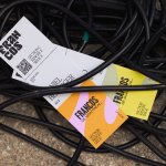
Francos de Montréal by LG2
Les Francos de Montréal is Canada’s premier festival of French language music and culture. Held annually in downtown Montréal, it is a fixture in both the social calendar and cultural life of the city, and the wider francophone world. This year’s edition of the festival has been given a sophisticated new look, courtesy of LG2, Canada’s largest independent creative agency...

Pilo by 5.5
Youth hostels aren’t exactly associated with luxury – nor great branding. For the most part, they’re deemed the cheap and cheerful option; a trip where home comforts are sacrificed for socially minded living, affordability, and a more adventurous sensibility than the average Travelodge. They’re the sorts of places where creaky bunk beds, shower queues, pillows so thin they’re barely more...
GUT by &Walsh
Guts aren’t exactly glamorous. And the connotations of the word ‘gut’ are multifarious: there’s the gory (‘blood and guts’); the Germanic ‘good’; the straightforwardly corporeal; or for those with an interest in newer psychological findings, it’s a wondrous ‘second brain’. Ad agency folk, however, have long taken the word ‘guts’ far outside of the bodily. For many of them, ‘guts’...
Orchestra Sinfonica di Milano by Landor & Fitch
In the words of synesthete Johann Wolfgang von Goethe, ‘music is liquid architecture; architecture is frozen music’. Unlike 19th-century architecture, contemporary graphic design is afforded no such static reprieve – it faces the challenge of animating the ‘universal language’. Whereas once the plastic arts could content themselves with merely freezing music, any contemporary attempt to visually translate music must now...
National Portrait Gallery by Edit Brand Studio
In June 2023, a giant of British cultural life awoke from a three year slumber. The return of the National Portrait Gallery evokes a joy that is made all the keener when one recalls the troubled time in which it closed its doors: March 2020, as the COVID-19 pandemic took hold and public life evaporated in the announcement of that...