Chester Zoo by How&How
I’d lazily assumed that, like jazz record sleeves and Dutch public transport, zoos were one of those sectors with a visual legacy that’s packed with game-changing brand design – the sort that fills the pages of graphic design histories, up there with the likes of Paul Rand’s ‘IBM’ and the FedEx arrow and Alan Fletcher’s gloriously clever ampersand trickery for...
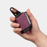
Ultraderp by Mucho
The name Ultraderp seeks to combine all things extreme (think ‘ultrafast’, or ‘ultra marathon’) with ‘derp’, which is, apparently, the face a dog makes when they don’t know what’s happening. The product that bears this name is an ultra-light, easily-packable dog leash that can be worn on the collar and deployed when needed, simply by pulling the tongue-like tab. This...
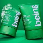
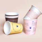
being by Zuru Edge
What does Gen Z really want? It’s the question at the heart of a thousand nigh-on identical think pieces; and at the fulcrum, it seems, of endless board meetings chaired by Gen Xers, and populated by ‘geriatric Millennials’, like me. My generation was simple. We wanted avocados, didn’t we? We wanted everything to be in millennial pink and to have...
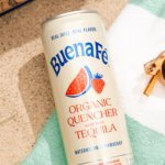
Buena Fé by Saint Urbain
Buena Fé is the first 100% organic tequila-based cocktail-in-a-can, and is made in Jalisco, Mexico, the ‘birthplace of tequila’, where the spirit was first distilled. The drink is made with 100% Blue Weber Blanco tequila, which means that all the alcohol in Buena Fé comes from the agave plant. Unlike your short Margarita, or shortish Paloma, these ready-to-drink cocktails are...
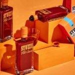
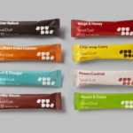
Stuzzi by Perron-Roettinger
Hot sauce branding has long been dominated by certain overarching tropes: there’s the hyper-trad (Cholula, Tabasco, Sriracha et al); the twee of the kitchen-table-scale small-batch brigade; and the I WILL RIP YOUR HEAD OFF! camp where products have names like ‘death’. In the first and second of those camps in particular, there’s a lot of decent branding. But this new...
Bettr by Anak
Between the late 2000s and the early 2010s, the coffee industry turned its attention to ‘craft’, elevating the beverage to a gourmet offering. When it came to brand storytelling, flavour notes, provenance and sustainability became key components. These features came to define what’s now known as ‘third-wave coffee’, which pre-dates the gamified science-infused ‘fourth-wave coffee’ movement in terms of textures...
Story Espresso by For the People
The unity of coffee-boffins and great typographic choices seems to be having a moment right now on BP&O. Just the other week we covered the truly superb work for Dark Arts Coffee by Not Wieden + Kennedy. Now, though, we’re heading down under – specifically to the Sydney suburb of Lane Cove, home to Story Café. Story Café opened in...
Spudos by Paul Belford Ltd
We live in chaotic and excessive times. Brands and politicians alike demand attention, clamouring for consideration and creating – quite frankly, for me at least – an unwelcome cacophony of competing voices and issues. All too often, the lines between competing interest are blurred, and even absurd. I crave clarity and simplicity, particularly when it comes to basic consumables. What’s...
OSESP by Polar
When São Paulo-based studio Polar was tasked with rebranding one of Brazil’s most important cultural institutions – the Orquestra Sinfônica do Estado de São Paulo (São Paulo Symphony Orchestra), better known as OSESP – its solution was an identity system that doesn’t just depict classical music but actively embody it. OSESP’s previous identity had served it well, with its 2003-2007...
Dark Arts Coffee by NOT Wieden+Kennedy
If a brand that fuses memes, hot takes, occultism, and coffee is going to succeed anywhere, it’s probably in east London. Dark Arts Coffee started out in 2014 in a Homerton railway arch, and managed to corner that distinct subgenre of goth/metal/biker-ish aesthetics which opts for craft ale over snakebite; Hackney over Camden; self-care over self-destruction. Where the old guard,...
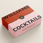
Williams Cocktails by Offff
In the last five years, canned cocktails have become ubiquitous, with offerings from MOTH: (packaging by Pentagram) and Whitebox (cans created in-house) among the strongest designs competing on the shelves of off-licenses, delis and bottle shops. Convenience and a post-pandemic demand for ‘on-the-go’ experiences have helped drive this trend, with Mintel data demonstrating that sales of spirit-based ready-to-drink beverages increased...

Tameko by DutchScot
Founded by Dominika Leveau and Chim Sonne-Schmidt in 2021, textile brand Tameko feels thoroughly ‘Scandi’ in aesthetics and ethos – it’s all clean lines, a singularly restrained stance on beauty. It’s form following function. Tameko embodies that very contemporary take on the luxury sensibility that never shouts about its status. It doesn’t need to: luxe quietly but confidently oozes from...