
Self, Made by Collins
Exploratorium is a “public learning laboratory” and San Francisco based museum that enables visitors to question and make sense of the world around them through hands-on exhibits that touch upon science, art and human perception. Its summer 2019 exhibition, Self, Made, continues in the spirit of exploration but turns this inward, tackling the theme of human identity. It did this...

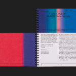
Albert Oehlen Book by Zak Group
Albert Oehlen is a German contemporary artist. Working with canvas, he brings together a bricolage of figurative, collaged, abstract and computer-generated elements, with a particular focus on process and self-imposed parameters such as limited colour palettes. His work, as described by the Serpentine Galleries, currently running a Oehlen solo exhibition till February 2020, engages with the history of painting through Expressionist brushwork, Surrealist...
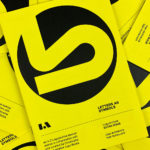
LogoArchive ExtraIssue – Letters As Symbols
LogoArchive in print was conceived, designed and sent to print in a day. It was inspired by a panel discussion at Somerset House as part of the exhibition Print! Now on to its seventh release, LogoArchive continues to reconfigure itself with each new issue with the intention of surprising, graphically and materially, within the context of archival. The distinctive smaller...
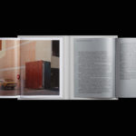
Inn Situ by Studio Mut
Inn Situ is part of the cultural programme of BTV Bank and series of three events; a exhibition, a concert and panel discussion. This takes place two to three times a year in the Austrian city of Innsbruck. The events are distinctive in their approach, a Russian doll of nested narratives, with each layer responding to the next. Practically speaking,...

Maria Sole Ferragamo by Lundgren+Lindqvist
Maria Sole Ferragamo is one-of-a-kind jewellery designer using up-cycled premium leather; remnants of the Italian fashion industry. She has a degree in architecture at Politecnico, Milan and another in jewellery design from Central Saint Martins, London. This intersection of fashion and architecture can be seen throughout the designer’s collection and has gone on to inform the design of her visual identity...
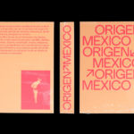
Origen México by Blok
Origen México is a encyclopaedic collection of cultural reference points from Mexico, and an expression of love for its land and identity, edited by Ámbar Editores and Paola Gonzalez Vargas. Written in Spanish it covers things such as, Barro negro pottery; the black clay pottery of Oaxaca, Barrancas del Cobre; the six canyons in the Sierra Madre Occidental and individuals such...
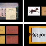
Studio Showcase: Studio Hi Ho
Studio Hi Ho is a Melbourne-based branding and communication consultancy co-founded and led by Wesley Waddell and Patrick Scanlan. BP&O has been following and writing about Studio Hi Ho since 2013 . Their work covers a variety of industries, however, it is their work with property developer Milieu that has often found its way on to BP&O. These projects can...

Daniel Jensen: Current Events by Bedow
Daniel Jensen is a Swedish artist whose work moves between paintings, sculptures and drawings and explores themes such as society and pop-culture, film, literature and nature. His latest book, designed by Bedow, features artworks that are figurative and abstract, unrelated and absent a narrative. With such compelling and intense imagery of colour and dynamic shape, Bedow developed a format that...
Napier Street by Studio Hi Ho
231 Napier Street is an eleven apartment building, now sold out, created by property developer Milieu, set with the culturally rich part of Fitzroy, Melbourne. It is their first collaboration with architect Edition Office—an innovative practice with a strong conceptual focus—and part of the developer’s ongoing enquiry into and interrogation of the dialogue between architecture and place. This interrogation forms...

One Wellington St Kilda by Studio Ongarato
One Wellington, a partnership between LAS Group and Qualitas, is a new property development located in the Melbourne suburb of St Kilda, not far from eclectic Fitzroy Street. The building’s architecture—designed by KPDO and comprised of 181 apartments across two buildings of 26 and 10 floors—features flowing curves inspired by its bayside location, highly-customisable interior options and unobstructed sky views. One...

Lagotto by Studio Hi Ho
Lagotto is a new all-day café, wine bar and food store situated inside Nth Fitzroy, a residential property development project from Milieu located at the heart of Melbourne’s, inner north. Named after the truffle-hunting Italian dog breed, the café offers a relaxed European surrounding in which to enjoy an Italian menu with a “joyful vibrancy that avoids kitschiness or pastiche”. Studio Hi Ho,...

BP&O Collections — Best Awards Winners 2019
The Best Awards is an annual celebration of interactive, graphic, product and spacial design work from New Zealand and Australia, run by The Designer’s Institute. This year’s event took place on Friday the 4th October at Auckland’s Spark Arena where winning studios where awarded a Gold Pin for best in category, a Supreme Pin for best in discipline or a Purple Pin for those considered to...