
Puebla 109 by Savvy
Puebla 109 is a three floor 20th century townhouse, located in the Roma Norte colonia of Mexico City, “where art, design and gastronomy converge” in the form of an evolving space utilised as a place to work in the morning, as a restaurant to eat lunch in the afternoon and as a bar to have cocktails in the evening. Puebla 109’s new brand identity—which includes...

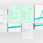
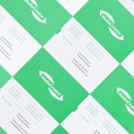
Intu by Heydays
Intu is a Norwegian accounting and consultation firm and real-time technological solutions provider located in the town of Bodø. Design agency Heydays developed a new brand identity solution for Intu—which included naming, logotype, business cards, print communication, custom typography and website design—based around the link between the firm’s two key services and the software it uses to deliver these efficiently....
Frederik Laux Photography by LSDK
Frederik Laux is an award winning German portrait, fashion, lifestyle and editorial photographer with a client list that includes Alliance and Mercedes-benz. His new visual identity, developed by Stuttgart based design agency LSDK, takes a competently spaced but generic condensed, sans-serif logotype and executes it as a redacted three-line mark die cut by hand across a print solution that mixes...

The Fableists by Freytag Anderson
The Fableists is a children’s clothing company that creates quality basics, predominantly unisex, designed to last with ‘punk rock flair’ and utilitarian, vintage clothing and work wear influence. Their products are underpinned by a sustainable brand philosophy that pays and treats their suppliers fairly, considers its impact on the environment and aims to educate buyers on the complete life cycle of their...

Feral Sphere by Mind
Established by Goldsmiths graduate Holly James earlier this year, Feral Sphere is a UK-based fashion label that creates simple, colourful and comfortable clothing and accessories made from organic cotton using 100% renewable solar and wind energy. The label’s brand identity and packaging solution, created by Mind Design working in collaboration with illustrator Lenia Hauser, was “inspired by Japanese Shinto spirits...

University of the Arts Helsinki by Bond
“The Finnish Academy of Fine Arts, Sibelius Academy and Theatre Academy Helsinki merged in the beginning of 2013 into the University of the Arts Helsinki. Bond created the complete branding solution for the new university. The strategy for the identity was to create a distinctive set of logotypes based on a common design language, and to introduce an anchor symbol...
MediaCreator by Lundgren+Lindqvist
Media Creator is a Swedish print production and project management company that utilises a flexible web-based system that pairs a ‘intuitive computerized system’ and translation service, with ‘alert’ and ‘friendly’ staff to streamline their entire print process. Utilising a predominantly two-tone colour palette, san-serif typography and bright contemporary illustrative detail, MediaCreator’s new visual identity, which included a new logo, stationery set and...

Heart & Soul Interiors by Band
Heart & Soul is an Australian interior decoration firm, specialising in residential properties, with a holistic, adaptable and flexible philosophy. Adelaide-based design studio Band were commissioned by the firm to update their brand identity so that it would better reflect their contemporary approach. Based around the duality of a heart/ampersand marque, a sans-serif logotype and print that juxtaposes a modern bright red...
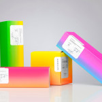
Bermellón by Anagrama
Bermellón is a Mexican confectionery shop that specialises in the premiumisation of traditional spicy treats typically sold on street markets. The shop’s identity and packaging, designed by Anagrama, fuses a bold and intense fluorescent colour palette with the fine detail and craft qualities of an adhesive label....

Smets by Coast
SMETS is a luxury department store located in the heart of Brussels (with two more locations across Luxembourg) with over 3.500 square metres of fashion, design, art, food and beauty. Following last December’s BP&O review of the SMETS identity, independent design agency Coast has recently published some further images outlining how this new visual identity has been executed across a wider variety of collaterals and touch-points....